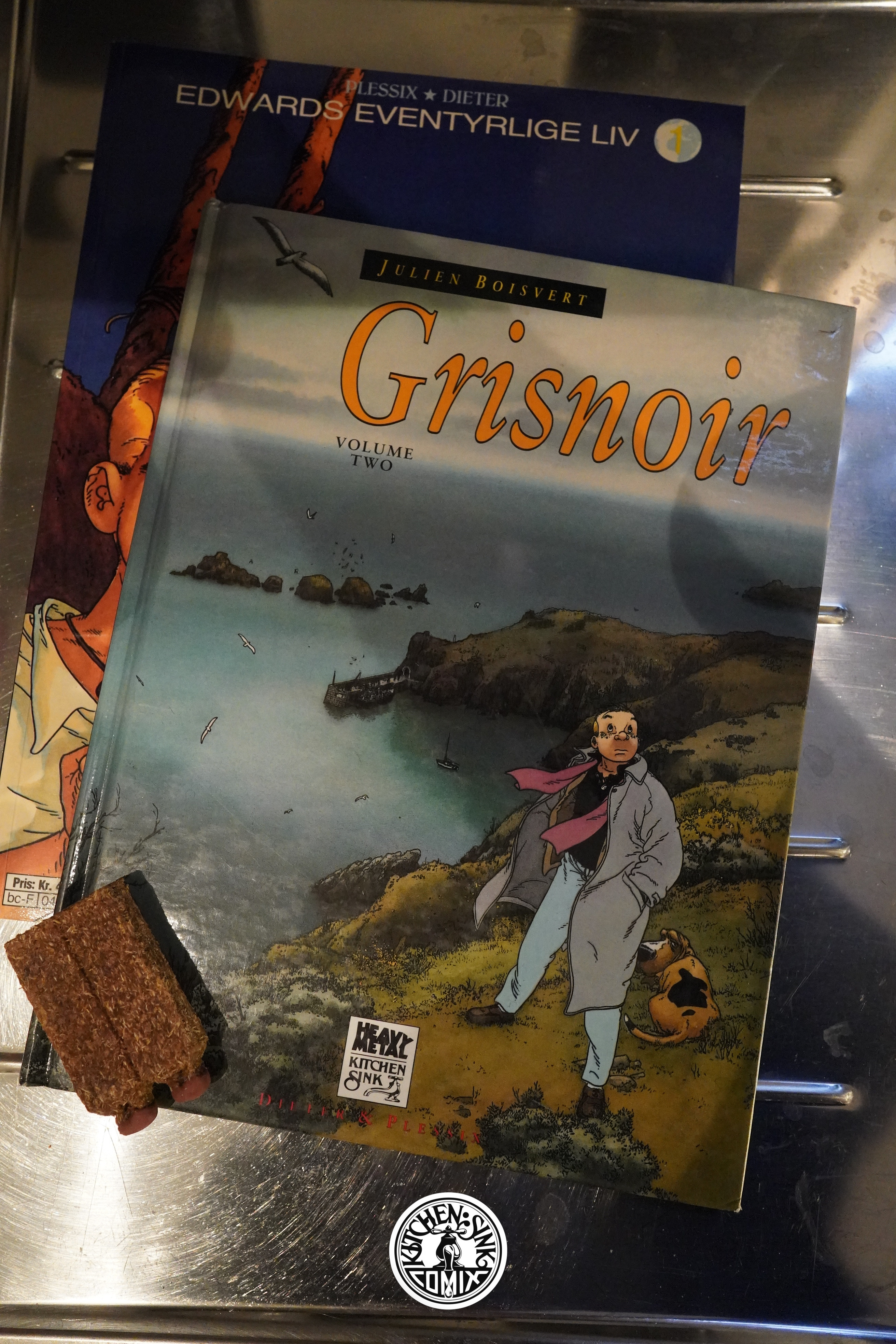
Neekibo (1993) ,
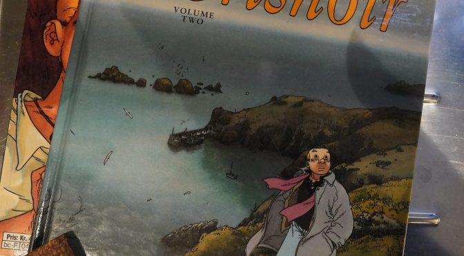
Grisnoir (1993) by Dieter/Michel Plessix
I’ve got the Norwegian edition of Neekibo here instead of the Kitchen Sink one, but let’s look at it anyway.
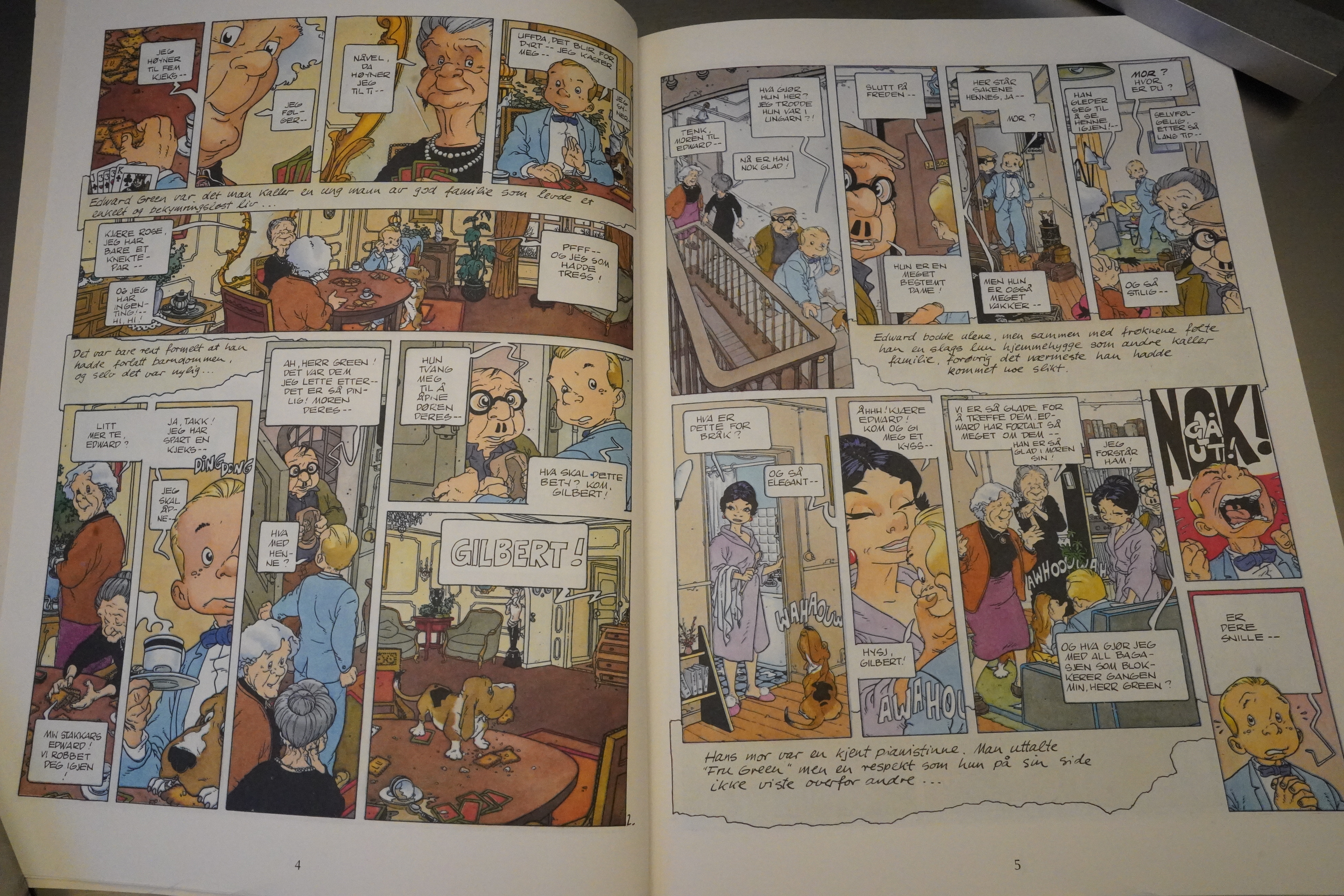
First of all, the art style seems pretty bizarre to me. The protagonist has a head that looks exactly like Fantasio (of Spirou fame), but the bodies and environments are generally drawn very realistically. The long, thin necks contribute to the confusion — it’s just hard to see what they’re going for here.
And there’s also excerpts from something that looks like a diary, but it’s told in third person, from a storyteller who seems to have total knowledge about the protagonist’s inner life, and these excerpts are placed below a run on panels, usually, and it’s difficult to guess what sequence we’re supposed to read these in. After the first panel? After them all?
It makes for choppy reading.
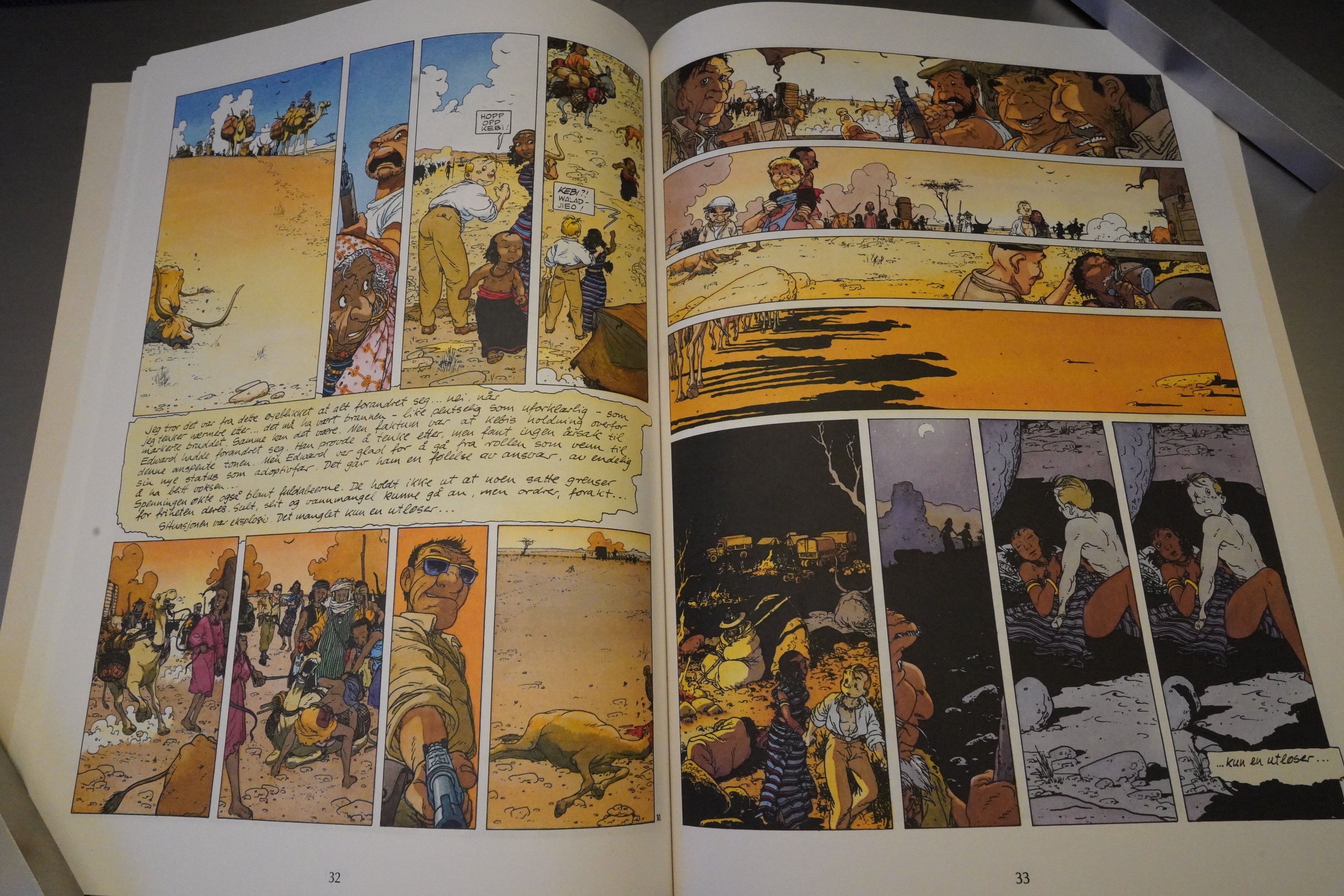
I assume that these landed at Tundra/Kitchen Sink via being serialised in Heavy Metal first, but it seems like an odd thing for Heavy Metal to run. It’s a rather serious book about African people being exploited by European multinational, and the art style isn’t something that Heavy Metal would typically go for.
There’s even just a couple of sex scenes? So that’s a mystery.

The second (and final volume from Kitchen Sink; it continued for two more in France) straightens out the storytelling a bit. We’re still getting bits of letters being inserted, but at least these more understandable now.
We do get a bunch of flashbacks that trip up the pacing a bit, though.
The artwork is less cartoony, but the mix of these bizarre head shapes coupled with “realistic” rendering (see that third panel up there) just makes things even more befuddling.
And again, it’s a serious, ponderous book, and like the first one, it doesn’t really have a really happy ending.
These are pretty compelling books, even if they aren’t completely successful — especially the second book, which is genuinely distressing.
I can’t find many reviews of the books, but here’s one:
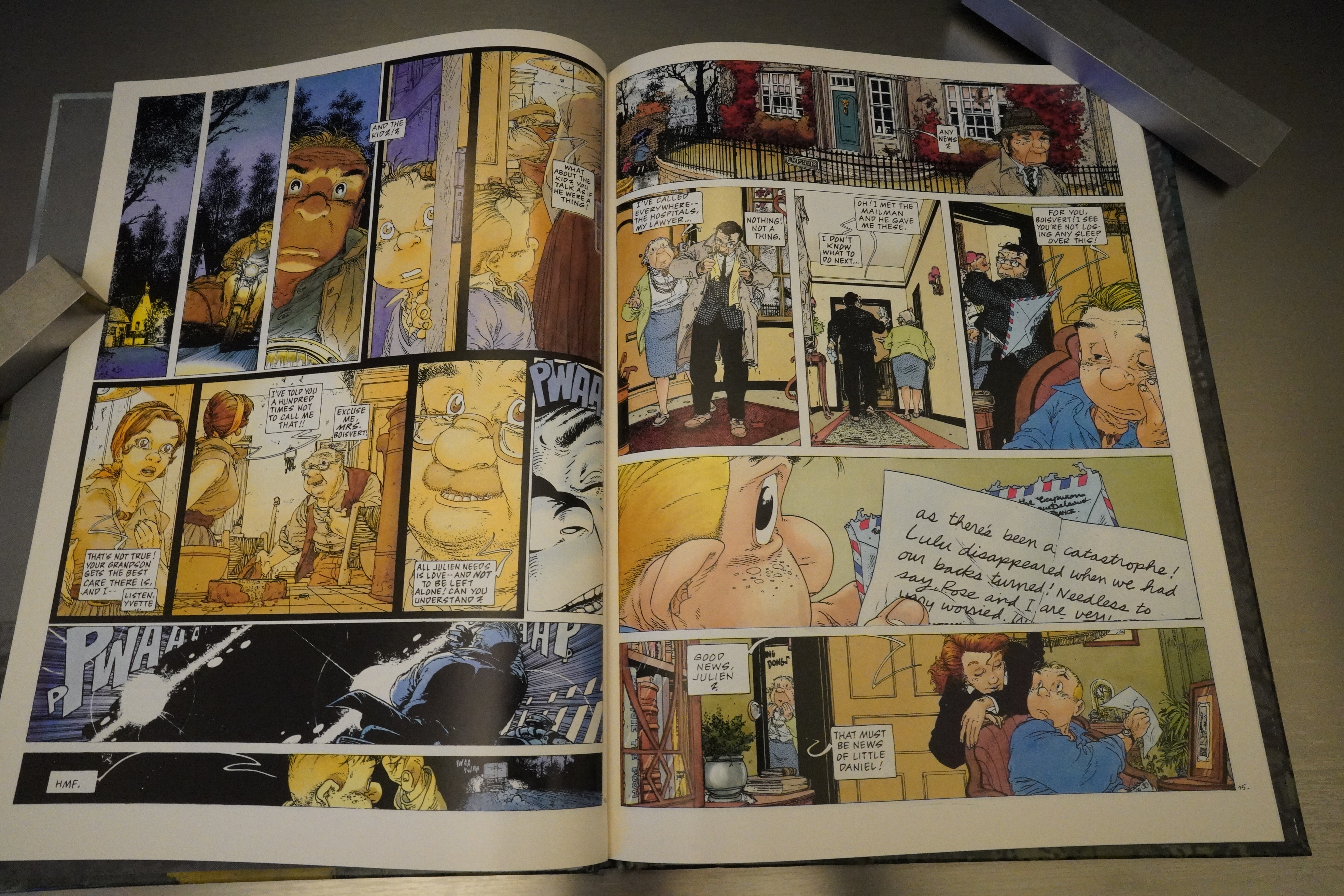
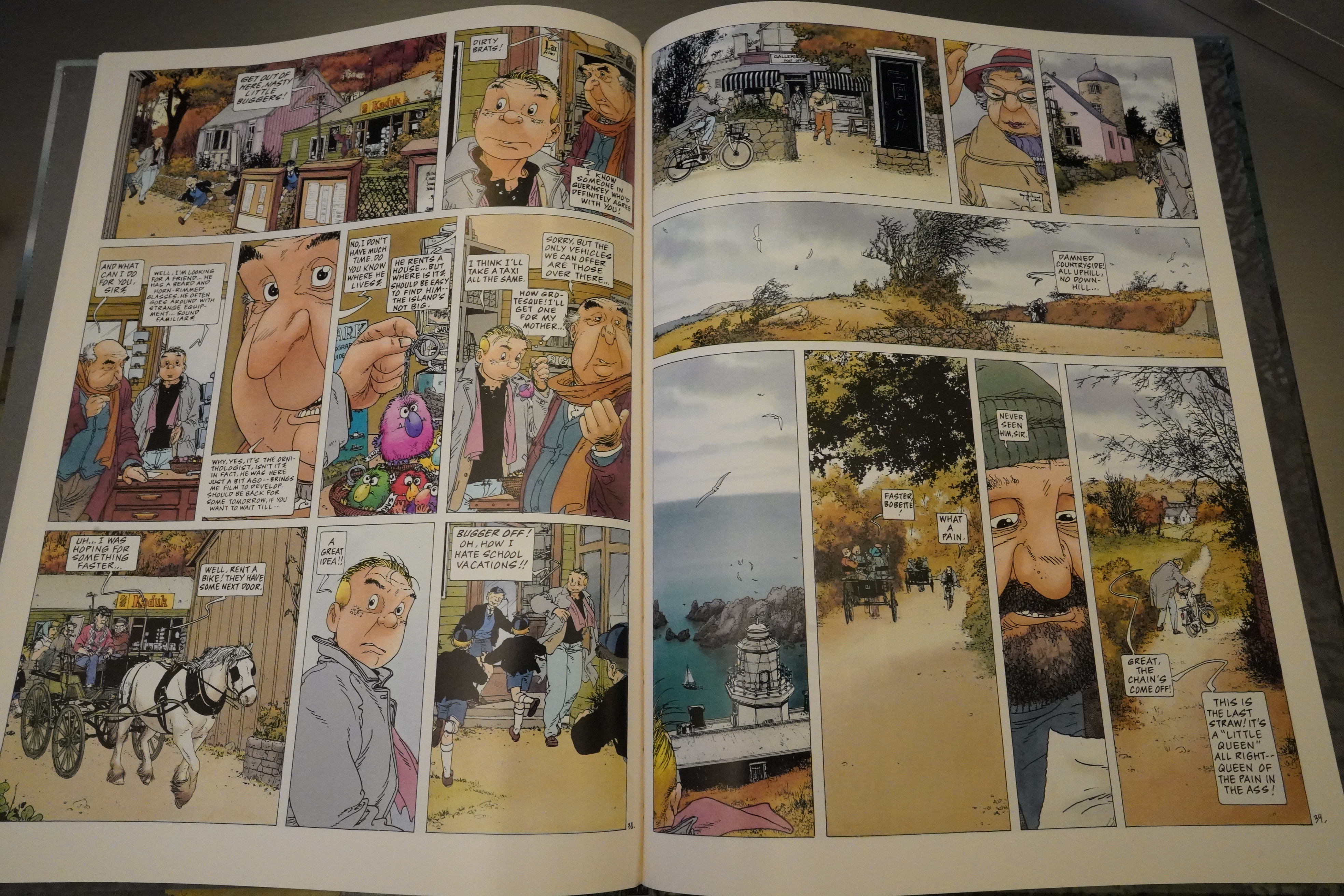
Plessix’s art is fantastic, and in the bucolic scenes of the young Julien in rural France we see the beginnings of the pastoral beauty Plessix would later create for his adaptation of Wind in the Willows. Plessix revels in the scenery, creating sumptuous and elegant backdrops for the cast, and again the colouring of Isabelle Rabarot elevates the art. The cast come to life despite a choice of bulbous or snub noses, and Plessix is especially good at conveying age.
This is the one hundred and forty-ninth post in the Entire Kitchen Sink blog series.