Category Archives: Uncategorized

1995: Welcome to the Zone

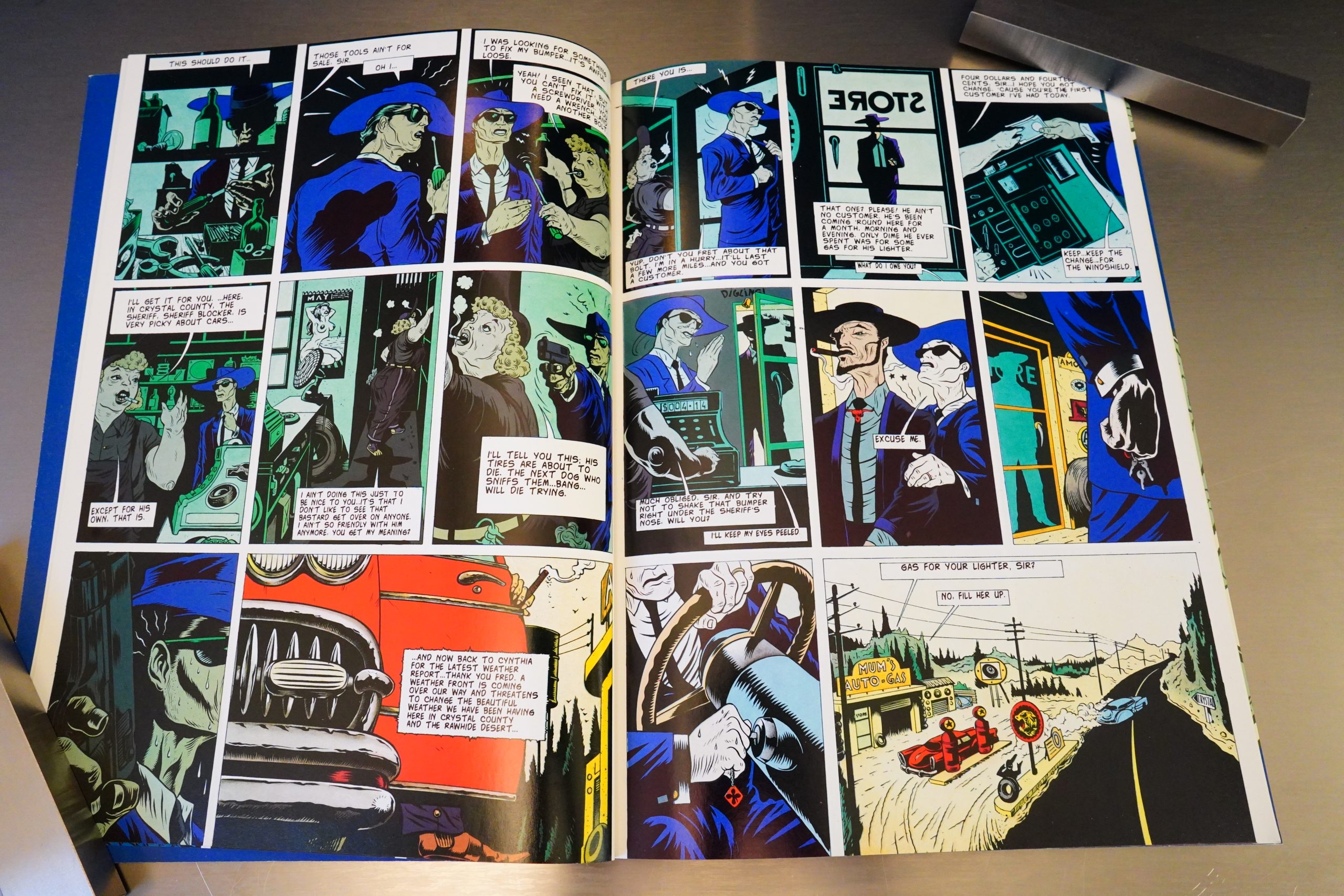
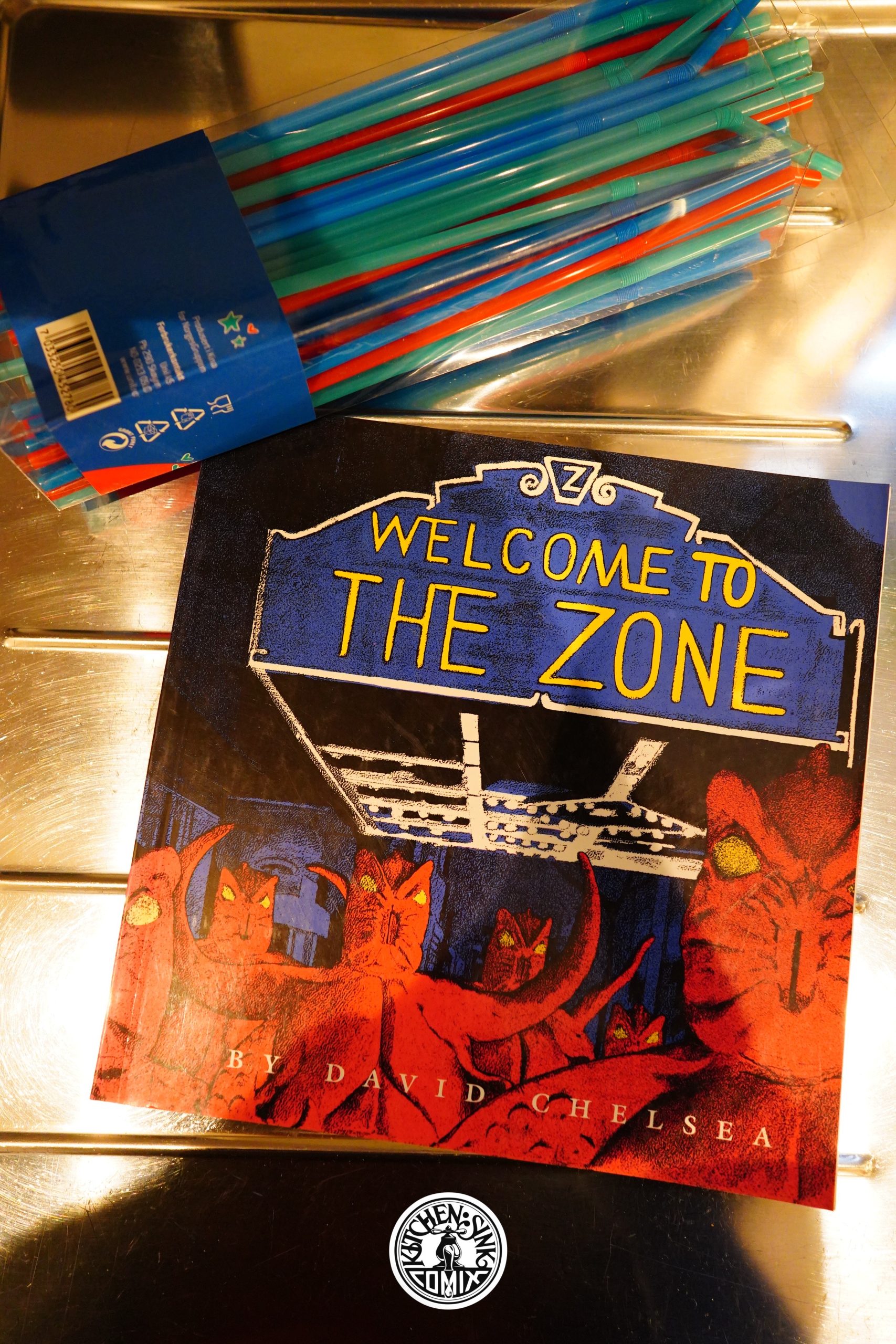
Welcome to the Zone (1995) by David Chelsea

I was a huge fan of David Chelsea In Love, but somehow this book went under my radar. On the other hand, a lot of the stuff Kitchen Sink was publishing by this point seemed to go oddly missing, so…

It’s also possible that I looked at this and went “uhm, possibly not” and put it back on the shelf.

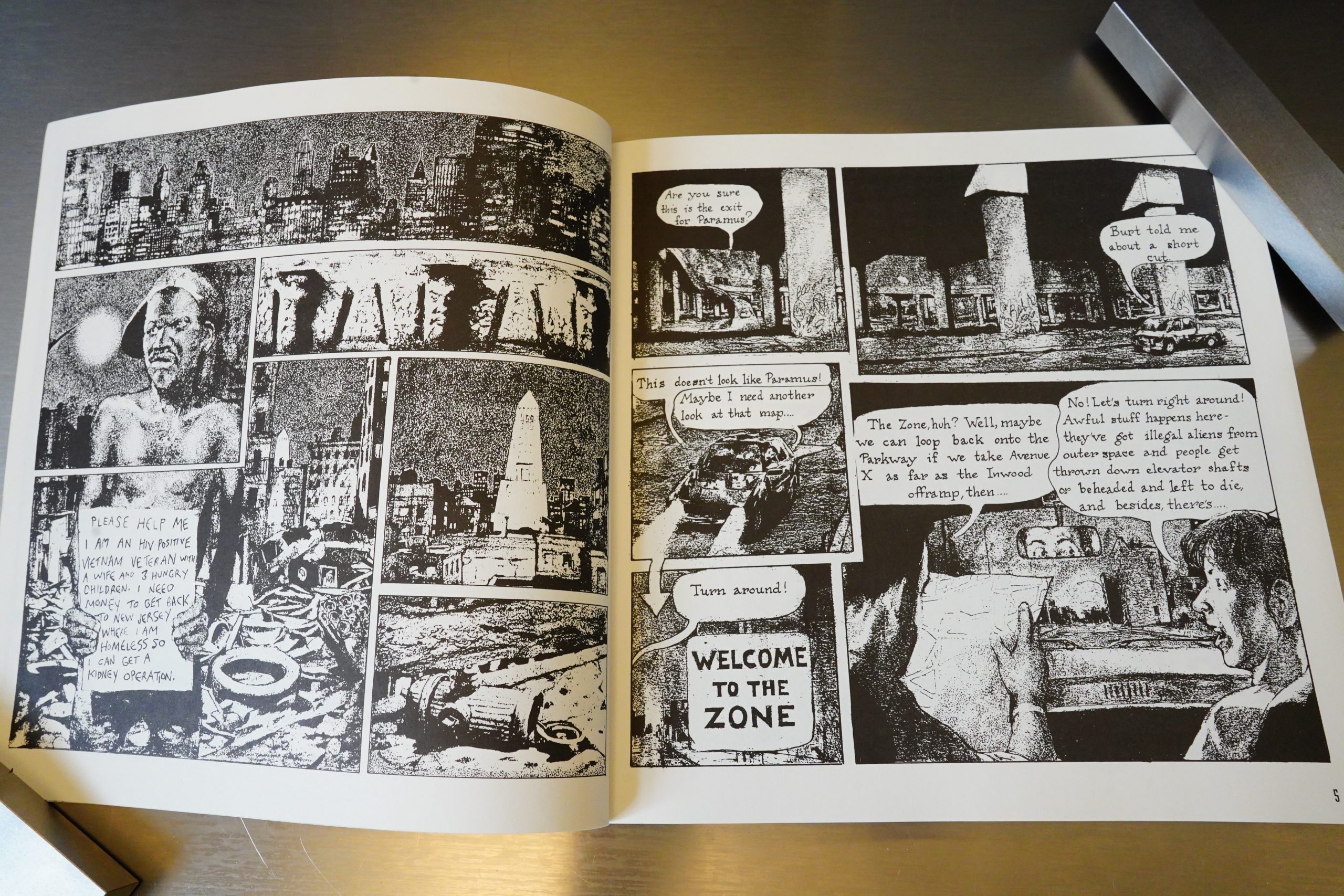
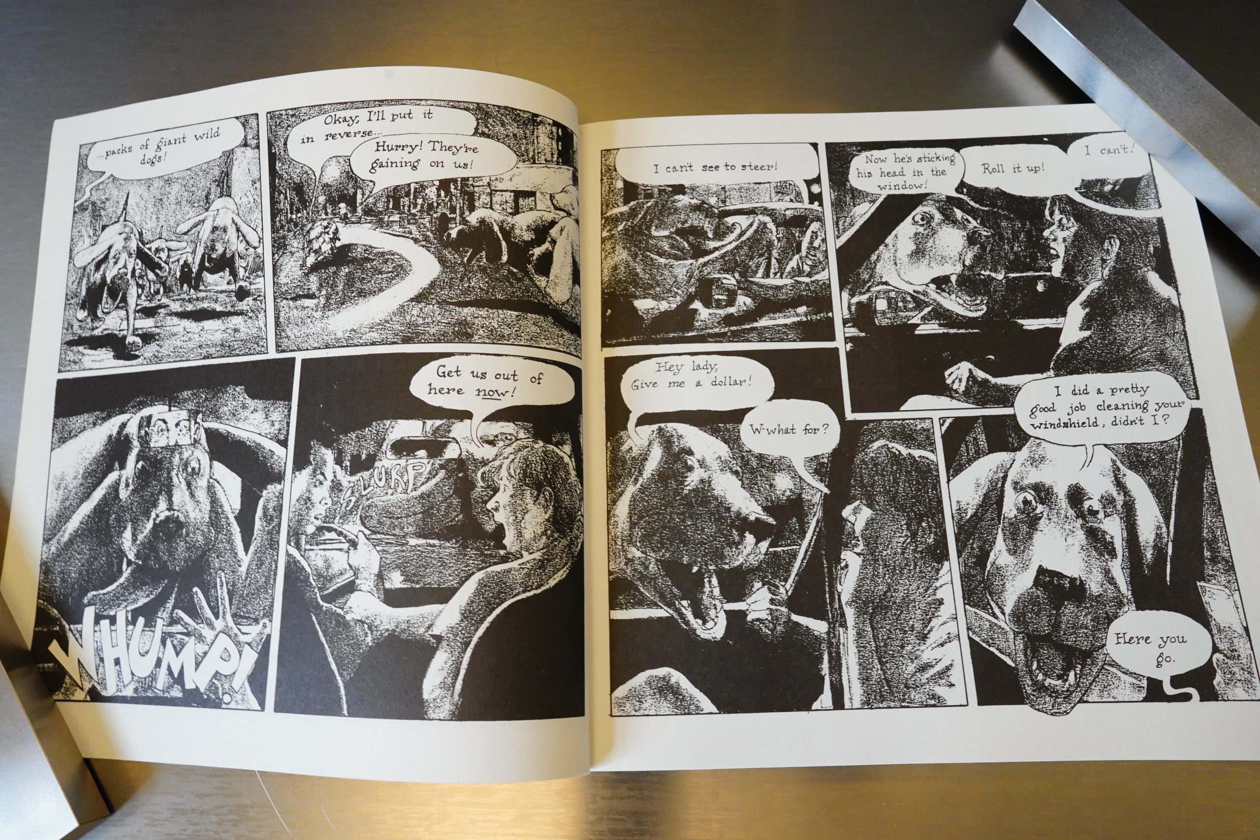
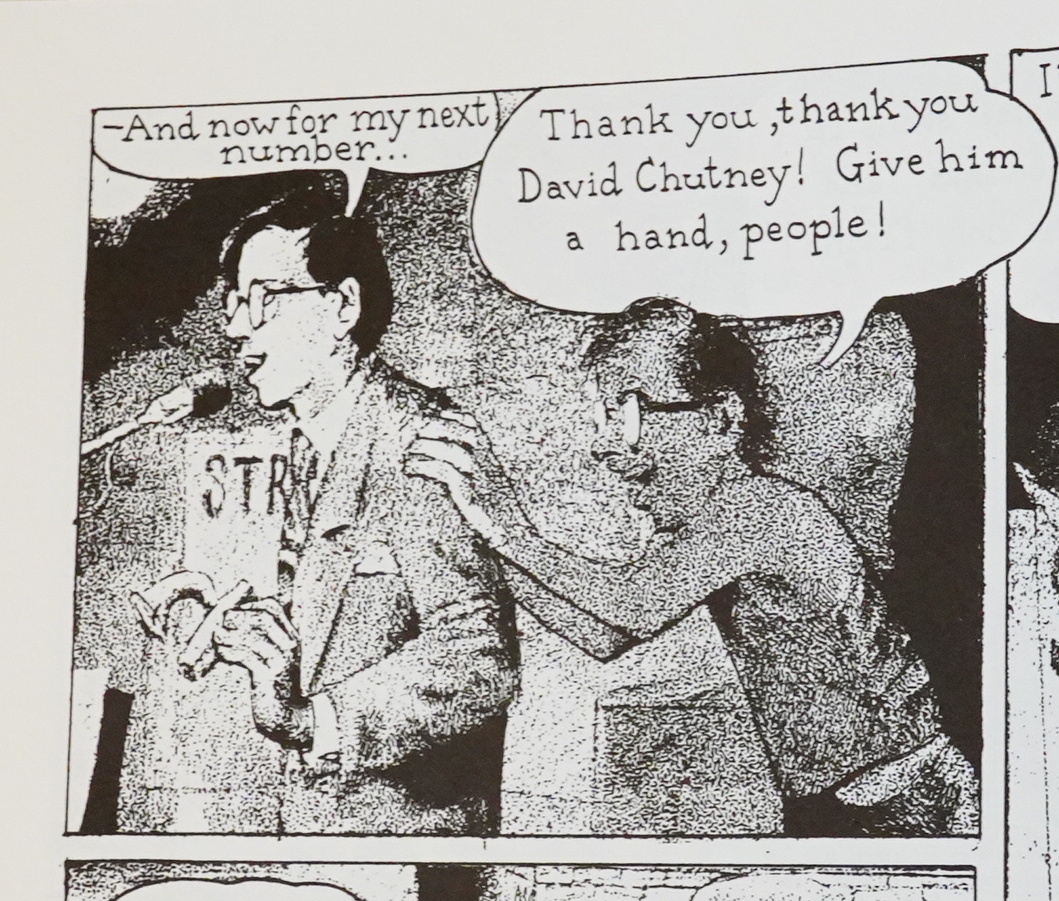
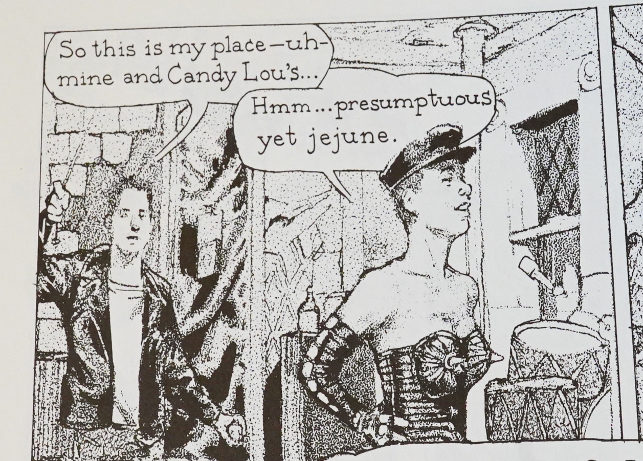
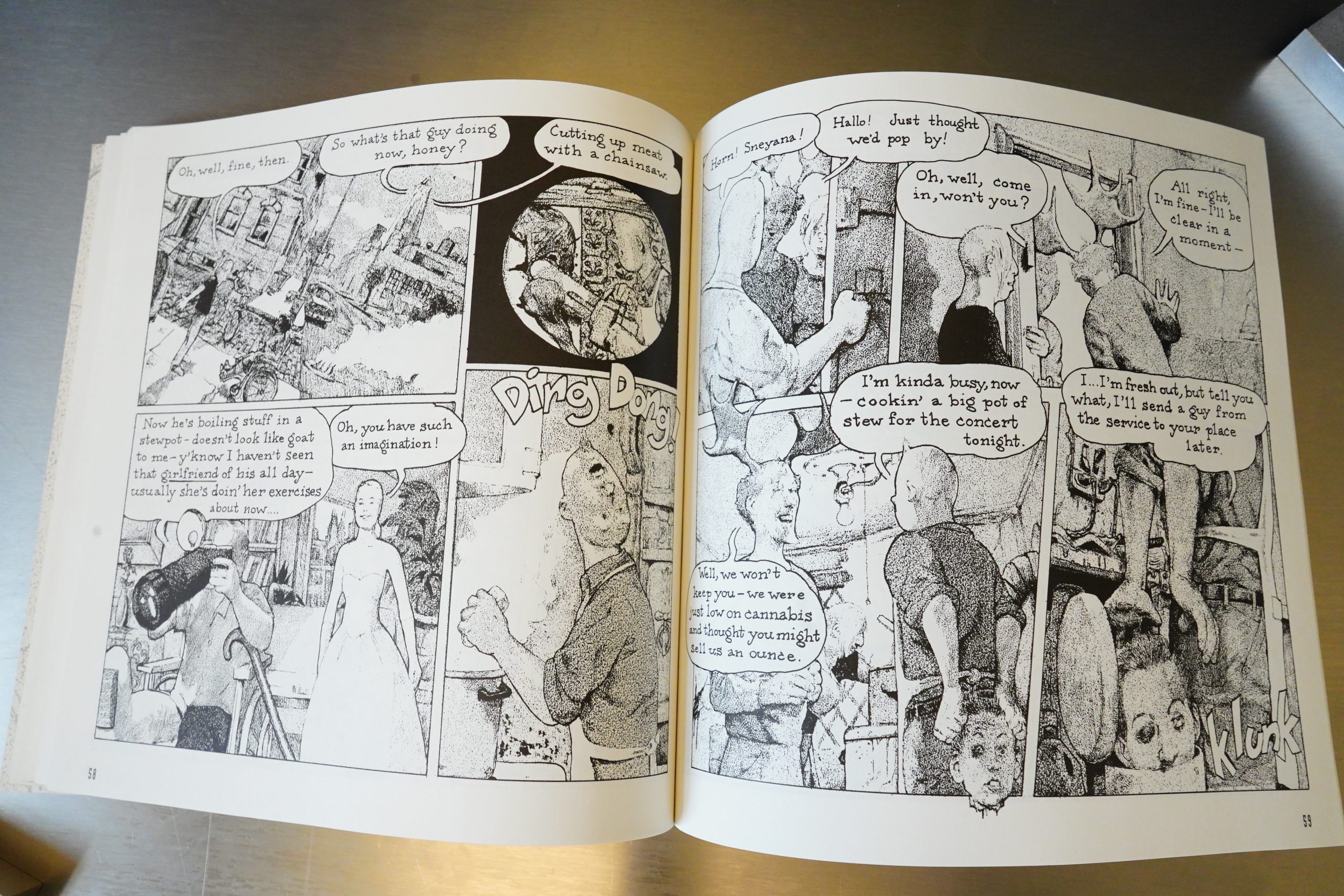
David Chelsea in Love was drawn pretty traditionally — this looks like it’s been traced from snaps and then run through a photocopier? Or… images composited in Photoshop, printed out, photocopied, and then drawn over? I have no idea — most likely just drawn traditionally, inked, and then messed up somehow?

I mean, it’s conceivable that he hand-drew all of that a la Drew Friedman, but it doesn’t look intentional — it looks random.

The imagery is striking, but it’s just a bit hard to get excited by this style, in my opinion. And I’m a great fan of punkier comics, but this seems to fall between all of the seats — the figures are a bit stiff, and then the rendering is way out there, so it just gives the impression of… well… something having gone wrong during printing.

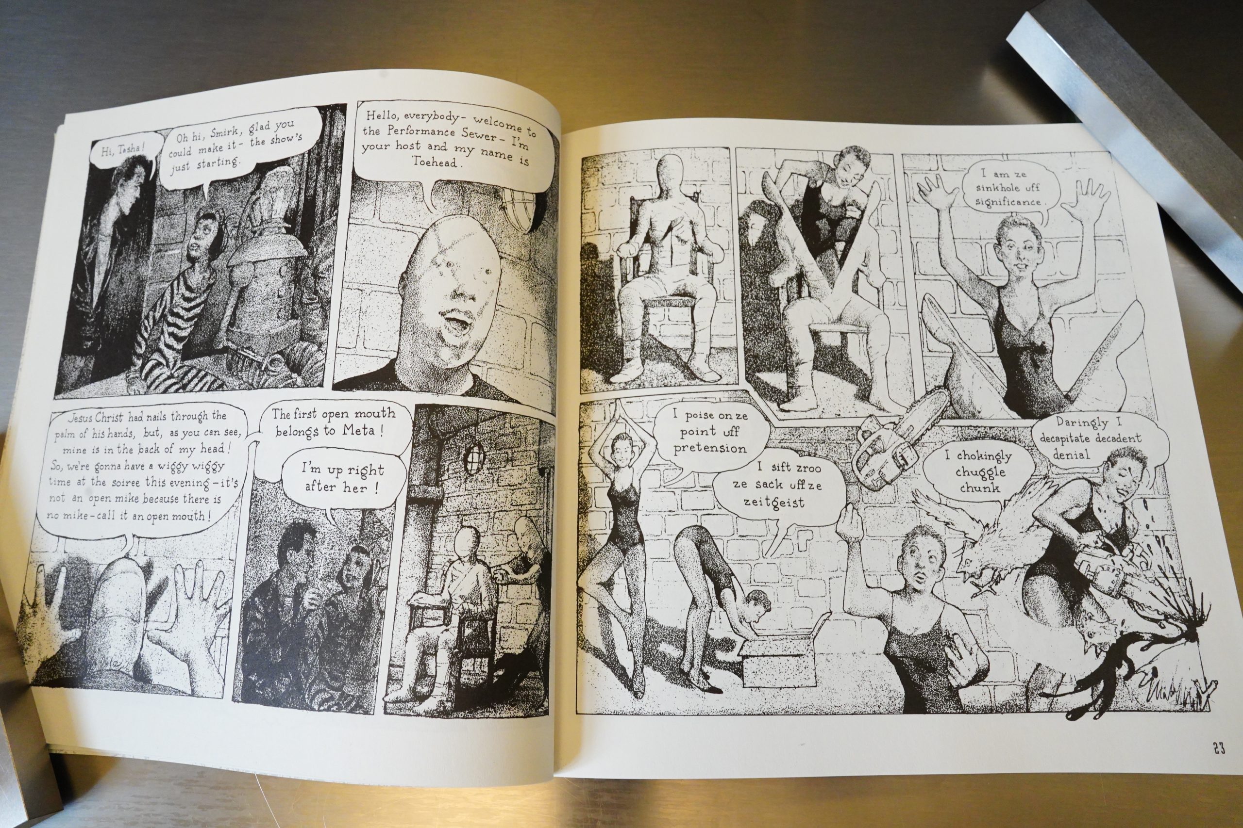
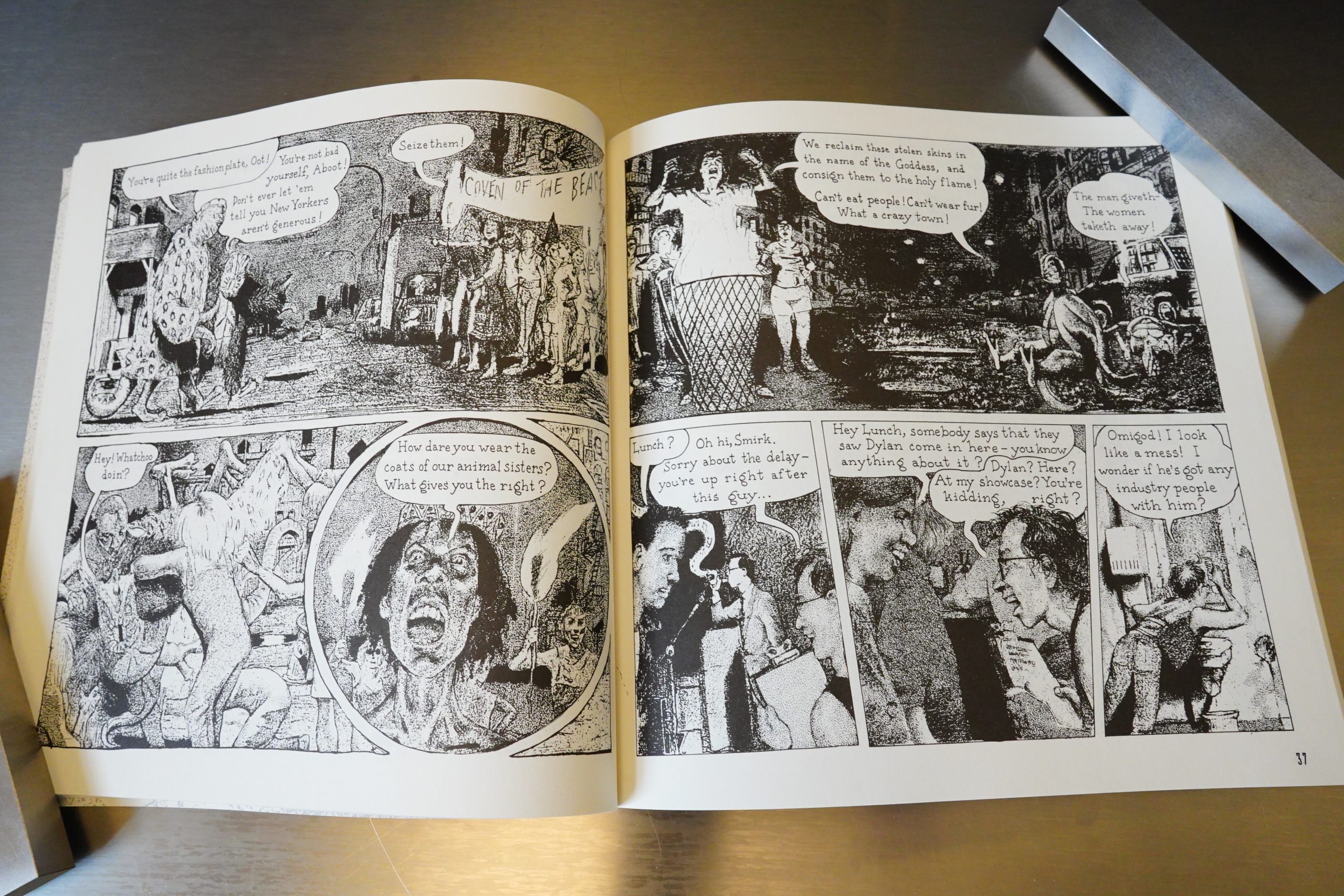
Chelsea has always had some absurd bits going on in his comics, but he really swings for the rafters here. The idea is that there’s a portion of Manhattan called The Zone where things are very strange indeed, and we follow a number of performance artists and musicians making their way through a couple of days.

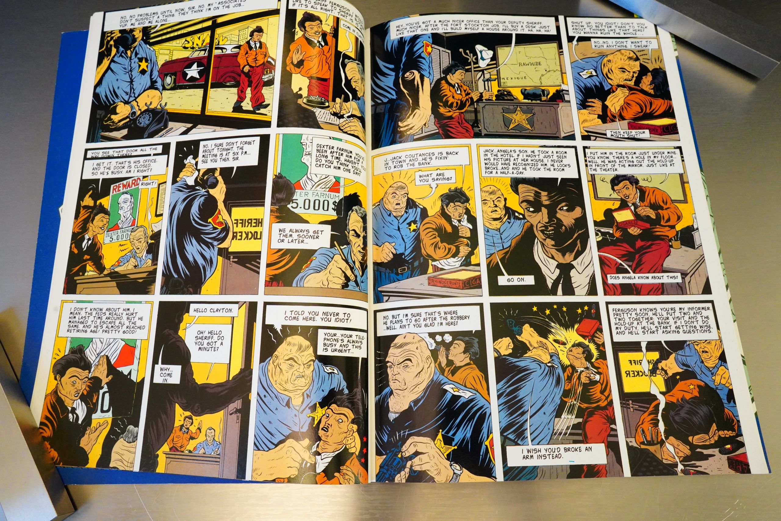
Chelsea hits many different targets — animal rights people, performance artists, cops, etc.

Oh, that’s Chelsea himself playing that harmonica thing, I guess.

I’m going to start saying that whenever I enter a room.

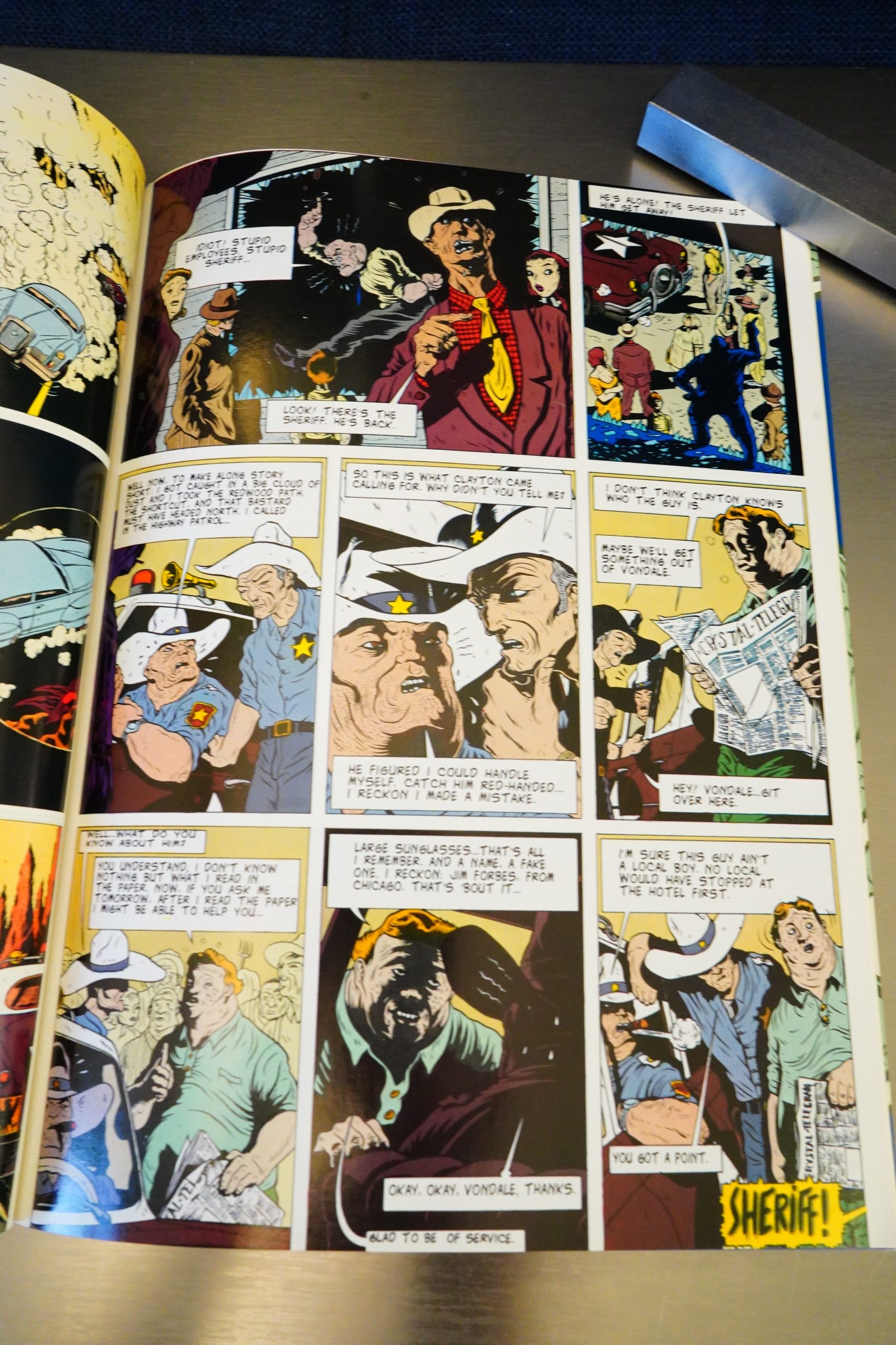
Towards the end, the rendering seems to change quite a bit. I.e., it gets a lot lighter, and some things become easier to read and some things get more obscure.

And, yes, there’s a whole bunch of pretty grisly violence in this book, which I didn’t expect.

It’s an odd book. Once I got over the art style, the digressive storyline is pretty neat, and there’s a bunch of good jokes sprinkled in there. So it is an enjoyable read.

I can’t find any contemporary reviews of this, so I guess I wasn’t the only one that was unaware that it existed. David Chelsea in Love got some attention, so it’s weird that Kitchen Sink wasn’t able to get it noticed, but Kitchen Sink was sinking, so…

It has never been reprinted, but you can pick up used copies for a fraction of the original cover price, so I guess Kitchen Sink did print a whole bunch of these (and presumably lost a bunch of money).

Urr…:

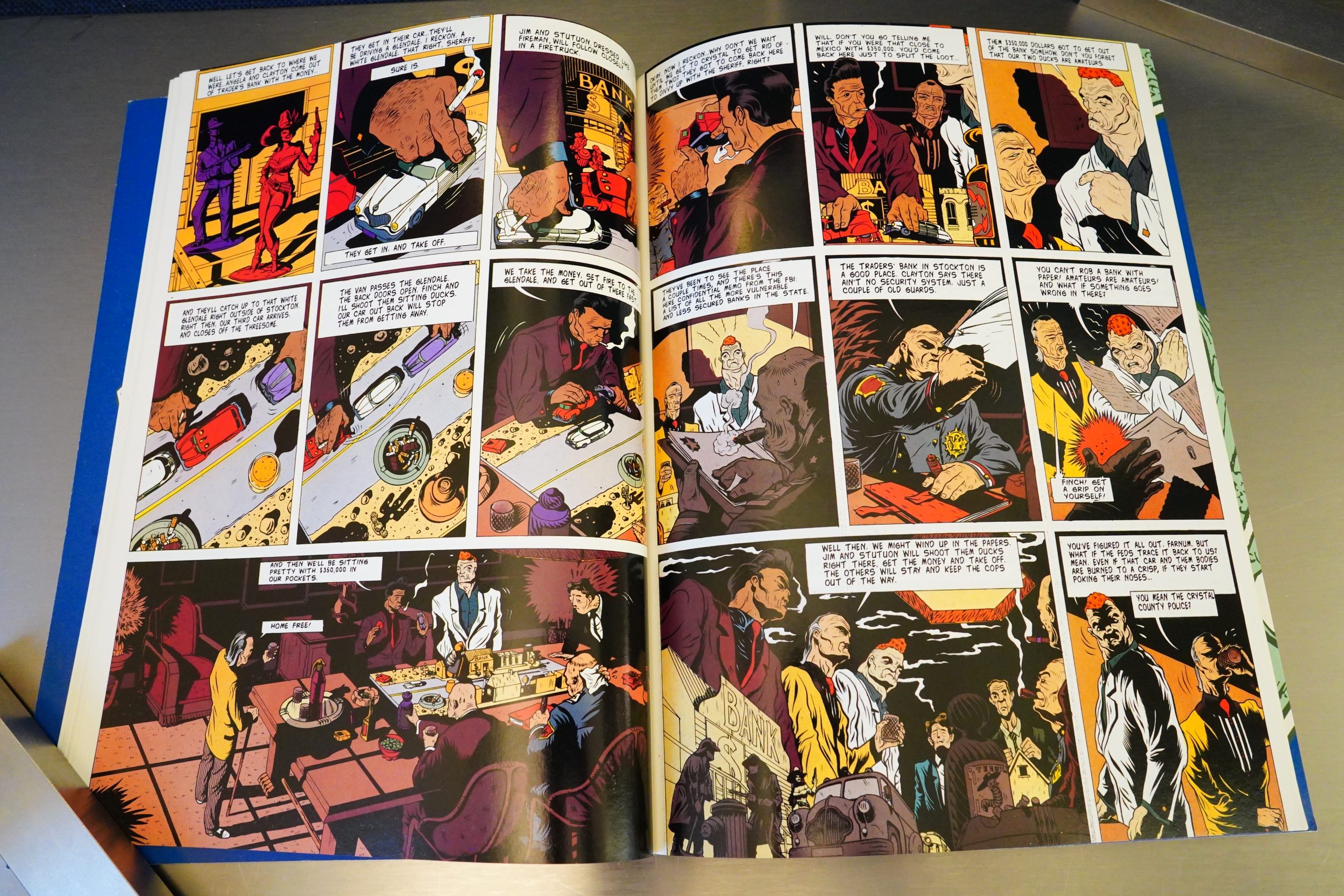
What truly sets the work apart is the excellent pointillism here. It’s so detailed and so well done that it looks as if each panel was an almost nightmare to draw.

Right:

To accomodate this farce, he’s adopted an amusing, pseudo-representational style, emphasizing comic exaggeration and abbreviated tonal modeling, to mostly good comedic effect.

Hm:

The book is willfully weird; coherent enough to be followed, but too surreal for it to be appreciated in its entirety. Regardless, the intricate tonal stippling makes it a visual feast worthy of the $9.95 cover price no one is likely to actually be asked to pay for decades to come. Give it a toss through if it crosses your path.

Chelsea is interviewed here:

CHELSEA: Mostly, I wanted to explore the more tonal stipple style that I had started to experiment with in David Chelsea In Love. Of course, that turned out to be far more labor-intensive, and l was back to the clear line style with Perspective!

[…]

CHELSEA: You know, if Zone had been a wild success, l might feel differently, but I regard this one as a misfire on just about every level, right down to my choice of a square format, which pretty much guaranteed low sales.

[…]

AUSHENKER: I remember you mentioned that Eclipse was not interested in publishing Zone following David Chelsea In Love. What was it like to work on a project for Denis Kitchen and Kitchen Sink (right before it went under)? Was this a positive, supportive experience? Did they let you execute Zone the way you intended or did they give you any input that shaped the final product?

CHELSEA: Kitchen Sink had just absorbed Tundra and there was a lot of reckless expansion going on. Ultimately, it all proved too much to handle and the company went under shortly after Zone was published. My book was lost in the shuffle; I think higher-profile projects that originated at Tundra were sucking up all the oxygen.

[…]

The Kitchen Sink people were telling Carol about some publicity stuff they had planned for her book. I blurted out, ‘What do you have in mind for MY book?’ There was a moment’s silence and then everyone burst out laughing.

Heh heh.

And here’s another post:

Among my works, Welcome To The Zone is the redheaded stepchild, a book even people who say they are big fans haven’t read. Cursed in its timing, the book was acquired by Kitchen Sink right around the time it was taking over the list of a far larger comics publisher that was going out of business, and it got somewhat lost in the shuffle editorially as a result. By the time it appeared in 1995, Kitchen Sink itself was on its last legs, I was too preoccupied by my move from New York to Portland to do much in the way of promotion, and the book was quickly remaindered.

And Chelsea was redrawing the book on his Patreon.

This is the one hundred and seventy-ninth post in the Entire Kitchen Sink blog series.

1995: The Comic Strip Century: Celebrating 100 Years of An American Art Form

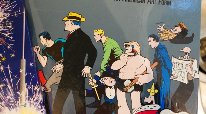
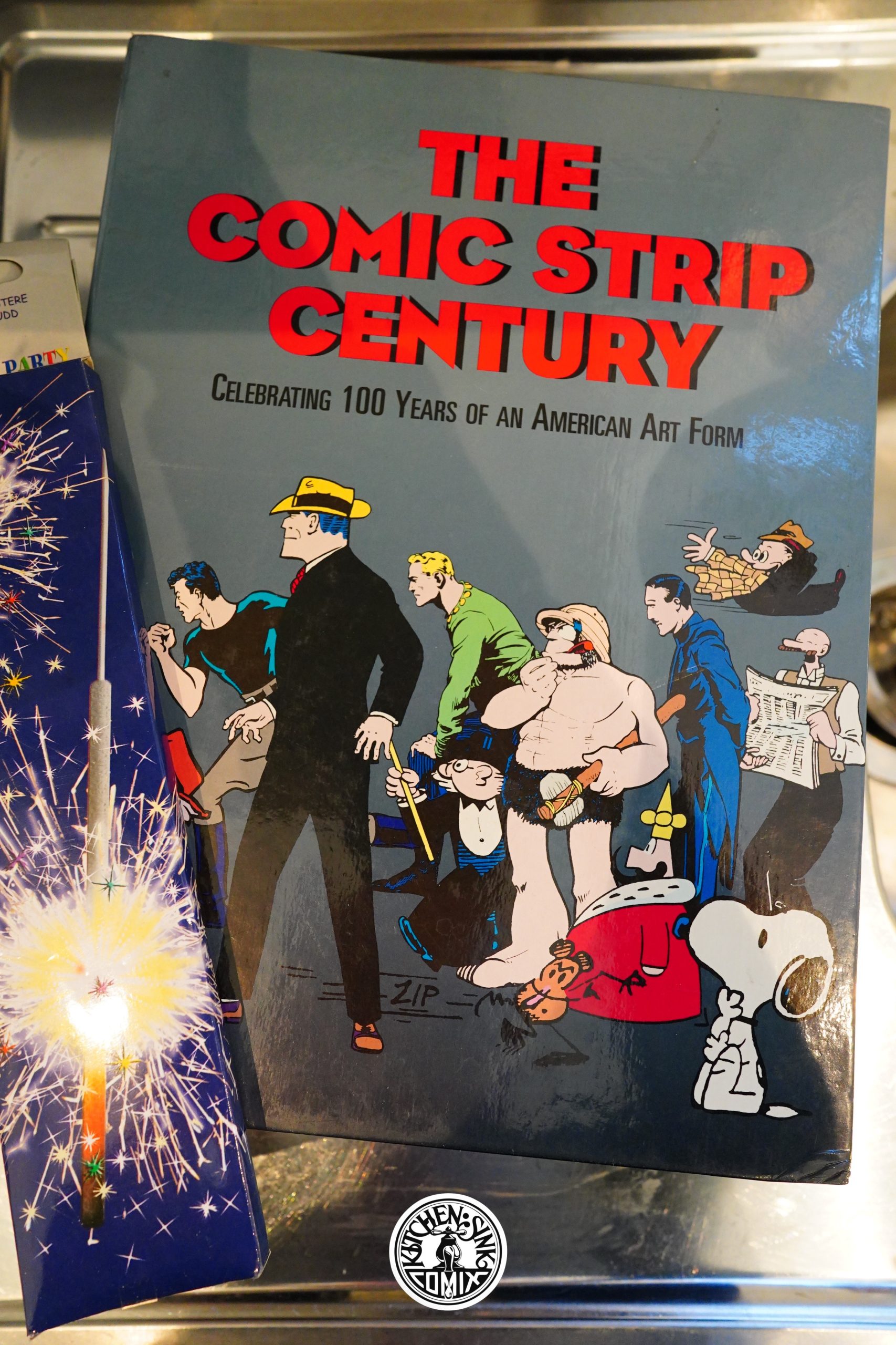
The Comic Strip Century: Celebrating 100 Years of An American Art Form (1995) edited by Bill Blackbeard and Dale Crain

I’ve read more than more share of histories about comic strips, so I was less than enthused by the prospect of reading this box set. It’s two hardcover books in one box, which is a good choice, because each individual book is pretty heavy, and having it all in one book would have been unwieldy.

But I wonder whether that was the original plan? The numbering across the two volumes are continuous (i.e., the first page in the second volume is page 231), and there design on both volumes are the same (which seems like a missed opportunity).

And while I’m kvetching about the physical format — this isn’t cloth-bound: The signatures are just glued together, and you really have to crack the spine open to read it, so I guess it’ll fall apart after reading a few times. (The copy I got from ebay was previously unread.)
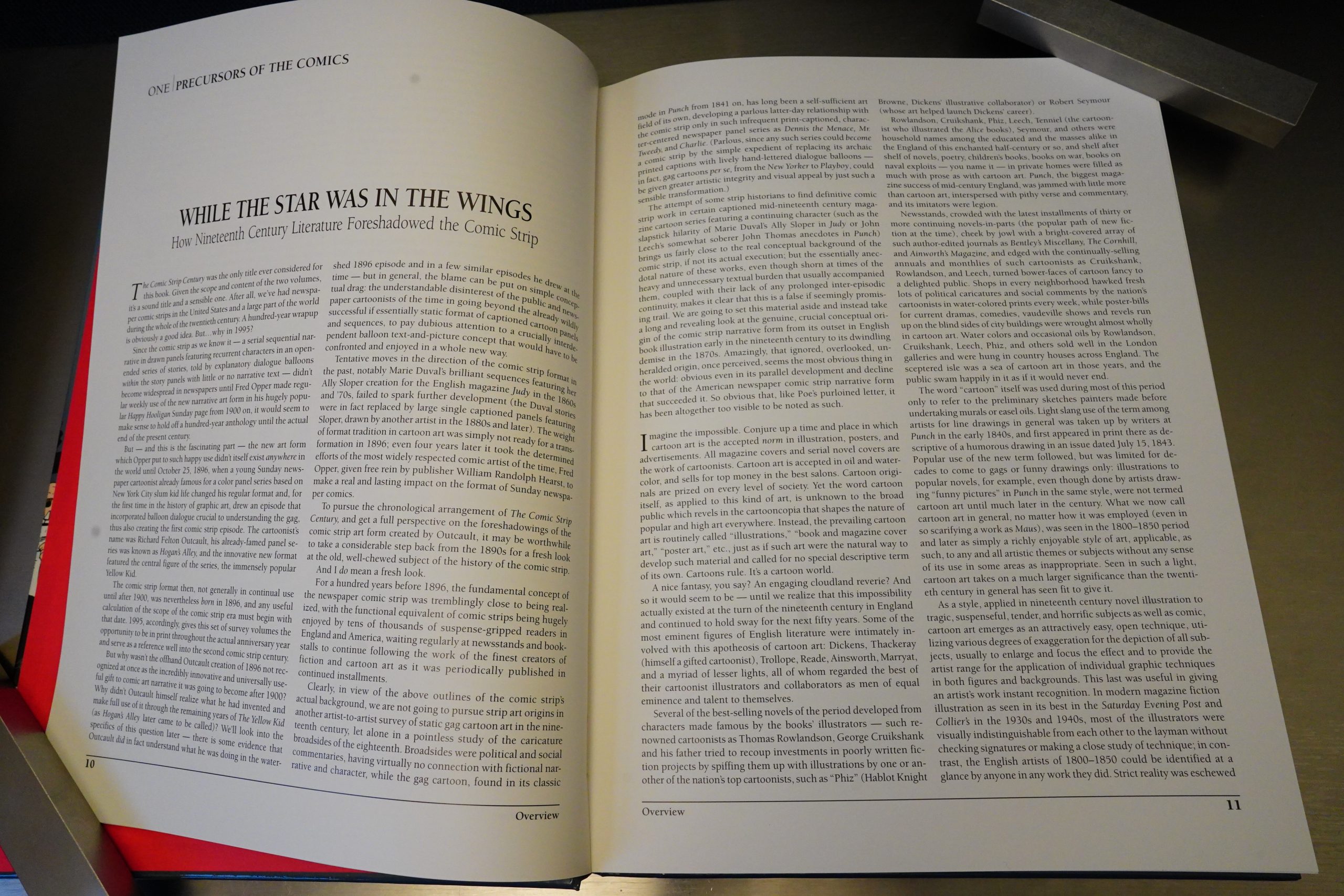
We start off with a thirty page historical overview (which I skipped; sorree)…
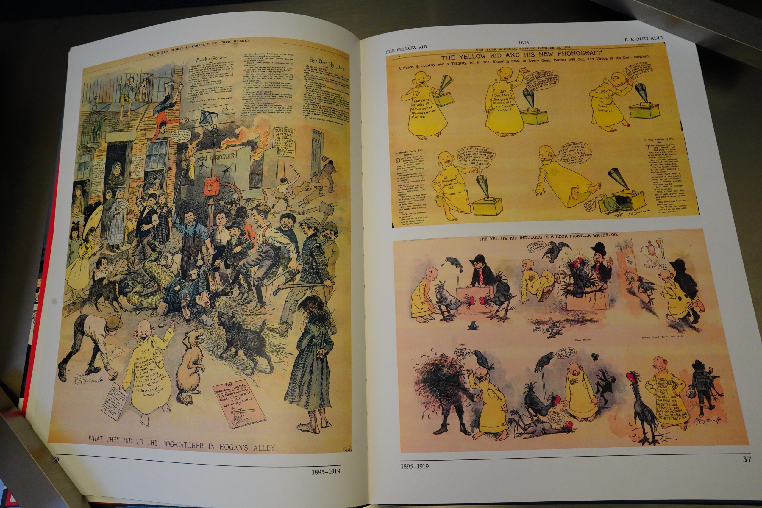
… and then the rest of these five hundred pages are just reproductions of strips, with no accompanying text.
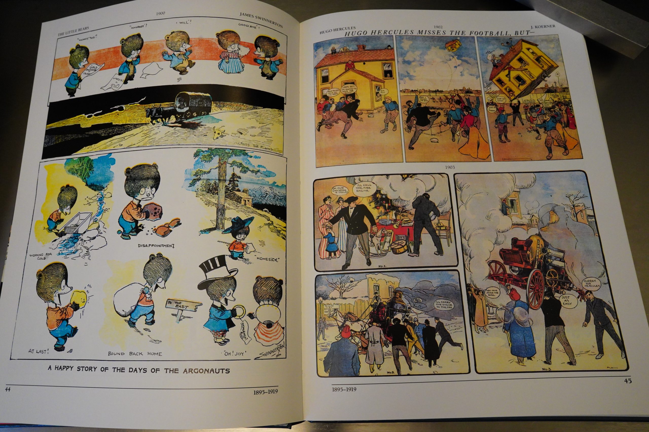
Which is such a relief! If I had a dime for every time I’d read a strip reprint project where the editor just can’t shut up, and seems to feel the necessity for carrying on the hard sale throughout the book, I’d probably have a dollar by now. Perhaps two!

The common trope is that the editor can’t stop gushing about how great whatever artist is, and what a genius he is (always “he”), and how fantastic the page we’re looking at is… and that just makes me go all contrary and I’m like “no! this sucks!”

But this book is silent: You get the name of the artist, the name of the strip, and the year. It’s wonderful! Reading this book is the perfect experience of these old strips — every time you turn a page, there’s some new delight, reproduced wonderfully, instead of having somebody explain every minute reference, pointing out what the joke was, and draining every ounce of joy out of reading and making the book into homework.
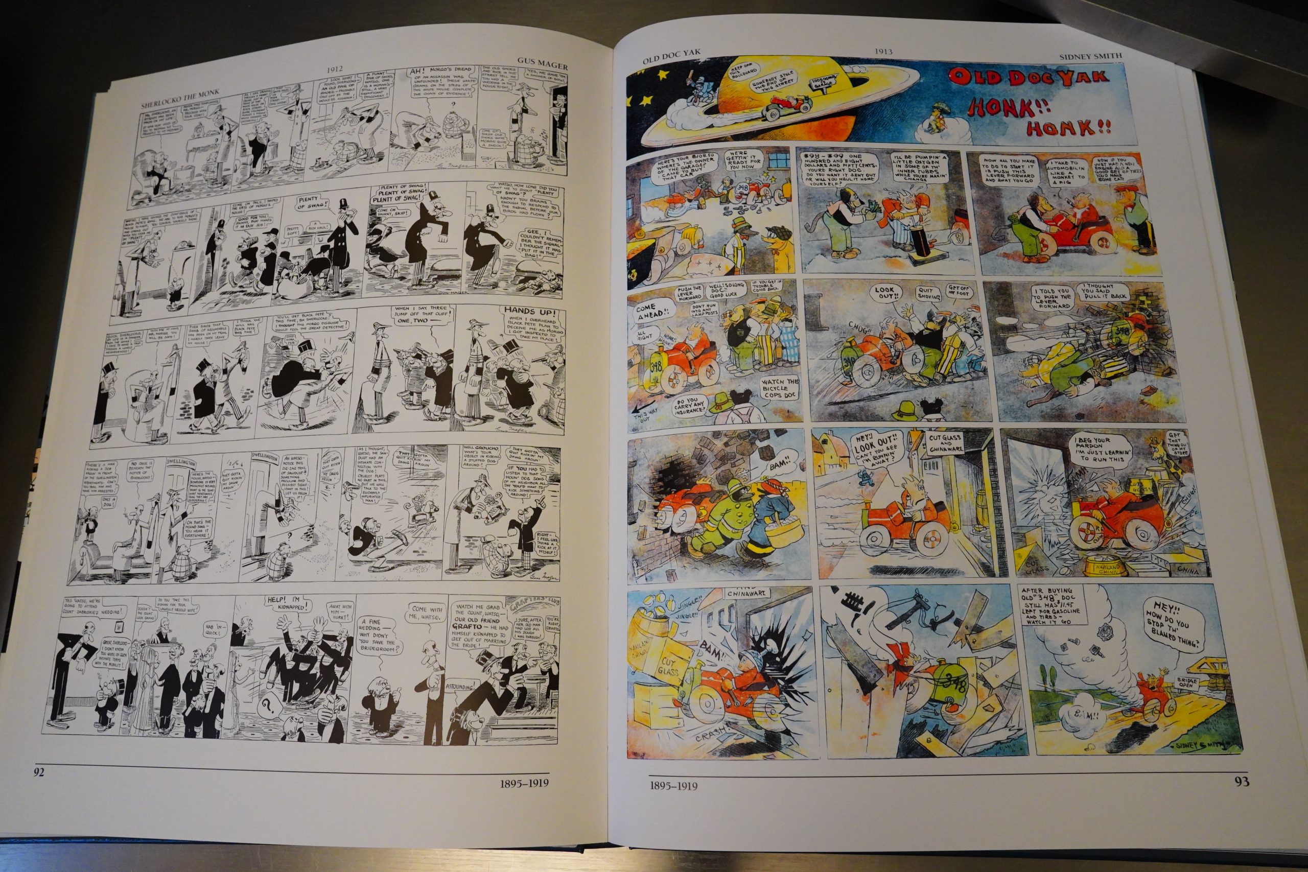
And it’s not just Sunday pages, either — we get quite a few dailies, too.
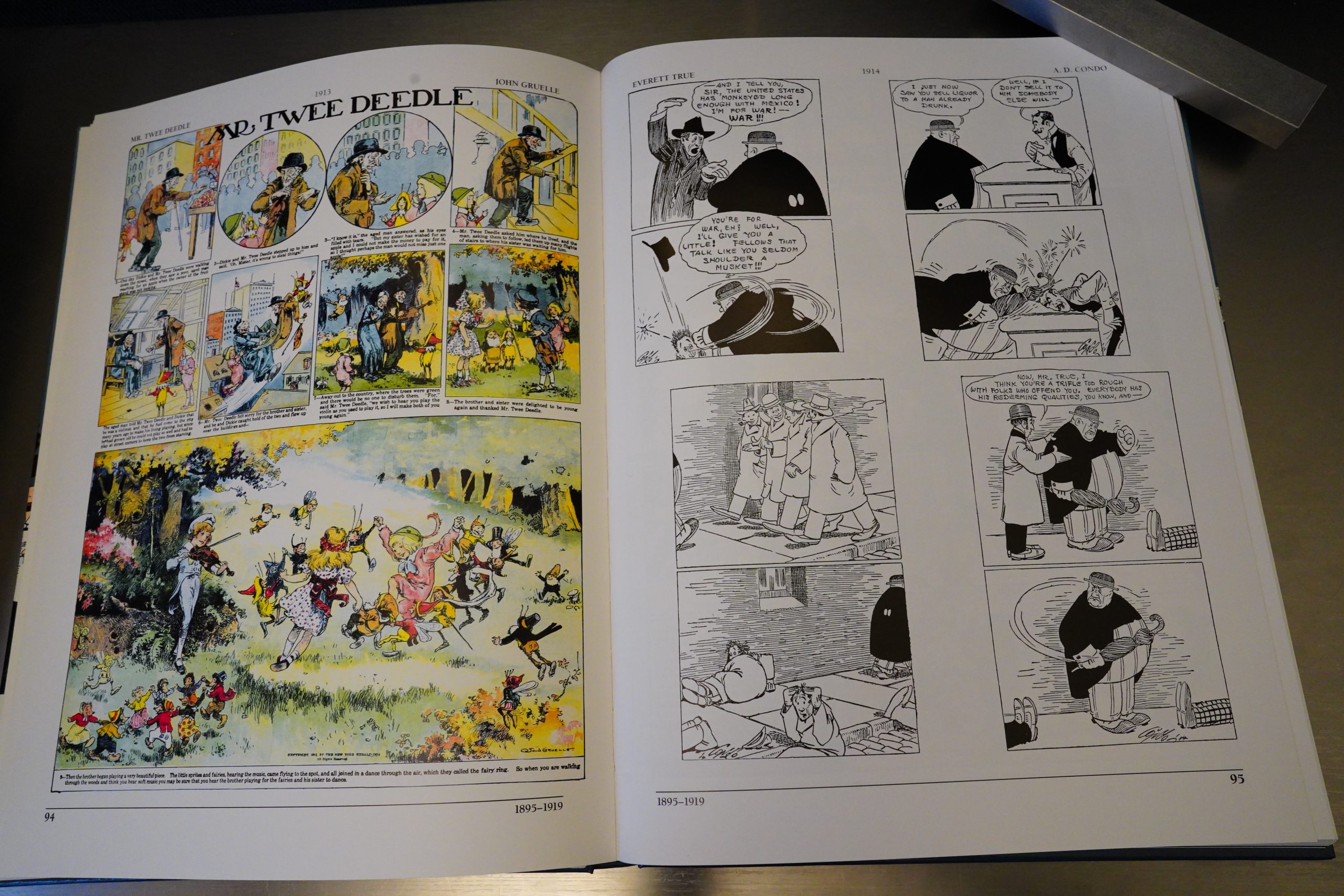
So many people I’ve never heard about before.
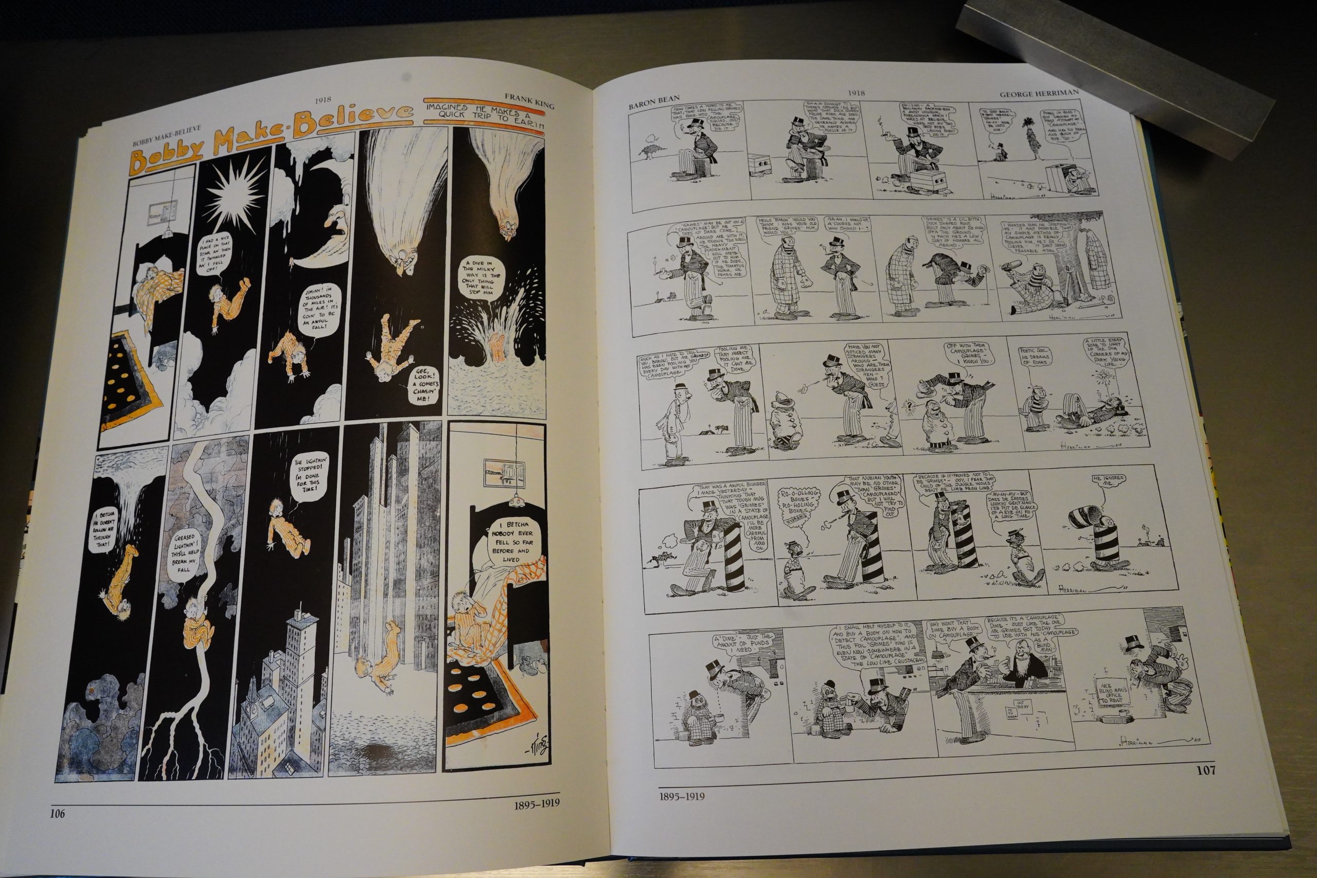
And, of course, all the famous ones, too.
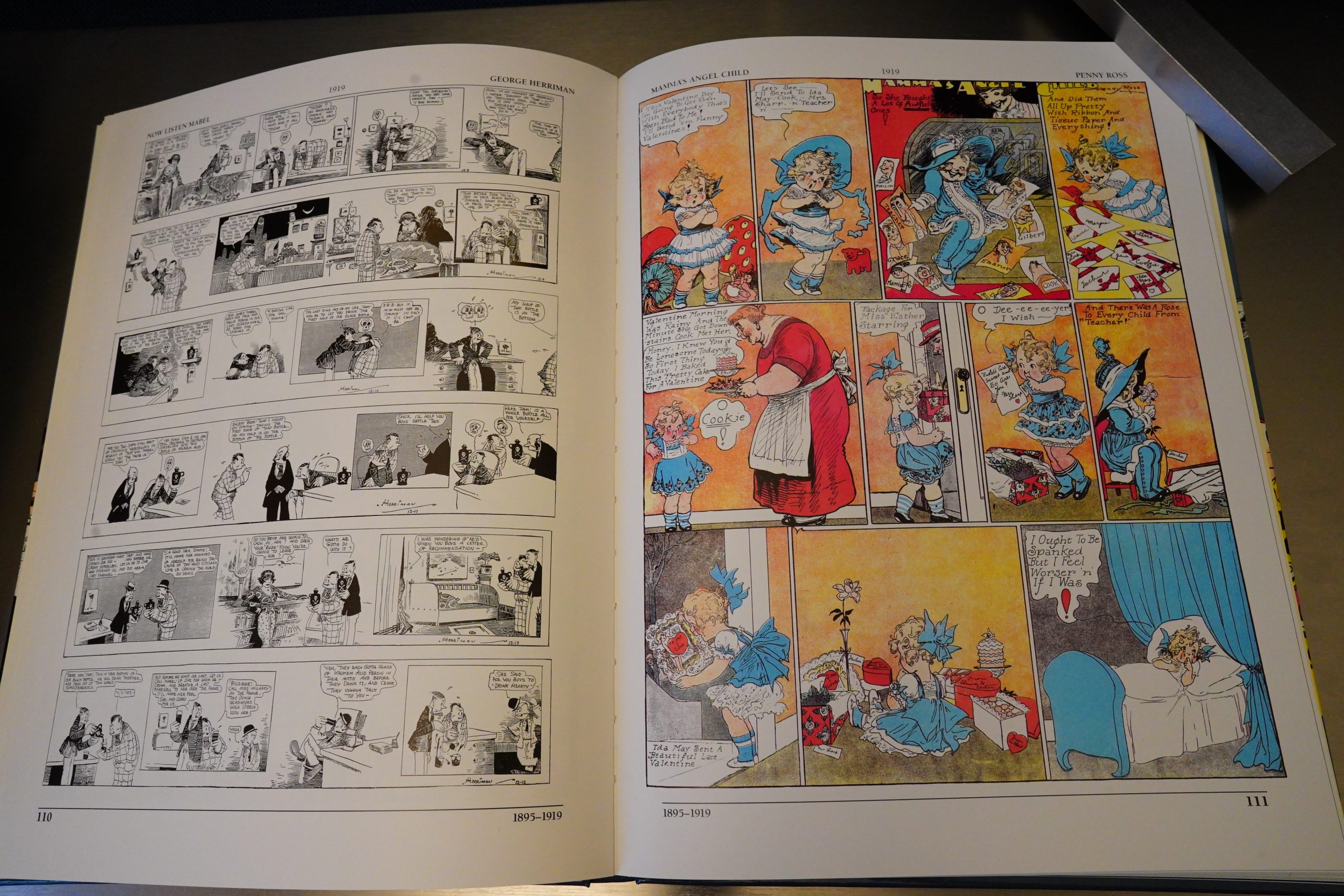
There’s only a handful of women cartoonists included.
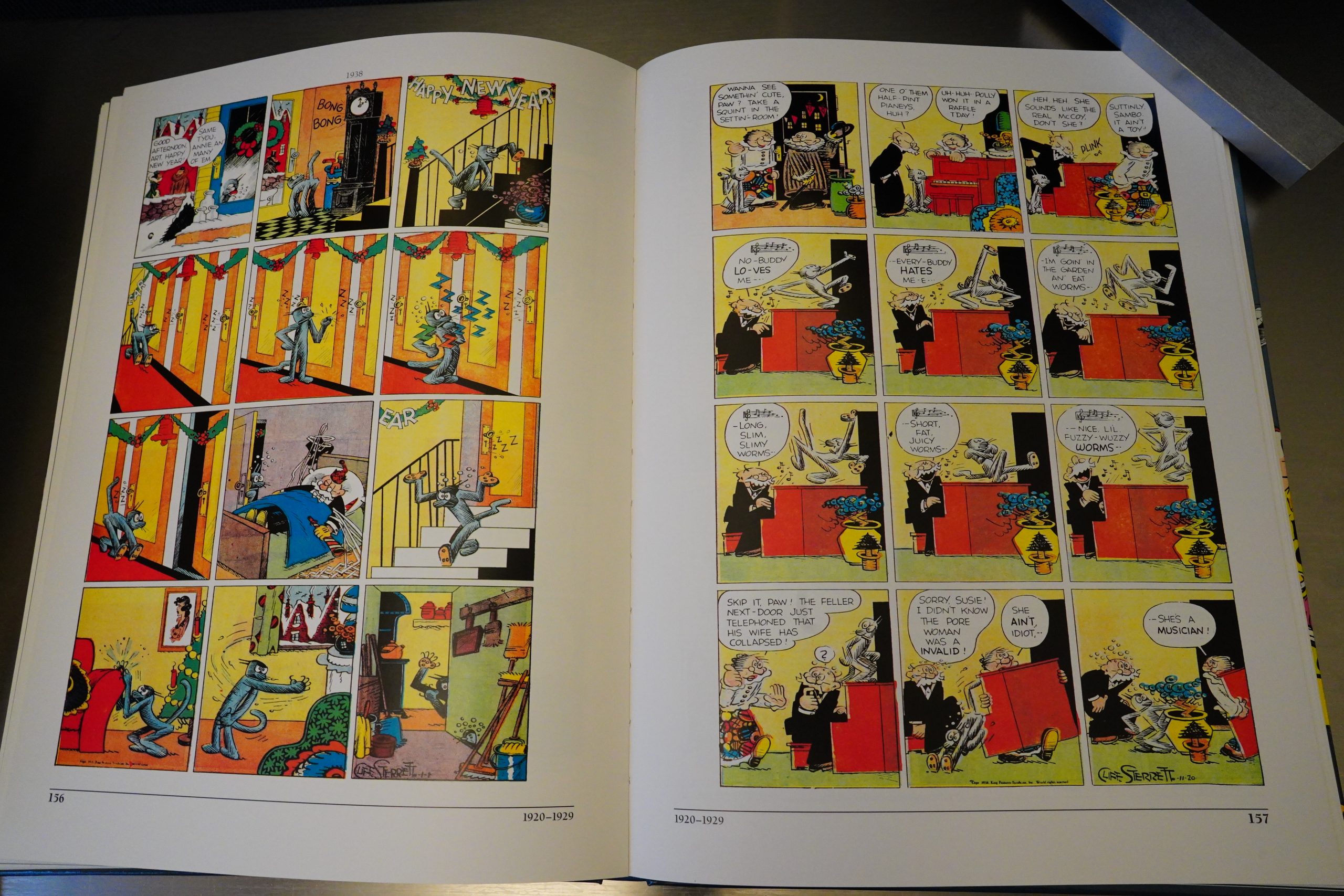
Did I mention that the reproduction on this is great? The colours really pop, but not to an unnatural degree. The linework is unbelievably well reproduced on most of these things — reproduced from proofs, perhaps? The paper is white and shiny, which helps with the colours and the linework, but it’s not of that super-shiny variety, either.

My one complaint is that it’s sometimes a strain to read the lettering because of the size. It’s basically slightly larger than standard album size, and it would have helped a lot to just have it, like, 5cm wider. But that would probably have been prohibitively expensive — as it is, I’m guessing Kitchen Sink lost a lot of money on publishing this. (But then again, it’s Kevin Eastman/Ocean Group money to squander at this point, so…)
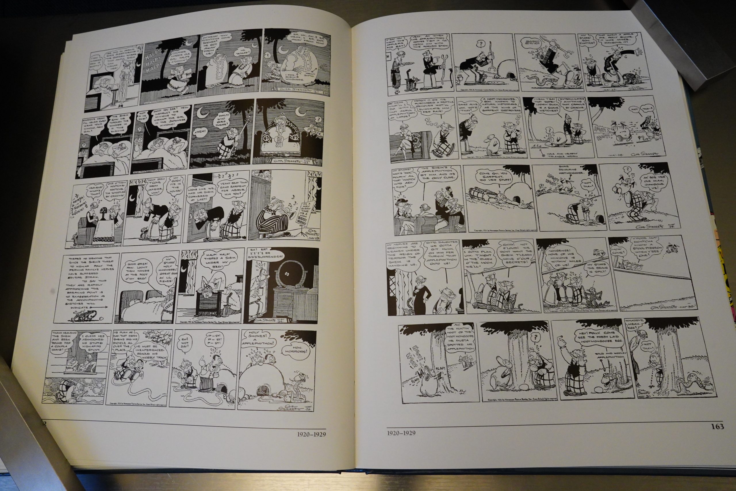
Like I mentioned, there’s also dailies included, and the book is not divided into a colour and a black-and-white section — everything just flows naturally. And with the dailies, we don’t just get a random sampling, but we get longer narratives, like this ten page Polly and Her Pals story.

The selection feels really thoughtful — the book does not feel like a random collection of whatever the editors could get their hands on, or to cram as many artists as possible in to these pages. Instead they make selections that include awesome art, funny bits and thrilling sequences to read.

This is, simply put, the best book of its kind I’ve ever encountered. (But I haven’t read the Smithsonian collection of strips from the 70s that was supposed to have been very influential.)
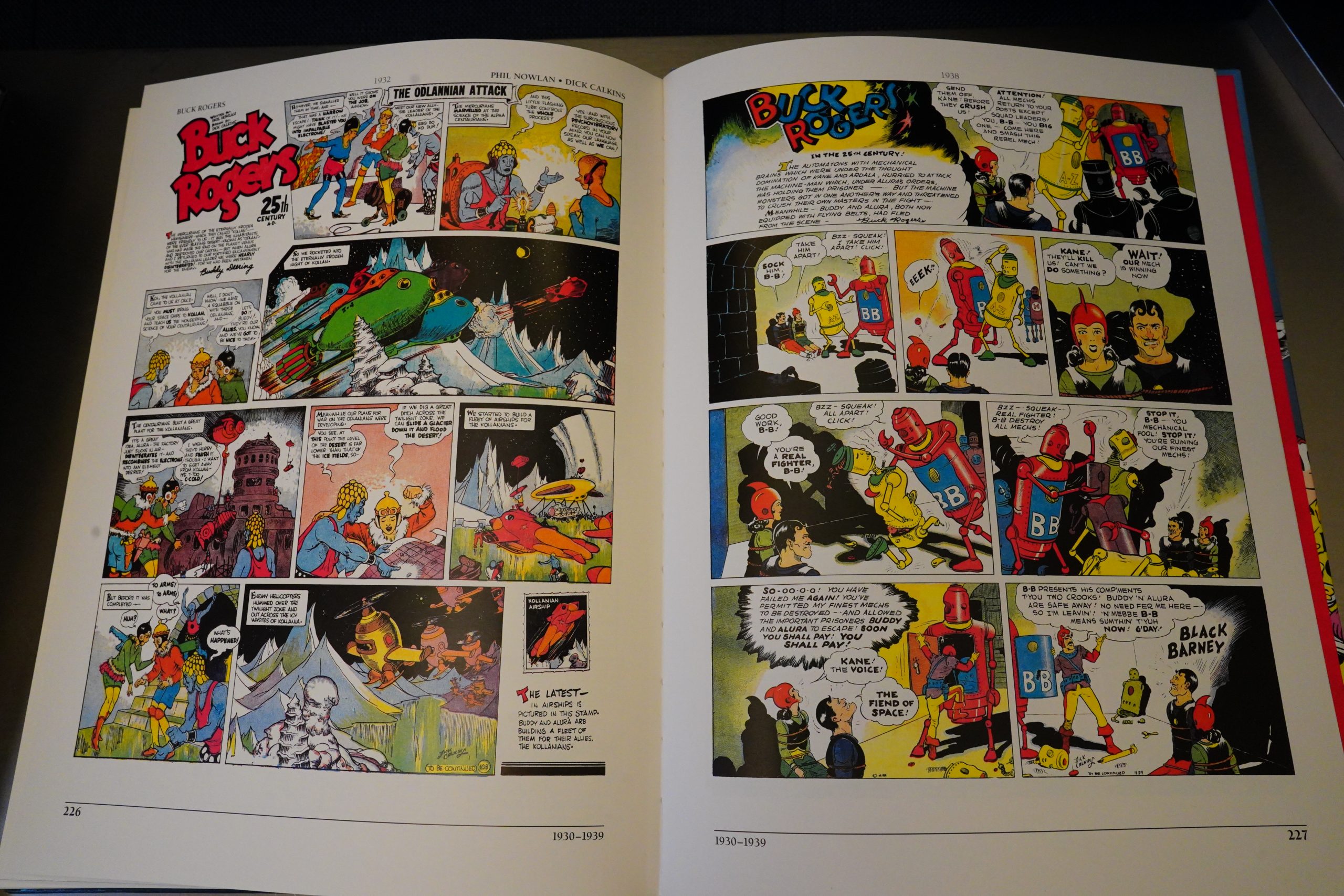
When we get to the 30s, we get more adventure serials, and the editors seem to struggle a bit more with selecting stuff. These two Buck Rogers Sunday pages look very impressive, but rather random.
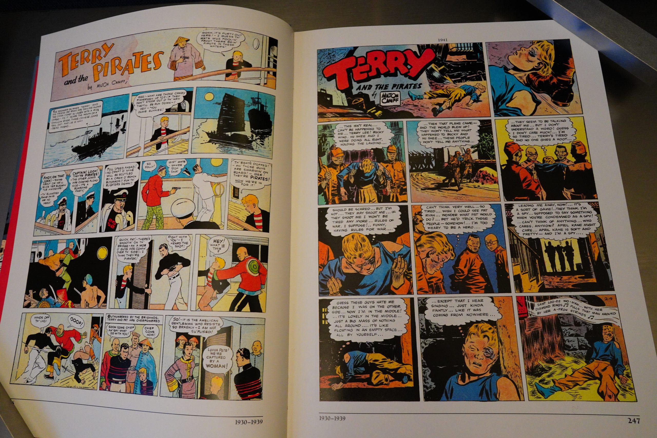
Same with these two pages — it seems like the editors going more with “well, we have to include this, but… what…”, so it gets more of a “sampler” vibe. But it’s fine — they’re still picking good pages.
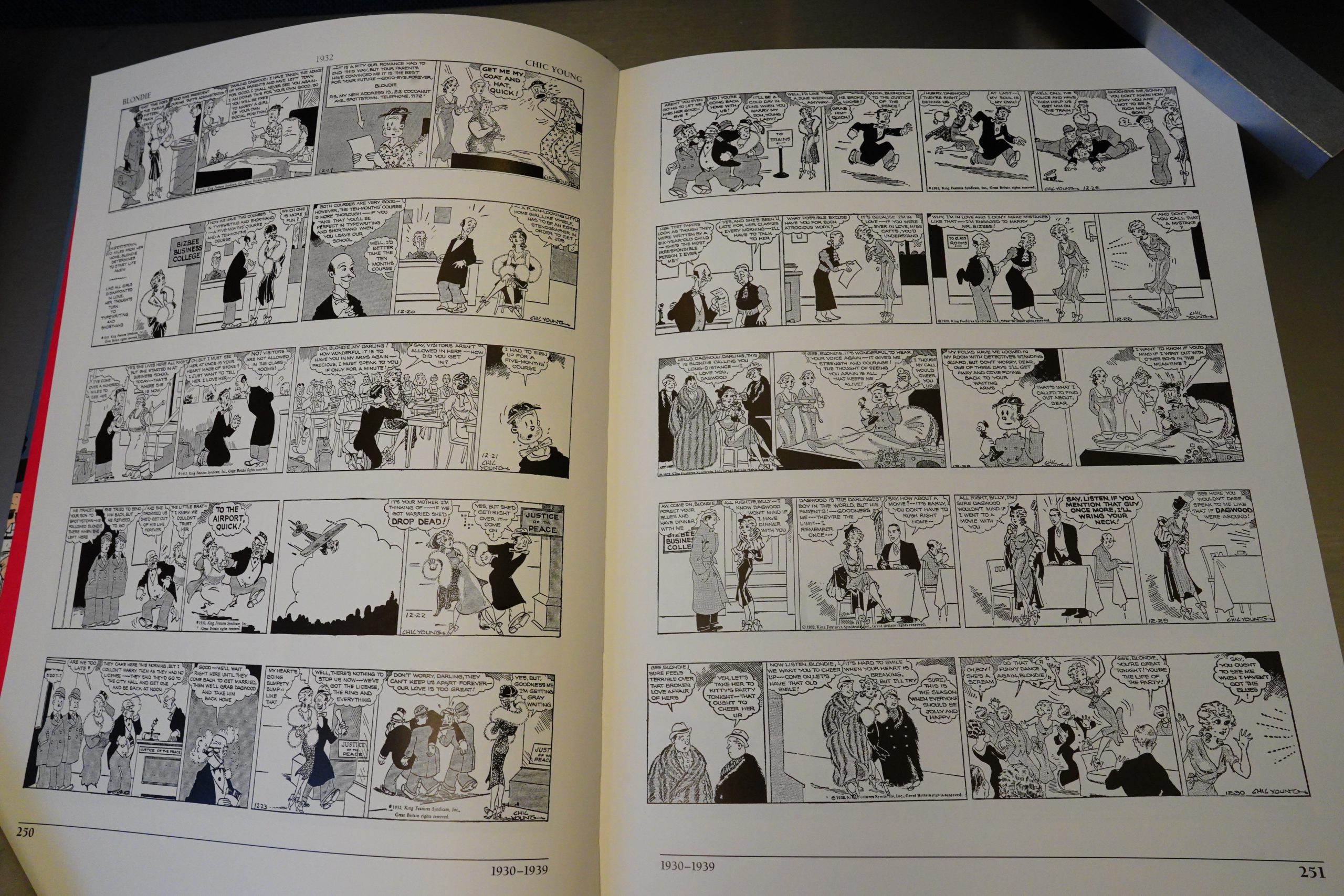
The longest section in the book is this Blondie sequence — we get 25 pages of this, which seems, on the face of it, an absurd way to spend 5% of the book. But no! I’ve only seen later Blondie strips, and they’re kinda dull, but this has a lot of zip, and a bunch of funny gags. Over the 25 pages, we get one long sequence about Blondie marrying Dagwood, and how much his millionaire parents opposed the marriage, and then into their married life, and it’s great. And it makes perfect sense to include it, to give a respite between all the adventure strips.
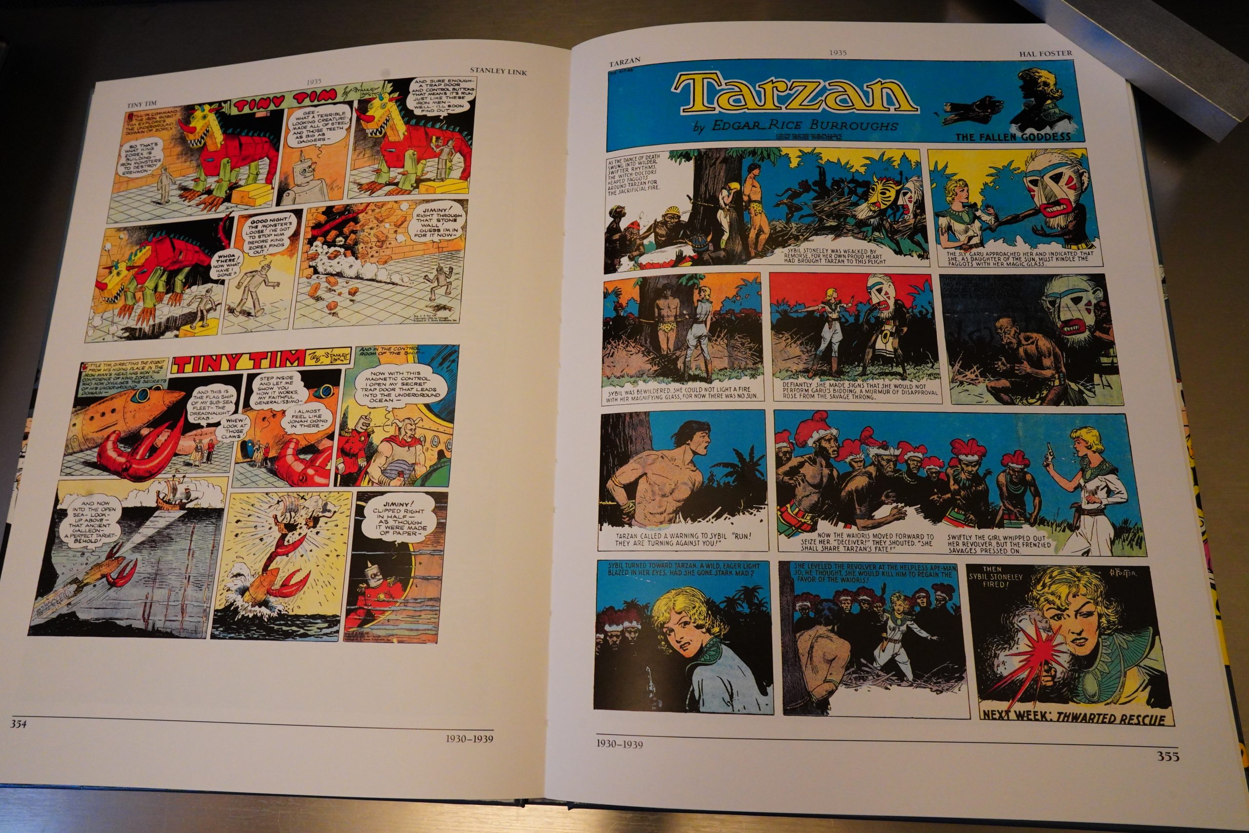
Which are mostly represented by pages like this — which makes for choppy reading, and are perhaps more to gaze at than to read when you only get a single page.
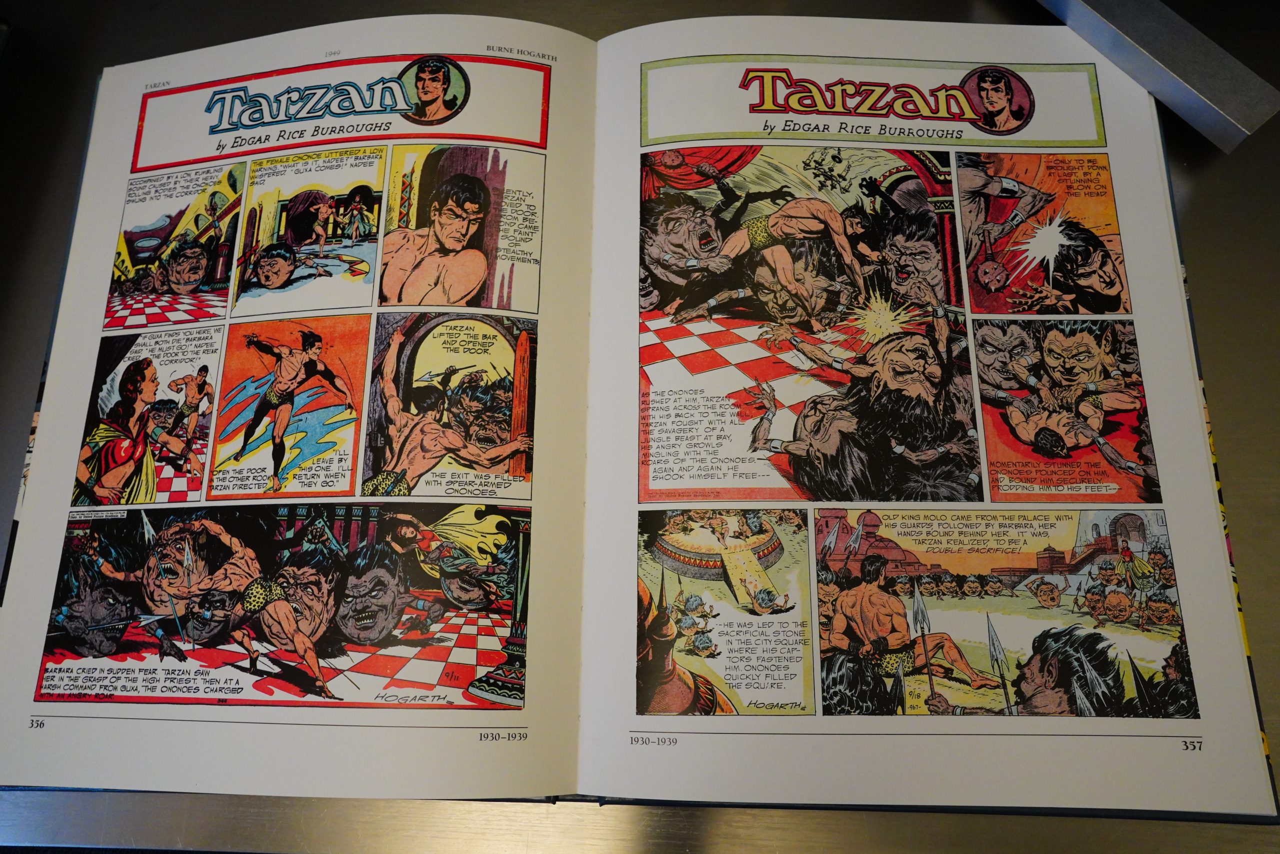
*gasp* I REMEMBER THESE PAGES!!! As a child, I had a huge (tabloid-sized) thick book that reprinted Tarzan strips, and this was one of the adventures included. Those creepy round creatures… I remember that the book seemed to come from not just a different era, but from a different world than own. I was fascinated, and I was repelled, but I haven’t seen this for, like, four decades, and I still remember it viscerally.
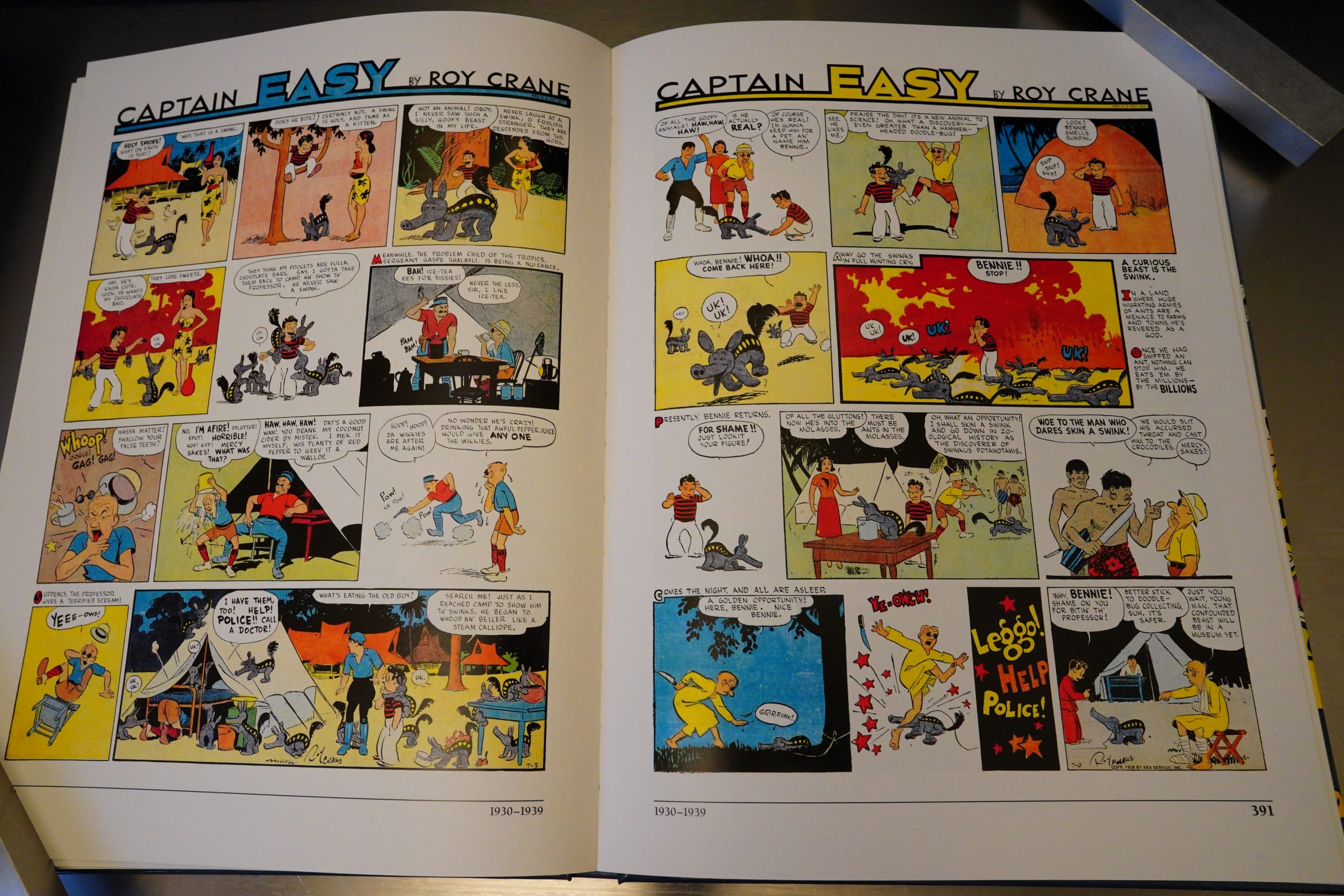
We do get one longer sequence of adventure-ish Sunday serials — Captain Easy by Roy Crane. It’s fun, but perhaps the reason they included it at such length was because it’s one series that hadn’t gotten a comprehensive reprinting?
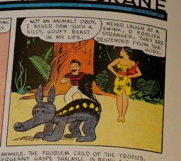
And… does that Swink look suspiciously like Dave Sim’s early Cerebus design? It sure does.
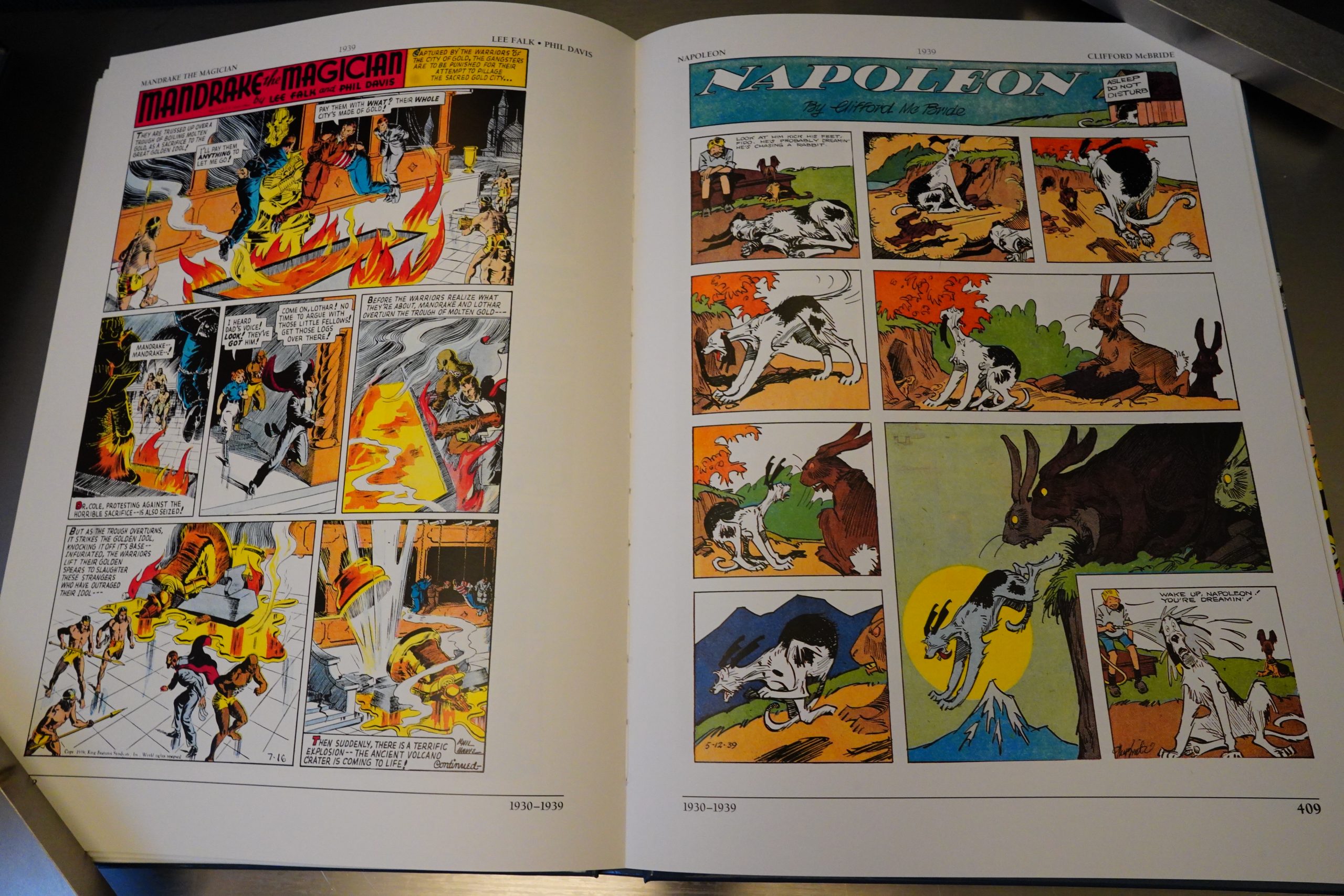
Again, reading this book is just one delight after another. So much stuff I didn’t know existed… not that I’d necessarily want to read these things in length, but it’s exciting happening upon these things here.
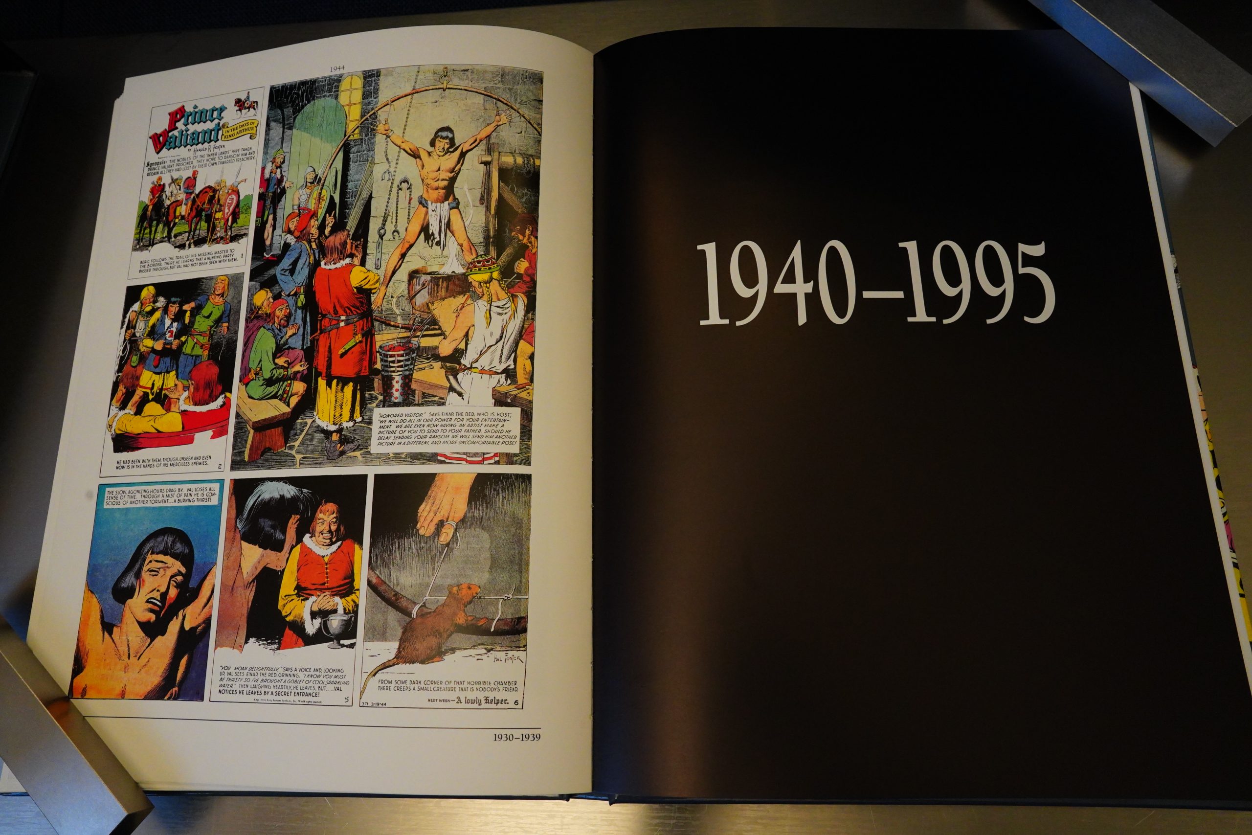
Nitpickers will probably find the book somewhat misnamed: We don’t really celebrate 100 years of comic strips — it’s all about the 1895-1940 period. But the final section takes us up to 1995 in one big gulp (and is the shortest section in the book).
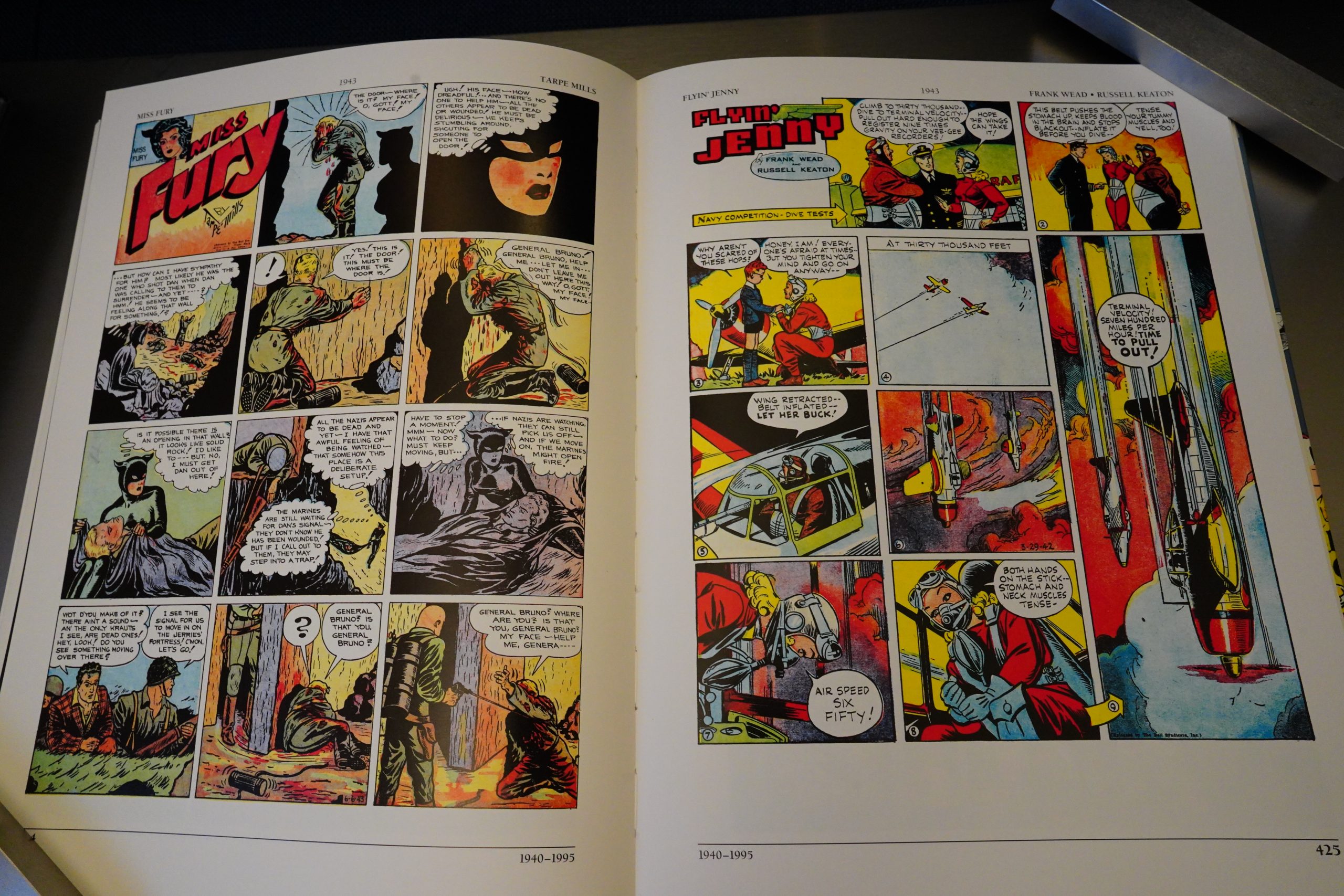
So this section feels less compelling that the previous ones. Strips are represented with a page or less, and that’s not very readable. But I guess they sampled things mostly for graphical impact and/or historical importance.
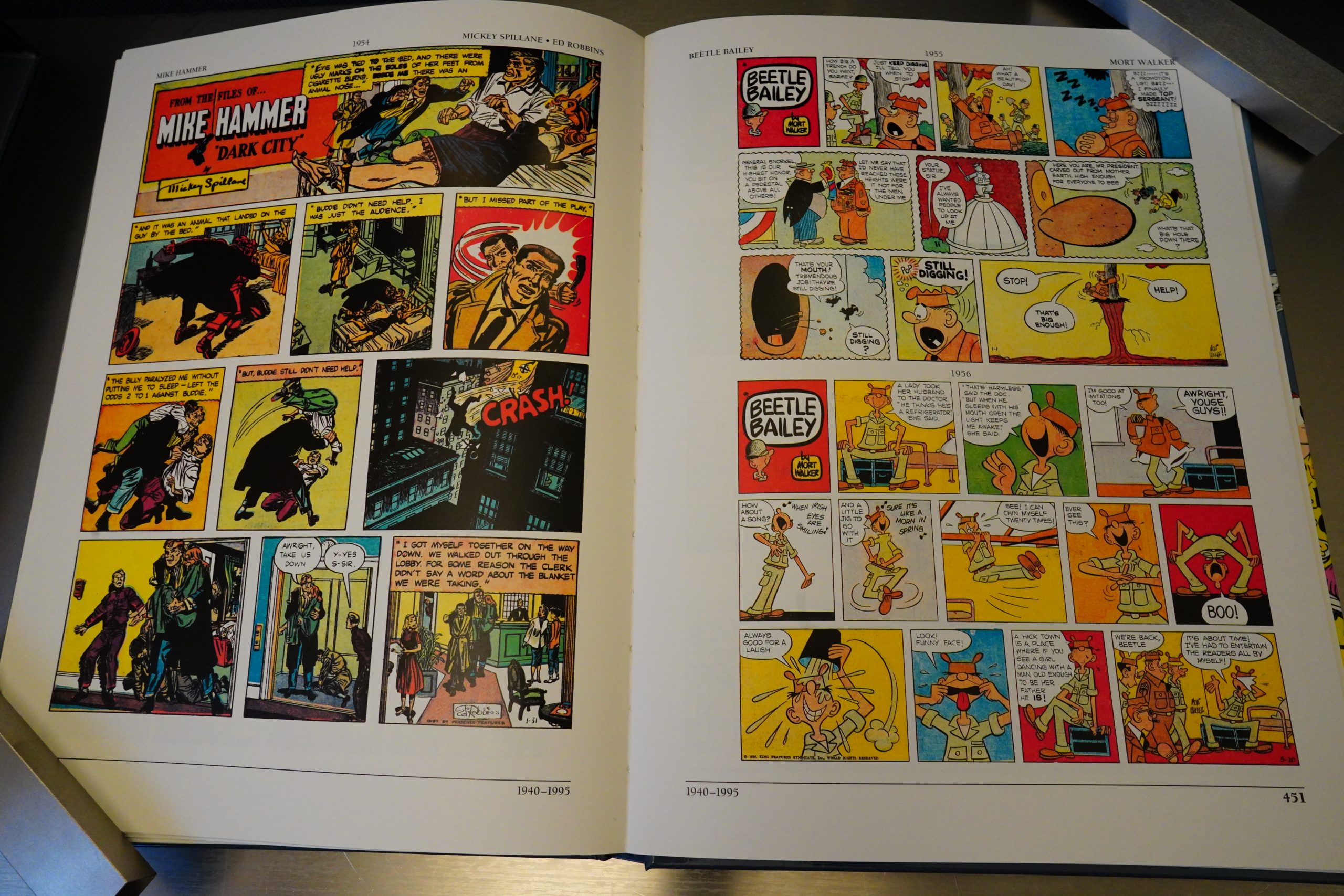
Beetle Bailey gets four pages, for instance, which is pretty odd. Or was this book financed by Mort Walker’s cartoon museum?
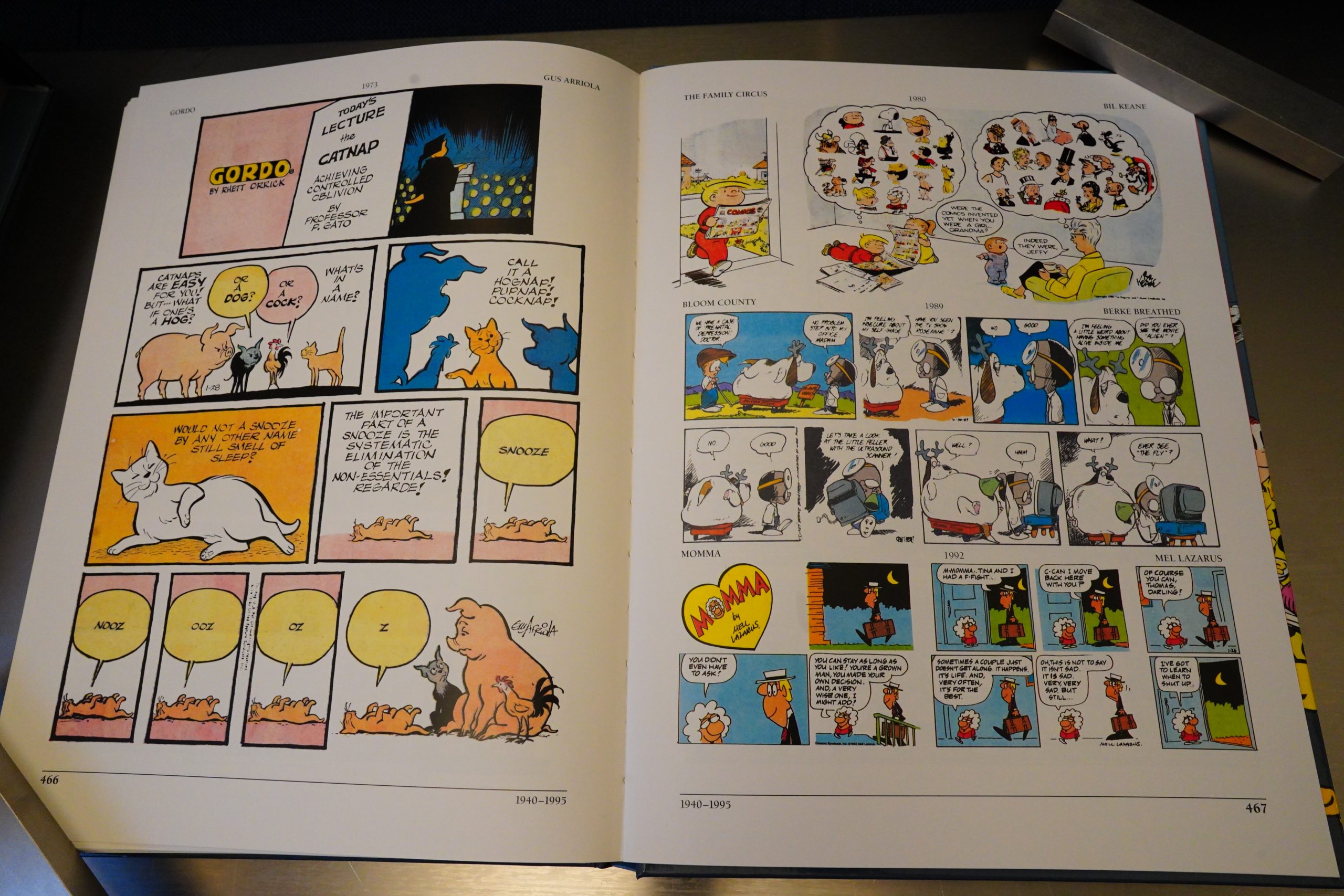
These two pages cover two decades — 1972 to 1992. And weirdly enough, the only badly reproduced strip in the entire book is here — that Bloom County strip.
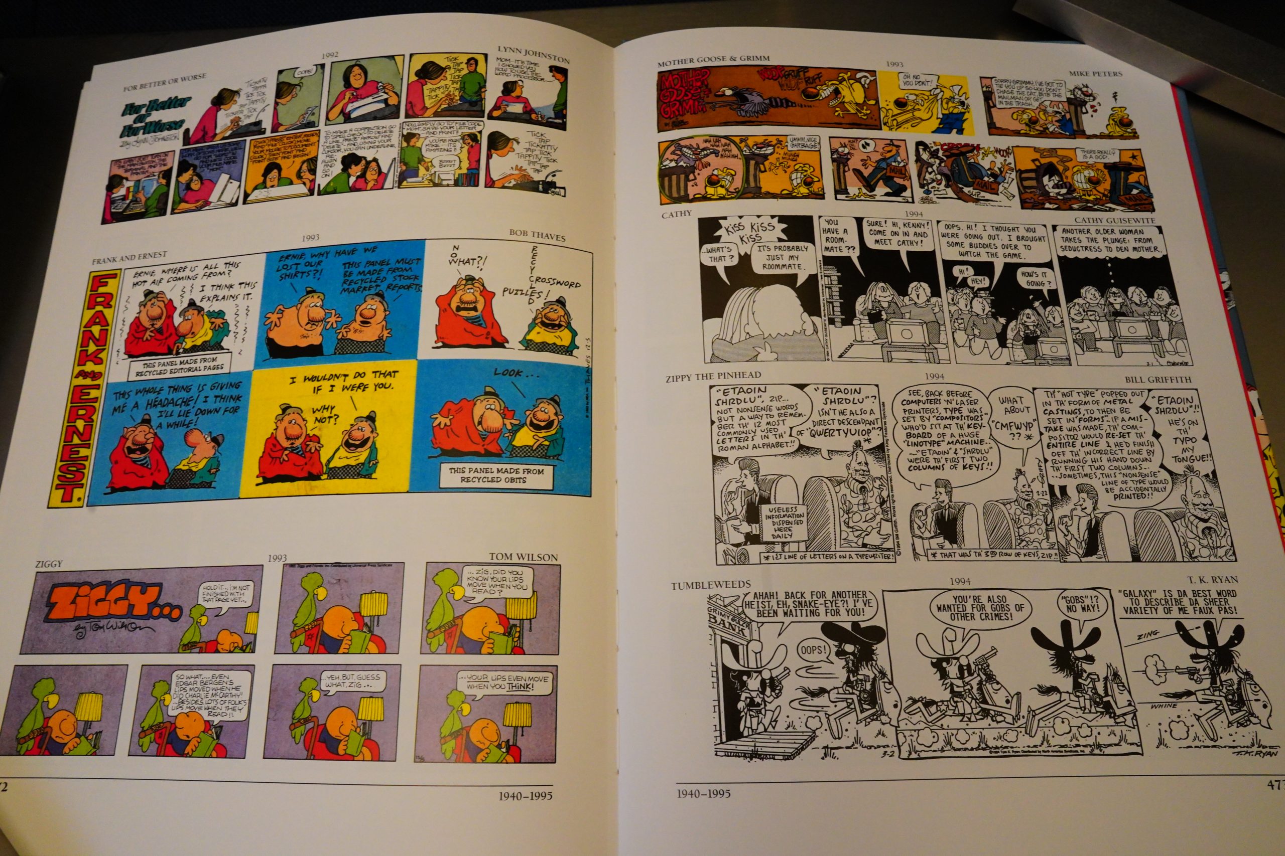
And in the 90s, we just get itsy bits. It’s understandable, but it feels off when the rest of the book is so meticulous.
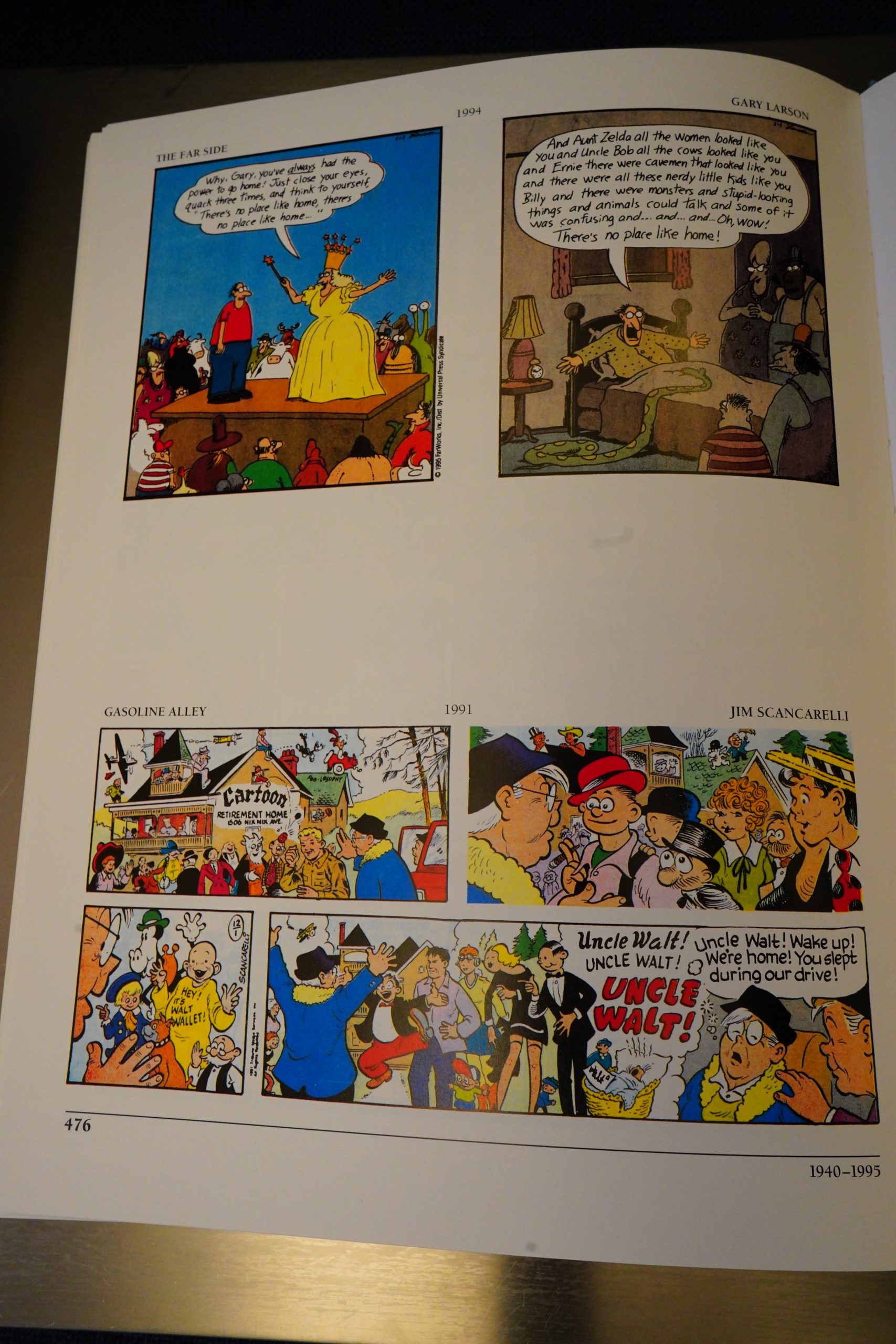
And this is the final page.

So what can I say? It’s a wonderful book, and I didn’t expect that at all. It’s well-designed both for flipping idly through, dipping in here and there, and for reading straight through.

R C Harvey writes in The Comics Journal #196, page 37:

In hardback, is the resoundingly titled The
Comic Strip Century, edited by Bill
Blackbeard and Dale Crain. The project
was apparently Crain’s idea. A designer
and art director, Crain began plotting for
the book as long ago as 1990, he tells us;
he turned immedia tely to Blackbeard, who,
as Curator of the San Francisco Academy
of Comic Art (a sort Of crammed albeit
somehow orderly attic of moldering news•
print at the western edge of the city), has
not only great knowledge Of comic strips
but the vast resources of the Academy’s
collection to draw upon for the book’s
content.

[…]

The KSP opus is elegance incarnate
in a slipcase, a two-volume extrava-
ganza (S 79.95, the pair), each volume
numbering a matching 240 pages (many
in color) and measuring 9×12 inches.
Slick, brilliant white paper and high
quality printing.

[…]

Here’s a Happy Hooligan page in which
a parrot continually croaks “dark and
stormy night,” that line of picayune prose
from Bulwer Lytton that has been given
new life by Snoopy in Peanuts. And here’s
a Sunday Bringing Up Father in which
Maggie falls asleep and dreams of the days
when Jiggs courted her. And a Polly and
Her Pals page in which characters sing
“Barney Google with the goo-goo-googly
eyes,” the 1920s hit song that Billy Rose
wrote about Billy DeBeck’s comic strip
character. And, as a reminder, no doubt,
of the merchandising contagion that very
quickly infected the producers of comic
strips, here’s a Happy Hooligan page in
which the action is performed by toys and
dolls of Barney Google, Happy, Jiggs, and
Maggie. And finally, we have a sequence
from Mort Walker’s Beetle Bailey in which
Beetle goes home on furlough, and we
meet his sister Lois and her husband Hi,
both dark-haired at this time, but Lois
would dye hers when she became the co-
star of the feature that Dik Browne would
produce from Walker’s concept.
I miss, however, that Little Orphan
Annie Sunday page of May 17, 1942, in
which Harold Gray depicts Annie hanging
out the weekly wash as she prattles on
about the war and patriotism and so forth
in her inimitable fashion. In the conclud-
ing panel, Annie surveys the clothing she’s
been hanging up and says, “Hope some Of
the neighbors who’ve been crackin’ that I
have only One dress are rubberin’ now.”
Annie always wears a red dress, as you
may remember, and here Gray takes a
swipe at those of his readers who pitied
Annie because she seems to have only one
such garment. On the clothesline he dis-
plays a dozen dresses, all identical. All
red.
The presence of such in-group mate•
rial in Centuryraises questions about what
the editors of these volumes thought the
audience for this work might be.
While these little in-joke tableux are
undeniably a hoot for someone already
versed in the history of the medium to
discover, the uninitiated must remain come
pletely oblivious to their import because
Blackbeard has supplied no text from which
we might draw the necessary inferences.
The reticence of the editors is understand-
able, but it borders on the perverse.
The editors clearly wanted to give us
the enviable experience of seeing the comic
strip century unfold before us
uninterpreted. The great virtue of these
books is their primacy: they print the
evidence, the very artifacts. Thk is one of
those rare occasions in the scholarship of
the medium when we are the eye wit-
nesses. We can see with our own eyes the
evidence upon which the history of the
medium rests: to assess the quality or
importance of a given work, we need not
rely, for once, solely upon the testimony
of someone else, someone who gargles up
a verdict after staring into a microfilm
reader for hours and hours.
Indispensable as it is to have material
like this available in book form, the use•
fulness of the books could have been
greatly enhanced if the history underpin-
ning the selections as well as the in-jokes
were rehearsed herein.

*gasp* No, can’t have jokes go unexplained. Uninterpreted reading! Well, I never! *clutches pearls*

You can apparently pick up this book for next to nothing used, so I guess this means that they printed quite a lot of copies. Pick up a copy and enjoy an unmediated evening with some great comic strips.

This is the one hundred and seventy-eighth post in the Entire Kitchen Sink blog series.
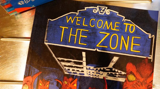
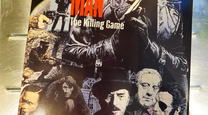
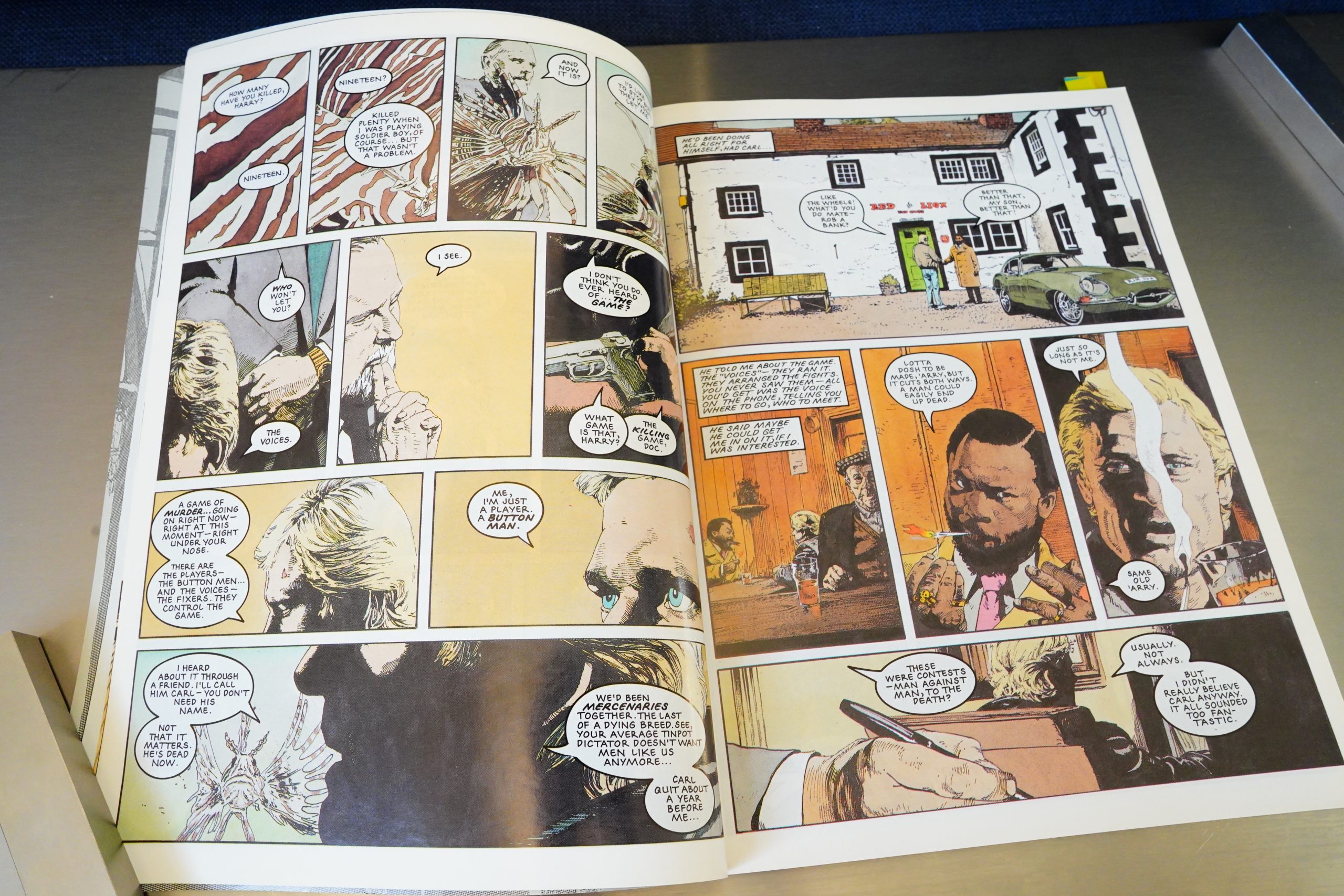
1995: Button Man: The Killing Game

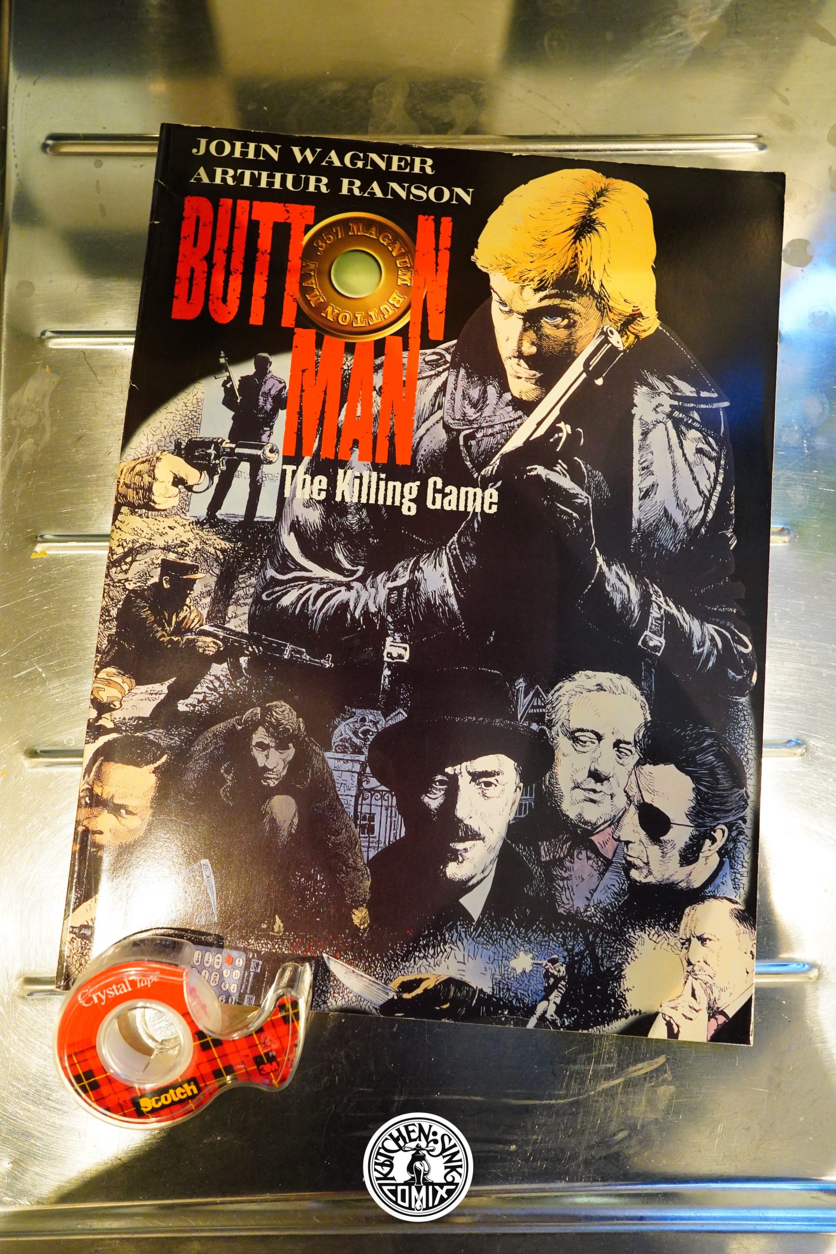
Button Man: The Killing Game (1995) by John Wagner and Arthur Ranson

This is a slightly oversized album collecting a story serialised in 2000AD.

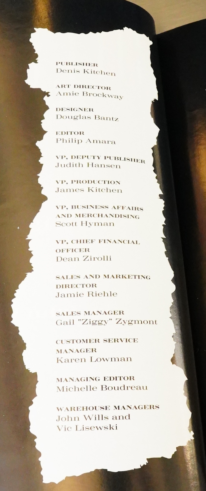
Heh. Kitchen Sink had grown four vice presidents by this time? They’d been sold to an investing group, Ocean, so I guess the more VPs the better.

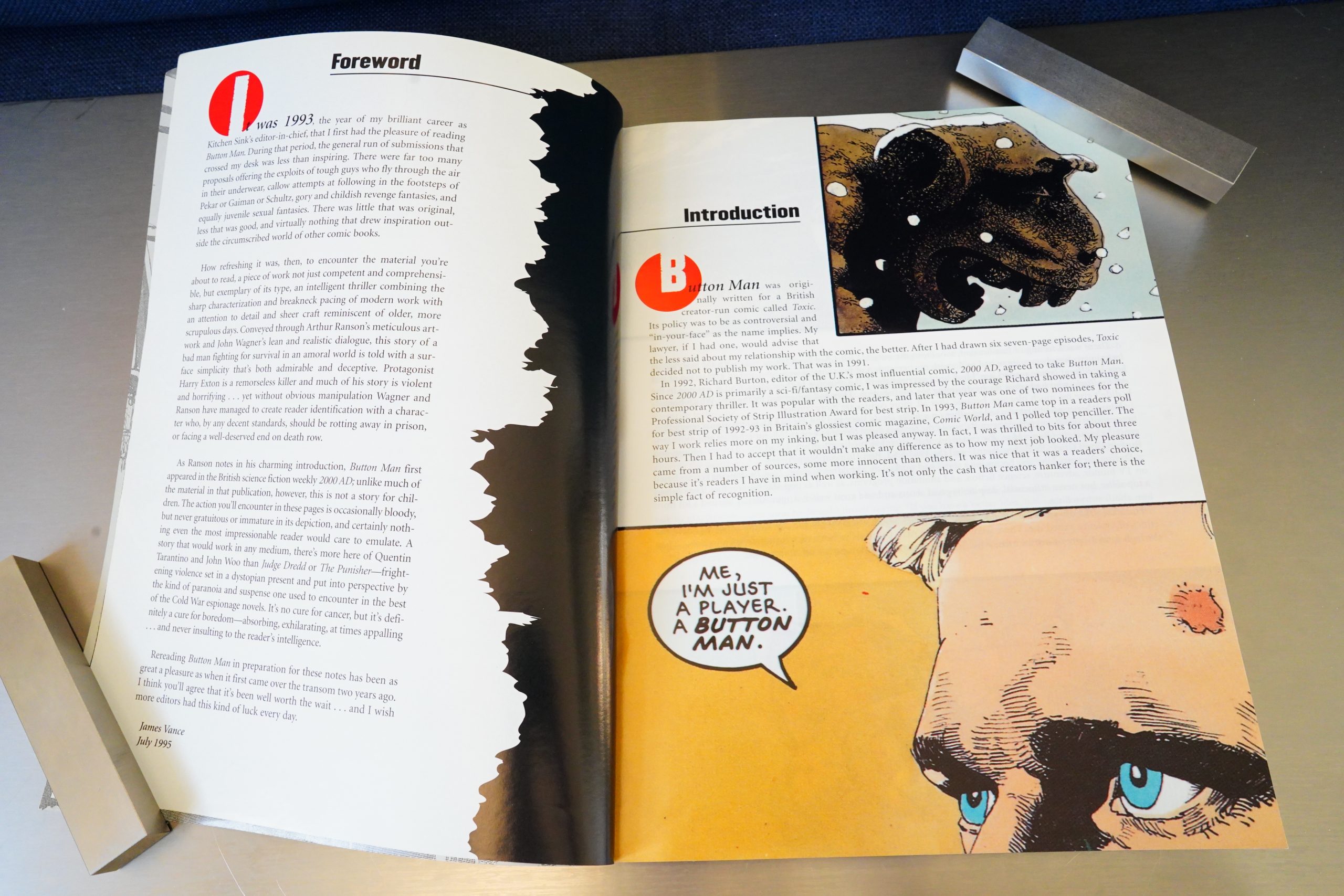
And this is also an unusual thing for a Kitchen Sink book: We get both an introduction from the ex-editor, as well as a four page introduction by the artist. (It’s a pretty interesting introduction, so I’m not complaining — it’s just the sign of the times.)

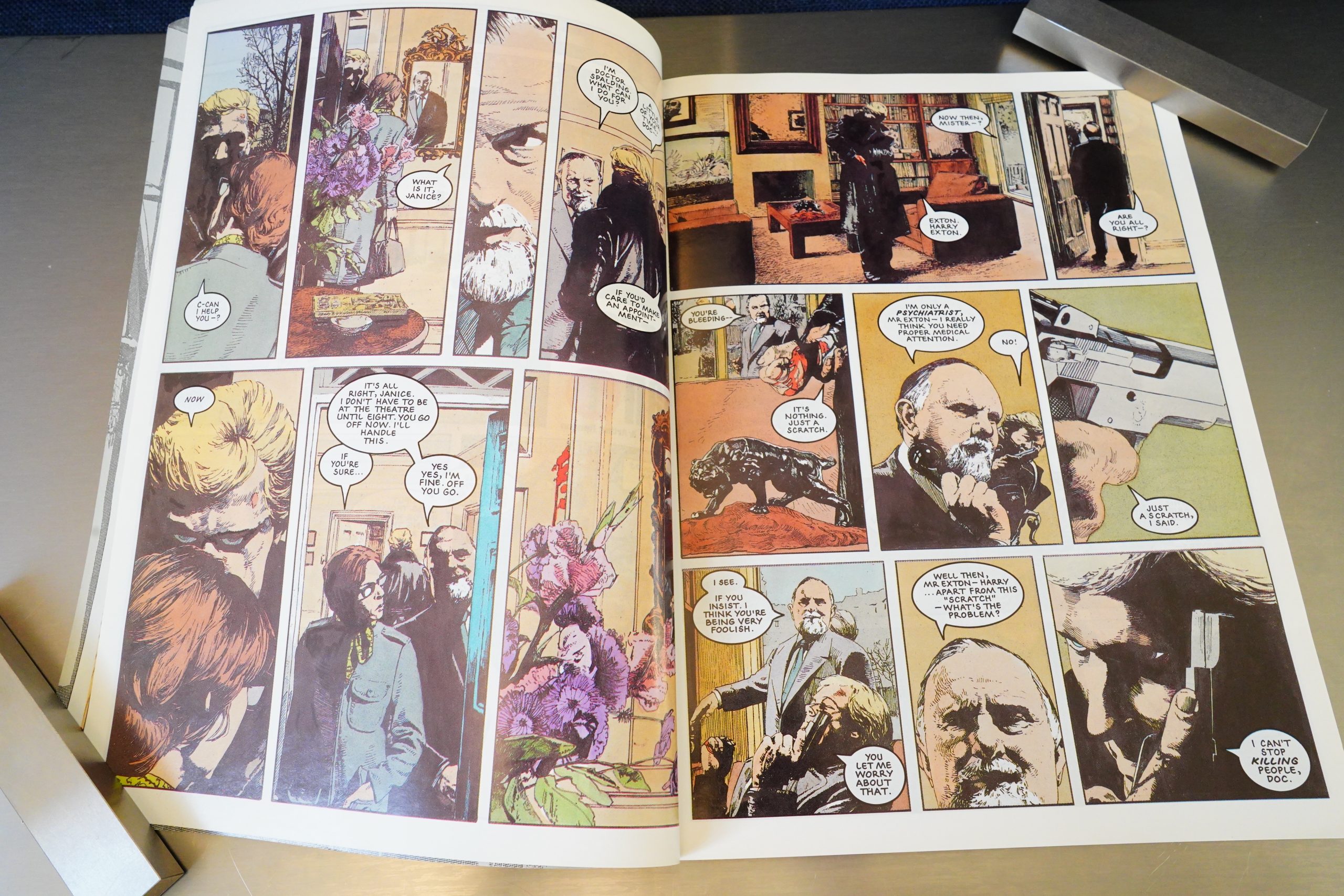
The printing on this book is quite unusual. It’s printed on very shiny paper, but that’s not the unusual bit. The unusual bit is that there doesn’t seem to be anything that’s properly black. (Except the lettering.) Instead we get some really, really dark areas where you’d normally have black, but it’s not quite black. Is this offset-printed, perhaps?

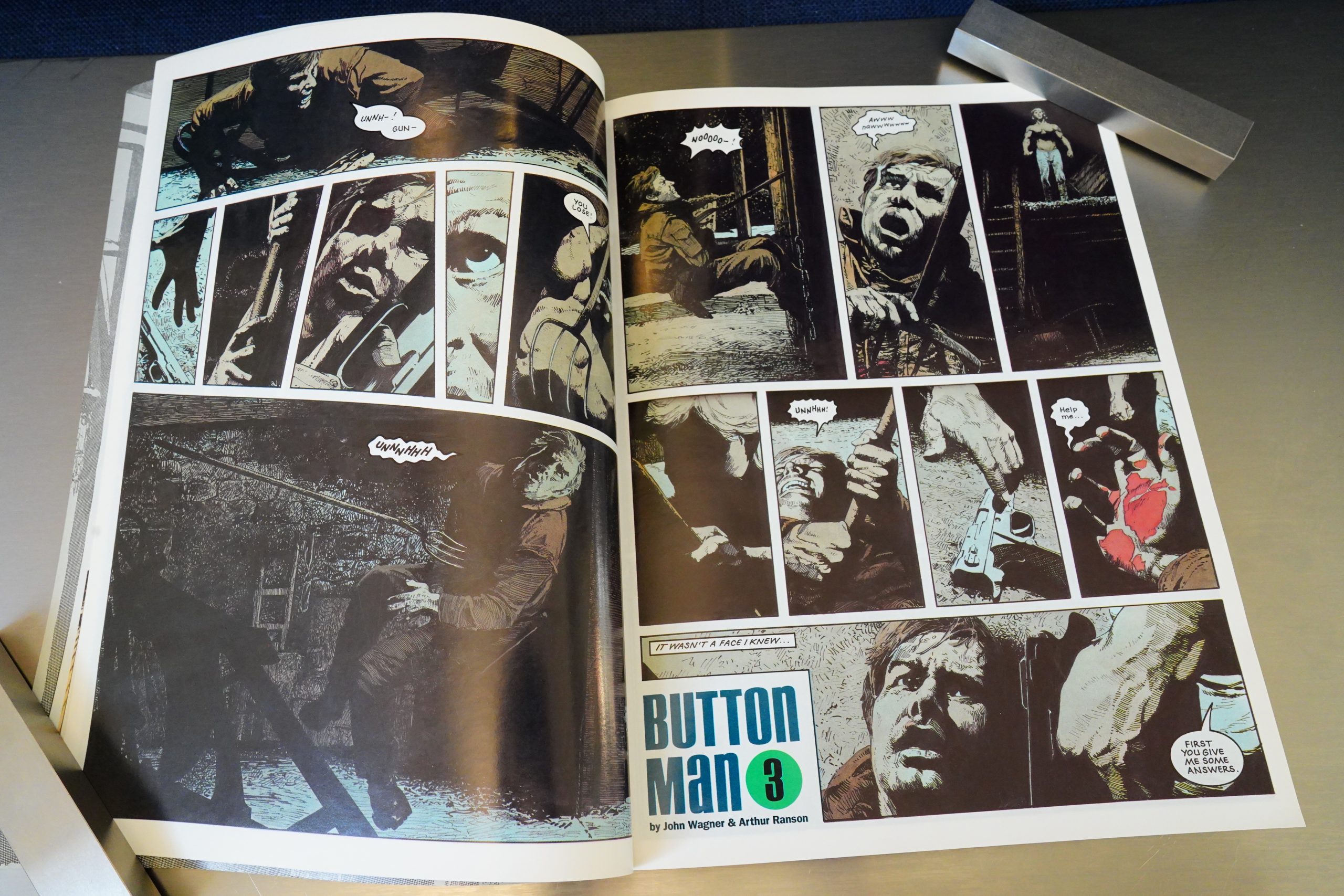
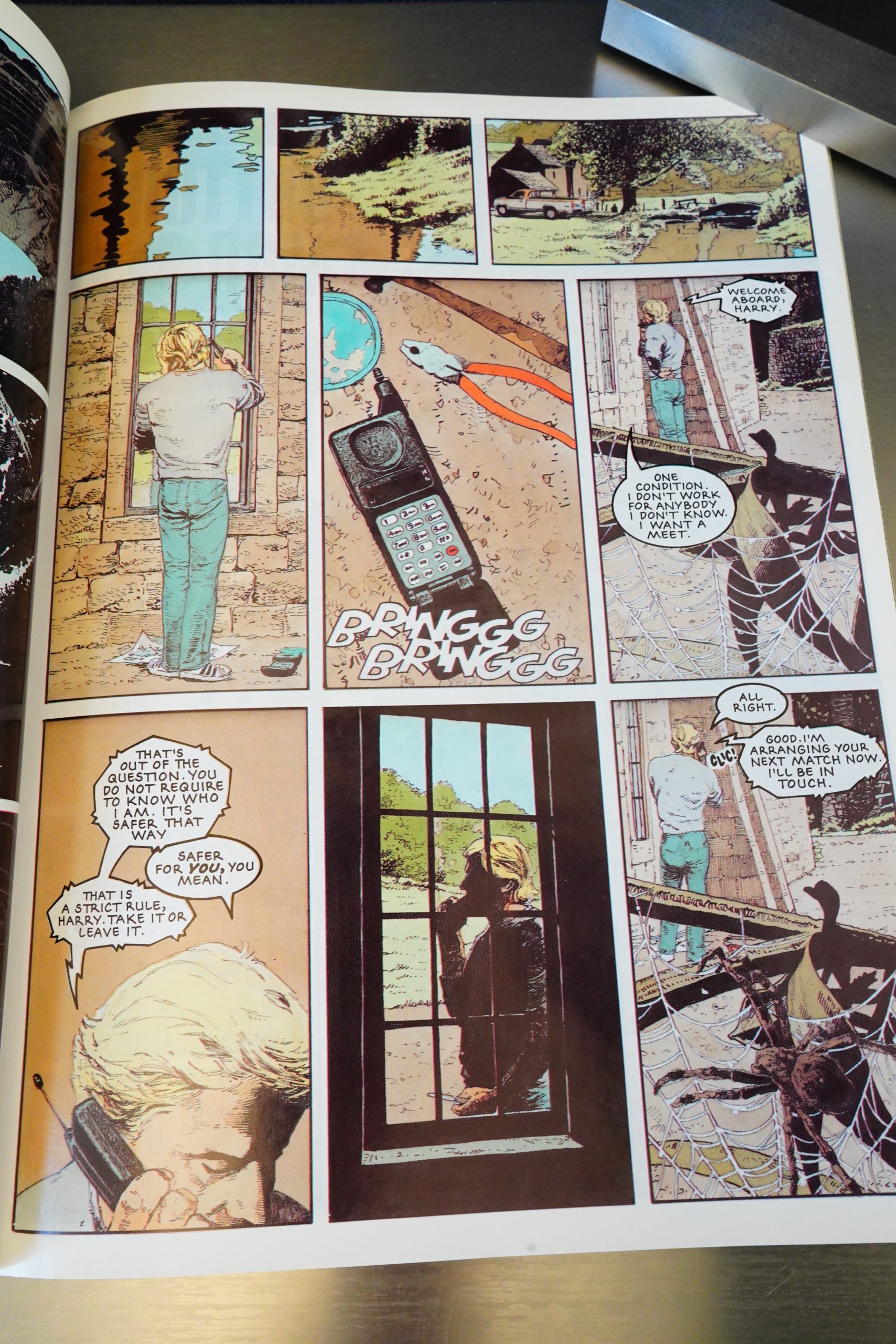
The thing that makes the book is the storytelling and the artwork by Ranson. It’s got a really nice flow — he likes to draw objects and people in a slightly oblique way, but it’s always clear what’s going on anyway.

This was printed in seven page portions, but without regard for where the seven page breaks landed, but I’m not sure that’s that unusual for 2000AD? I mean, I haven’t read it extensively, but I seem to recall that stories would just be serialised there in a non-chapter way. So I’m wondering why they didn’t just take out the chapter labels here. I mean, they’d have to do something to fill in the spaces, but…

I wondered whether Ranson was getting at something by never drawing the protagonist’s face in full — he’s always looking away, or in shadow, or we’re getting just his forehead or whatever. But nope.

It’s slightly grisly, but mostly off-screen.

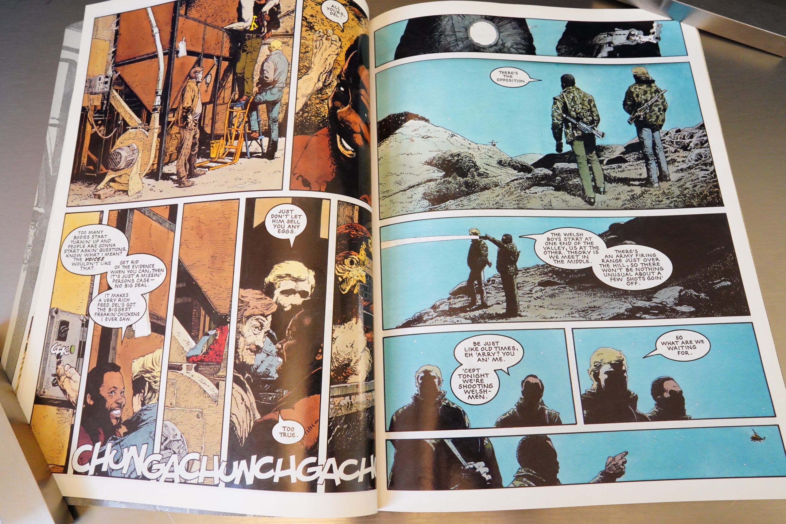
As for the plot… It’s Modesty Blaise plot #4, and one they’d done many variations on over the year: Rich assholes want to watch people hunt each other, so they kidnap/pay/brainwash/whatever people into doing that. But in Modesty Blaise it makes sense, because they have cameras and stuff to film the excitement. Here, they mostly set up “matches” between two killers, and then a couple days later, one of them call back to say who’s won. (With some evidence of the kill.)

It makes absolutely no sense. Why would you pay thousands of pounds for something like that?

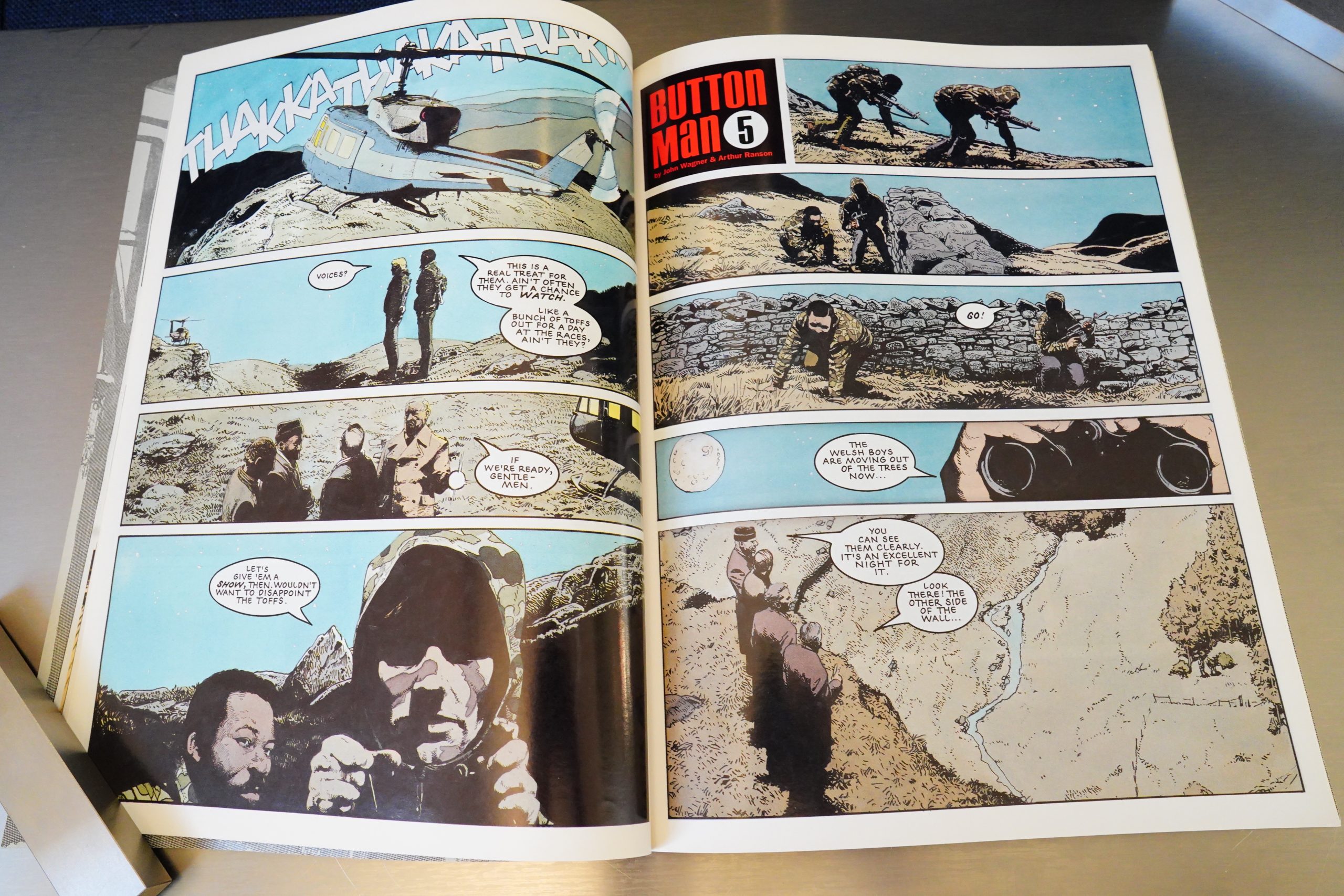
Above is the one time where the rich assholes get to watch. Via binoculars. Such excite.

But it’s not a bad book, really. It’s about as exciting as any Modesty Blaise adventure… except there is absolutely zero sex, and it’s a total sausage fest: Not a single female character.

A new edition was published some years back:

Obsessive about detail and always happy to experiment, Ranson’s intricate line work, gorgeous inks and meticulous layouts perfectly suit the strip’s gritty, realistic tone, as well as Wagner’s propensity for cinematic action sequences. Wagner and Ranson’s collaboration on BUTTON MAN marks one of those rare synergies of writer, artist and material, and as such makes it the high point of both men’s not inconsiderable careers.

Right:

As far as I can tell this is the single 2000 AD story that does not have a single science fiction or fantasy element to it, being the sort of down and dirty thriller that would fill the paperback racks in the 1970s, brought to you by the likes of Donald E. Westlake (more on that later).

This is the one hundred and seventy-seventh post in the Entire Kitchen Sink blog series.
1995: Armed and Dangerous

Armed and Dangerous (1995) by Mezzo and Pirus

Kitchen Sink had previously published a few albums that had originated with the French publisher Zenda — but in conjunction with Heavy Metal (who had the same owners as Kitchen Sink). This is a pure Kitchen Sink publication (since Kitchen Sink had been bought by Ocean, presumably).

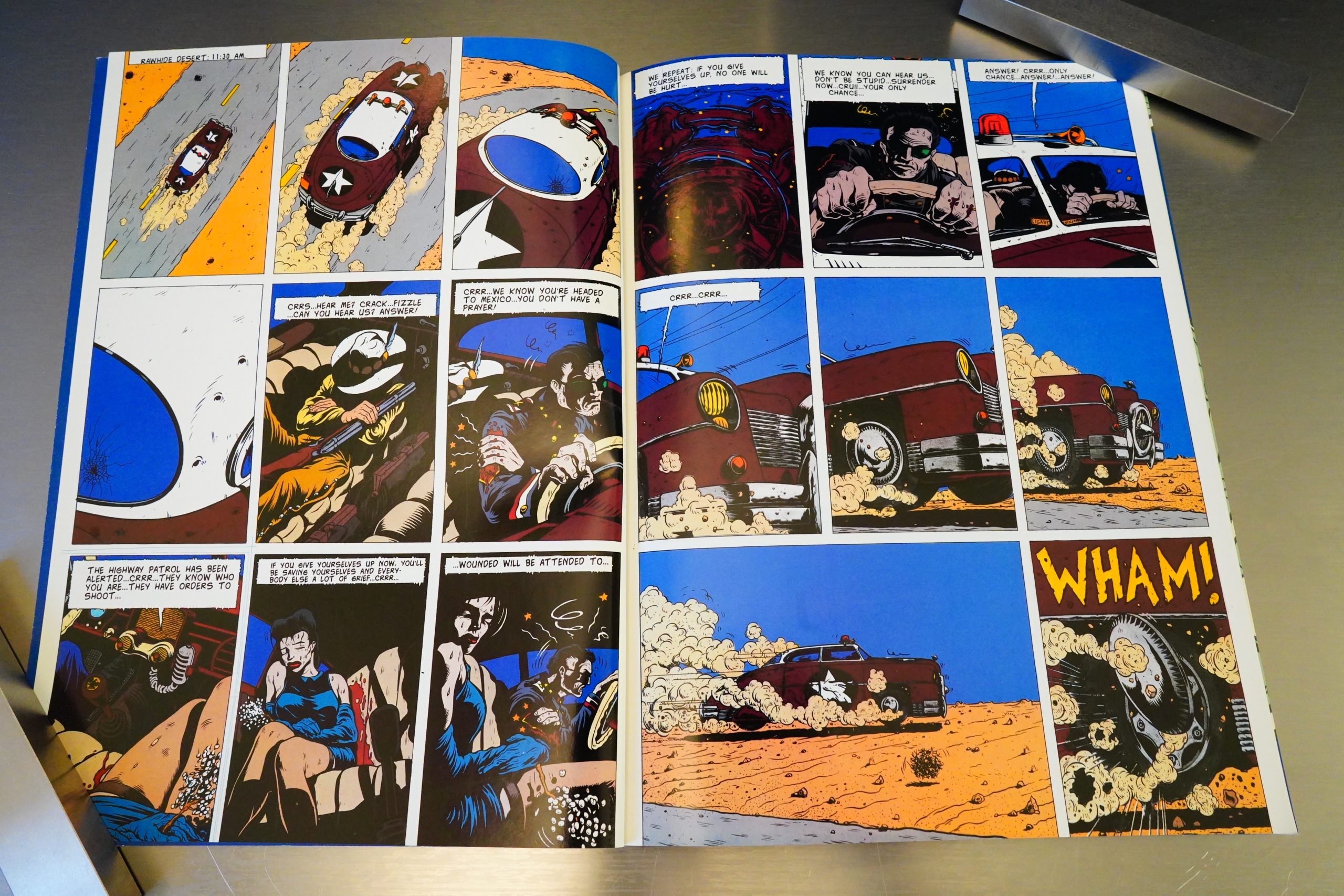
I wonder whether this odd lettering is a remnant from the Heavy Metal serialisation? If Heavy Metal has a smaller trim size, perhaps they had to do it this way to avoid having the text cut off at the bottom? But in this album, it just looks really wonky.

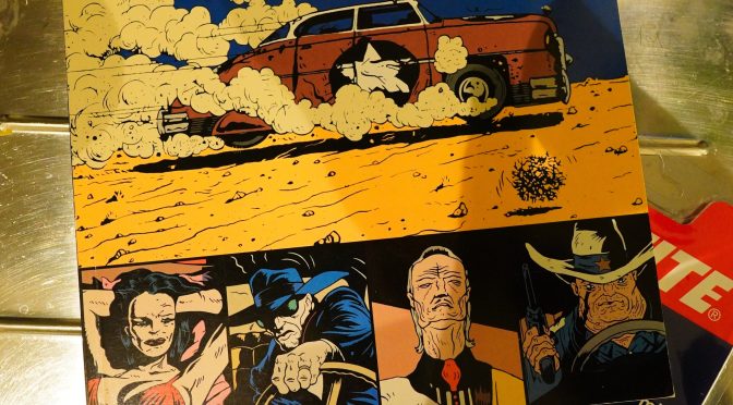
Anyway, this starts off great — it’s very mysterious and incredibly stylish.

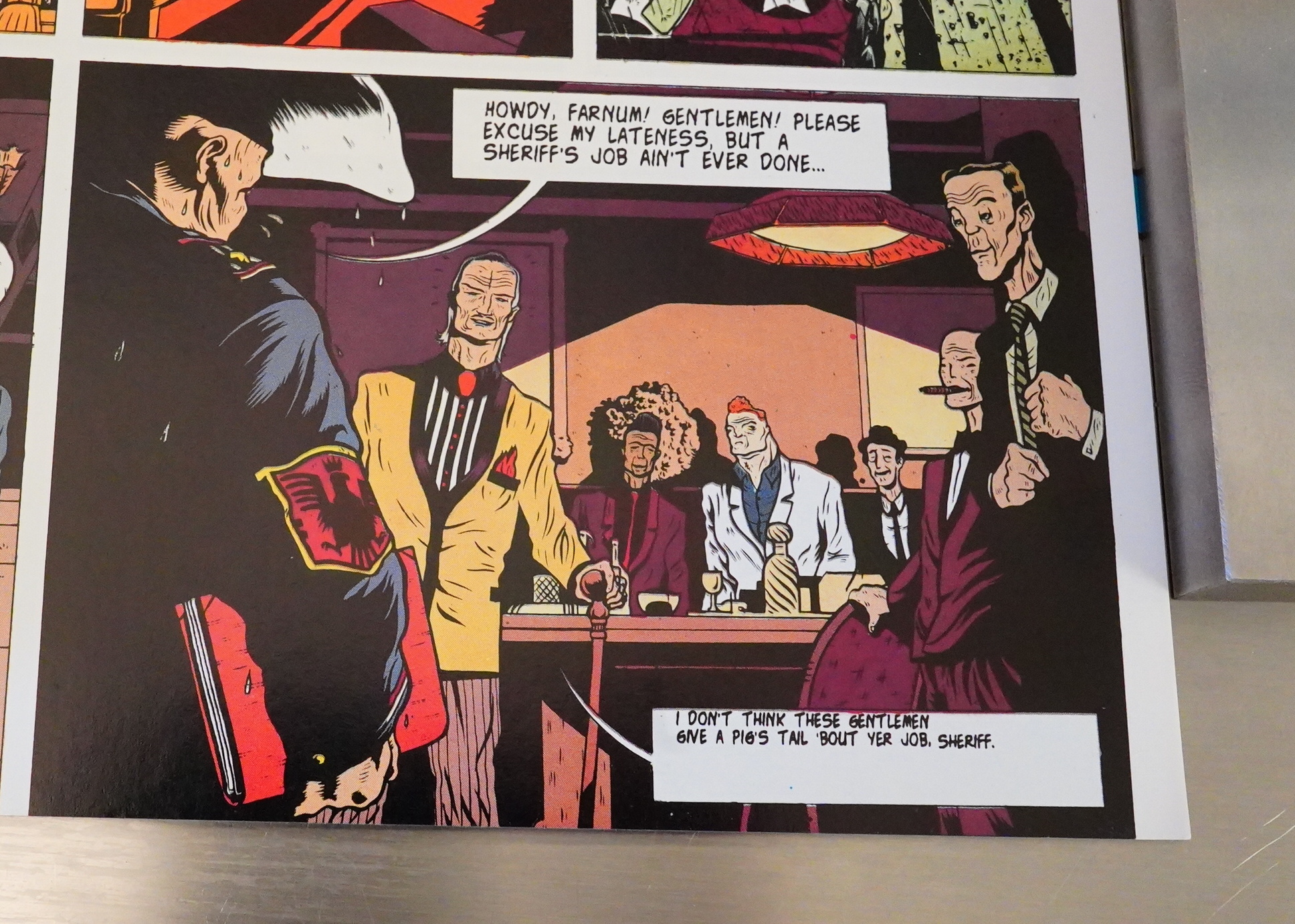
We’re soon introduced to a large cast of characters and a pretty complicated plot involving two bank heists, some corrupt cops, crime bosses, an incestuous family, a developmentally challenged spy guy, and and…

As with the other Zenda books, the creators here are young, and this is among the first things they published. And the artwork seems really, really derivative, and this time it’s influenced by Charles Burns (and Marti). But man, they really go for it, and it’s kinda mesmerising to look at.

But I’m wondering whether the translation is a bit wonky? Sometimes what they’re saying doesn’t quite seem to track…

And there’s a lot of exposition.

But then we leave this bank heist scenario, and the last half of the album is a domestic drama involving that family (and the first bank heist) and the corrupt cop, and then:

Whaaa?!?

Those gangsters up there detailing the bank heist in detail, and then nothing? And the end to the family doesn’t really seem to make much sense either, because it seems to contradict what we’ve been shown is going to happen in the future.

What the?

The explanation is that this was published in two albums in France as Les Desarmes. And Kitchen Press only printed the first album in English, and the second has never been translated, apparently.
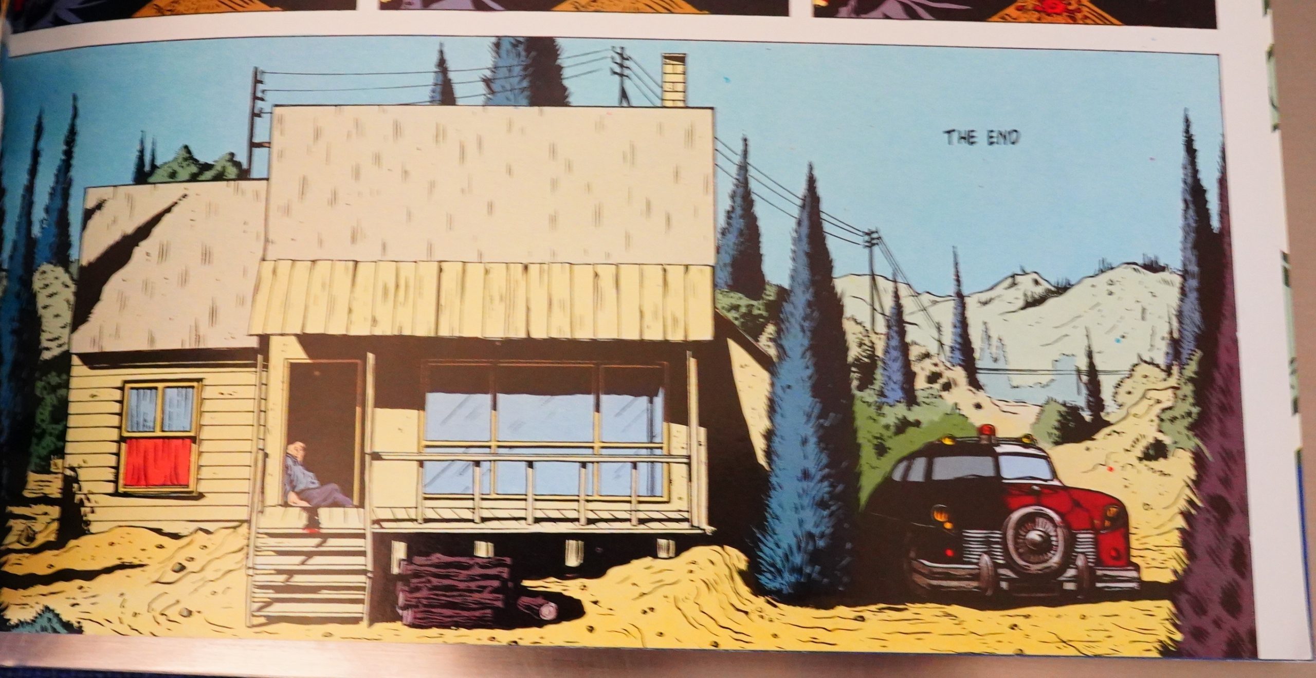
So… why? Just why? It makes absolutely no sense the way it is, and there’s no hint that there’s a second volume. Just “The End”.

Very strange, but then again, Kitchen Sink was a very odd place by this time.

Exactly:

And I don’t know about the production, but the big problem is that it’s only half the book, and the same half that was featured in the Heavy Metal May 1994 issue. The second half is totally unreprinted in English. It’s like publishing X’Out and then forgetting about ever putting out the continuation.

Perhaps there were rights issues as Zenda had gone bankrupt and been sold by this time.

This is the one hundred and seventy-sixth post in the Entire Kitchen Sink blog series.