Category Archives: Uncategorized

1991: To the Heart of the Storm

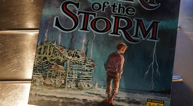
To the Heart of the Storm (1991) by Will Eisner

Oops! I’ve got the DC edition of this book here instead of the earlier Kitchen Sink version…

This feels, in some ways, like Eisner’s magnum opus — it covers the same ground as he’s done before, but more thoroughly. And this time over, it’s presented as one single tale, instead of a series of vignettes.

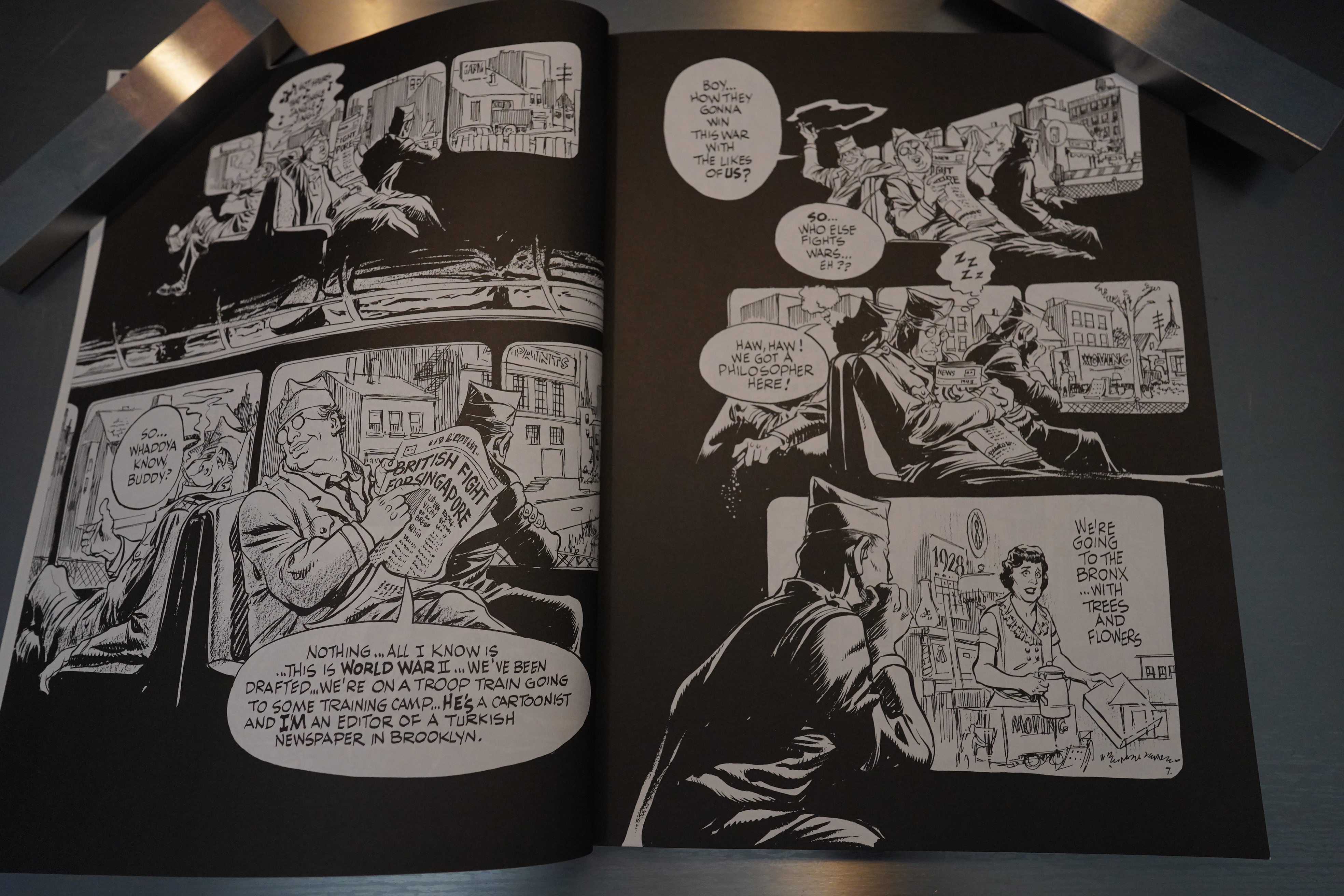
The structure is classic — Eisner has been drafted in 1942, and on the train down to camp, he’s thinking about olden times. (Well, I’m assuming “Willie” is Will Eisner — the book doesn’t say whether it’s fiction or autobiography.)

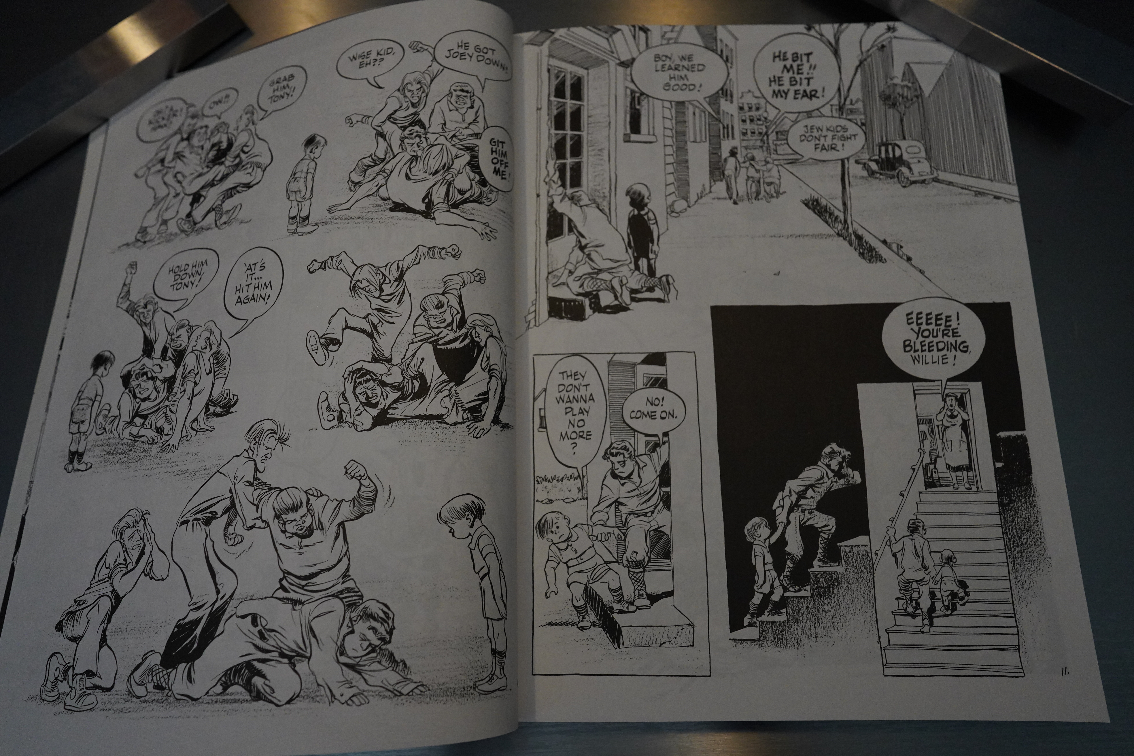
And we get… a bunch of vignettes from Eisner’s life — quite a lot from his childhood, and some from his teenage years. But these aren’t random vignettes: They’re (almost all) on the theme of living as a Jewish boy in New York, and the prejudices and abuse he suffered.

Finally somebody sensible!

So it seemed like we were going to have something more focused than Eisner’s usual books, but nope: We then get a whole bunch of flashbacks inside the flashbacks to Eisner’s parents, and their parents even. And it’s not that the individual anecdotes aren’t interesting — but there’s just a lot of them. So it’s a book without any momentum, and is instead a contemplative, kinda quiet book.

Except for the melodrama. Oh, so much melodrama. It gets a bit hard to take after a while — the family suffers so many setbacks that it gets a bit difficult to take seriously after a while.

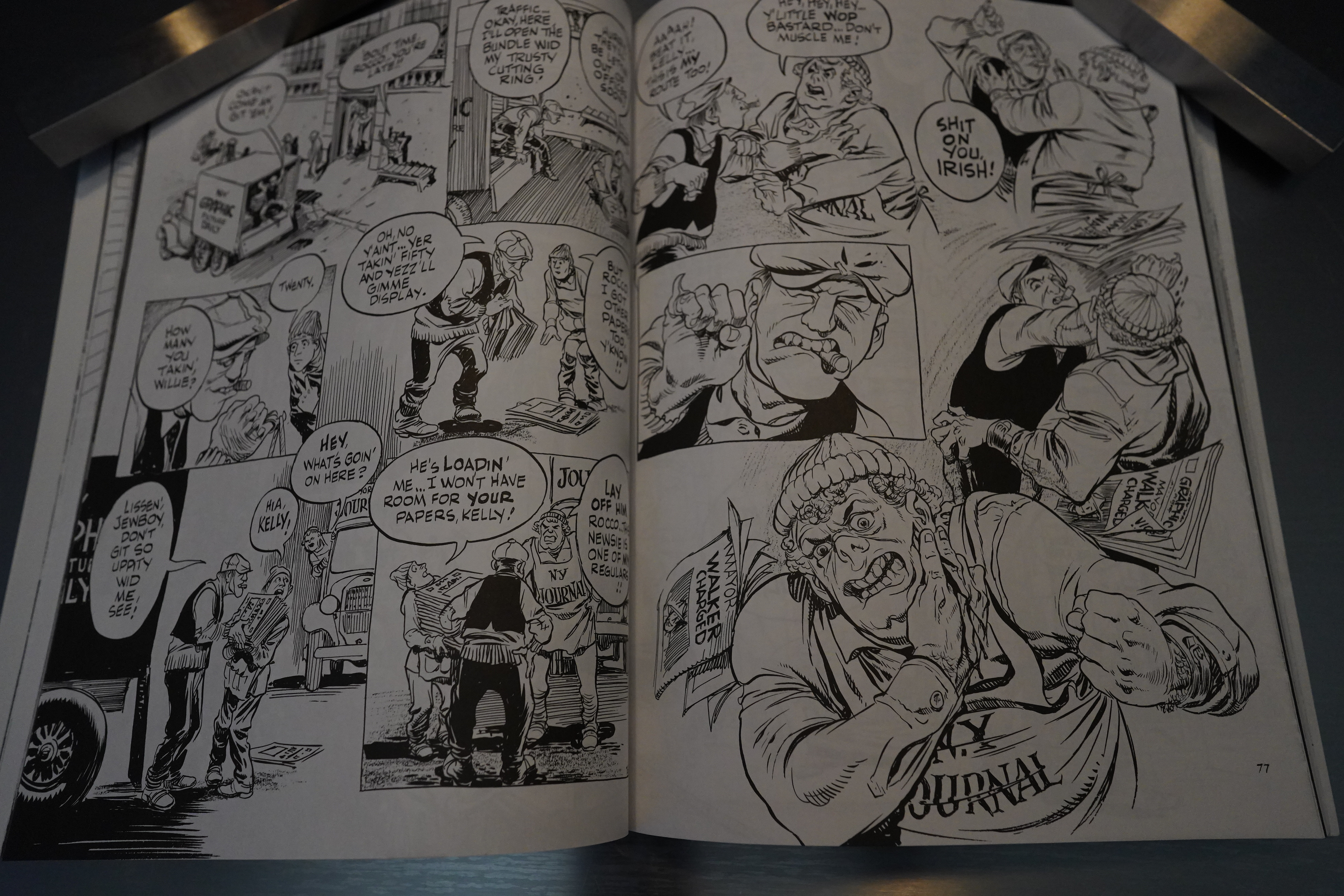
There’s interesting stuff all along, though, like the on-ground newspaper distribution wars here.

Eisner shifts between doing free-flowing layouts without (clear) panels, to doing more traditional layouts, apparently on a whim. But it reads well — it’s got a nice flow.

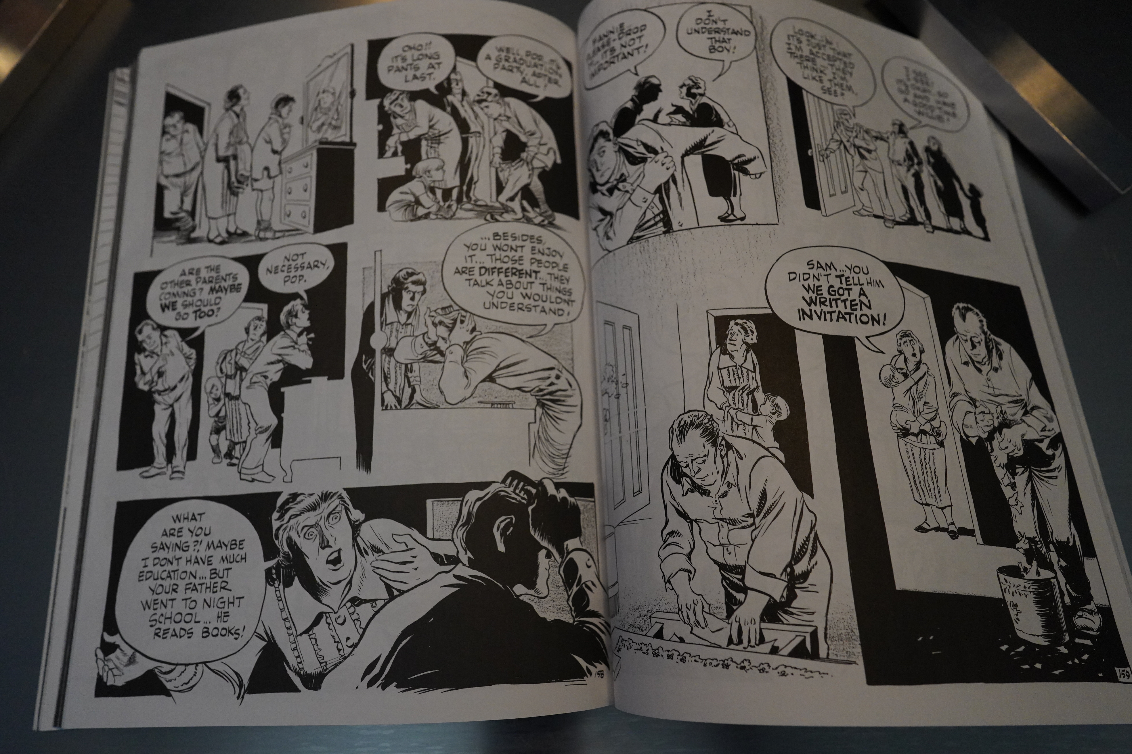
Eisner is pretty reticent about including really embarrassing stuff here (as autobiographies go), but the bit about passing as a gentile to go to a German girls’ prom thing (and disinviting his own parents) is shockingly heartbreaking.

So… I think this might be one of Eisner’s most successful works — it’s structurally sound, and has real flow, and doesn’t any of the many 40s schlock twists and turns that mar much of his other work. But it’s not exactly a thrilling book: It feels somewhat self-indulgent. Not all of the anecdotes we get are all that interesting.

Rob Rodi writes in The Comics Journal #144, page 45:

Will Eisner honed his craft, and
what many would call his art (l “Ouldn’t dis-
agree) on the seven-page Spirit sections he
created for Sunday newspapers during the 1940s
and 1950s. He became an expert at conveying
much more than was actually on the page; his
works were little miracles Of succinctness.
Thirty-odd years later, that’s still where his
greatness lies; the shorter the works, the bet-
ter. His first collection of non-genre stories, A
Contract with God, is very fine, and City Peo-
ple’s Notebook and New York: The Big City, two
recent volumes of even briefer pieces (often
nothing more than observations) are his most
graceful and powerful works to date; some
of the vignettes achieve an almost mythic
transcendence.
So it’s not surprising that To the Heart ofthe
Storm, his years-in-the-making, 208-page,
quasi-autobiographical graphic “novel,” should
prove to be such a disappointment; it plays to
his weaknesses. Its rambling. episodic structure
leads the reader in too many different directions,
and while certain sequences are memorable,
they don’t cohere into a thematic whole. Liber-
ated from page-count restrictions, the master Of
economic storytelling has no idea what to do.
The confusion starts almost immediately.
The title of the work suggests an inexorable des-
cent into sound and fury — and the kind of
sound and fury we’re expecting is war (World
War II, to be exact). After all, on the first page,
we’re given a look (in a rather uninspired
documentary fashion) at the induction of raw
recruits into the armed services in 1942. “It was
a time of thunder and lightning” is the opening
line, and though your eyes may fog a little at
so cliched a metaphor, at least you’re pretty sure
where you’re being led. And sure enough, the
next pages find us on a train heading south with
a couple of newly enlisted men. We don’t know
much about them, until someone in an adjoin-
ing seat turns and asks one of them, “Whad-
daya know, buddy?” and gets the reply, “All I
know is…This is World War II…We’ve been
drafted.. .We’re on a troop train going to some
training camp…He’s a cartoonist and I’m an
editor of a Turkish newspaper in Brooklyn.” (All
of which kind of reminds me of the get-it-out-
of-the-way-in-one-breath backstory you’d hear
characters spout at the beginning of ’40s “B”
pictures, except I don’t think even they were
quite so blatant about it.)
But then, instead of following these draftees
to their destinations and then on to Europe and
war, we’re almost immediately sidetracked by
an extended flashback sequence, as played out
in the window of the train that a draftee named
Willie (the Eisner character) is staring into. The
flashback takes place in 1928, and recounts Wil-
ly’s family’s move from Brooklyn to the Bronx,
where, Willie’s mother warns, Jews musn’t feel
too safe, as there are “Italians, Irishers, and
Only knows what else on the block.” Despite the
warning, Willie promptly gets into a fight with
some local toughs, after which his father
demonstrates that a Jew needn’t fight — he can
always think and talk his way out of a potential-
ly dangerous situation. The sequence is cute;
but what, you uonder, is it doing here? You ask,
when do we get back to the war?
The answer is, we don’t; every flashback
leads to another flashback — there are even
flashbacks-within-flashbacks — which collec-
tively comprise a nonlinear history Of Willy’s
family. The focus, in most of these (but not all),
is on the way anti-Semitism permeated our
culture in the early decades of the century, and
of the ways immigrant and first-generation
American Jews dealt (or avoided dealing) with
such oppression.
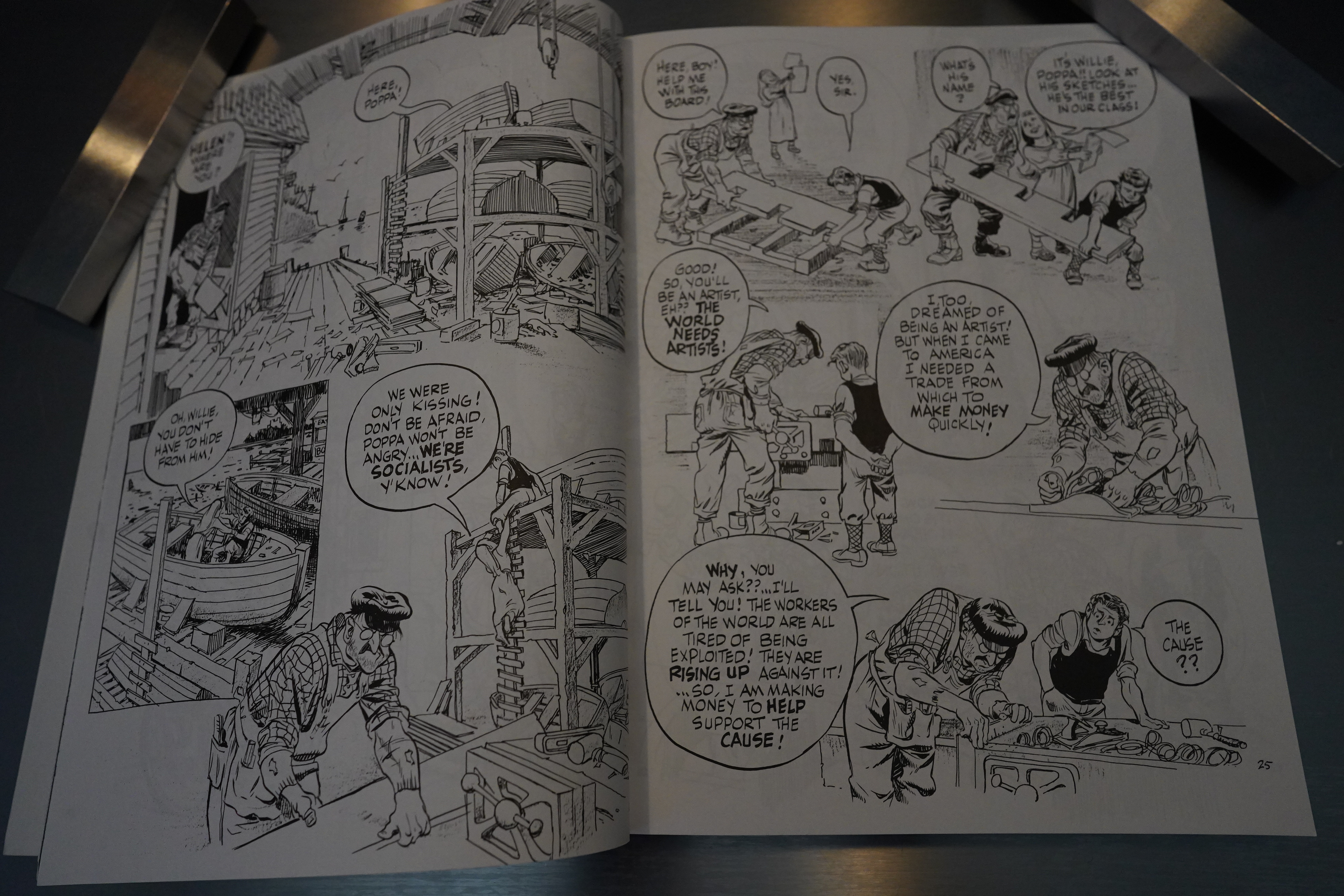
Eisner is often very affecting on this theme,
especially in the story Of Willie’s summer-long
toil at building a sailboat with his best friend,
Buck (a Gentile of German ancestry). While the
noisy politics Of race obsess the boys’
tive families, the boys themselves become in-
creasingly and pleasurably immersed in their
project, oblivious (or nearly so) to all the
ruckus. The pacing the tone of this sequence
are exactly right; it’s one of the best represen-
tations of a pure boyhood friendship (the kind
men can’t have, because they’ve learned about
status and money and power) that I’ve seen in
this medium. Eisner conveys Willie and Buck’s
golden afternoon with perfect control and a
sureness of touch.
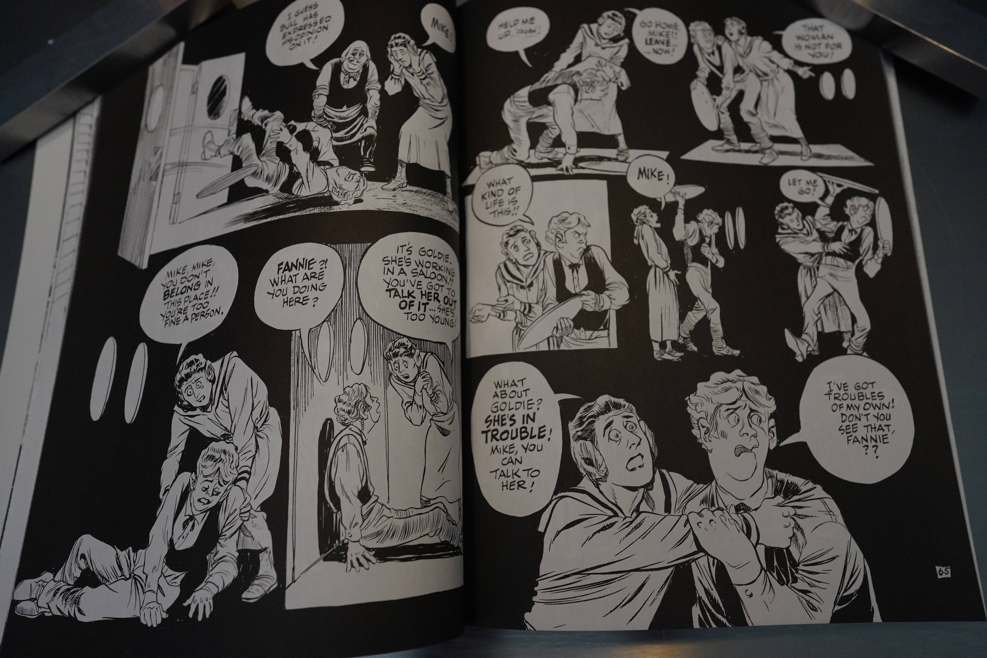
But virtually all the other sequences are
simply overwrought —
particularly the
flashback-within-a-flashback in which Willie’s
mother tells him the story of her life. (“Let me
tell you,” she moans, “I know from experi-
ence… life is not exactly perfect.. .you have to
do with what you given. . .for me it was
never easy.. .never.. ..”And that’s just the se-
gue.) I’ll give Eisner the benefit of the doubt
and presume that the litany of oppressions that
constitute Willie’s mother’s life conforms to the
hard facts Of Eisner’s (Nn mother’s life; but the
tenor of that life has here been hyped up to an
almost hysterical degree — it comes off as a kind
of melodramatic binge. As her troubles magniW,
Fannie Wolf clutches her breast, she to her
knees, she raises her hands in supplication to
those who might help her. She’s a vulnerable
innocent in a hard, cruel world, ami we’re PNC-
tically exhorted to weep for her. But the fever
pitch of the narrative subverts any sympathy we
might have for her; I found myself remember-
ing Oscar Wilde’s remark on Dickens’s The Old
Curiosity Shop: “One would need a heart Of
stone not to laugh at the death of Little Nell.”
The problem here is that the exaggerated,
cynical cartoon vocabulary that Eisner invented
so many years ago works for his ironic,
comic Spirit stories (and for his short urban
anecdotes), but it’s not remotely suited for
anything resembling an epic Or a saga. Every
artist has limitations, and maybe Eisner simply
hasn’t come up against his before; but just as
Damon Runyon couldn’t have written Anna
Karenina, Eisner can’t pull off the kind of thing
he’s trying for here — it’s beyond his range.

[…]

So, To the Heart of rhe Storm doesn’t take
us into the heart of a storm at all — the best
it can manage is a couple of quick cloudbursts.
Had Eisner presented this as a stream-of-
consciousness memoir, or a kind of folk family
history, it might have gone down more easily;
but its pretensions sink it. What is the purpose
of the framing sequence (Willie on the troop
train heading toward boot camp)? Why is the
title of the work To the Heart of the Storm? Is
Eisner really suggesting that American anti-
Semitism Or ethnic separatism was a cause of
the Second World War? Your guess is as good
as mine. (If he thinks it is, he needs to give us
more proof.)
Eisner himself explains how this confusion
came about in his introduction: “I intended to
deliver a narrowly fictional experience of that
(pre-war) climate, but in the end, it metamor-
phosed into a thinly-disguised autobiography.”
Why, then, keep us pointed at the “Storm” in
Europe if the only storm he’s going to show us
is the teapot variety?

[…]

I don’t mean to dismiss Eisner as an old
master who can’t learn new tricks (a label that
seems, sadly, to apply to Harvey Kurtzman); his
range may be limited, but there is plenty to ex-
plore within that range — besides which, the
autobiographical form has sabotaged other
writers and artists (Ray Bradbury and Federico
Fellini come to mind). It tempts them with the
sort of excesses of sentimentality they otherwise
would have enough objective distance to avoid.
I can’t believe, for instance, that Eisner would
have made Fannie into such an impossibly vir-
tuous cipher if the character hadn’t been based
on his mother. We’re only shown her suffering
and endurance; we never feel any identification
for her — we never even know whether she loves
(or has ever loved) her husband

Well… I think that’s a fair review, but I disagree with some of it.

Bruce Canwell writes in Amazing Heroes #191, page 112:

Only Eisner’s youthful counterpart
Willie is able to avoid the mistakes of
his father: in World War I Sam Eisner
immigrated from Austria to America
to avoid conscription, then he married
shortly after attaining citizenship to
avoid the U.S. military draft. But
when Willie is called upon to serve
during World War II he refuses all the
available dodges and reports for
duty—he is determined to face the
unknown rather than perpetuate old
ways, old mistakes; Only when a
person can make such a decision is he
truly an adult; only then can he break
the vicious cycle of bigotry.
The story is richly textured, the art
is fluid and full offemotion—united,
they turn To the Heart of the Storm
into a major comics experience, a fit-
ting companion to Eisner’s A Contract
with God, A Life Force, and that most
underappreciated graphic novel, The
Dreamer.
If there is any justice in the world,
Mr. Kitchen and Mr. Eisner are gonna
sell a lot of copies of this one… •

The Comics Journal #146, page 11:

You Eisner-
Basher, You
RANDY REYNALDO

Of all the “Eisner-bashing” I’ve seen
in the Comics Journal in the last couple of years,
I was compelled to comment on Rob Rodi’s
negative review of Will Eisner’s graphic novel,
To The Heart of the storm (Journal #144).
I disagree with Rodi’s assertion that the book
doesn’t cohere to a “thematic whole.” Many of
the flashback sequences recounted in the graphic
novel not only underscore Eisner’s theme of
anti-Semitism (as well as racism and prejudice
on a larger scale) , but also demonstrate how they
shaped him as an artist and an adult. Rodi in
his own review points out th… many of the
story’s episodes revolve around “the way that
anti-Semitism permeated our culture in the early
decades of the century.” Furthermore, many of
these scenes are Often echoed throughout the
work, strengthening the cohesion of the story
even more.
Eisner uses America’s entry into World War
II, for instance, to create a parallel between the
son, Willie (Eisner), entering the service and
the father, Sam, •who left Austria at the begin-
ning of WOrld War I to avoid the draft. Although
he too could have avoided the draft, young Willie
decides to enlist because, unlike the father, Wil-
lie is more enfranchised as an American Jew
than his father was as an Austrian Jew. Because
they were only one of Many ethnic groups strug-
gling to establish themselves, Eisner shows that
Jews had more opportunities to integrate into
the mainstream and succeed in the U.S. than in
Austria. Willie’s father welcomed and encour-
aged this integration, sometimes over his wife’s
objections, by choosing to live in non-Jewish
areas and not discouraging Willie to make
friends with non-Jews. As a result, Willie is will-
ing to fight when the U.S. enters the war.
Eisner is not suggesting, however, that this
period was not without its problems; nor, as
Rodi proposes, is Eisner suggesting that “Amer-
ican anti-separatism or ethnic separatism was
a cause of the Second World War.” Instead,
superimposing world War II over Willie’s mem-
ories allows Eisner to demonstrate the irony of
Americans happily going off the war to fight
ethnic-based oppression without realizing that
similar prejudices existed right here at home.
As Rodi points out, young Willie is told that “a
Jew needn’t fight,” but as he matures, Willie
finds out that sometimes there’s no choice,
especially if it’s for a cause one believes in —
even the pacifistic and often compromising
father understood that.
In direct response to one of the questions
raised in Rodi’s review, the purpose of the fram-
ing sequence (the train trip to boot camp) is to
create a metaphoric link to the father’s asser-
tion that “life is a journey” — this too creates
a coherence that ties many of the stories within
the book together. This “journey,” along with
the parents’ own experiences and attitudes, all
contribute to the sum of Willie, the adult.
(A parent’s attitudes can have a negative ef-
fect on an individual as well; when Willie’s
mother tries to convince him that his father is
a failure as a businessman, Willie comes to his
defense by asking his father for business advice,
thus embarrassing his mother. This reverence
Of the father over the mother, which partly
results from the father and son’s similar tem-
peraments, may explain why the mother
sometimes comes across as unsympathetic.)

[…]

ROB RODI REPLIES: Randy, I’d like to reply to
your letter at greater length than I’m able to;
unfortunately, once I’d finished with it, I threw
Out the photocopy of To the Heart of the Storm
that was sent to me for review. This was not an
aesthetic decision, but a practical one. The need
for art may be strong, but the need for closet
space is eternal.
Even so, the work is fresh enough in my
mind to allow a few general responses.
First off: you state that “superimposing
World War II over Willie’s memories allows
Eisner to demonstrate the irony of Americans
happily going off to war to fight ethnic-based
[sic] oppression without realizing that similar
prejudices existed right here at home.” But it
isn’t the nur that frames (not superimposes) the
flashback sequences; it’s Willie’s ride on a troop
train. And his fellow recruits aren’t “happily go-
ing off to war” — they seem a bit dazed, if
anything; Willie’s seatmate even gives voice to
the general bewilderment. And, most impor-
tantly, WOrld War II was far more than a fight
against ethnic oppression; Germany’s invasion
and occupation of Austria, France, et al, was
a far greater incentive to fight than the plight
of Jews, Slavs and gypsies under Nazi rule. So
if it was German oppression of ethnic groups
that inspired Willie and his fellow soldiers to
enlist, Eisner should’ve said so.
But, uait — just as To the Heart ofthe Stom
doesn’t cohere, neither, it seems, does your let-
ter. A paragraph later you write that “the pur-
pose of the framing sequence [the train trip to
boot camp] is to create a metaphoric link to the
father’s assertion that ‘life is a journey'”; but
this contradicts what you just said about the pur-
pose of the framing sequences being to demon-
strate the “irony” of ethnic Americans going
abroad to fight ethnic oppression when it exists
in such force at home. Now, I know that in a
sophisticated work of fiction, a narrative device
(such as the train trip) can do thematic double-
duty — but To the Heart of the Storm is far from
a sophisticated work of fiction. Its characters
are leaden, its tone is consistently overwrought,
and its various themes — even presuming you’re
correct in your assertions — are deadeningly
banal: “life is a journey,” “it’s ironic to fight
oppression abroad when it exists at home.”

[…]

In the end, I can’t help thinking that you put
more work into analyzing Eisner’s intentions
than Eisner did, which is, I think, a common
failing of critics who approach cartoonists of
Eisner’s stature. His reputation not only sends
many nascent critical sensibilities scampering
away into dark corners, it also inspires even
those who should know better to give him the
benefit of the doubt when they see something
in his work that quite register. “He’s WIII
Eisner; he must have meant to do that,” they’ll
tell themselves. “And if I think hard enough,
I’ll find a reason he could’ve meant it.”
Fortunately, most of the Journal writers are
made of sterner stuff; I think few of us would
deny Eisner’s contributions to the comics me-
dium, but the “Eisner-bashing” you refer to in
these pages is, even so, not a case of lese-
majesre. Eisner is a working cartoonist, and
must continue to be judged as such. If you want
to hear the usual chorus of hosannahs every time
Eisner puts his pen to paper, there are plenty
of publications devoted to slavishness of that
sort; but as a Journal critic, I say a cartoonist
is only as good as his most recent work. It’s up
to those of us who want to see the medium grow
to stand toe to toe with such artists and say,
“What have you done for us lately?”

Harsh!

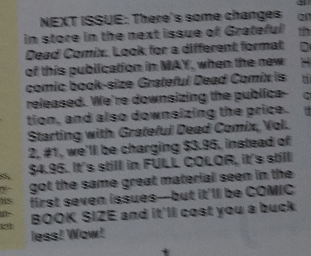
This book has been reprinted several times. Here’s some reviews on the interwebs:

Boat dissing:

Ironically, a lot of Eisner’s autobiographical stuff is really boring. He gets into fights with the neighbourhood kids because he’s Jewish, he builds a small boat with a wealthy German kid – ehhh. It’s nothing special.

To the Heart of the Storm isn’t among my favourites of Will Eisner’s books, and I wouldn’t say it’d appeal to anyone but fans, but it’s not a bad read, particularly if you’re in the mood for a Dickensian comic!

Hm:

The one criticism that could possibly be levelled is the simplicity of characters’ approach to situations, which could come across as being stereotyped and formulaic, but equally, could just be the obverse of the energy and straightforward narrative drive of the story. It would rather be like criticising Hamlet for being full of cliches and hackneyed old sayings. It’s a ‘Yes’. Highly recommended.

Hm:

From his denial of Jewish prejudice in America to his determination to escape a cultural stereotype by choosing to fight in World War II, Eisner’s story feels familiar and overlooked. This book comes highly recommended for its high quality narrative and illustrations, as well as the reminder it serves about America’s own history and legacy of continued discrimination during a time period when history books still too often overemphasize the country’s blameless and heroic character.

There sure are a lot of reviews:

We found the way in which the author’s train-travelling alter ego remembers his past to be a little too chaotic though, especially interspersed as it is with further dramatised recollections built from the memories of his parents. This is probably one best left to those with a particular interest in the era or the circumstances in which Eisner grew up, as it left us feeling like we wanted more, that too few conclusions had been drawn. Or perhaps that’s just the way life is.

So… it doesn’t seem to be a generally well-reviewed book — opinions differ more than usual for Eisner.

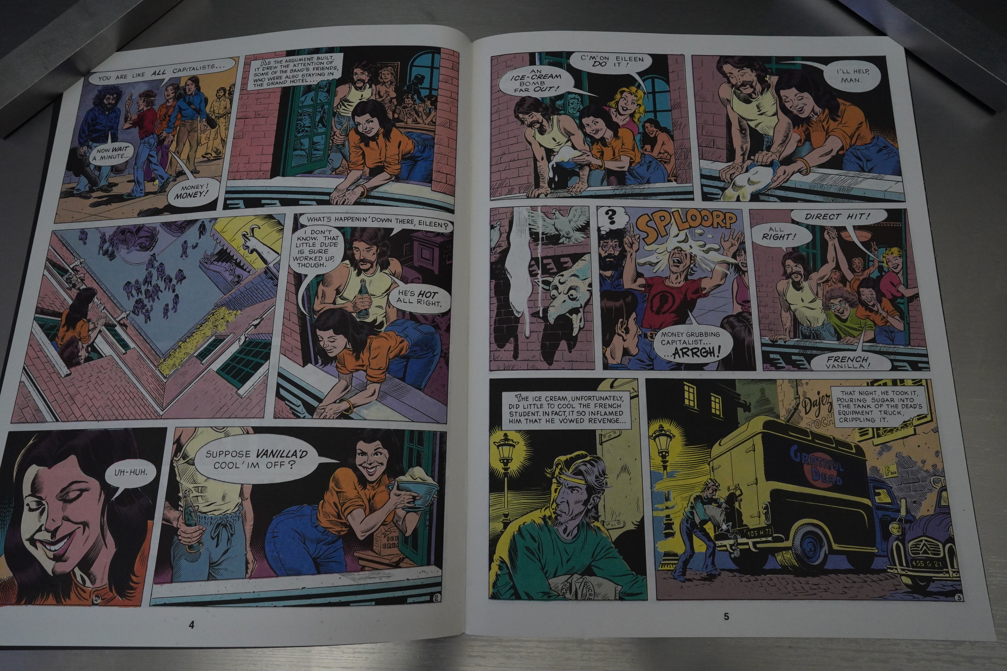
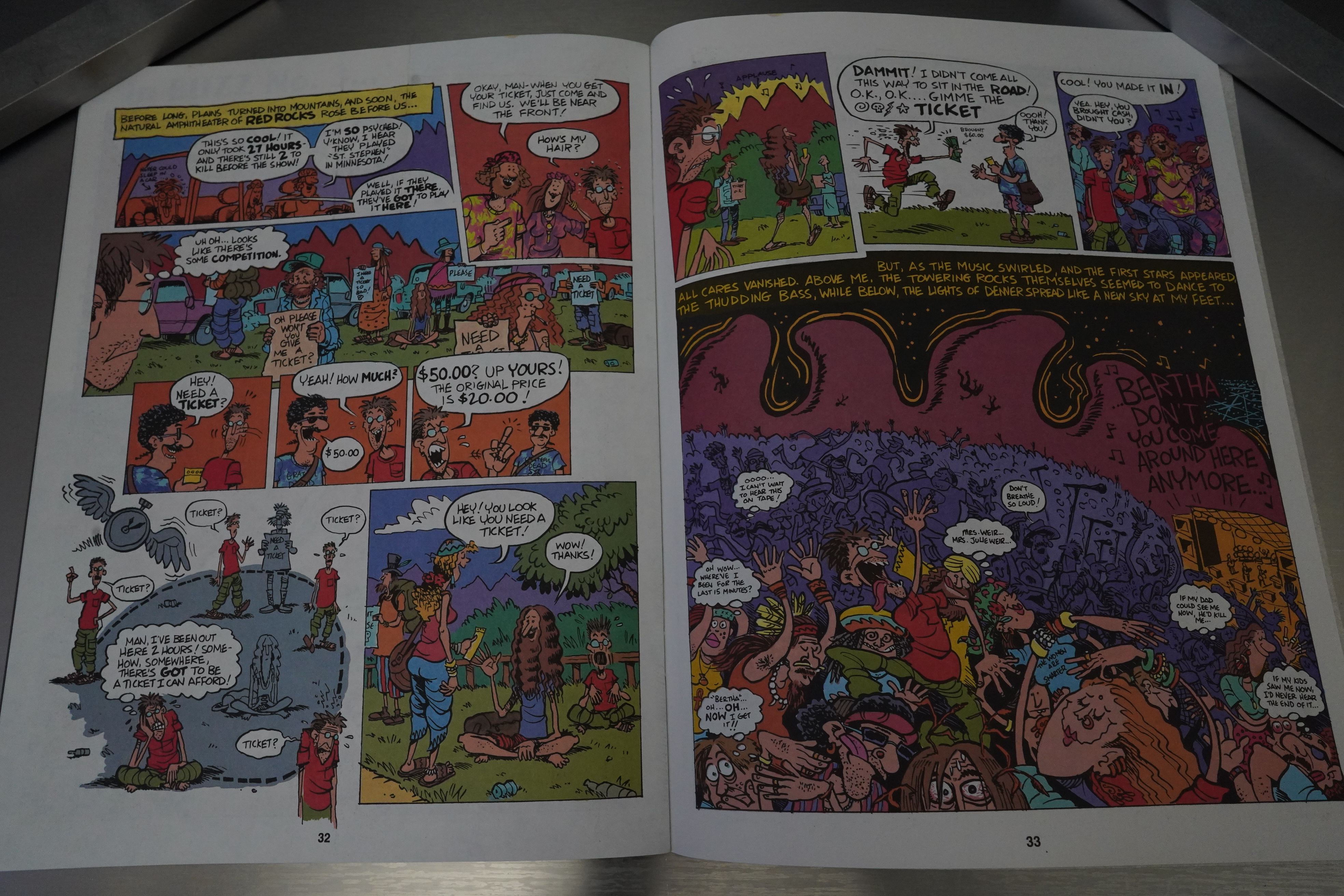
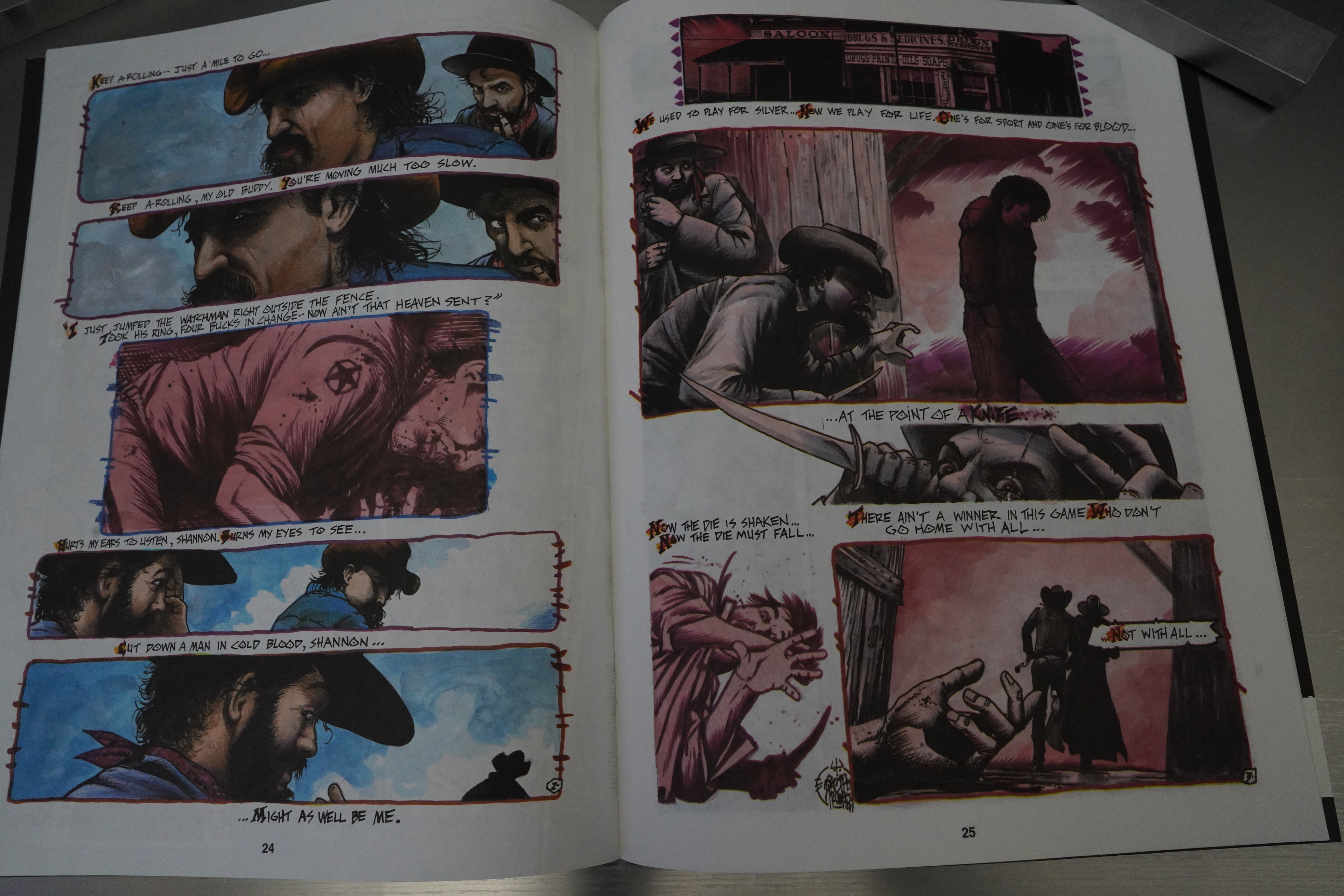
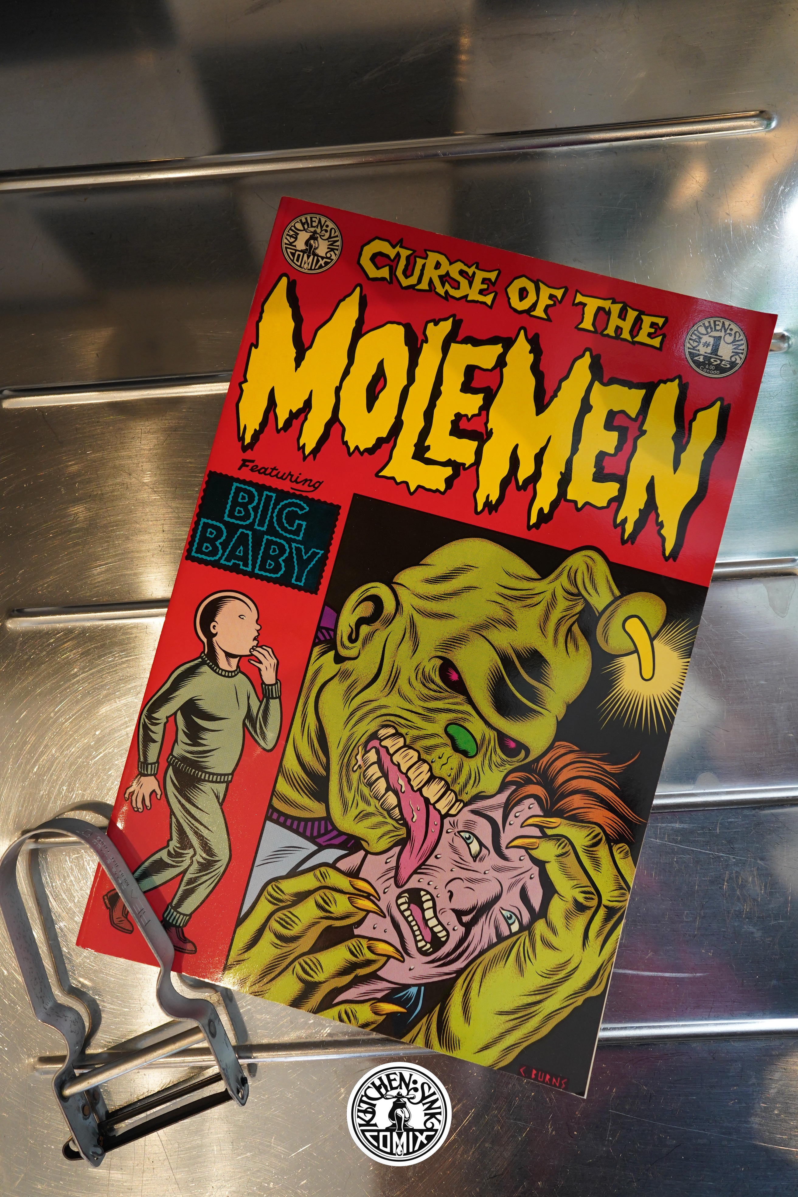
This is the one hundred and thirty-first post in the Entire Kitchen Sink blog series.

1991: Grateful Dead Comix

Grateful Dead Comix (1991) #1-7,
Grateful Dead Comix (1993) #1-2 edited by Dave Schreiner

Welcome back to this blog after an unexpected half-year hiatus.

Let’s see whether I remembered how I used to do this… I’ve got a new lens for the camera, so hopefullythis will be less out of focus now.

Uhm, a bit on the dark side… I should have more light when snapping pics. Oh, well, I’ll fix that for the next post.

Anyway, this is a 40 page magazine sized book with cardboard covers. And it’d printed on recycled paper, with soy inks, by a non-polluting printer, apparently. Right on! (It may even be edible.) (For $5, which doesn’t seem to be unreasonable if it also gets you a salad.)

But what is this? Yes, indeed — it’s a collection of illustrated lyrics. So we’re talking about a publication that’s for the most hard-core of hard-core Grateful Dead fans. Of which I’m not — I’ve barely heard any of their songs. I think the music they’re playing is something called “rock”? I don’t know from that.

Tim Truman is in every issue of this series, and I’m not surprised that he’s a fan, and the grizzled artwork works well here.

Dan Steffan takes on Terrapin Station with a totally different, sci fi approach. And it’s bizarrely spread over two issues — there’s four more pages in the next issue, for some reason.

There’s a lot of ads in these books, for various related Grateful Dead merchandise. About ten pages per issue? Which seems a bit odd, since these books otherwise seem kinda high class. On the other hand, doing merch seems to be part and parcel of the Grateful Dead experience, so…

You can’t say that they go for a unified art style. (Fred Carlson.)

But they’re all quite straightforward in their approach to adaptation: They basically illustrate, panel by panel, what the lyrics say. I expected a more diverse range of approaches — for instance, telling an opposing story, or doing… something. But I guess I’m totally outside the intended audience for this, so what do I know.

And Moebius shows up for a page.

Only the first issue was printed on recycled paper, because that stuff sucks. (I’m rephrasing slightly.) Right on?

Rand Holmes does an anecdote from the band’s history, and this is kinda more what I imagined that this series was gonna be like. But it’s so slight an anecdote that even Holmes’ artwork doesn’t really help much.

Finally! Some good comics! Terry LaBan (who’s been to over 200 Grateful Dead shows) does a story about going to one of their shows. And it’s fun. He does a handful of these bits over the length of the series, and they are (for me) the best bits of the series.

Tim Truman, like I said, is in every issue, and he does vary his choices quite a bit. All the stories are somewhat Western-inspired, but they look nice. But what’s up with the colouring here? Kinda unusual… but looks nice and organic.

Mary Fleener! Well, I guess I should have expected that, her being all psychedelic and stuff.

Oops. Out of focus! Need more light… Darn. Anyway, this was originally planned to be a four issue series, but sales were apparently unexpectedly good, so the series continues.

John Wooley/Dan Burr does a couple of stories of Grateful Dead anecdotes, and… They’re OK? But not really thrilling.

LaBan’s stories are a lot of fun — look at those dance moves. Just look at them!

As with most any anthology, people get tired of doing short pieces, so they start a four part serial where Tim Truman adapts a mooted Grateful Dead opera. It’s still basically the same stuff, though, so it’s neither better nor worse than what’s gone before. It’s just… more.

Eric Vincent’s artwork looks great, but is printed slightly off register?

Oops! Darn!

Anyway, after issue 7, they drop the 40 page magazine, and start a 32 page standard comics version. Presumably the sales had been dropping, and they’re trying to see whether a format change will help?

Chris O’Leary’s piece looks great, but it’s still really really literal.

So we come to the final two issues, in a smaller format.

It’s printed on glossy paper, too. And… Reed Waller can draw people, too!? Not just anthropomorphics?

Huh! Paul Ollswang. I wouldn’t have guessed it’s him, but it’s really cool.

The final Wooley/Burr anecdote is the most substantial one.

OK, when I’m taking close-ups I have my camera too close, I think?

Anyway, they announce that this is possibly the end of the series, and it is.

This series was somewhat controversial internally in Kitchen Sink: Grateful Dead, as part of the licensing agreement, demanded that they own the resulting comics fully. This means that the comics had to be done on a work-for-hire basis, which Kitchen hadn’t done before: All the comics they’ve published have been creator owned. (Except some of the reprints.) In addition, Grateful Dead demanded full approval rights to everything, which was also a hard pill to swallow.

The Comics Journal #148, page 24:

Another Band May
Sue Revolutionary
Revolutionary Comics’ Rock n ‘ Roll Comics is
being threatened by another band that doesn’t
want an unauthorized comic book to bear its
name. The Grateful Dead, like New Kids on the
Block before them, are claiming that three soli-
cited issues of RRC about them constitute a
trademark violation. Both the Dead and the New
Kids have their own licensed comics: both have
the same merchandising agent, MCA/Winter-
land Productions.
As of Feb. 6, the Grateful Dead Merchan-
dising Corp’s attorney, Joseph A. Yanni, has not
yet sued Revolutionary. He has written a “cease
and desist” letter demanding that Revolutionary
publisher Todd Loren not distribute the issues.
Loren says he will proceed with the comics. “Of
course, if they do take legal action,” Loren says,
“we will fight them, as the industry sits back
and jeers us as they have in the past.”
During the New Kids case (which ended in
a letter of judgment banning Loren from reprint-
ing the New Kids issue of RRO, Loren applied
for legal and financial assistance from the Comic
Book Legal Defense Fund. He was turned do’,vn,
on the grounds that he was fighting a trademark
case, not a First Amendment case. The fund’s
administrator, Kitchen Sink publisher Denis
Kitchen, is also publishing the authorized Grate-
ful Dead Comix. Kitchen says that if Loren
Kitchen Sink’s authorized Grateful Dead Comix.
makes a new request to the fund, he will refer
the decision to the fund’s board of directors.
While the decision to take any legal action
against Loren would be made by the band’s rep-
resentatives, Kitchen does have a few words
about the dispute: “We’ve gotten a lot of good
publicity and reviews for our Grateful Dead
Comix. The argument is going to come down
to confusion in the marketplace.. .We’re not say-
ing he can’t do unauthorized biographical com-
ics; he just can’t do it with the band’s name so
dominant on the cover that it’s creating confu-
Sion with our series.”

Right on? And… it’s a small comic book world: Loren wanted help from the CBLDF with doing a Grateful Dead book, but CBLDF is run by Kitchen, so…

R. Fiore writes in The Comics Journal #150, page 45:

Grateful Dead Comix #1-4
KITCHEN SINK
It goes without saying that anything to do with
the Grateful Dead is for the faithful only, and
for that hardy fraternity buying Grateful Dead
Comix should make just as much sense as hoard-
ing hundreds of hours of concert tapes. It’s a
slick color production, all quite snazzy except
tor the socially responsible but still slightly
cruddy recycled paper (abandoned after #1).
Most of it is given over to rock video-style in-
terpretations of song lyrics, often featuring band
members as characters. For what it’s worth, let
history record that the foremost interpreter of
Grateful Dead lyrics is Tim Truman. Truman
perfectly captures Robert Hunter’s smoky, sepia-
tone Haight-Ashbury version of the old west,
and reveals a grittiness that you might not have
known was there. Truman aside. the best inter-
.pretations are the ones that take the most liber-
ties. particularly Frank Gresham’s berserk take
on “Friend of the Devil,” which is reminiscent
of the poetry “interpretations” in the old MAD
comics. and Mary Fleener on “St. Stephen.”
Fleener has a knack for capturing rhythms on
paper, and while you usually have to supply the
soundtrack in your head. she is the only one pre-
sent who seems to have incorporated it into the
strip. breaking away from all psychedelic cli-
Ches. Unfortunately, for every highlight there’S
a pedestrian performance, usually by someone
trying to recapture underground comics styles
with neither the energy nor the originality. The
song interpretations are sometimes (though not
often enough) leavened by tour and concert an-
ecdotes. Here, again, the one good/one bad pat-
tern holds; Rand Holmes’ “Lille Story” doesn’t
have much of a point. but Terry LaBan’s “Red
Rocks •82” is one of the best things in the series.
The opening line encapsulates the secret shame
of this band’s followers: “To be honest, I don’t
really think of myself as a ‘Deadhead,’ and it’s
hard for me to believe I’ve seen them 200 times.”
Sounds like something you’d hear at an AA
meeting. doesn’t it? But there he is, riding hun-
dreds of miles, sleeping in the rain, and trading
his friend’s spare tire for tickets. It’s the sense
of humor that both the band and the fans have
about themselves that keeps Grateful Dead
dising and idolatry. though if you’re really look-
ing for a cartoon equivalent Of the Dead
ambience, you’d be much off with any Old
Freak Brothers comic, which Kitchen will also
be happy to sell to you

Thomas Harrington writes in Amazing Heroes #196, page 68:

Kind of hard to imagine that this
official (01991 Grateful Dead
Merchandising, inc.), deluxe (five
bucks, in full color, and on recycled
paper) comic book is based on one of
the most laid back, unostentatious
bands ever to hit the big time. But hey,
this is the ’90s, right?
It’s also almost clean enough to get
a “G” rating, which surprised me.
That the book seems no less entertain-
ing for this surprised me even more.
With a package like this I wanted
to see some pretty exceptional mater-
ial. I got it half the time.
This book, which adapts four
popular Dead tunes, has been a
surprise direct market hit for Kitchen
Sink, due in no small part its star
artist, Tim Truman. Truman, inter-
preting “Dire Wolf,” gets to combine
three of his favorite subjects: The
Dead, the frontier, and ornately
dressed psychopaths. It’s a typically
strong job from the artist, whose art,
as always, manages to look incredibly
gritty and unbelievably slick at the
same time.
At the opposite end of the spectrum,
but equally good, is Nina Paley’s
manic treatment of “Casey Jones.”
Paley is one of the foremost praction-
ers of the rubbery, underground
cartoon style that’s so associated with
the Dead and acid rock, and it’s a
wonder that she’s not better known.
She presents a funny, warped version
of the legendary locomotive engineer,
as viewed through a wide angle lense.
Fred Carlson’s “One More Saturday
Night” isn’t quite as good, though its
rough style grows on you. It’s helped
along greatly by Randall Berndt’s
psychedelic coloring.
The book’s only real disappoint-
ment is Dan Steffan’s “Terrapin Sta-
tion,” here interpreted as a space
station romance. Though the artist has
good draftmanship and a clean line,
his adaptaion is pedestrian and un-
imaginative compared to the work of
the other artists.
Since only half the book’s material
seems really worthy of this first class
treatment, Grateful Dead Comix does-
n’t rate as highly as it might, but any
fan of the Dead, Truman, Paley (and
Moebius, who contributes the inside
back cover), or mck comics in general
will find this a. fun read.

Some of these bits were reprinted in book form by Kitchen Sink, but some googling now seems to show that they’re not longer in print. I guess these comics aren’t as commercially viable today, since there are presumably fewer Grateful Dead fans? I dunno.

This is the one hundred and thirtieth post in the Entire Kitchen Sink blog series.

1991: Hey Look!

Hey Look (1991) by Harvey Kurtzman

Kitchen Sink’s been publishing a lot of reprint collections in various formats, and some of them haven’t been quite ideal. This book feels just right, though — compact and satisfying, somehow, as an object.

People writing introductions (in those days) felt compelled to shovel it on with a trowel.

But it’s fun reading these early Kurtzman strips. Kurtzman hasn’t quite developed his line yes, and things look more influenced by animated cartoons than his artwork would later become.

The humour veers between over-the-top zany and goofy word play.

Sometimes the gags are pretty strained, but I guess he was on a deadline.

He doesn’t get meta all that much, but… this is pretty ingenious.

Kurtzman’s great at making things so absurd you just have to kind of go along with the gag.

Towards the end, Kurtzman’s mature style develops, with those thicker inky lines.

Anyway, I’m sure I’m not surprising anybody by claiming that the Hey Look strips are pretty amusing. Reading this many in one sitting, though, did not have a cumulative effect (you know, where things get funnier and funnier), and instead it’s rather wearying?

The book also collects some non Hey Look strips. Some are very Mad-like.

And some are more conventional.

The Comics Journal #151, page 113:

Harvey Kurtzman’s “Hey Look!” one-pagers, used
as filler in Timely (later Marvel) Comics’ cheesecake
and kiddie titles in the late 1940s, are fondly remem-
bered while the detritus they summed has lxrished
in obscurity. Gathering all the various issues of Nellie
the Nurse and Gay Comics (no relation to the current
title!). etc., to get these delightful, graphically exciting
strips is a feat beyond human ken, but the folks at
Kitchen Sink have done it. In these strips. produced
fmm 1946 to ’49. you can see Kurtzman finding him-
self as both a humorist and a cartoonist. The first
25-or-so episodes are teeming with klutzy gags and
stiff drawing. Towards the middle of “Hey Look!”
Kurtzman slips into first gear and plays wildly and
joyously with the conventions ofthe comics form. bu
can also see the satirist he’d soon become lurking in
the wings. The bmk’s designer. Monte (Blab!) Beau-
champ and his talented assistant, Dale Crain. have
done the t*St job rescuing rnany of thee strilh
from their atysmal original printings. Blessedly, most
of the later “Hey 1.00k! “s conne from crisp photostats.
as do the tx»ok’s backup features. which include the
very MAD-Iike \ÅCstern comedy Shot Pete” and
the less involving ‘Genius” and “Egghead Docxile,”
the latter barely recognizable Kurtzman’s work.
Stylishly packaged in a RAW-sized volume, The Com-
plete Hey Inok! is long overdue, offering a vast chunk
of Kurtzman’s undergraduate “Ork. Now somebody
needs to reprint the complete runs of Trump and Hum-
bug. Kurtzman’s post-MAD satire mags. Any takers?

Mark Barnette writes in The Comics Journal #153, page 46:

Kurtzman’s first published Hey Look! strips
are as reductive as early Ramones, peeling away
the non-essential elements of plot — leaving as
much as can be shoe-horned onto a single page
— and putting the strip and everything in it to
the service of the gag — which, admittedly, was
often pretty hoary.
Here in abundance are the familiar violence
and the peculiar visual codes of gag comics:
sweat marks popping out of characters’ heads,
the tipping over backwards to indicate surprise
or exasperation — the sine qua non of standard-
issue funnybooks. Understood by nearly every-
body, the product was therefore presumed to be
salable, even to the readers of Great Lover
Romance.
In a traditional comics device, Kurtzman
employs two characters, a big stupid guy and
a small short-tempered one (both nameless), in
almost every Hey 1.00k! strip. Sometimes the
big guy will violate some law of physics: sitting
on the ceiling or trying to drown himself while
wearing a water-repellent coat. Sometimes he’s
overly-literal, as when he brings a potted plant
to a palm reader or mixes up a deck of cards
with a Mix-Master. These shenanigans infuriate
the little guy, who can be seen tipping over,
sweat marks suspended, or bashing the big guy’s
head with the blunt side of an axe in the final
panel.
On the face of it, these early Hey look!
pages might be the ‘*Ork of any journeyman car-
toonist laboring in Lee’s employ at the time. But
there are enough suggestions Of what was to
issue later from Kurtzman’s fevered brain to be
found here that a more careful reading is re-
warded. Eventually — and especially if the
reader attempts to barrel through the book in
a single sitting — a rhythm asserts itself, and
the one-two punch of the strips becomes hyp-
notic. Punchlines reminiscent Of schoolyard
jokes — “I just remembered! I can’t swim!”
tap into something familiar and comfortable,
while bit by bit Kurtzman begins standing that
comfy tradition on its head.
Even the earliest strips toy with the notion
of the characters’ awareness of themselves as
inhabitants of a two-dimensional world.
“Deemed, destined and doomed to a comic
book existence — nothing but a two-dimensional
caricature of a life. I want to die!” says the big
guy in a strip in which he keeps bouncing back
onto the bridge from which he hurls himself,
thanks to his water-repellent jacket. The very
first Hey Inok!, in fact, ends with the short guy
gunning for “the guy dat wrote this gag!”
but Kurtzman wasn’t yet confident enough to
allow his handiwork to actually catch up to him.
Later strips, however, become more authorita-
tive. As his art became less beholden to comics
conventions, Kurtzman began his reconnais-
sance for an assault on the formalities of the
idiom — turning panels inside out, or allowing
his characters to communicate between different
episodes.

[…]

In another strip (one that must have raised
some eyebrows at Timely), the two decide they’d
like to try “some regular adventure comics for
a change!” and become caped am] cowled super-
heroes, bouncing bullets Off their chests for fun
and indulging in little bit of sadistic violence”
— and some stock moralizing, too. In the end,
surrounded by corpses, up to their knees in
blood, nauseated, they decide to return to Hey
1130k! , where it’s back to business as usual.
“Ha!” says the little guy, “Nothing like good
clean funny comic fun! No blood! Nobody dies!
Nothing to clean up! Nothing!” — all the while,
of course, flattening his partner’s head with a
mallet.
Hey lnok:’ came to an abrupt end in 1949,
just as Kurtzman was hitting his stride. Accord-
ing to Benson, Timely assigned him to illustrate
a Blondie rip-off called Rusty. where he was ap-
parently let go for not copying Chic Young’s
style closely enough.
He continued to freelance, scraping by with
very unremarkable kid-strips, also included
in this volume; one for Lee called Egghead
Doodles (“That’s me!”), and the other for Elliot
Caplin at Tobey Press called Genius. But the
next step towards MAD and posterity was an-
other series for Caplin called Pot-Shot Pete,
which included three ambitious five-pagers —
two of which were assured enough to be later
reprinted in MAD.

This is the one hundred and twenty-ninth post in the Entire Kitchen Sink blog series.

1991: Curse of the Molemen

Curse of the Molemen (1991) by Charles Burns

I wasn’t quite aware of what extent Kitchen Sink had become a reprint publishing house by 1991. They’ve done reprints of comic strips and the like since the late 70s, but now they’re also reprinting books like this, originally published a handful of years earlier.

But this time it’s in colour, on very shiny, white paper.

The original book was smaller, and in black and white, and it felt like such a perfect, mysterious little object. It was alien, with Burns’ insectile people and odd, but familiar, storytelling. I hadn’t expected the format to make much difference, but printed in colour, in normal comic book size, it’s just a whole less powerful, for some reason. It reads more like camp? While the original book was horrifying.

But I mean, it’s still Burns.

Kitchen Sink had, by this time, perfected their production line. They’d tried out a lot of stuff in the 80s, but now most anything that had any sort of nice appeal would also be available in signed and numbered hardcover editions for $$$. It sometimes seems more mercenary than anything else.

This is the one hundred and twenty-eighth post in the Entire Kitchen Sink blog series.