Category Archives: Uncategorized

1988: Li’l Abner Dailies

Li’l Abner Dailies (1988) #1-27 by Al Capp

I know all the readers (I’m sure there’s several? Right?) of this blog is going: “Hang on. That’s not a picture of 27 Li’l Abner collections in that picture up there?”

Well spotted!

For the previous blog posts in this series that have dealt with Kitchen Sink’s huge reprint projects (The Spirit, Steve Canyon, etc), I do have the comics in question, but I didn’t bother to actually read them, because it would have taken months. Well, for Li’l Abner I didn’t bother to buy the books, either, because I’m never going to read them — I’m just not a fan of Al Capp.

Sorry!

But let’s look at the one volume I happen to have, #8.

The book starts off with two essays that both wonder why Li’l Abner shied away from dealing with WWII subject matter.

The book starts, oddly enough, with a 1941-12-09 strip. I wondered whether that was because Kitchen didn’t want to start in the middle of a serial… but that’s just what they do. So… they just have a certain page number target, and fill a volume with strips until they’re out of pages, perhaps?

This format for reprinting comic strips isn’t unusual, but I’ve always found it to be odd. I mean, one quarter of each page is basically dead space (i.e., the logo). If that bit hadn’t been there, then the book might be been uncomfortably short and unstable, so there’s probably a practical reason for it, but…

I love George Herriman’s comics, and his play with dialects, but I’ve somehow found Capp’s treatment of the same to be tedious and annoying.

But his artwork’s nice, I guess, and some of the gags work.

I’m still not reading these books.

This is the one hundred and third post in the Entire Kitchen Sink blog series.

1988: A Life Force

A Life Force (1988) by Will Eisner

When I was like twelve I really liked Will Eisner’s comics. Then I grew up to be a wise-ass teenager, and I thought that his stuff was kinda maudlin and embarrassing.

Reading all these Eisner comics now in my dotage, I’m taking that thesis and that anti-thesis and landing on a synthesis: His comics are kinda maudlin and embarrassing, but I like them.

Eisner has many, many faults, like choosing some Great Theme for a book, and then hammering it home with the subtlety of a 2200Watt Heavy Duty Electric Demolition Jack Hammer. This one has survival as the Great Theme, so we get cockroaches every nine pages to remind us.

But that’s a really good drawing, isn’t it?

This was originally serialised in Will Eisner’s Quarterly some years earlier. Eisner’s books have a tendency to be a series of vignettes that’s tied together by that Great Theme, and this is organised the same way — but basically tells only one story (with some digressions).

I feel like I’ve seen that page in Mad Magazine.

Anyway, this is Eisner’s big 30s depression book, and he drops in quite a few pages of news stories and factoids and stuff…

And even a kind of … fairy tale.

He’s also big on ironic contrasts: To the left, we have idealistic Communists, and to the right, we have real life, which means mobsters coercing shops to unionise. (I’m sure there’s an ironic contrast in there somewhere in Eisner’s mind.)

But this book differs from many of his other works. Of course it has an “ironic” ending, but this time it’s not quite what you’d expect. Instead he lands a sorta-kinda happy ending, but in an ambiguous and wistful way.

I think it kinda works? (I’m not showing you what that ending is here or anything; I’m not spoiling the twist!) Eisner, as he always does, ties up all the loose ends, but it’s done so brazenly efficiently that goes from trite to overwhelming, and I can’t help being impressed.

What I’m saying is that this is a quite good book, and much better than most of Eisner’s books.

Or perhaps Eisner is slowly brainwashing me.

Bill Sherman writes in The Comics Journal #92, page 66:

With “A Life
Force,” Eisner gives us a seriesof fine-tuned
interlocking character studies set in Con-
tract’s Depression milieu, pieces that com-
bine Eisner’s Characteristic comic book art
style with a range of physical and verbal
expressiveness that humanizes his subjects
beyond the traditional caricature.

Dale Luciano interviews Eisner in The Comics Journal #100, page 87:

Following that came Life Force. Life Force
is reportage. It’s billed bv Kitchen Sink as a
sequel to Contract With God. simply
Ex•cause it takes place in the same area and
at the same time. But there I attempted a
kind of quasi-historical work, where I
reproduced articles that appeared in
newspapers at the time and built my stories
around that facade, using the newspaper
articles to give moment to the stories, to
give a historical reference, and at the same
time build a story around a man who was
looking for a meaning of life. In the case of
A Contract With God. was one where the
first story dealt with a man’s struggle with
his relationship with God. Somehow or
other God sometimes does not fulfill on his
bargains that are part of the contract that
we create. We’re always creating a contract
with the deity. In the case of Life Force, it
was really an observation that man con-
tinues to move on as a result of some inner
force that keeps him going despite all the
things that happens to him. And I compare
it to the cockroach who keeps going and
going on without any perceived reason. So
those three novels each deal with a subject
area that requires a little life experience to
appreciate.

I think the book was generally well received:

Though not as well-known as A Contract with God, in many ways A Life Force surpasses its predecessor. While that first book was technically a collection of short stories, A Life Force is truly a novel, one complete work of literature that develops over the course of roughly 140 beautifully illustrated pages.

WW Norton combined this with A Contract With God and Dropsie Avenue into a brick:

A Life Force follows the ways in which love, tradition, organized crime, and politics affect the inhabitants of Dropsie Avenue more than they are willing to admit. Again, readers see Eisner’s hard work to create natural borders for his panels or to painstakingly integrate them into the scenery. The end results puts readers deeper into the story in a kind of physical sense that straightforward panels could not accomplish.

This is the one hundred and second post in the Entire Kitchen Sink blog series.

1988: Flash Gordon, The Complete Daily Strip

Flash Gordon, The Complete Daily Strip (1988) by Dan Barry with Harvey Kurtzman

This book is in a very unusual format for no discernible reasons. There’s often a problem with finding a good format when doing reprints of comic strips because Sunday pages and daily strips have different requirements, but this is just daily strips, so printing four to a (huge) page is just odd. Using the same format at the Steve Canyon books would have been more logical, and they you could have printed the strips larger, too.

Anyway, the first couple months of this strip is just Barry without Kurtzman, and Barry was trying to take the strip away from the more fantasy oriented origins and going in a more hard sci fi direction — so we get a plot involving a prison in space. It’s pretty good, and Barry’s artwork is certainly appealing.

Then Kurtzman comes aboard as the writer, and all that goes out the window, and we’re in more action/fantasy territory again.

And it’s not that it’s out of character for women to throw themselves at Flash Gordon, but it’s so abrupt here that it seems like we’re in parody territory.

Yeah! That’s showing Dale, Flash!

And then, out of the blue, we suddenly get a dramatic narrator, as if this were one of Kurtzman’s war comics?

In short, the Kurtzman/Barry collaboration is a mess — the plots seem to make no sense, and the tone veers wildly from one strip to the next.

There’s excellent supplemental material in this book, though, including a long essay from Dave Schreiner.

He’s interviewed all the people involved, and gets them to speak frankly. Barry had a lot of problems working from Kurtzman’s plots, but was too polite to actually fire Kurtzman. So the collaboration went on for a year, until Mad became a hit and Barry felt like he could finally let him go gently.

An amusingly enough, it sounds like Kurtzman knew nothing about this dissatisfaction on Barry’s part (until he presumably read it here).

Oops!

It’s good journalism and worth the book alone.

We also get some pages of Kurtzman’s layouts, and some Frazetta pencils, and it’s a really good archival release.

As for the Barry/Kurtzman strips, they’re… not good.

Steve Ringgenberg writes in Amazing Heroes #137, page 57:

AH: And what kind of format will this
be printed in?
SCHREINER: It’s a hard and soft-
cover book. It’s a hard 28 pages. It’s
kind of an odd-sized book. It’s going
to be 12″ high by 9h” wide.
AH: And how are you putting the
strips on the page?
SCHREINER: Four strips on a page.
We had a set of proofs from Harvey
Kurtzman who wrote a good portion
of that time period we’ll be printing.
And we’re reprinting the strips at the
size of the proofs which were 12″
wide by a couple of inches high and
just run it straight through.

[…]

SCHREINER: After the first story
that Barry completed, he and Harvey
Kurtzman got togethermd Harvey
wrote the next year or so of the strip.
AH: Right; I’ve talked to Dan and he
discussed a little bit about what his
relationship with Harvey was like.
SCHREINER: They had some con-
flict, but they still had a good work-
ing, well, they had a workable rela-
tionship at least through that period
of time.
AH: From what Dan said I gathered
their working styles clashed. He said
he maintained respect for Harvey all
through the period even when they
were having troubles doing the strip.
SCHREINER: Harvey corraborates
that. We talked to Harvey for this
book and he really felt that Dan Barry
definitely had his own strong ideas
about which direction a story should
take and so forth, but they still got
along. And, personally, I guess they
got along very well.
AH: It’s always heartening to hear
that people can clash creatively and
still don ‘t have any animosity.

Amazing Heroes #137, page 41:

AH: Did Kurtzman use his usual
stick-figure layouts?
BARRY: He used the same writing
style he always did, and it was im-
possible for me to work over. (laughs).
What happened is, here’s a guy who
can tell a story wonderfully in this
wild bigfoot style, but you start to add
drawing to it, you lose the punch, and
at the same time the goddamn paradox
is that you’ve been looking at his
drawings and you’ve forgotten how to
draw! (laughs) So what came out was
some kind of bastardization that was
a stiff me. I hated it! And Harvey kep!
—well, he didn’t have any hair to pull
out, he wore a very close-cropped
crew cut, but he was pulling his hair
out because he was by then an editor.
This was while he was planning Mad,
but he was doing those war and hor-
ror books for EC, and he had this crew
of guys who loved working for him
and could translate his layouts fairly
faithfully. More than that, his being
the editor, he could insist that they
bend, so they did. For me, it didn’t
make any damn sense. •I’d hired a
writer, and I found myself with a boss!
(laughs) This is impossible!
Our taste was totally different. I
called on Harvey because, as I told
you, I’d met him during the organi-
zing days of that union that never hap-
pened. I’d been very impressed with
him. He looks like an intellectual, or
did then: bow tie, crew cut—he looked
like the super egghead Harvard
graduate.
AH: Yeah, Harvey looks intelligent…
BARRY: well, he is intelligent, but
his taste is the lowest brow you can
find! And he loves it! That’s his taste
and that’s probably his greatness. Our
tastes didn’t jell. (laughs) It’s really
amazing because I liked him all along,
but I was almost getting an ulcer try-
ing to decide how I was going to abort
this thing withgout hurting his feelings
and without crushing that enormous
ego. I don’t think it’s any secret, I
think he might admit it, Harvey always
believed himself the greatest creative
genius that was ever born. Nobody
quite knew how to tell him [when
things weren’t going right].

This is the one hundred and first post in the Entire Kitchen Sink blog series.

1988: Melody

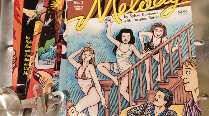
Melody (1988) #1-10 by Sylvie Rancourt, Jacques Boivin and Gabriel Morrissette

I vaguely remember this book being slightly controversial — Rancourt had published a number of mini comics on her own, but when Kitchen Sink picked up the project, they didn’t think Rancourt’s artwork looked professional enough, so they got Boivin to do the artwork.

(This is all from memory; I have no idea whether that’s accurate.)

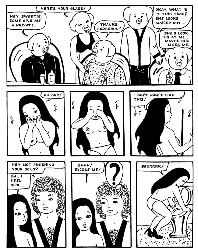
But Drawn & Quarterly published a collection of her original mini-comic a few years back, and it was generally well received. Here’s a sample page:

So, yes, I can understand why Kitchen Sink didn’t think that’d fly in the comics shops, and I can also understand why the Boivin-drawn comic has never been reprinted after 1990 or published to a bookstore market.

One other note before I start reading — Kitchen Sink would only start publishing a single original series after this that lasted more than ten issues after this, which means there’ll be less reading pr. blog post for me from now one, so perhaps I can keep to a daily schedule…

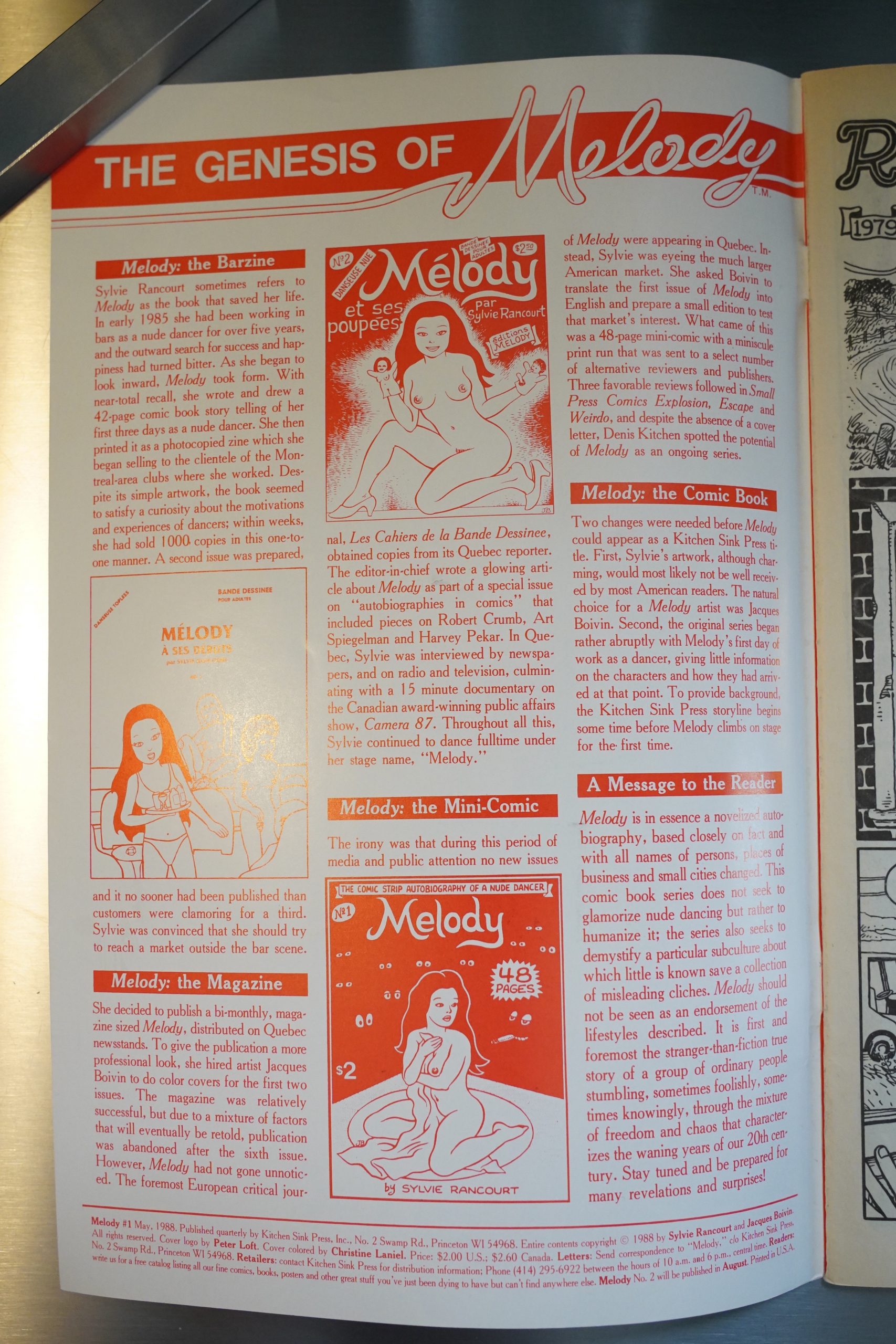
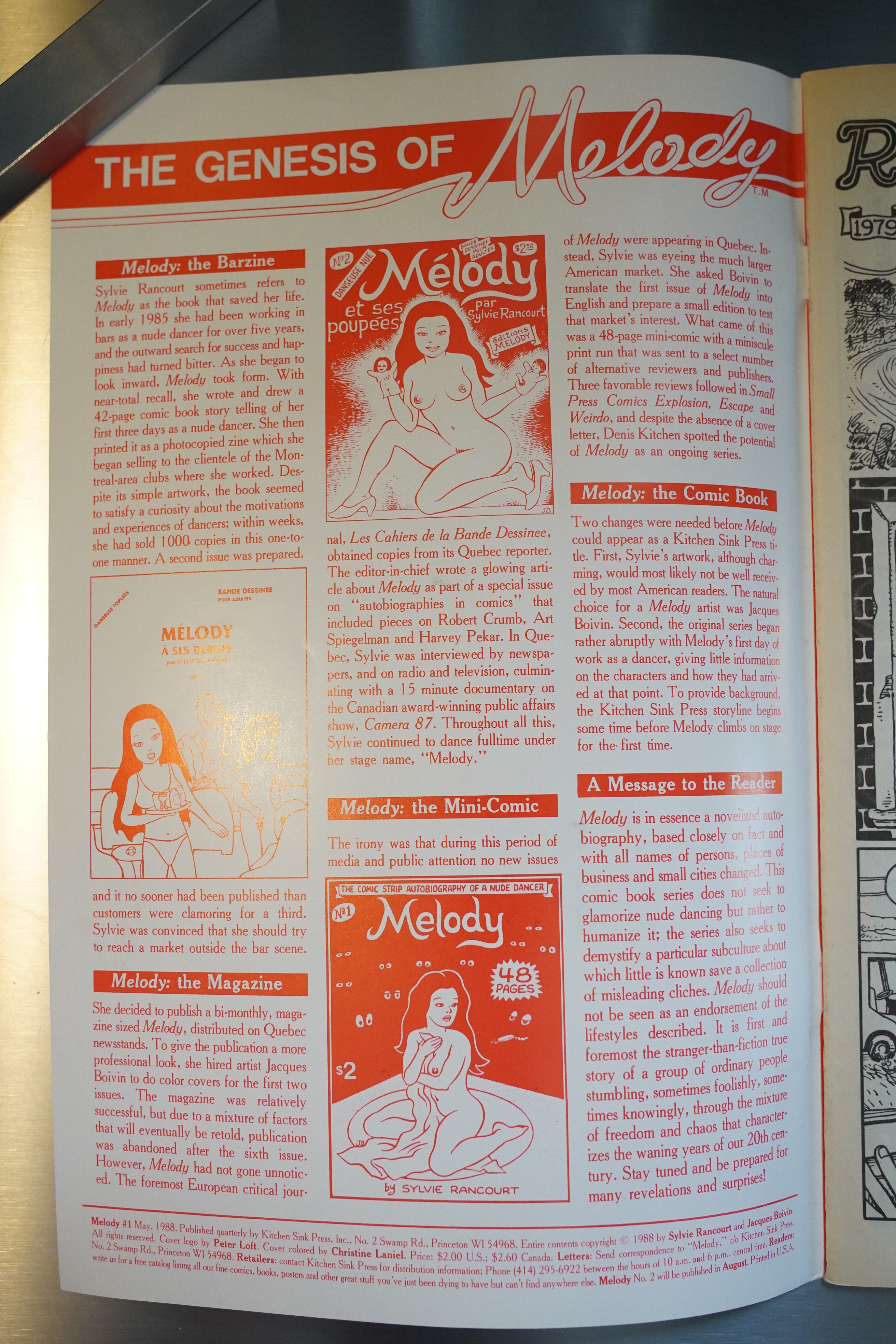
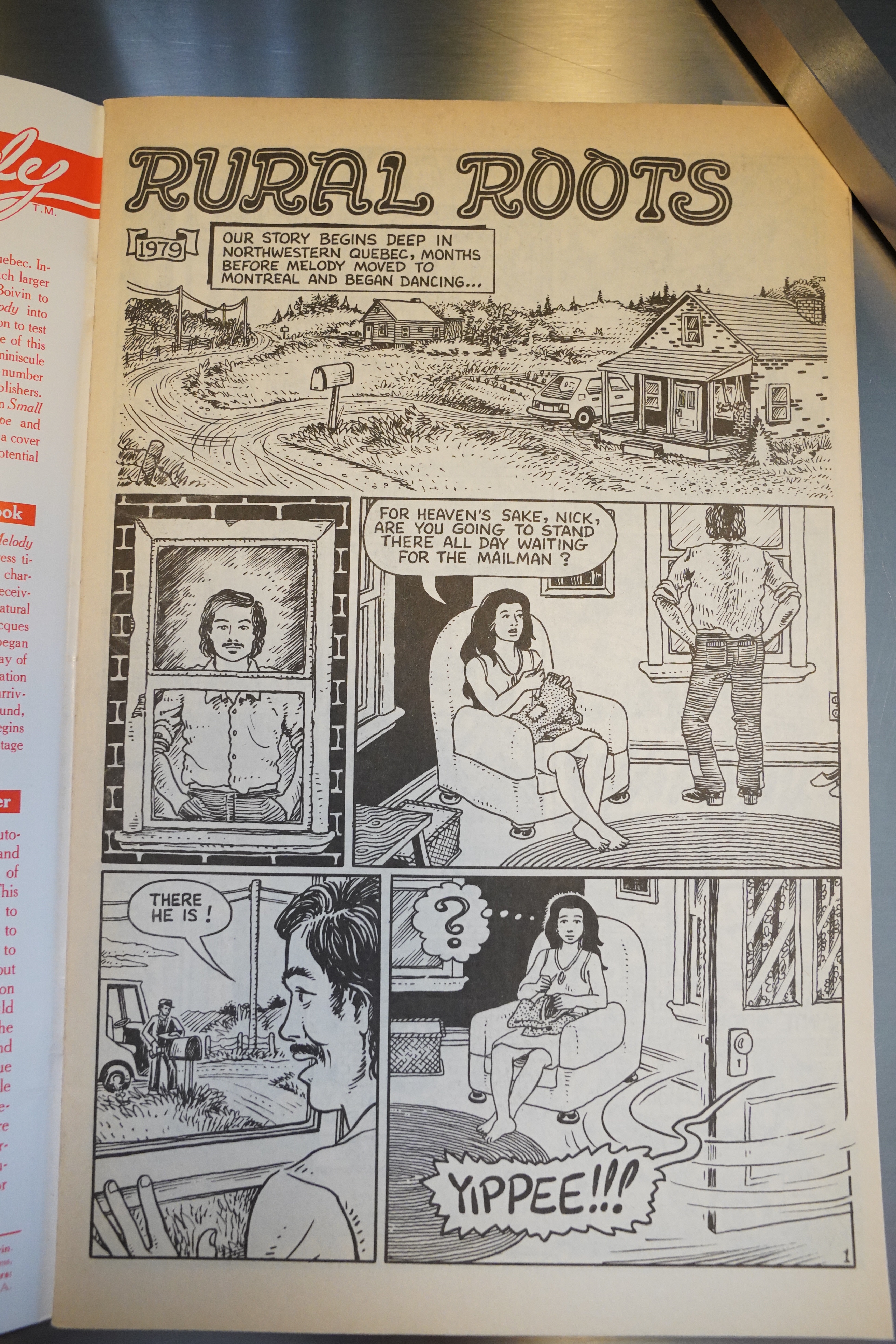
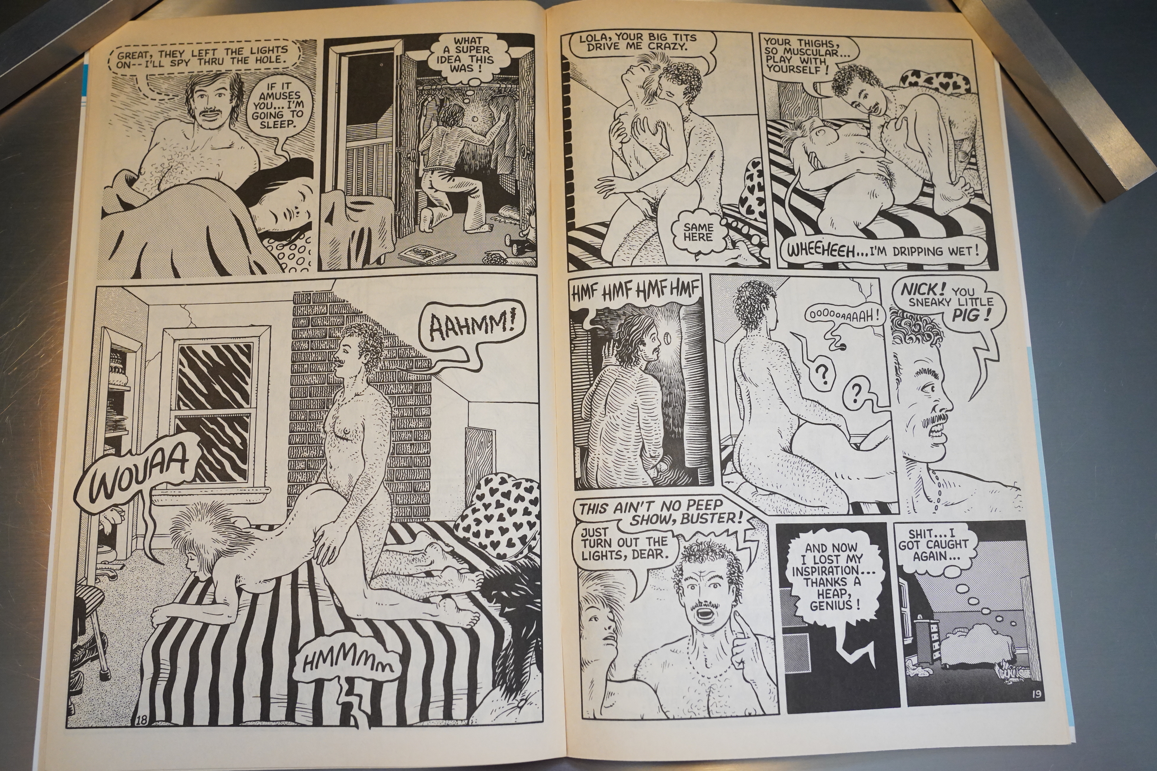
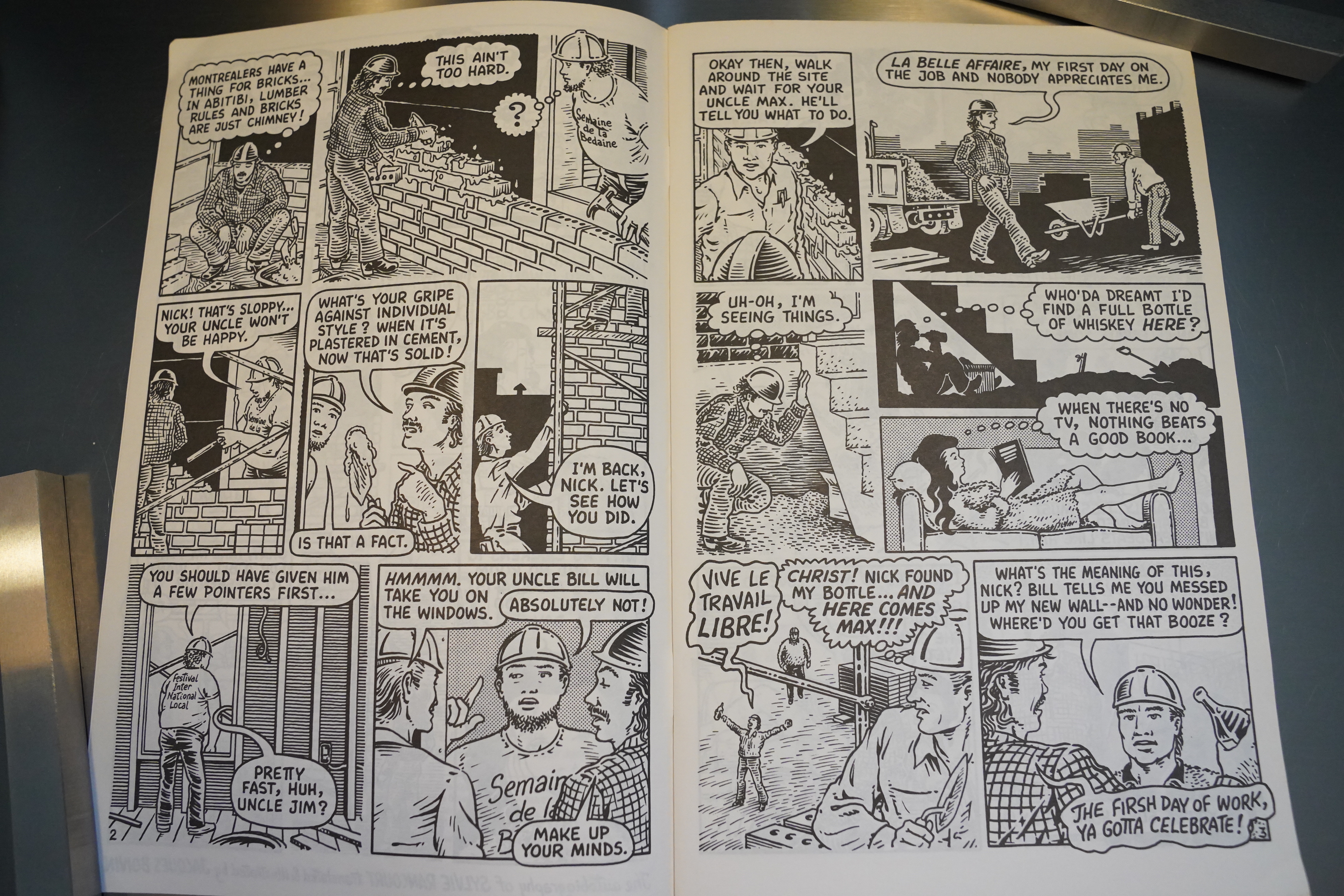
Ah, right — the inside cover on the first issue has the whole publication history. But I’d forgotten that Kitchen had requested that Rancourt give us her “origin story” — comics people are such nerds. Her solo work had just been about working as a nude dancer, but this series is about her life before she started dancing.

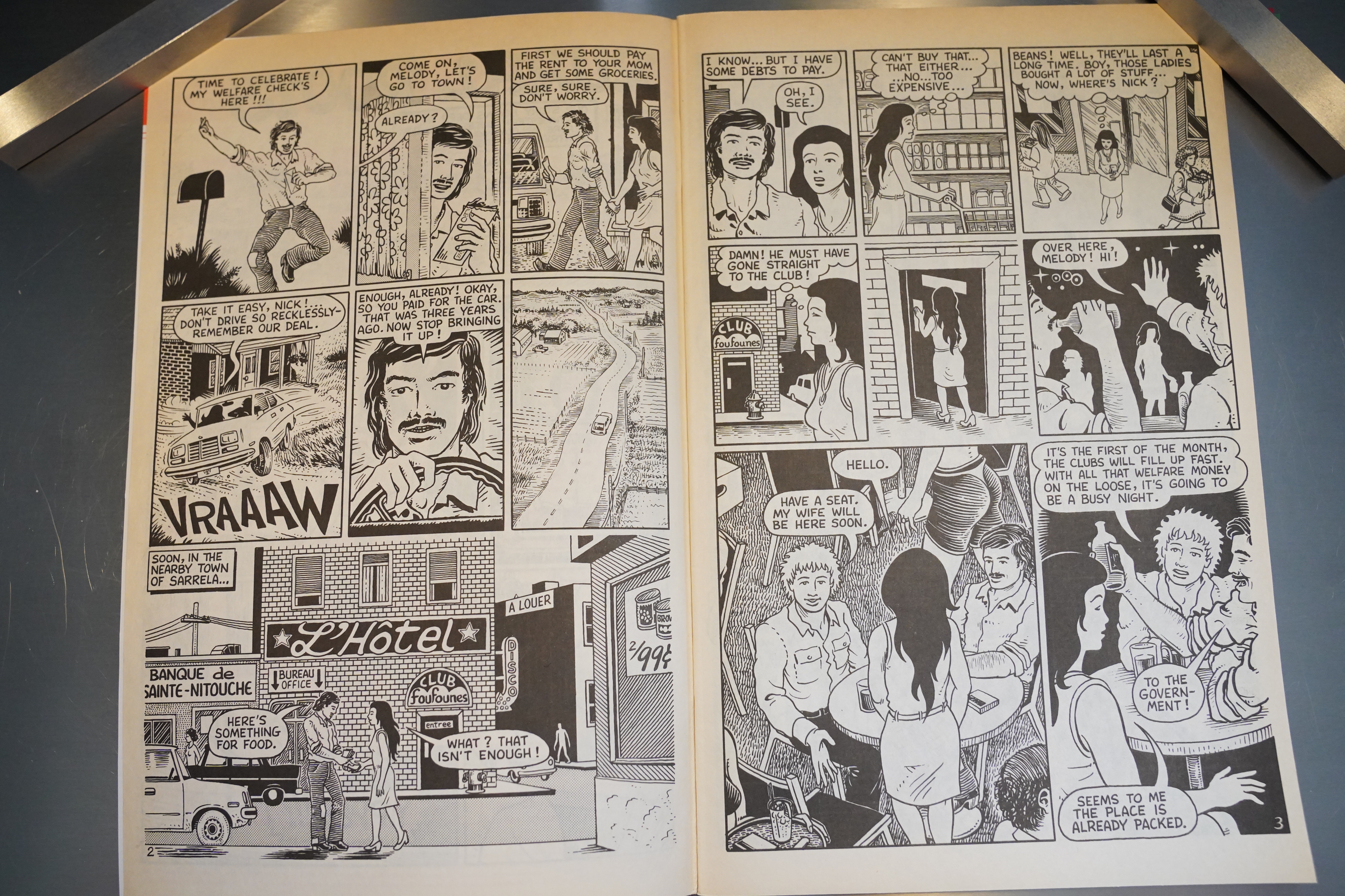
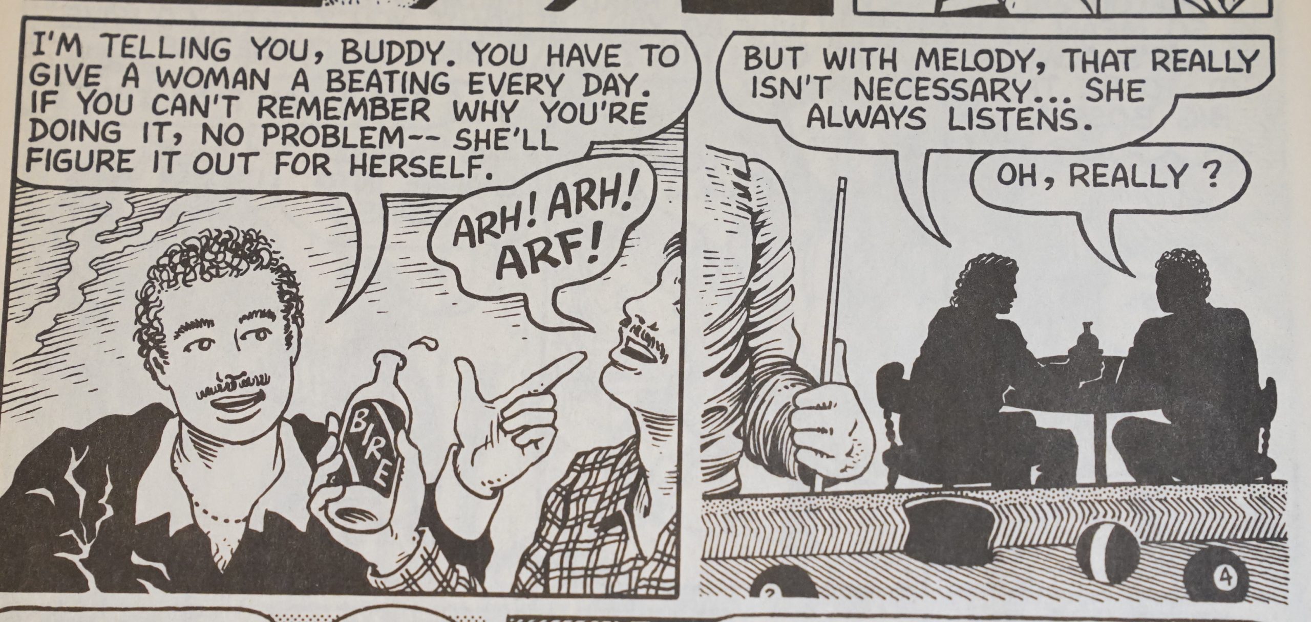
So we’re in rural Abitibi, which (I’m guessing from this book) is pretty rural, but a very poor part of Ontario? Or perhaps it’s just the people Melody’s hanging out with, and especially her slacker husband, who’s pretty hopeless when he comes to money.

His routine is getting his welfare check, and then spending it all in one day at the local strip club. (He eats at his parent’s house, but Melody doesn’t go there, because they don’t really like her.)

I know, I’m recapping the plot here 3000% more than I usually do, but it’s just so tempting somehow.

Anyway, Boivin’s artwork is fine — but it’s in a style that gone pretty much out of style. It’s very, very straightforward, with nary any inventive blush.

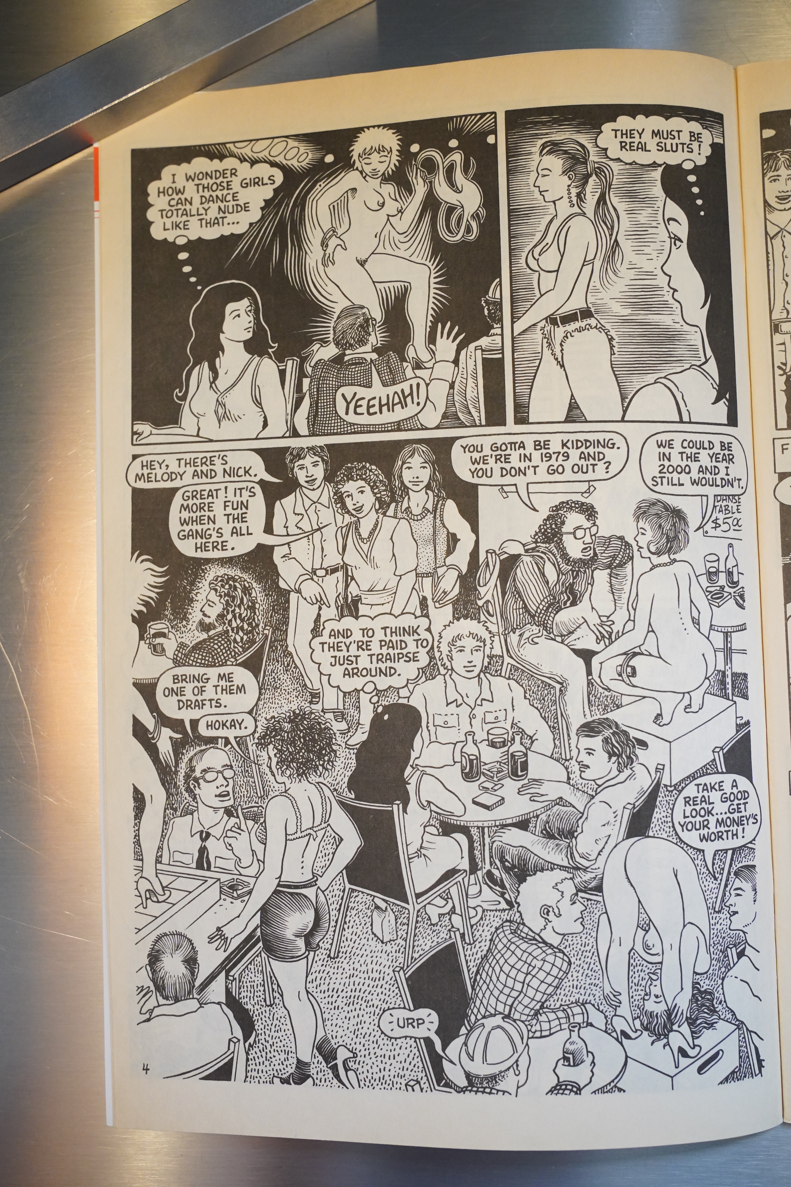
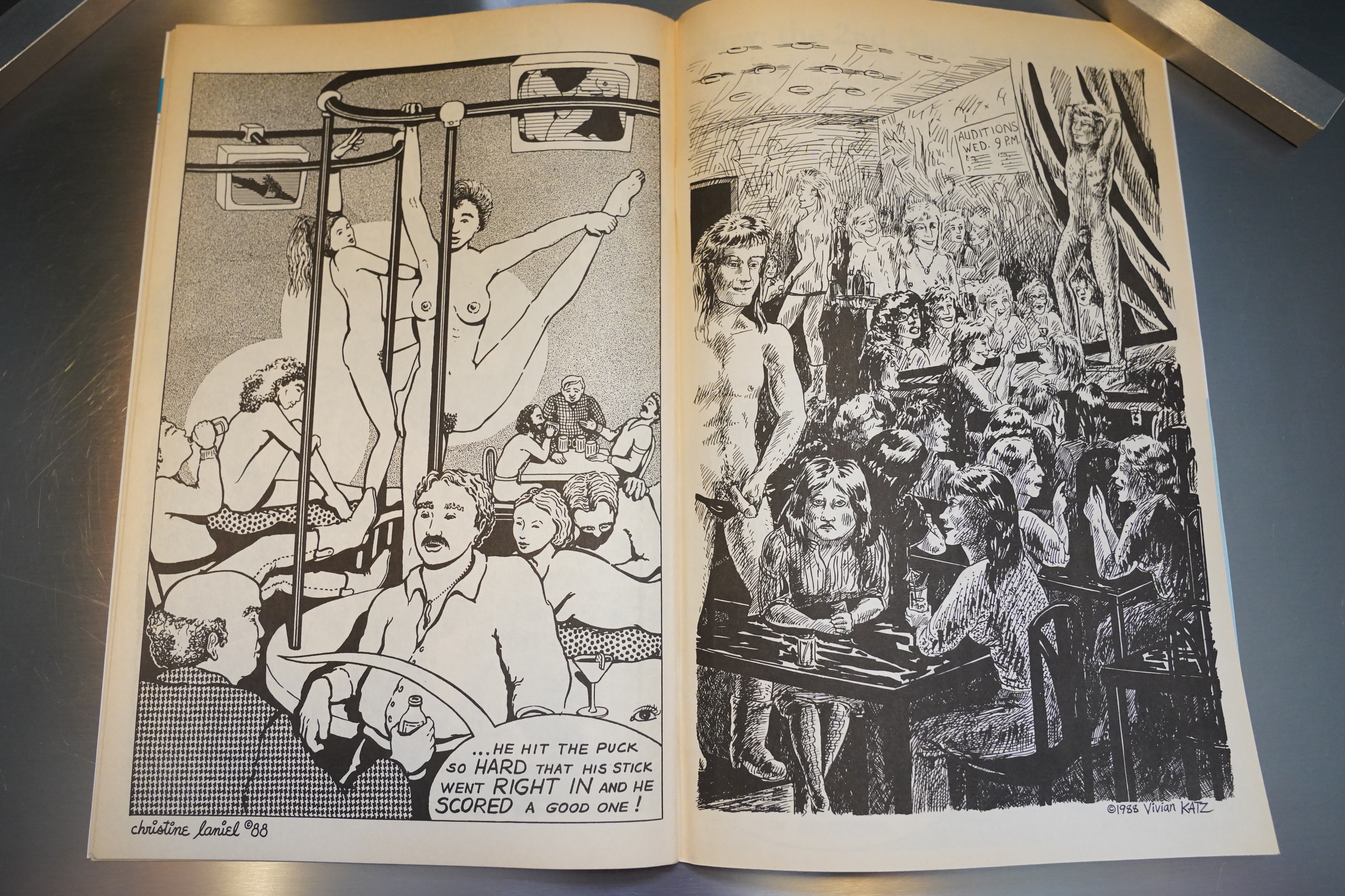
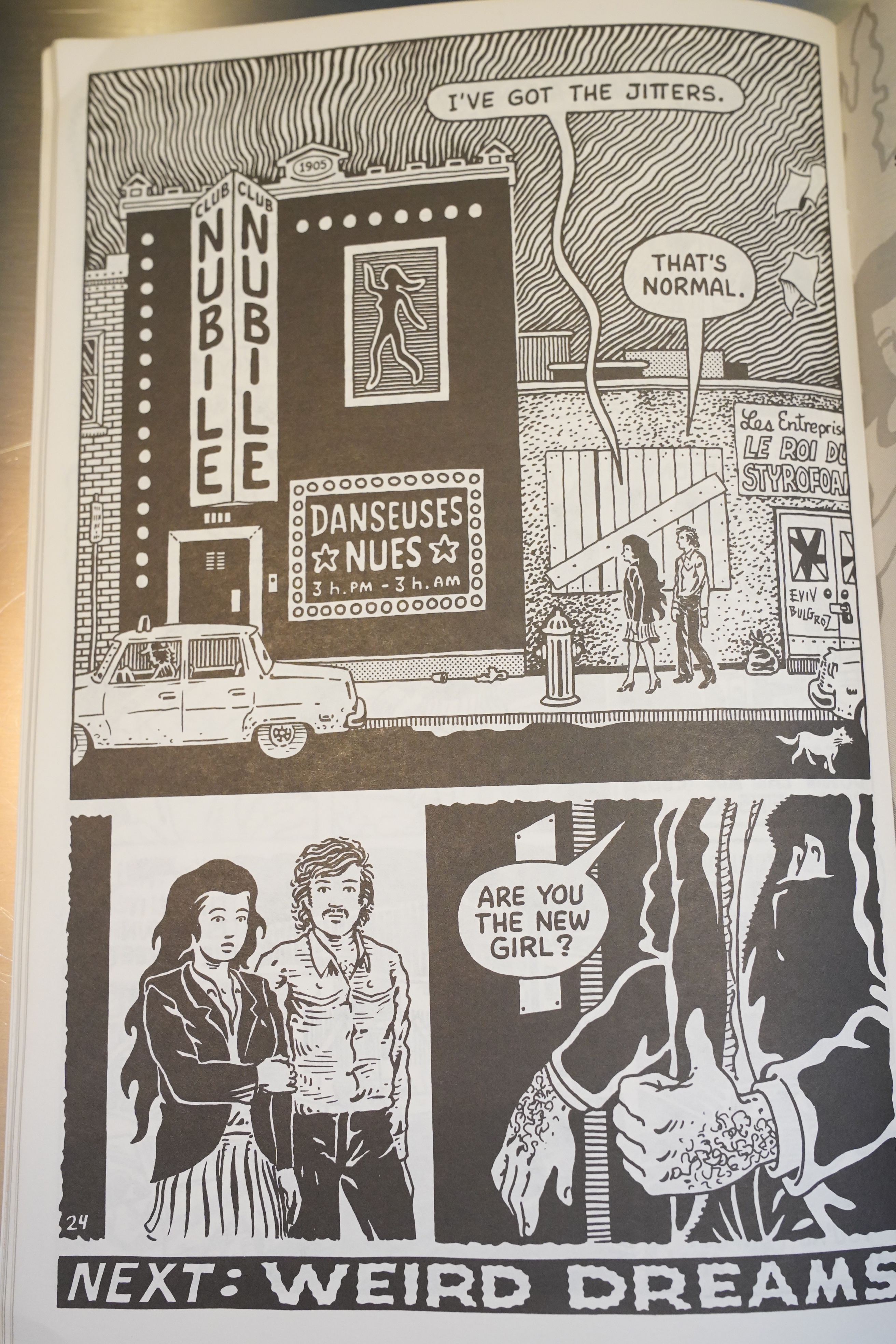
I guess the most innovative thing he does are these tableaux from strip bars, where we catch all the patrons and the dancers all at once. It’s sorta kinda oddly abstract, because the perspectives aren’t really meant to be realistic… it’s interesting.

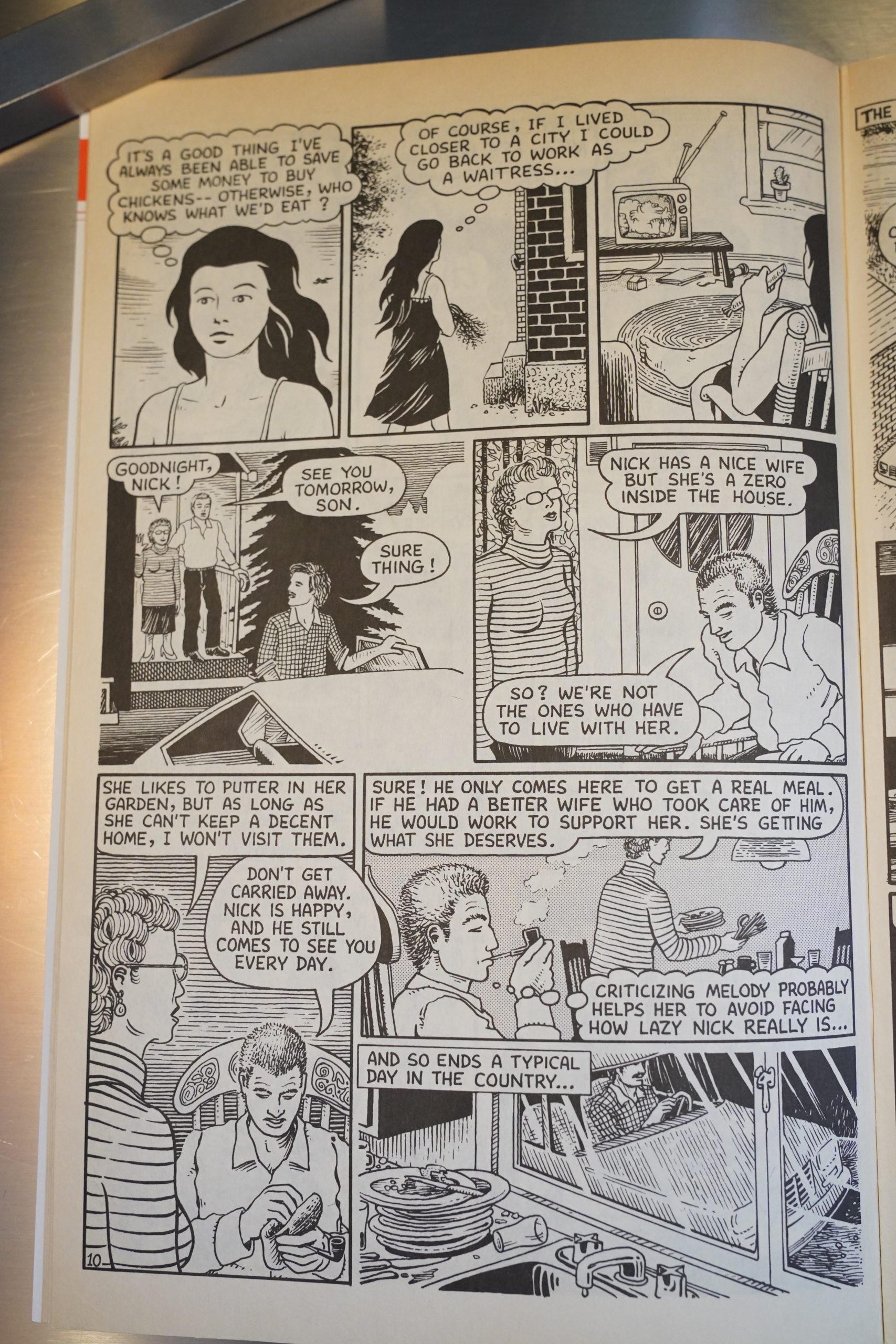
The storytelling overall is befuddling. I mean, if you think about it too much. It’s Rancourt’s autobio, but we’re somehow given more insights into the though processes of other people, and things that happens when Melody’s not around, than we’re given into Melody herself. So we have an omniscient author point of view… except what’s actually going on with Melody herself. I mean, we get thought bubbles like the above, but it’s surface stuff.

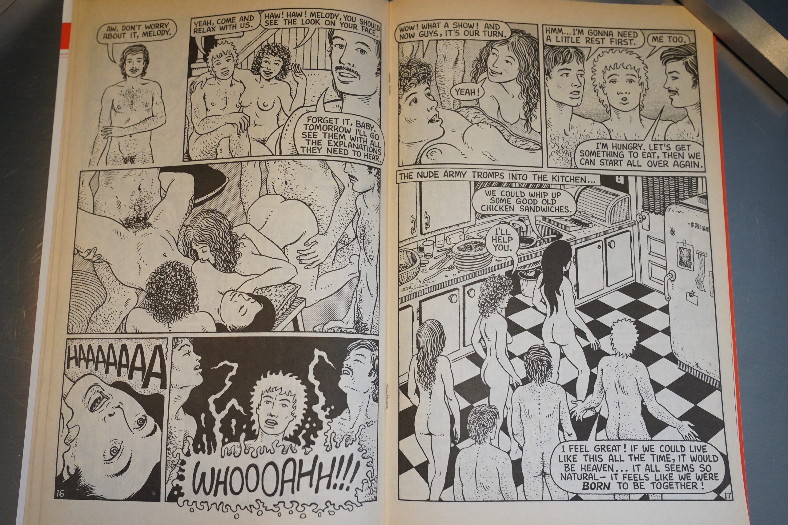
The collected edition of the first issues is called The Orgies of Abitibi, and that’s, of course, a major selling point here. They’re very amiable orgies… down home and relaxed.

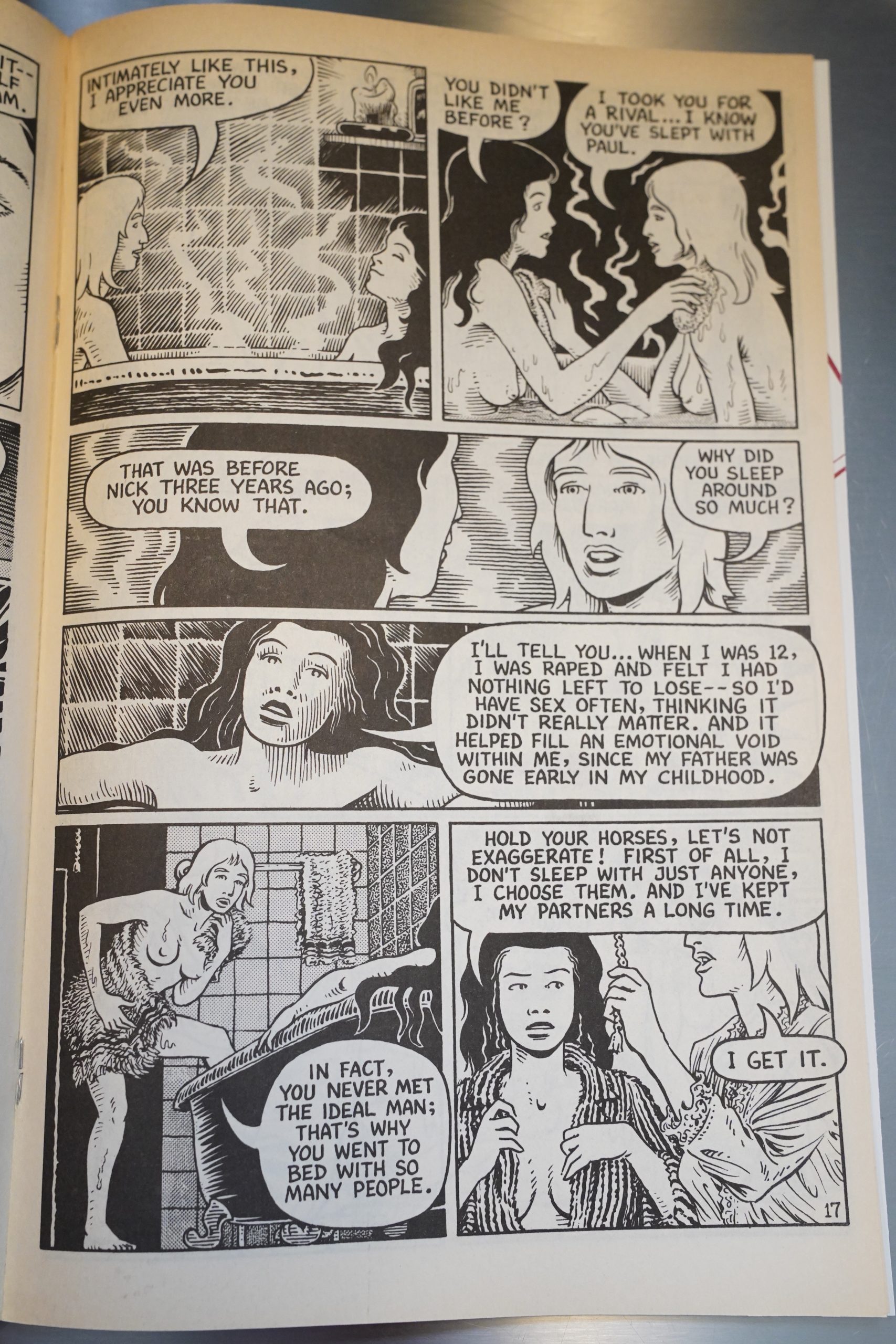
Melody is portrayed as being pathologically honest… They way she’s drawn, it’s easy to forget that she’s 19 here, and her behaviour makes more sense in that context.

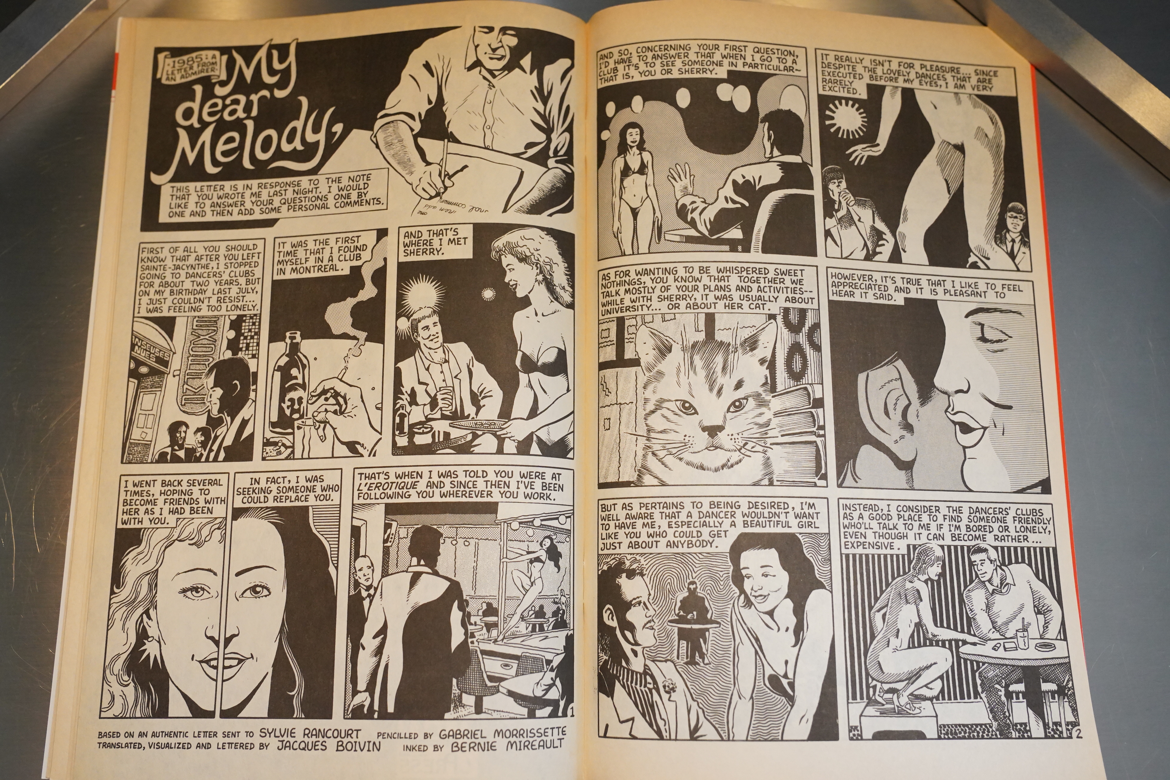
In each issue, we get a solid 24 pages of story, and then a there’s also back up features. A few of these are illustrated versions of letters she’s received, and they veer from the wistful…

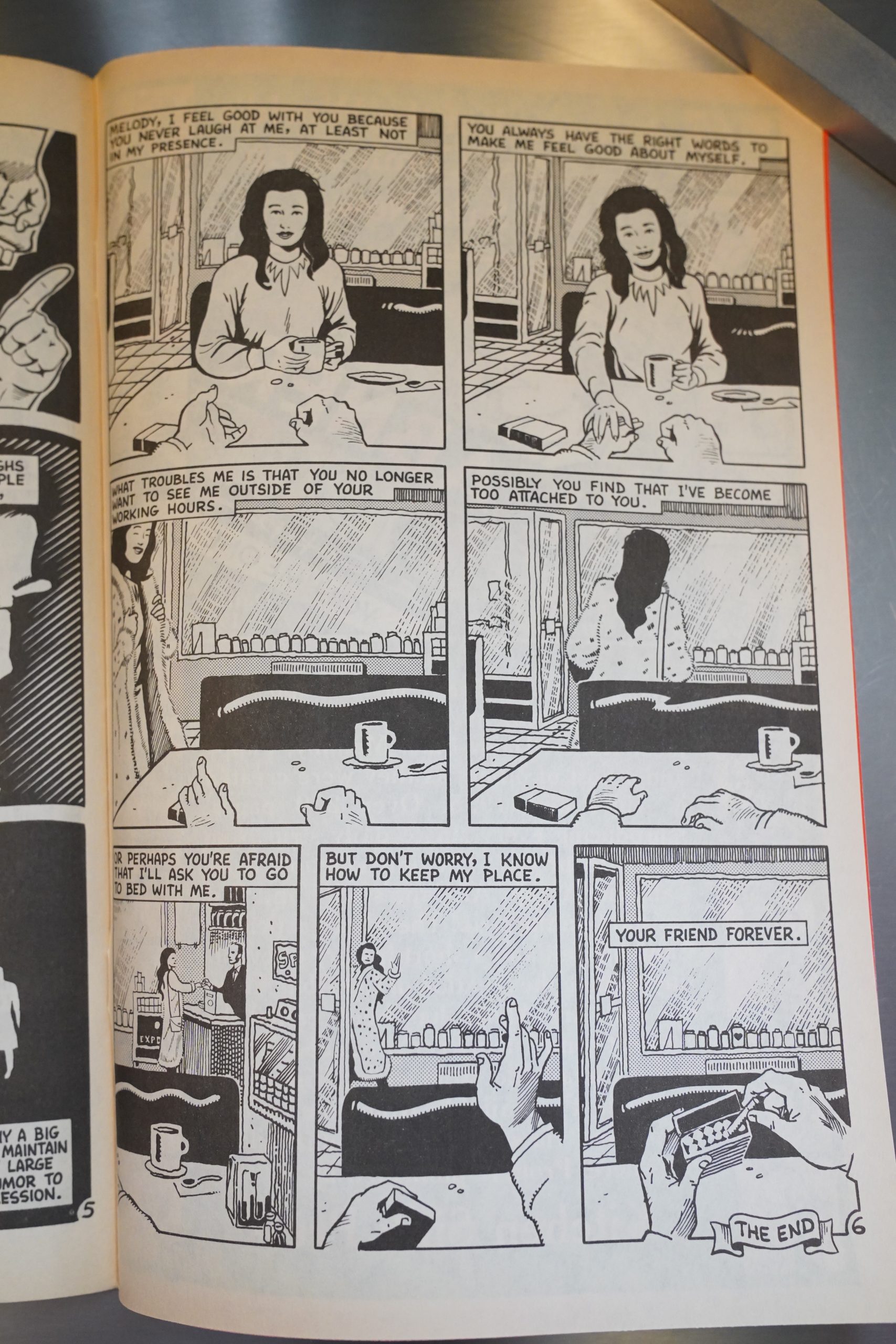
… to the unnerving, and sometimes in the same story.

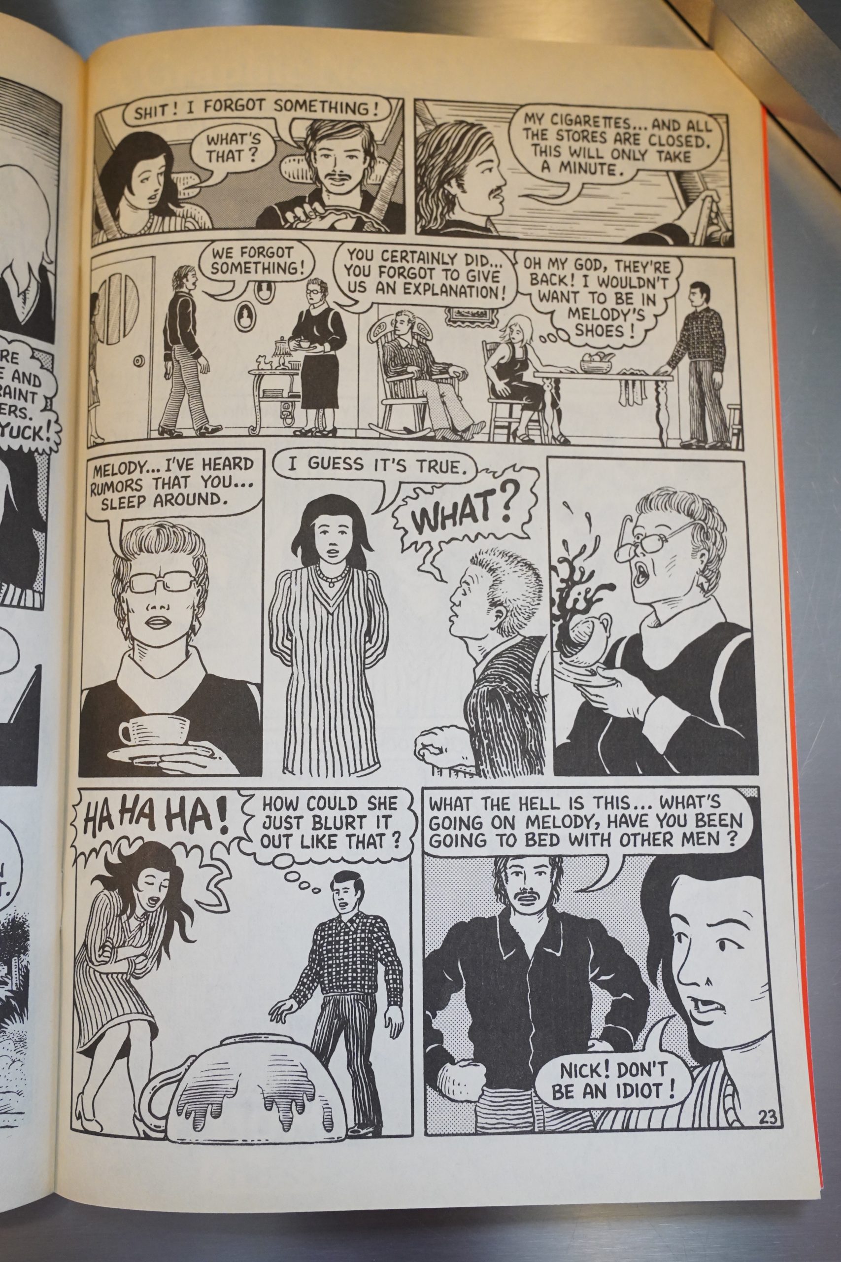
The autobio-with-an-omniscient-point-of-view leads to these jarring scenes, where you’re thinking — where did this come from? And moreover, Rancourt never comments what she’s depicting… Oh, writing this, I’m starting to realise what’s so special about the storytelling in this series: It’s an autobio book that feels oddly impersonal; it feels very distanced.

And it’s also — here she’s depicting her husband having made a peep hole into their guest room so that he can peep at guests having sex. And again, she doesn’t really comment — she depicts herself saying “if it amuses you” and doesn’t participate, but that’s as far as it goes.

It’s a strange lack of affect.

In the issues where there’s no illustrated letters, we get pin ups. The male artists mostly go for glamour shots; the female artists mostly go for humour, horror or disgust.

That thing I said about a lack of affect? In the fourth panel — this is the only mention of this in this book.

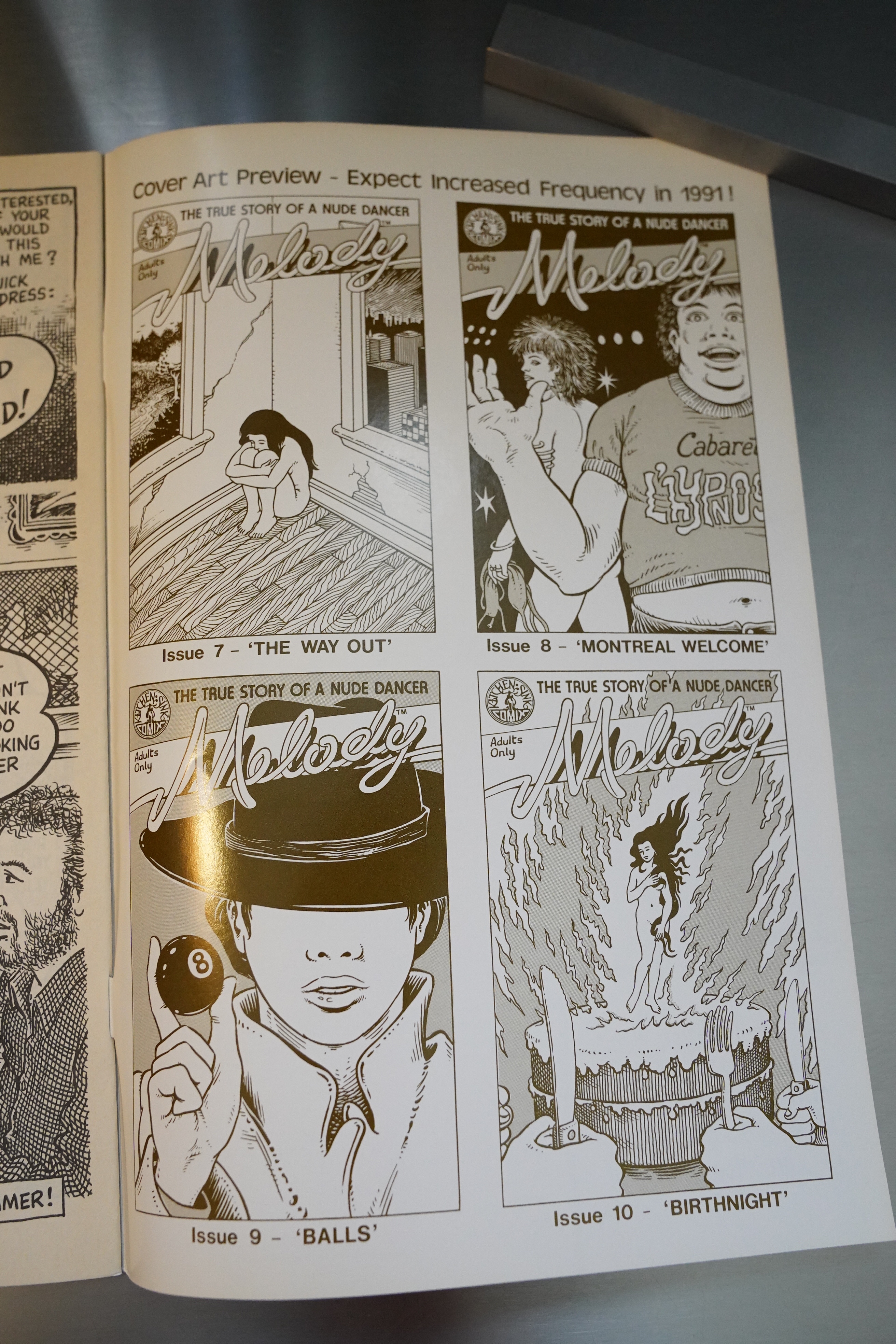
Huh. They had the covers for the first ten issues drawn already? They’d really been planning out this entire story…

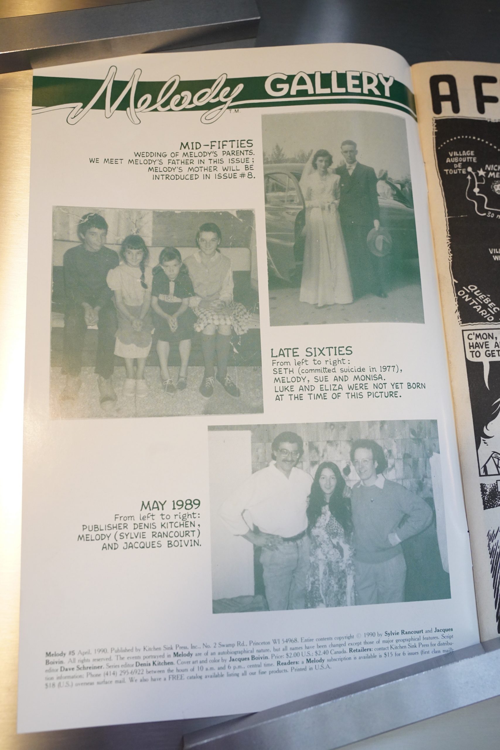
And that’s the only mention of her brother committing suicide.

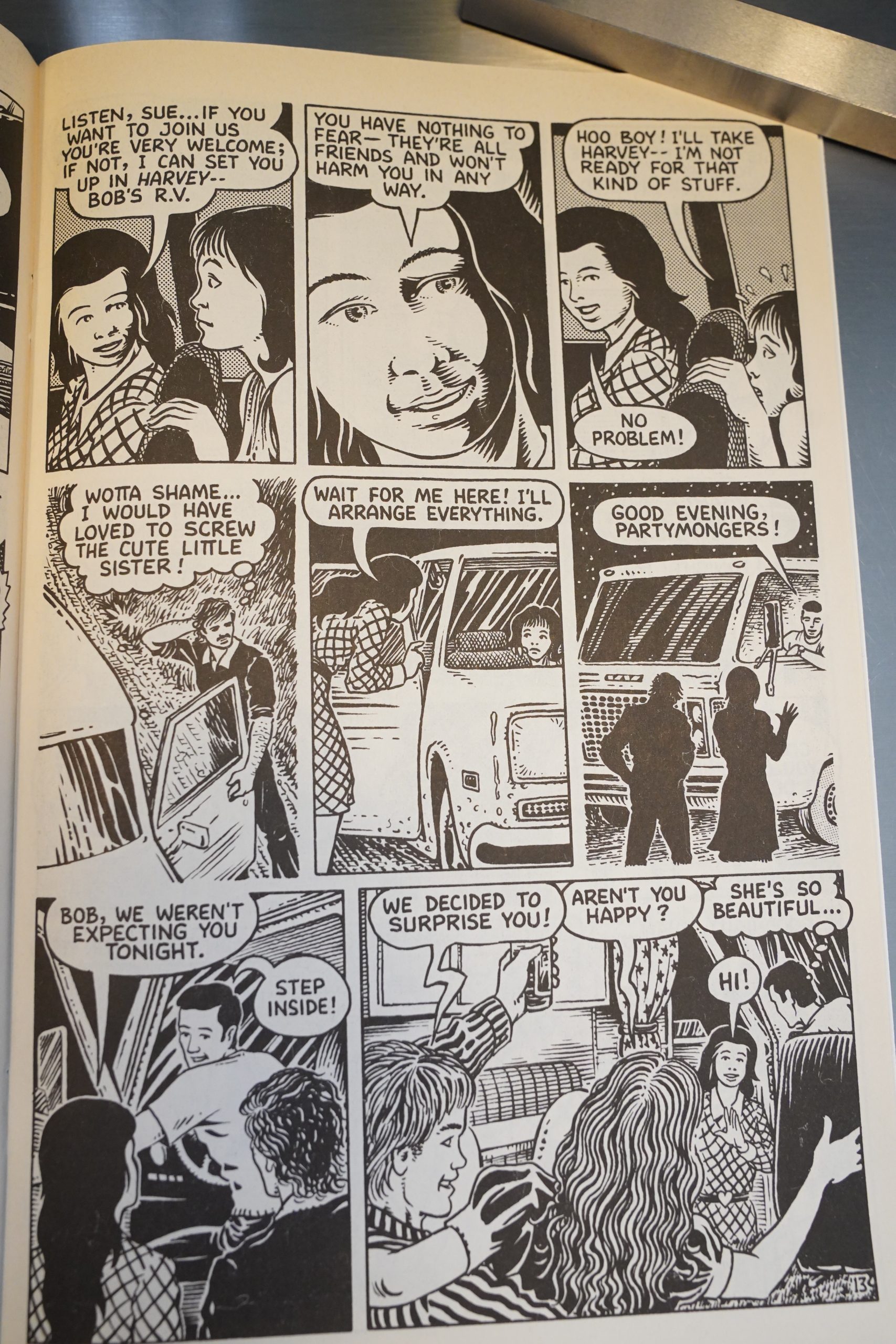
The must befuddling issue of them all is this one. Melody meets up with her family, and she ends up bringing her seventeen year old sister home with her. But this turns out to be an orgy night, so she (with her usual lack of affect) gives her the choice of staying in a camper or joining the orgy.

Later in the book (the day after) her father comes storming in and gives her a proper chewing out, and her reaction is, basically going “hm, perhaps that was a bad thing to do? If he’s that angry, then that can’t have been right.”

It feels like reading some transmission from an alien planet.

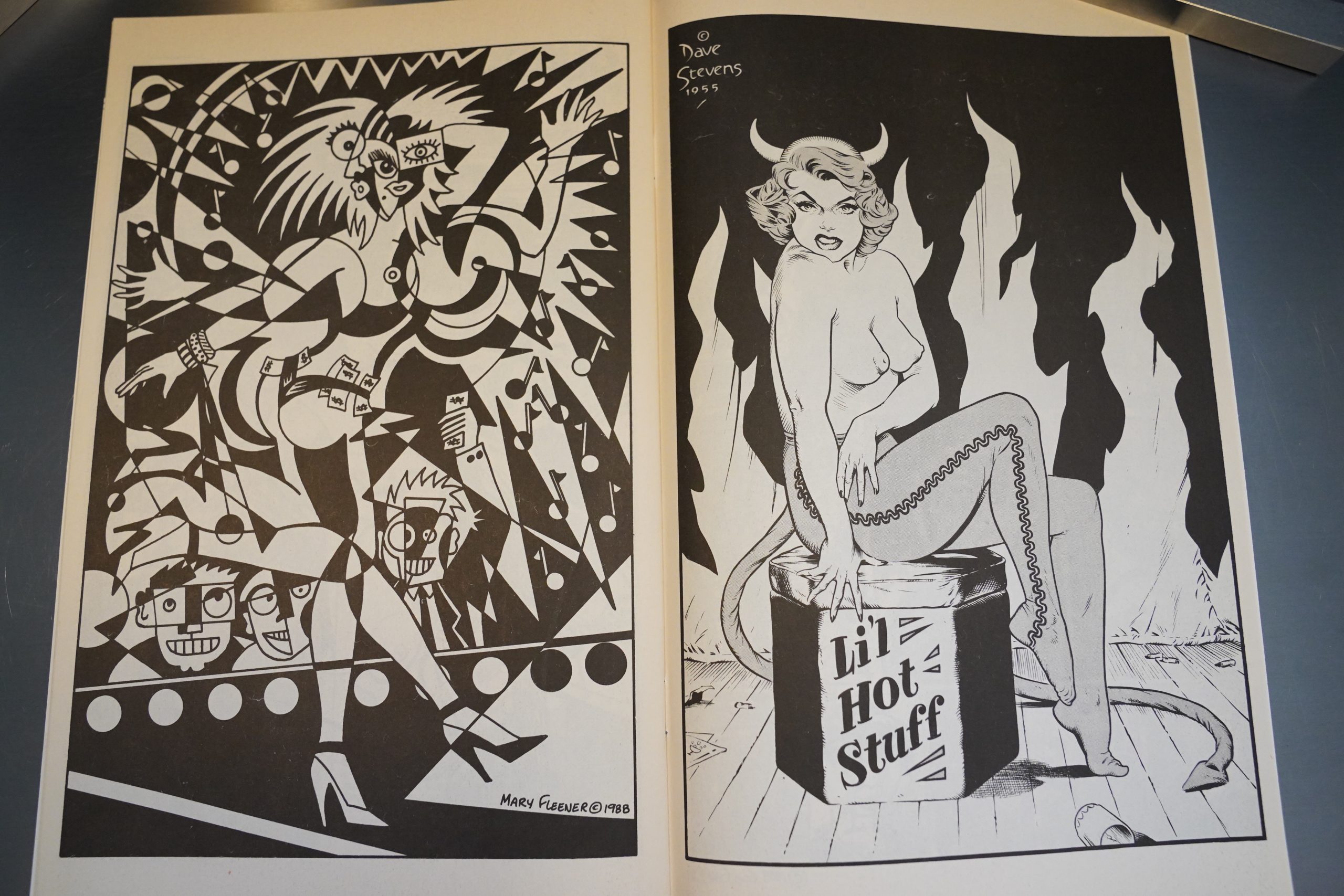
The pin-ups continue, with a very sexy drawing by Mary Fleener and a scary one from Dave Stevens.

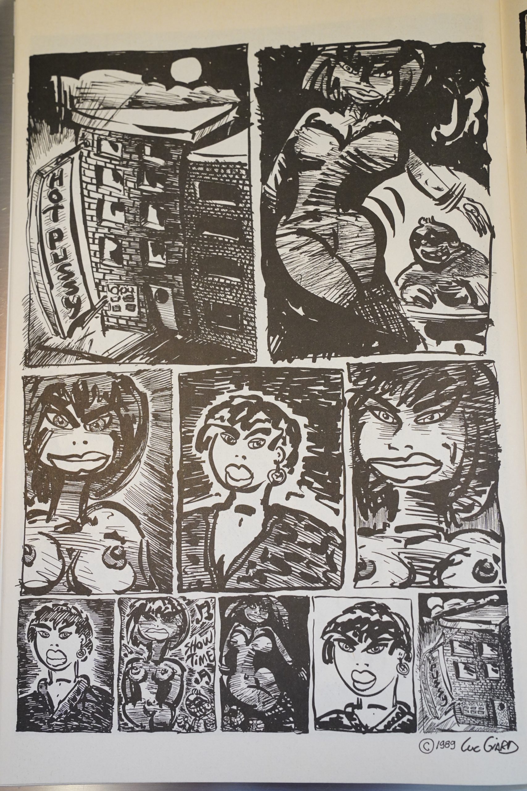
I love this one by Luc Giard.

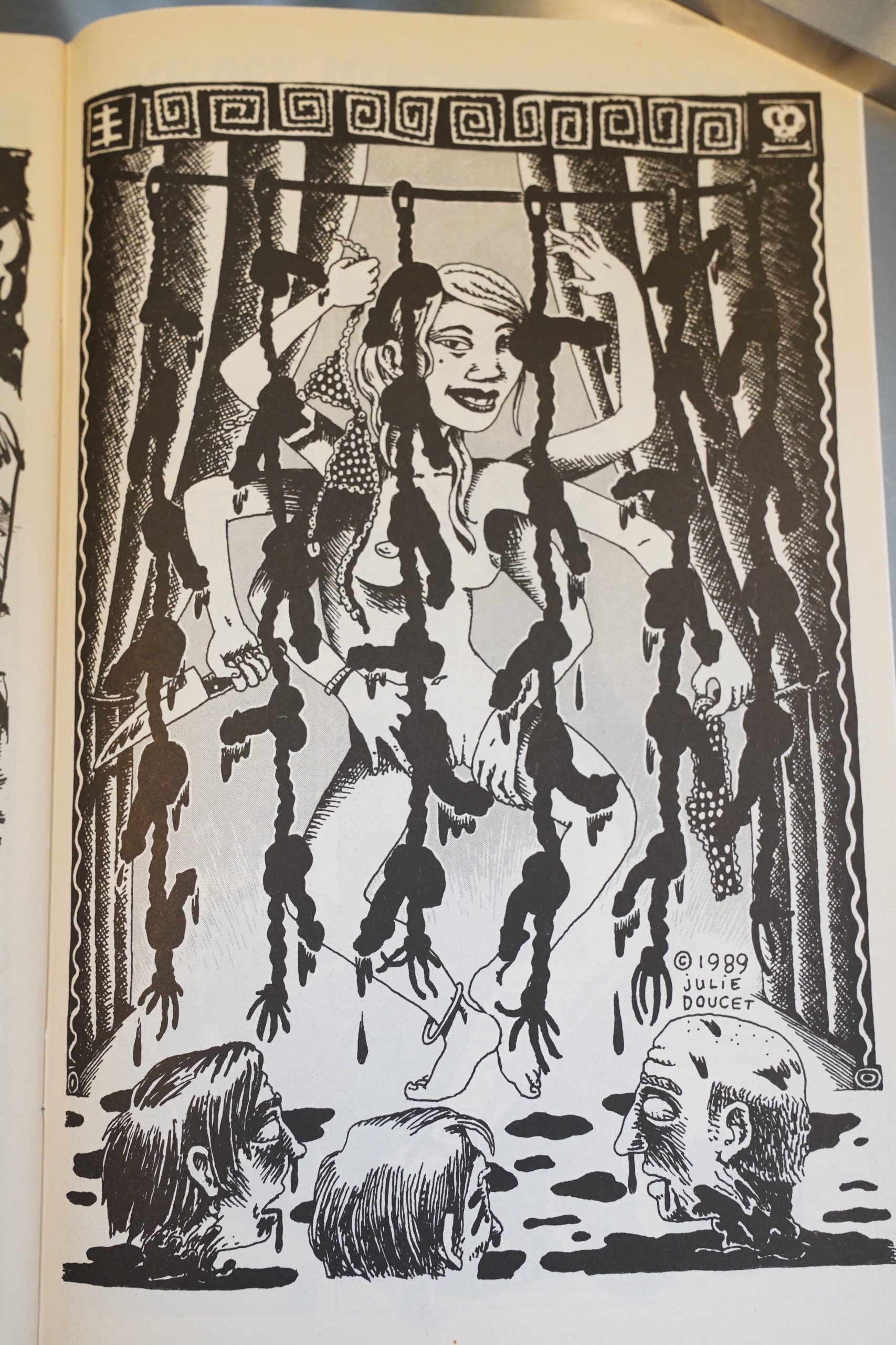
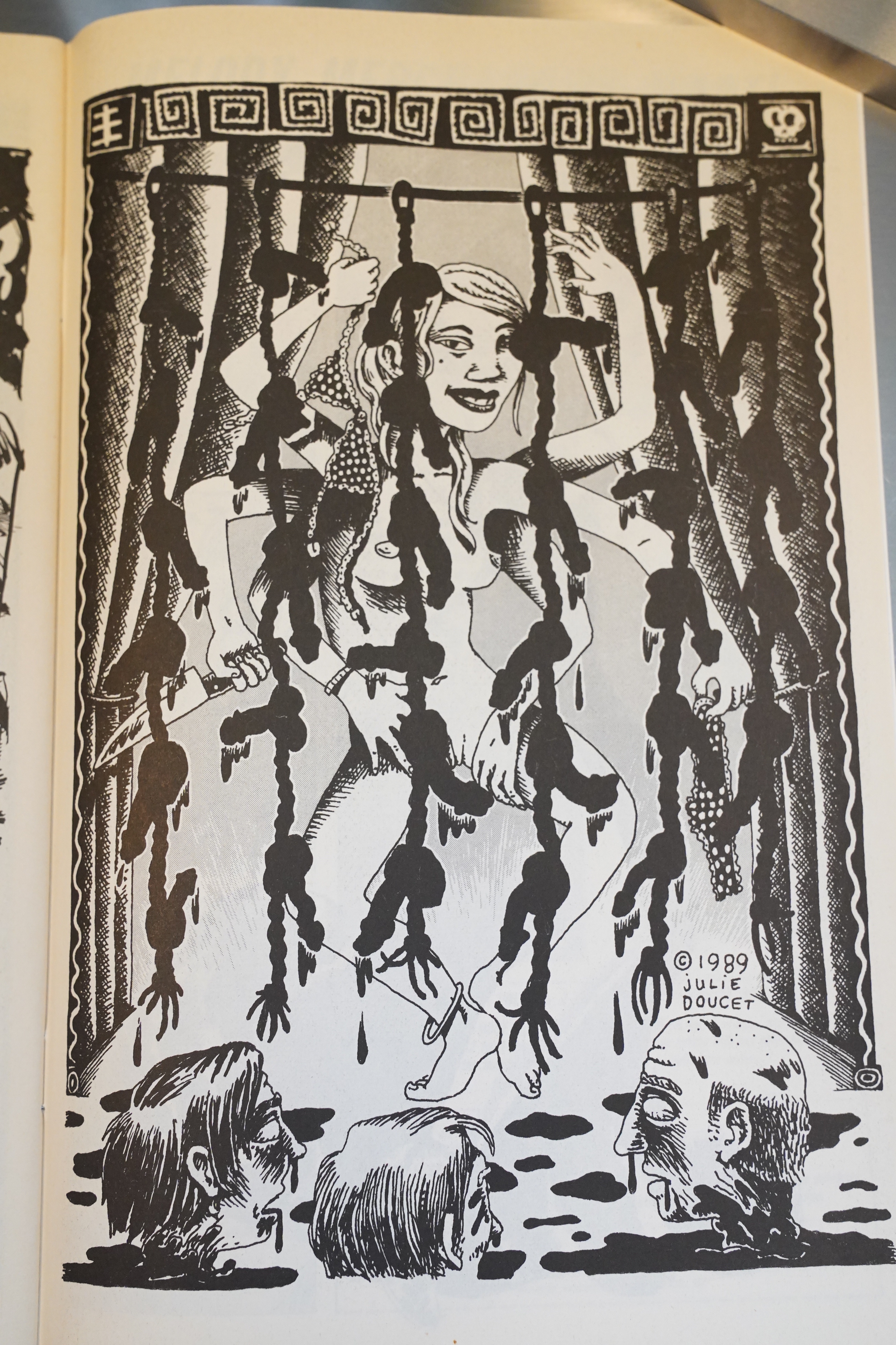
But the most amazing pin up of them all is this one by Julie Doucet. She wins again.

The schedule starts slipping — we’re now down to about twice a year.

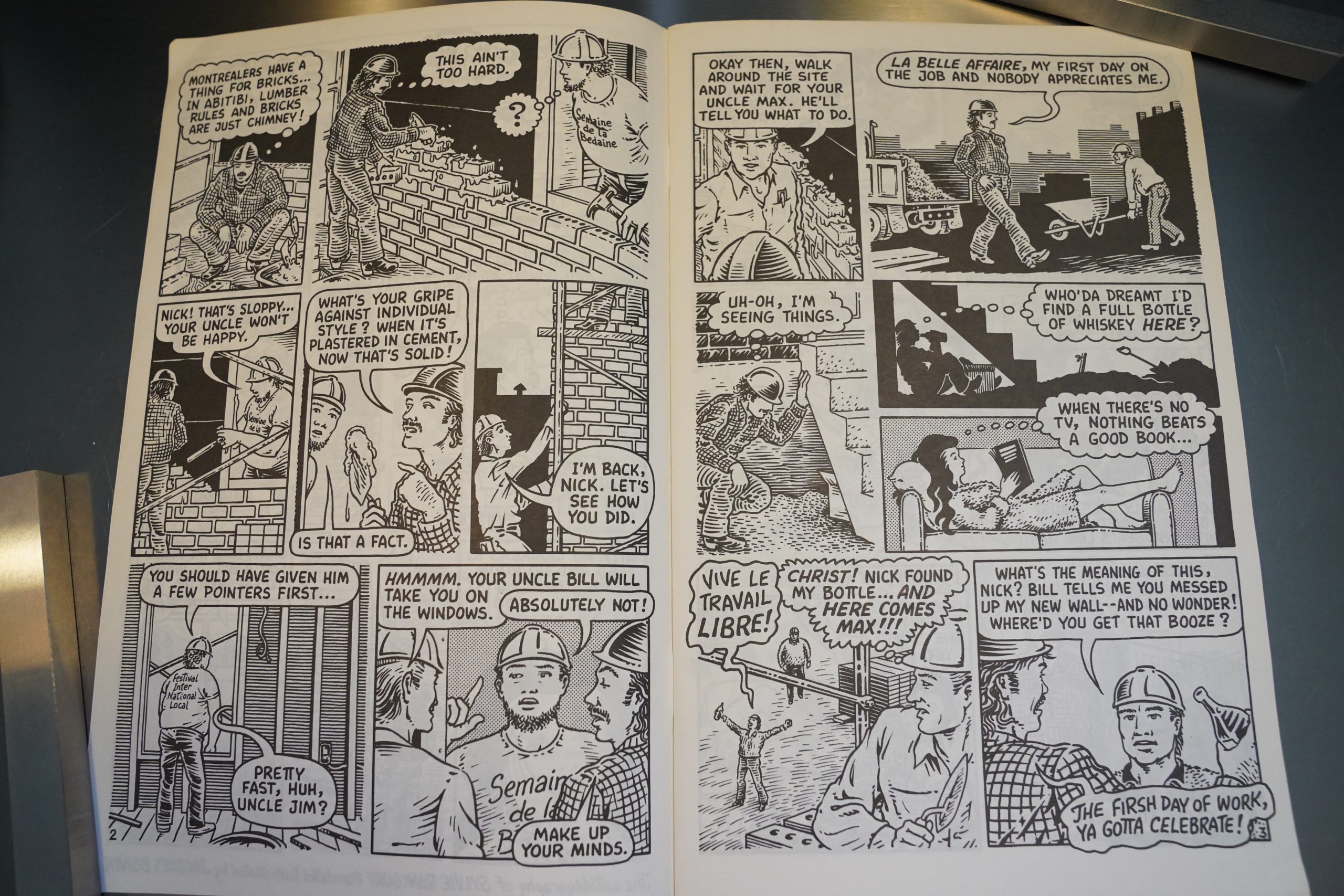
Perhaps this explains it — Morrissette is now doing most of the pencilling, and Boivin is doing most of the inking, but sometimes Morrissette does all of the artwork.

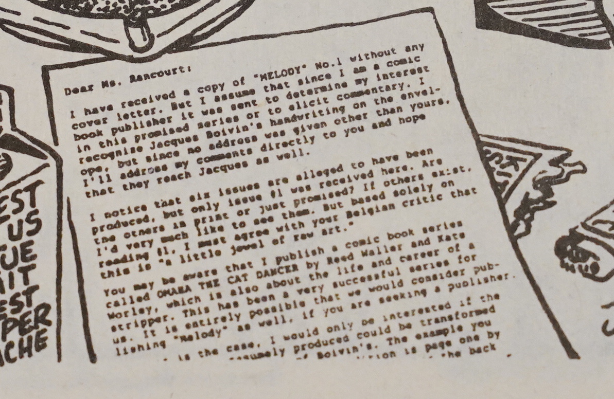
Oh, wow — is that Denis Kitchen’s original letter to Rancourt? It was reproduced to tiny that I couldn’t make it out on the page, but I’ve got the advanced technology to embiggen.

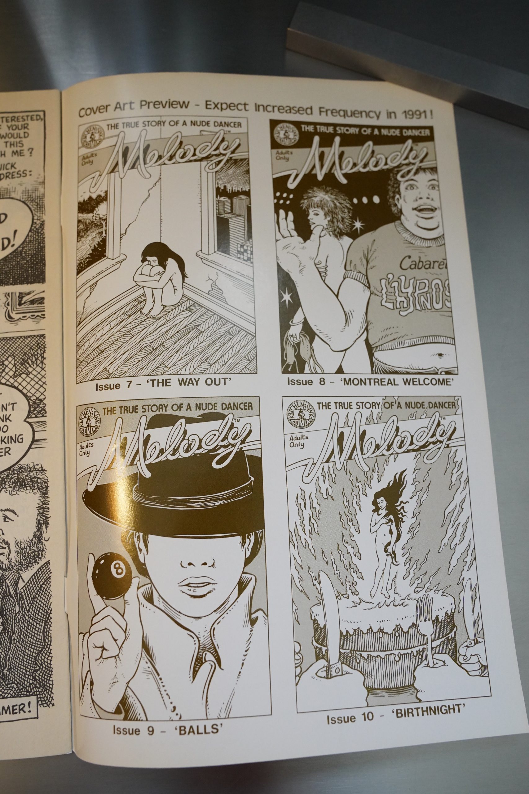
“Expect increased frequency in 1991.” That’s the traditional way alternative comics announce that they’re shutting down, but that’s not the case here:

There were no issues published in 1991, and we’re now basically on an annual schedule (and the page count drops to 24 for a couple issues).

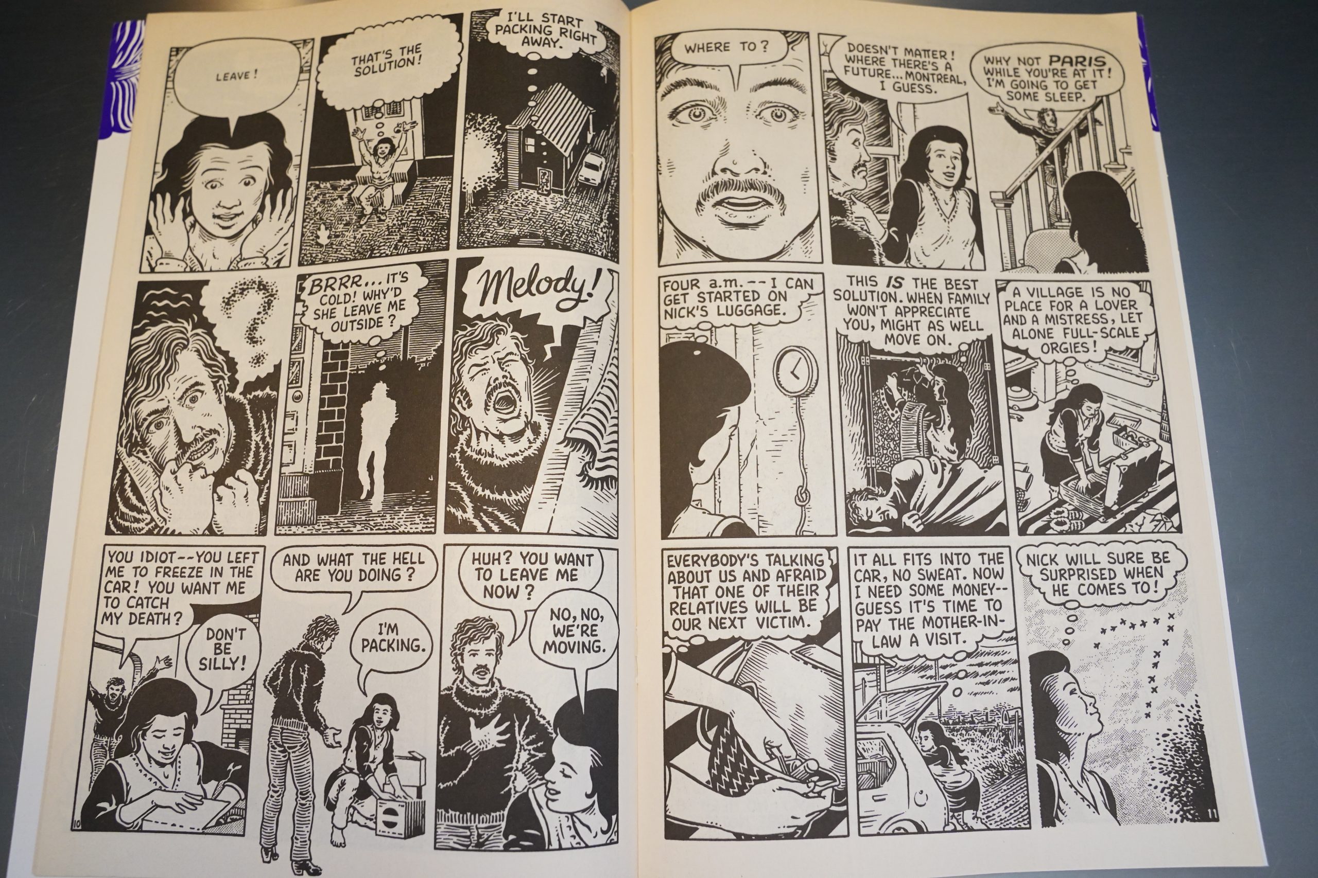
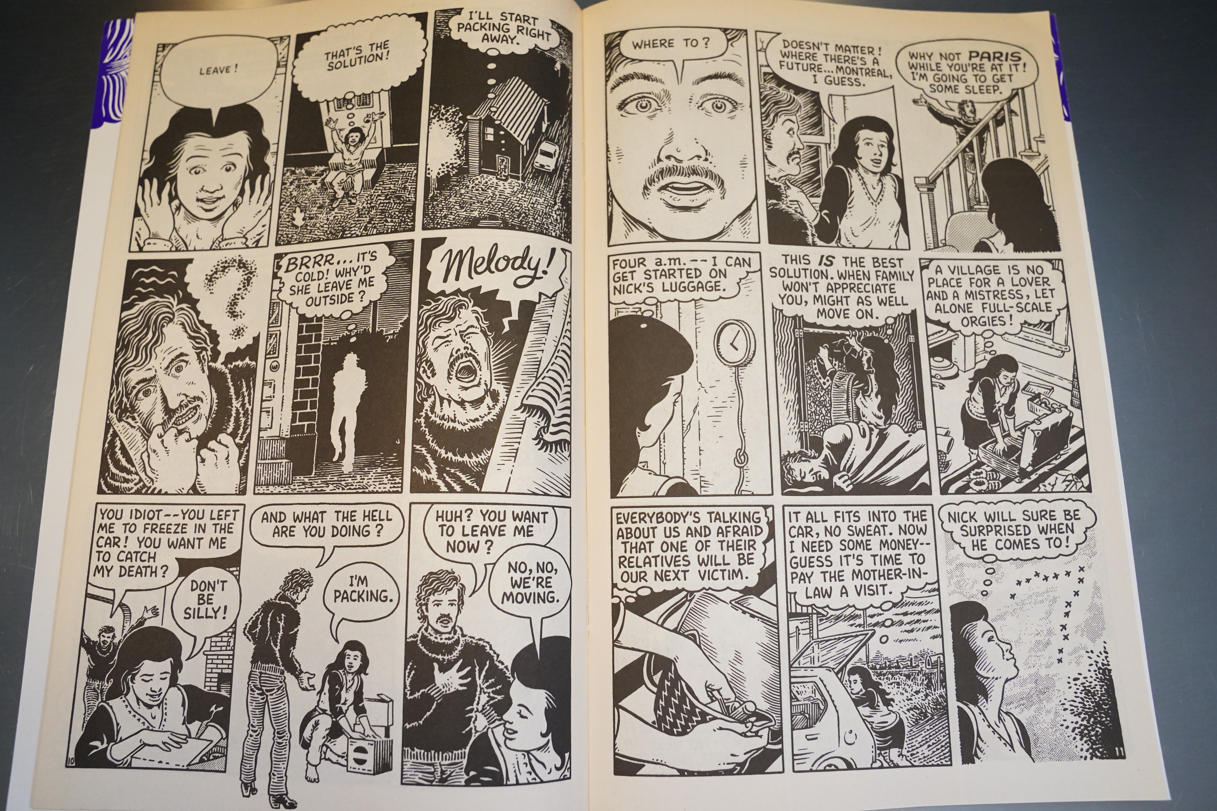
This is how Melody moves from Abitibi to Montreal — she just has an epiphany, sells the contents of the house, and they leave.

I really enjoyed (re-)reading these issues now, but structurally, the book takes some odd detours, like this issue which is half about moving to Montreal, and half about various superstitions. Rancourt is dropping in things that… didn’t really need to be here?

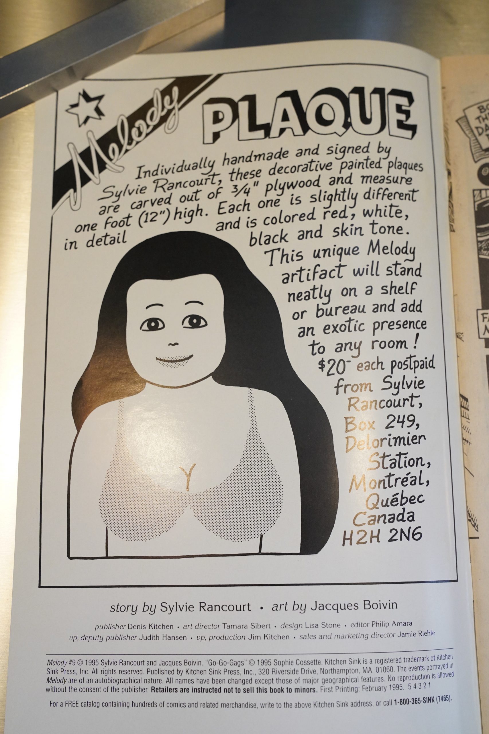
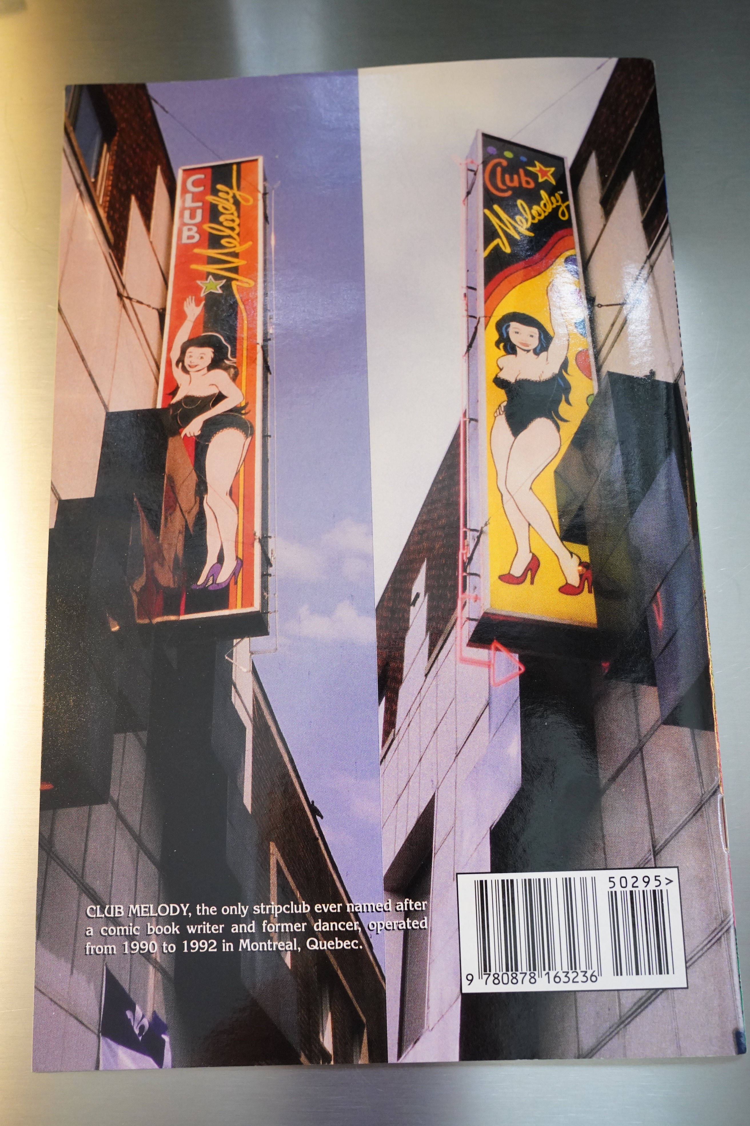
We’re now in 1995, and you could have bought one of those plaques back then.

Or visited Club Melody in 1992.

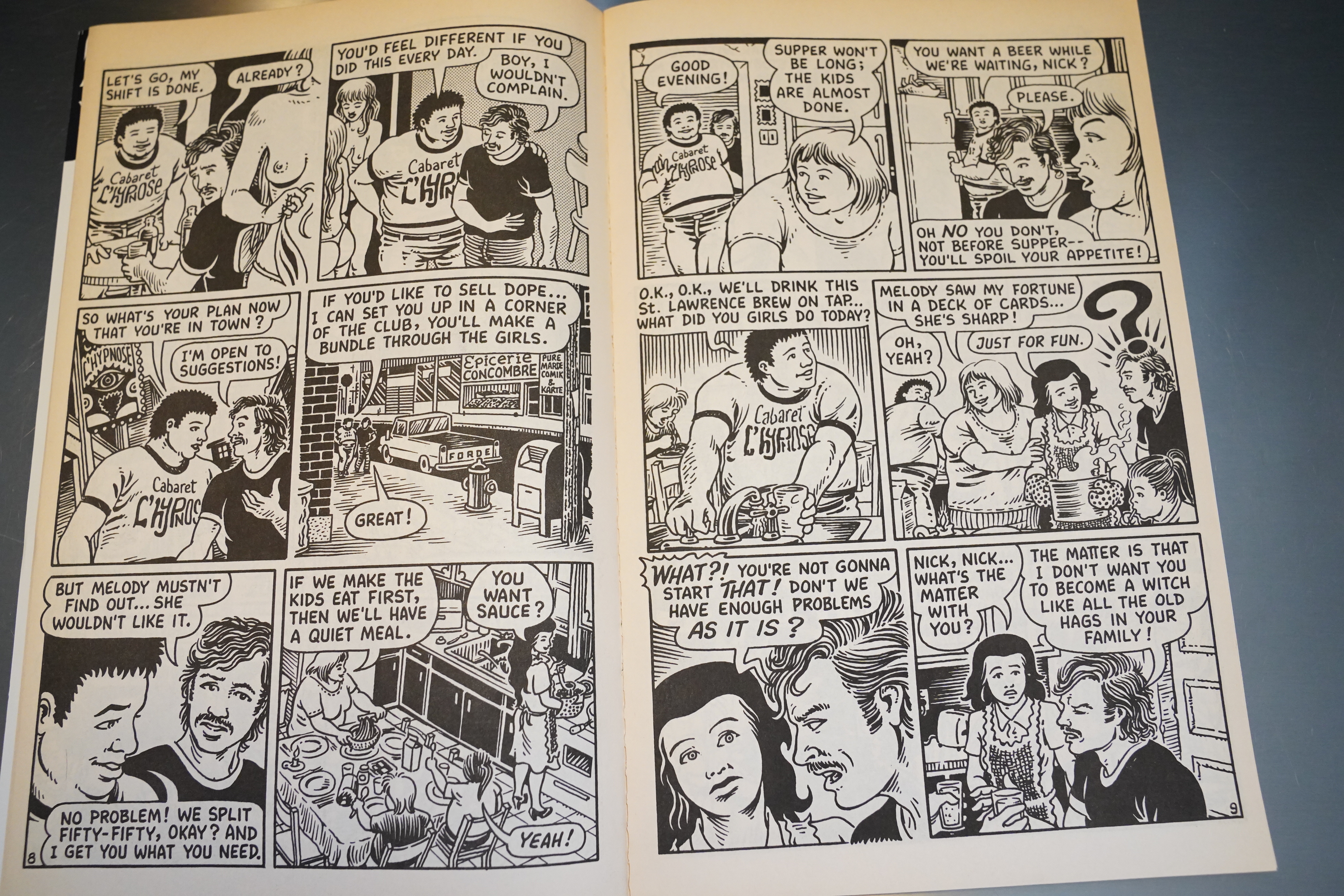
Her husband is kind of a loser, eh?

This is the final page in the series. And at least it has the traditional alternative comics final issue flair: A “next” tag line.

I have not been able to google why the book was cancelled. Kitchen Sink “bought” Tundra around this time (as far as I can tell, it was more of an aquihire situation where Tundra bought Kitchen Sink so that Denis Kitchen could take over running the Tundra tar pit), and many of the older Kitchen comics went the way of the dodo. But perhaps Rancourt and/or Boivin had just run out of steam.

It’s a shame, and it’s a shame that a collected edition of these comics still hasn’t been published… but I do understand why.

But in a way it’s fitting that the book ends here, before Melody becomes a nude dancer.

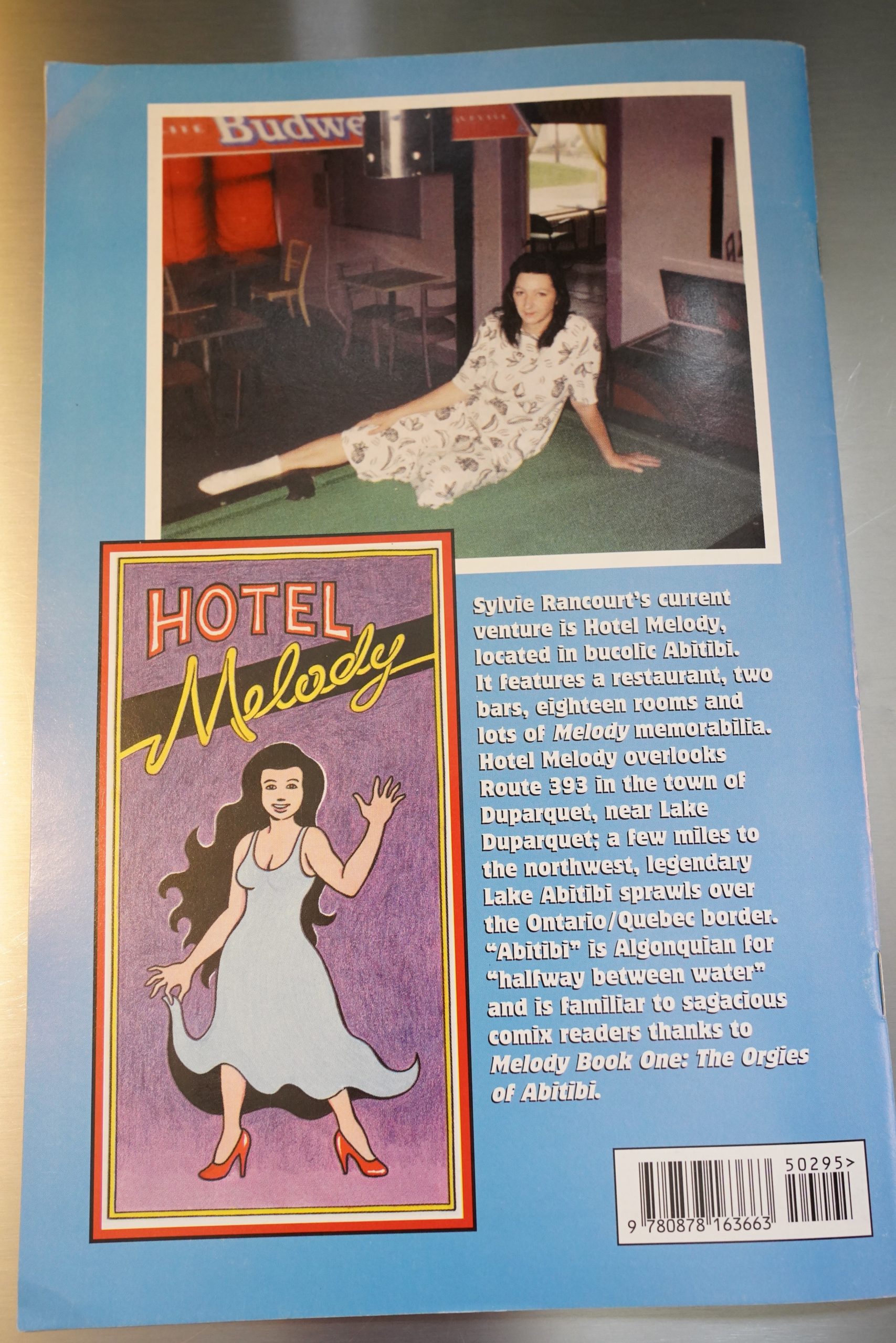
By 1995, Rancourt had apparently moved back to Abitibi and opened a hotel.

In 2015, Drawn & Quarterly finally published a translated collected version of Rancourt’s original comic, which has a storyline that almost starts on the heels of that final page up there. By the pacing of this series, I think we’d probably have half a dozen issues to go before we reached the start of the book?

It was well received:

“[Rancourt] is one of the pioneers of autobiographical comics . . . The republishing of this long-out-of-print and difficult-to-find saga . . . plunges the reader straight into a profoundly sensitive work that no moral judgment could taint.” —Le Monde

Heidi MacDonald writes in Amazing Heroes #151, page 59:

Melody (Kitchen Sink) is, as you’ve
probably heard, a new entry in the
field of tell-all autobiographical
comics, written by Sylvie Rancourt,
visualized by Jacques Boivin, and
based on Rancourt’s real-life adven-
tures. Publisher Denis Kitchen points
out that it is probably the first such
comic to be done from a woman’s
point of view, but it’s not a point of
view that most women would
recognize—Melody is a nude dancer
in the Montreal red light district.
You could peg this as a cross bet-
ween Omaha and American Splendor
and it is—but it’s also an unapologetic
look at the way people really
behave—not the way they pretend to.
In issue #1 we meet Melody and her
husband, Nick, living on welfare in
some god-forsaken tract of Quebec,
raising chickens and complaining
about eating a lot of chicken. Nick
squanders most of his welfare check
at nude bars. For a good time, they
invite a few close friends over for
evenings of Monopoly and group sex.
It may sound pretty sordid, and
some of it is, but like Omaha, Melody
deals with sexuality as just another
perfectly normal part of human
nature. In fact, the most sensa-
tionalistic elements often seem the
most mundane. Melody herself is so
straightforward that it’s totally dis-
arming. This openness is carried over
to her storytelling, which is utterly
natural and unforced.
The book has a rather convoluted
history—it originated as a French-
Canadian mini-comic written and
drawn entirely by Rancourt, but is
appearing in a version translated and
redrawn by Boivin. I’ve been a fan of
Boivin’s •charming artwork for several
years and it’s nice to see him get an
opportunity to work on a worthwhile
project. His art is, of course, far
slicker than Rancourt’s completely
naive style, and I think it uould be fair
to say that you can tell a guy drew the
book. There’s a kind of obsessive
quality to the original that is missing
in this far more accessible version—
however, Boivin’s efforts here
shouldn’t be overlooked.

This is the one hundredth post in the Entire Kitchen Sink blog series.