Category Archives: Uncategorized

1980: 50’s Funnies

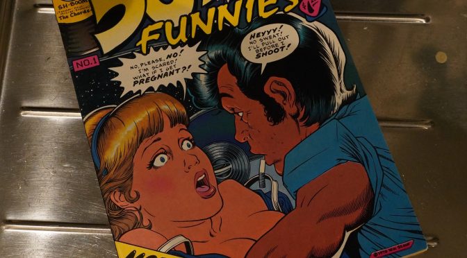
50’s Funnies (1980) #1 edited by Larry Shell

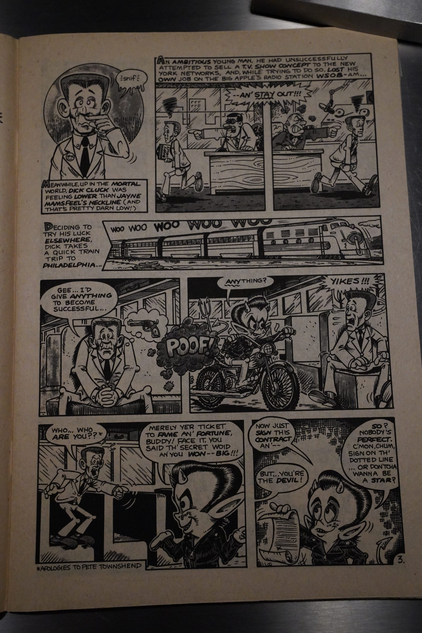
I assumed that this was going to be a reprint of 50s comics, but it’s not — it’s all brand new, but it’s loosely a 50s themed anthology. Here’s Larry Shell and Scott Shaw doing… er… I guess they’re going for humour.

Hey! Early Tom Yeates. (The gag makes absolutely no sense, so I’m not even showing you it. Hah!)

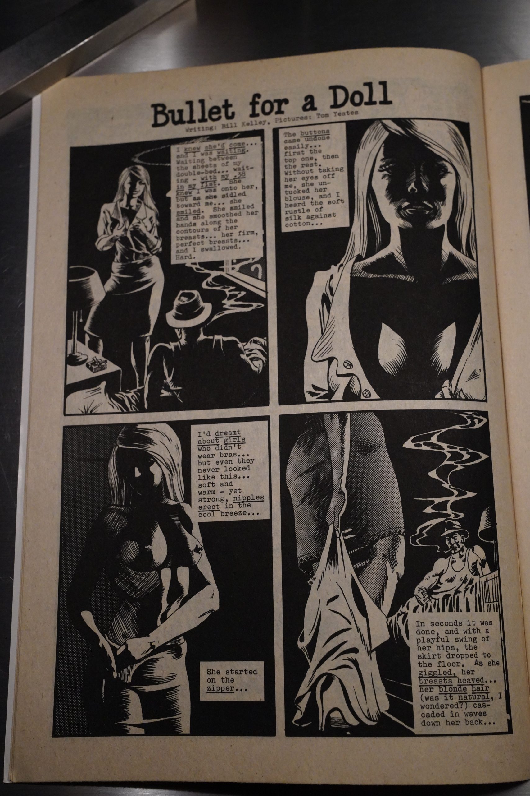
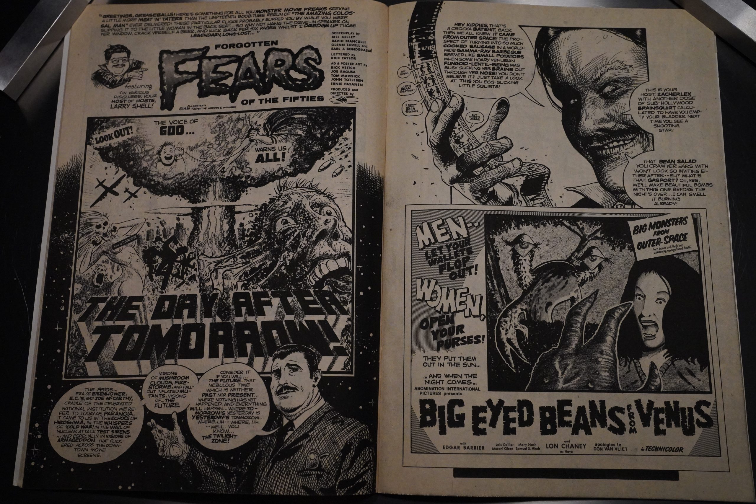
Tom Yeates… Rick Veitch… John Totleben… Hang on a minute! If I vaguely remember my comics lore correctly, all these people were at the Kubert School around this time, weren’t they? So is this a school project or something? It kinda reads like a school project.

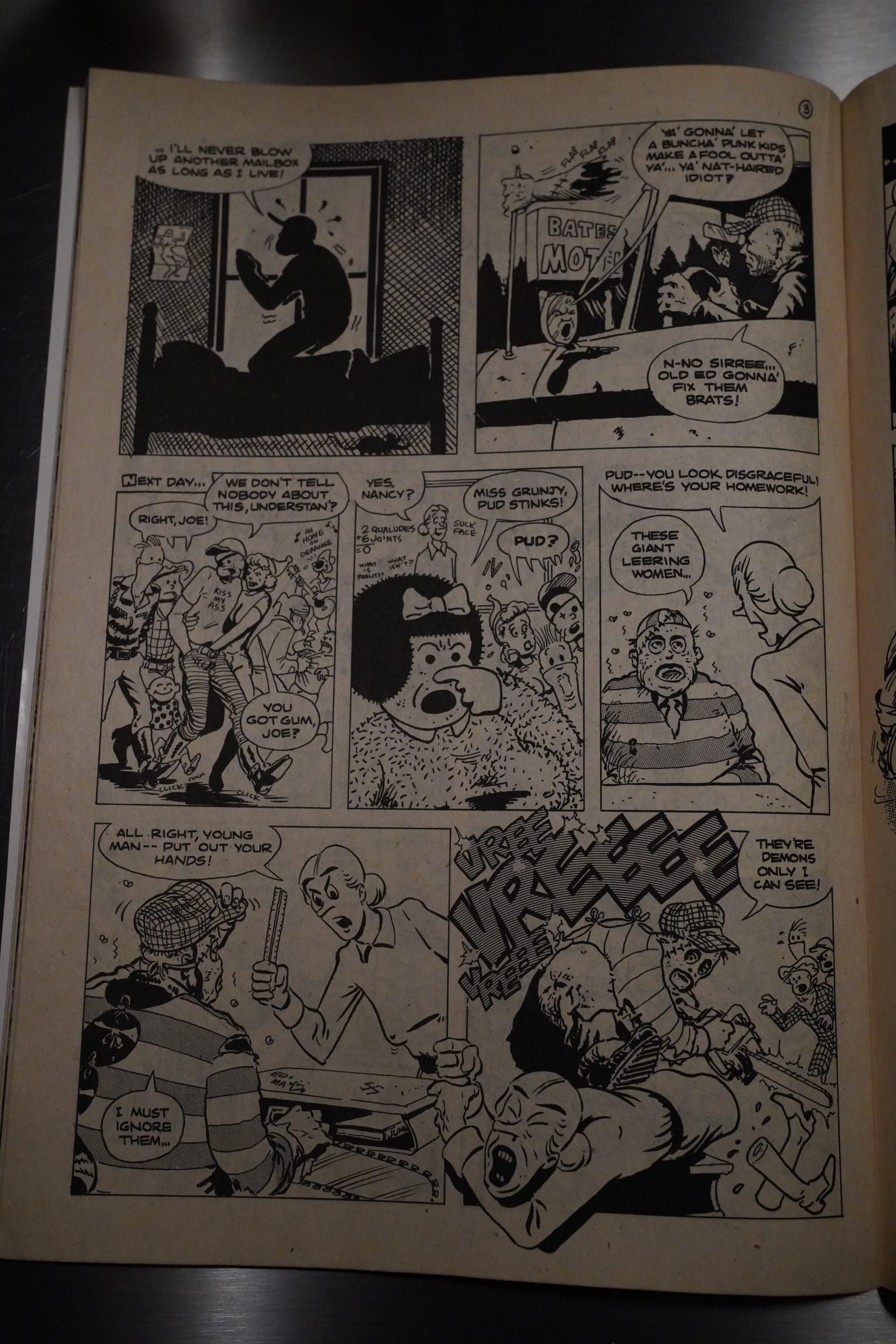
Bill Kelley (the name is unfamiliar to me) wrote this Texas Chainsaw Massacre parody, but Rich Veitch kinda saves it — the artwork’s very on point here, even if the actual gags aren’t… er… aren’t.

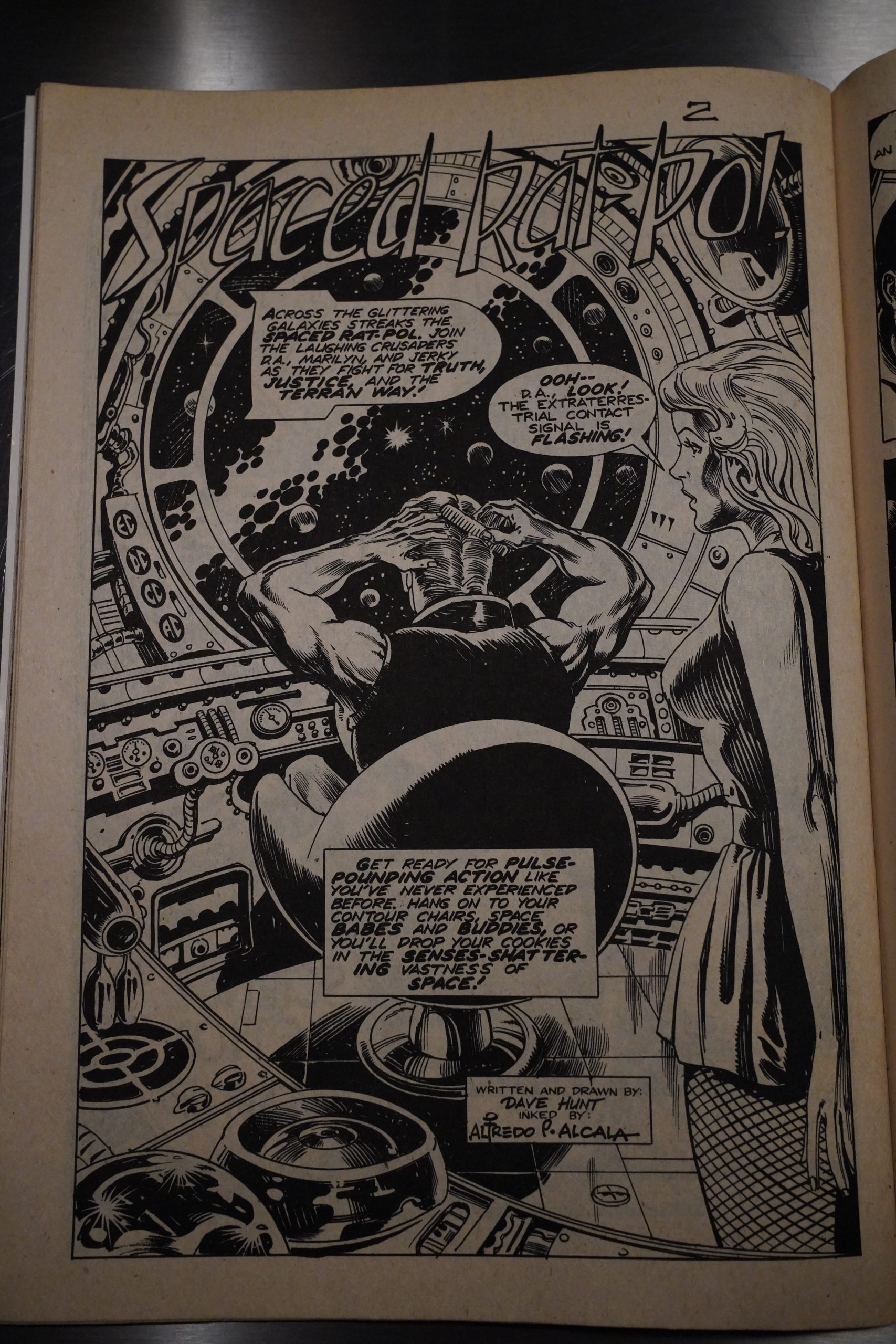
Dave Hunt and Alfredo Alcala do a kind of sci fi parody thing.

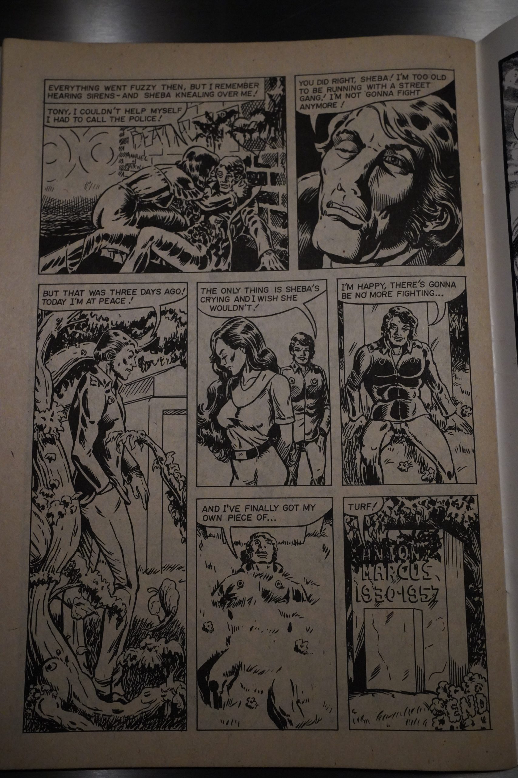
And then… Will Meugniot does an apparently totally serious 50s style moral weepie tale?

This is a very confusing anthology.

It only gets a six on Comix Joint:

Maybe there were too many cooks stirring up this bland soup, but the writing is rather flat in places. There are certainly highlights to be found, but not enough.

I can’t find any chatter about it on the interwebs.

This is the fifty-fifth post in the Entire Kitchen Sink blog series.

1979: Phoebe & the Pigeon People

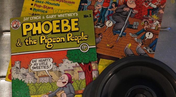
Phoebe & the Pigeon People (1979) #1-3 by Jay Lynch and Gary Whitney
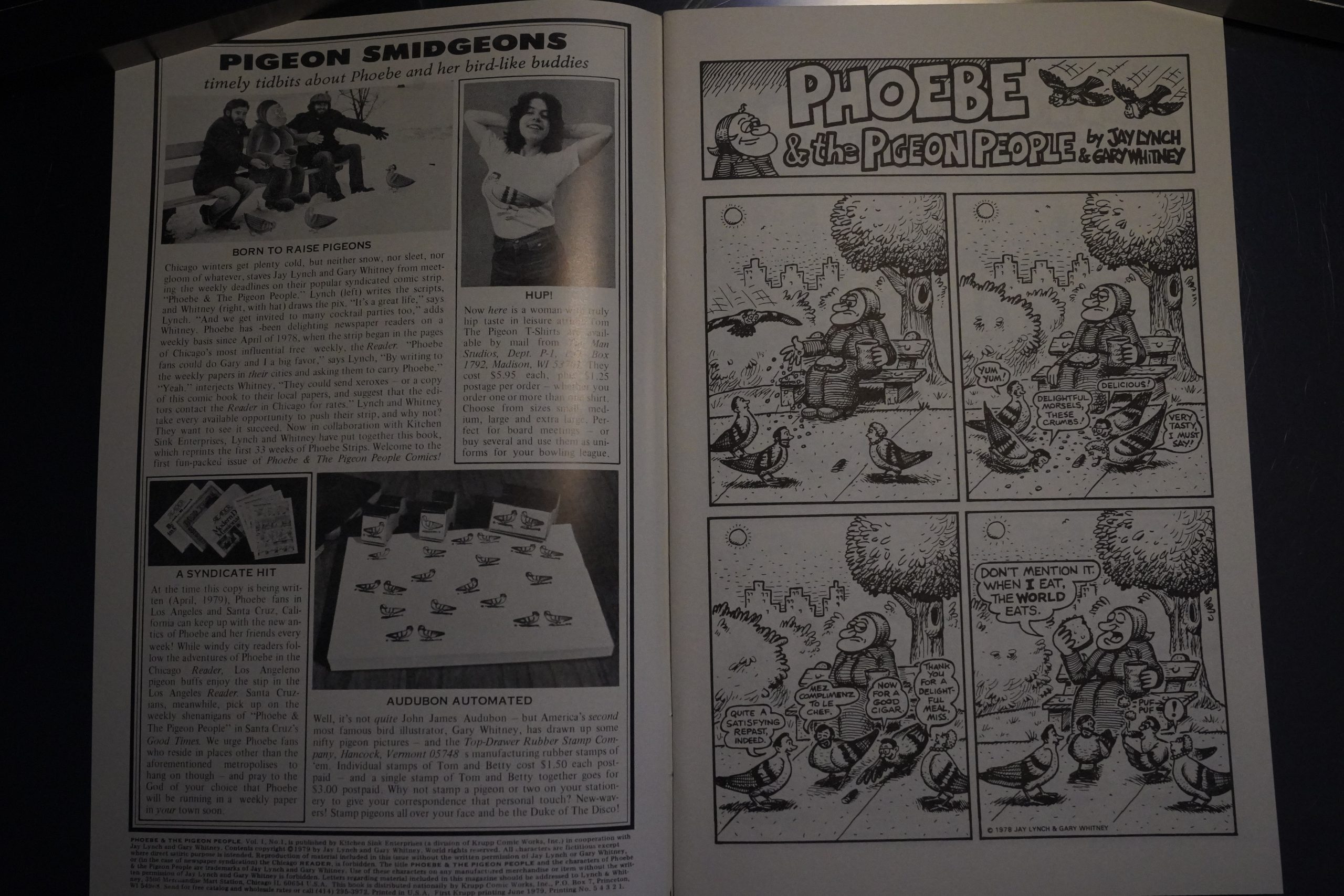
This is a collection of strips that were running in a handful of weekly newspapers across the US.
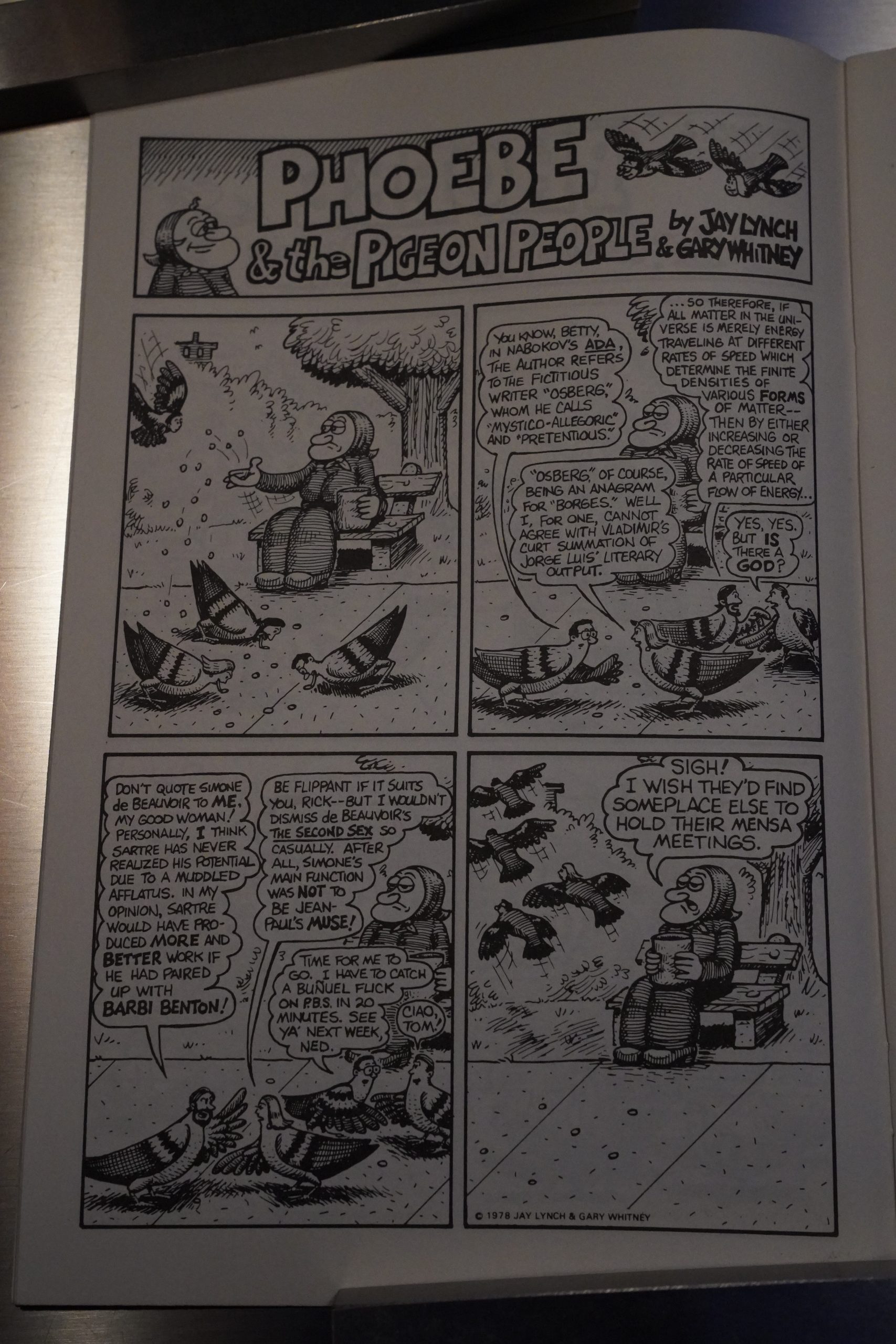
The concept is basically that there’s these pigeons with heads, and the Phoebe (the older woman) who feeds them. As concepts for strips go, that’s not too bad?
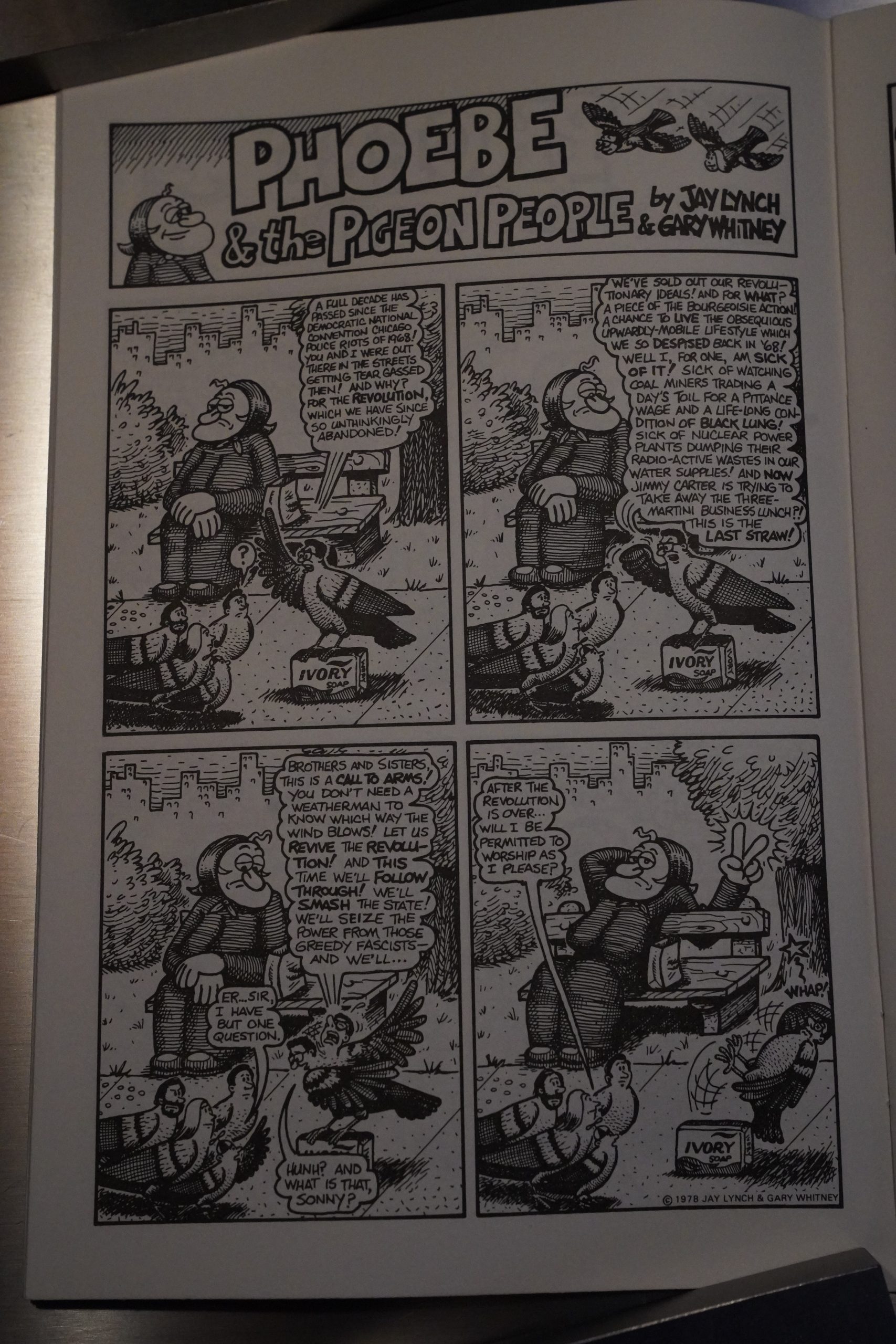
And it’s not that the gags aren’t amusing — but they certainly take their sweet time getting there. That is, the setups take quite a lot of effort for the reader to get through, and then the jokes are… there, but aren’t actually hilarious, so it feels like a let-down.
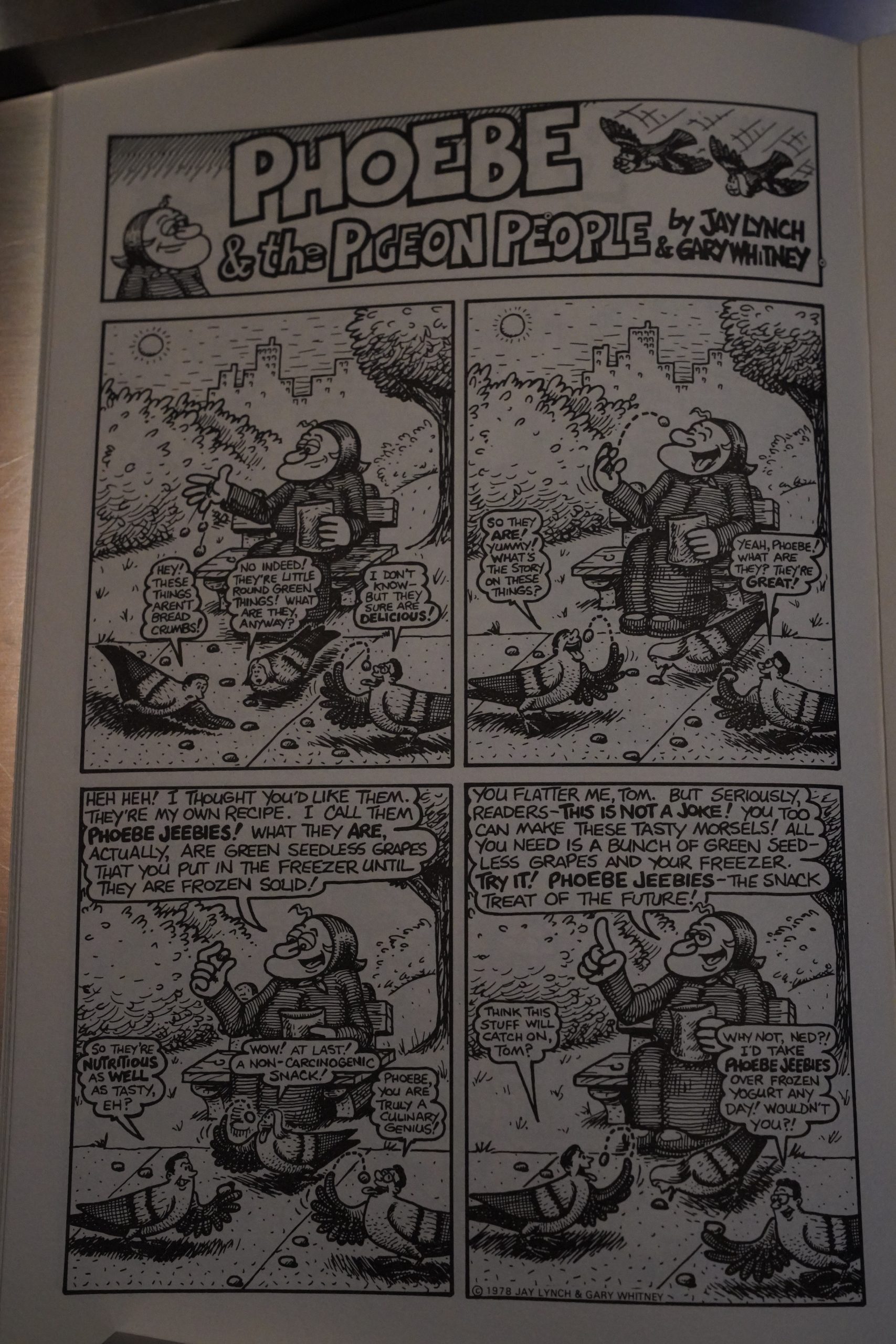
Hey! I remember doing that as a child. They got a kind of mushy, not totally stone hard texture? I have to try that again sometime.
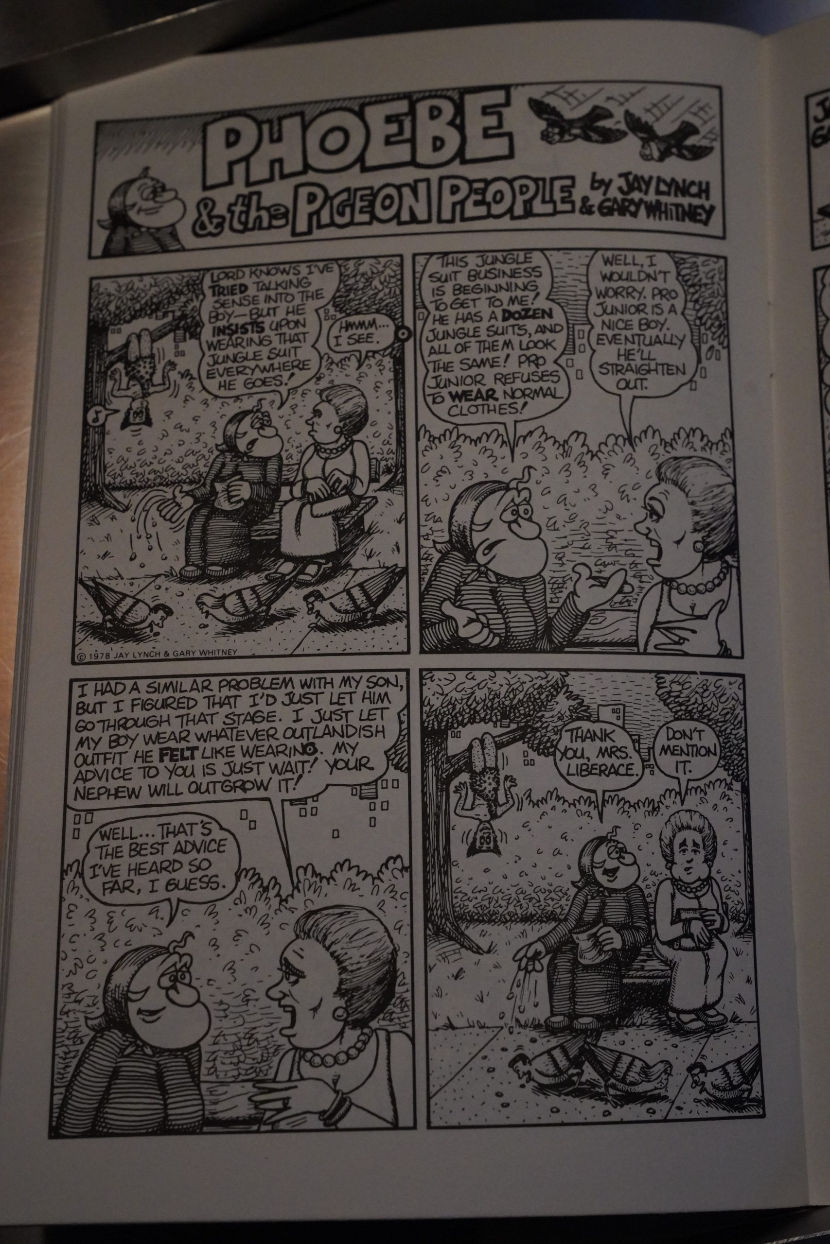
So topical.
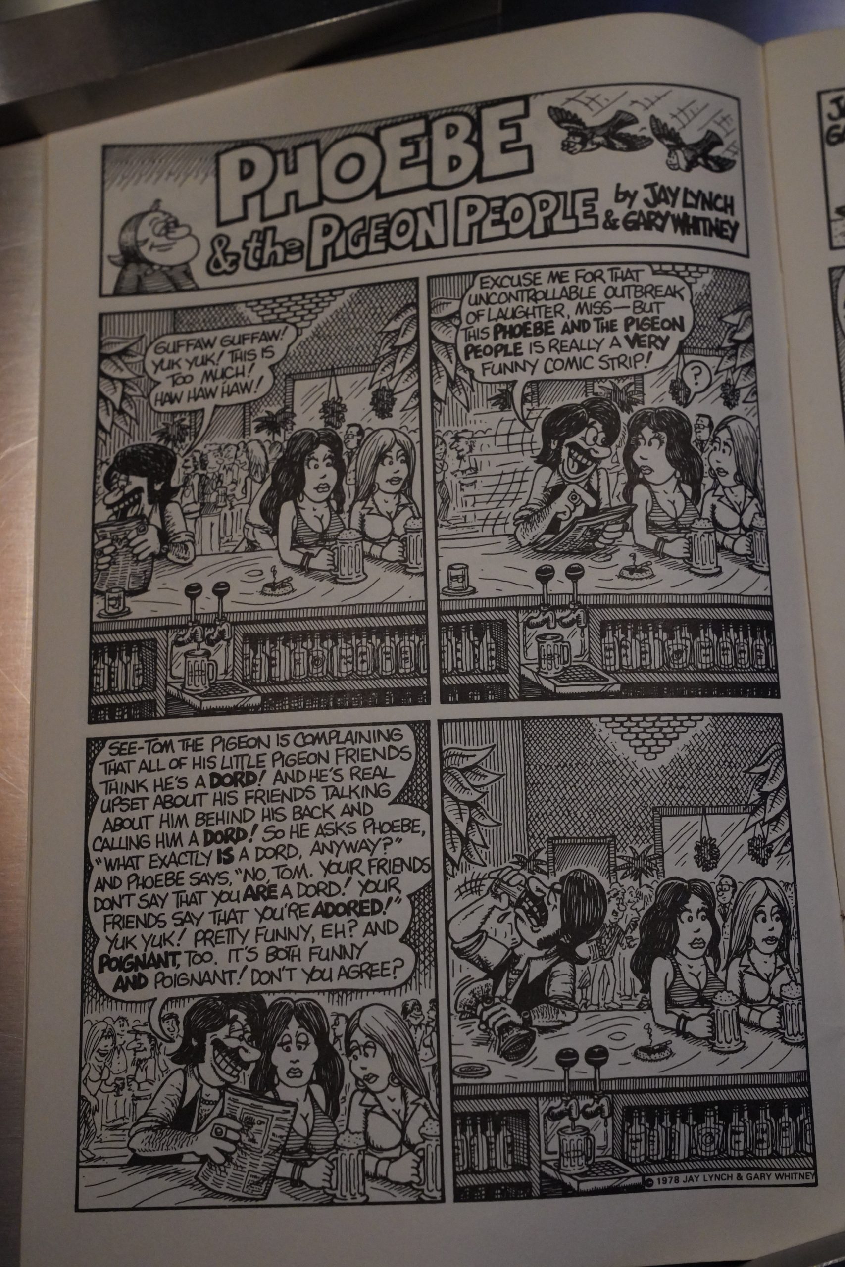
It doesn’t take many weeks for the artists to run out of possible jokes in the original setup, so we get a lot of strips about them not having any jokes this week, and things get kinda meta.
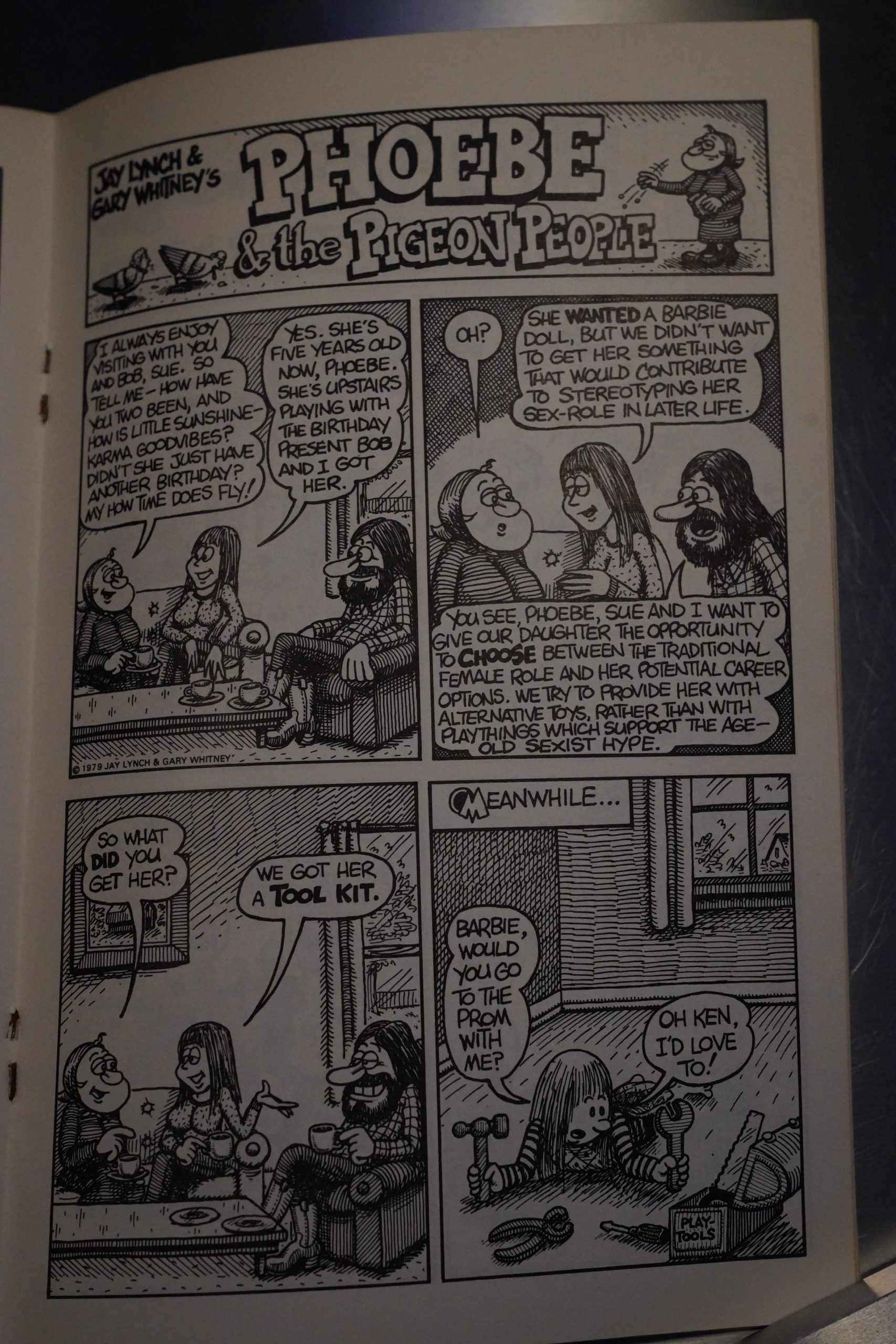
So incisive! I’m sure I haven’t seen that gag a million times before.
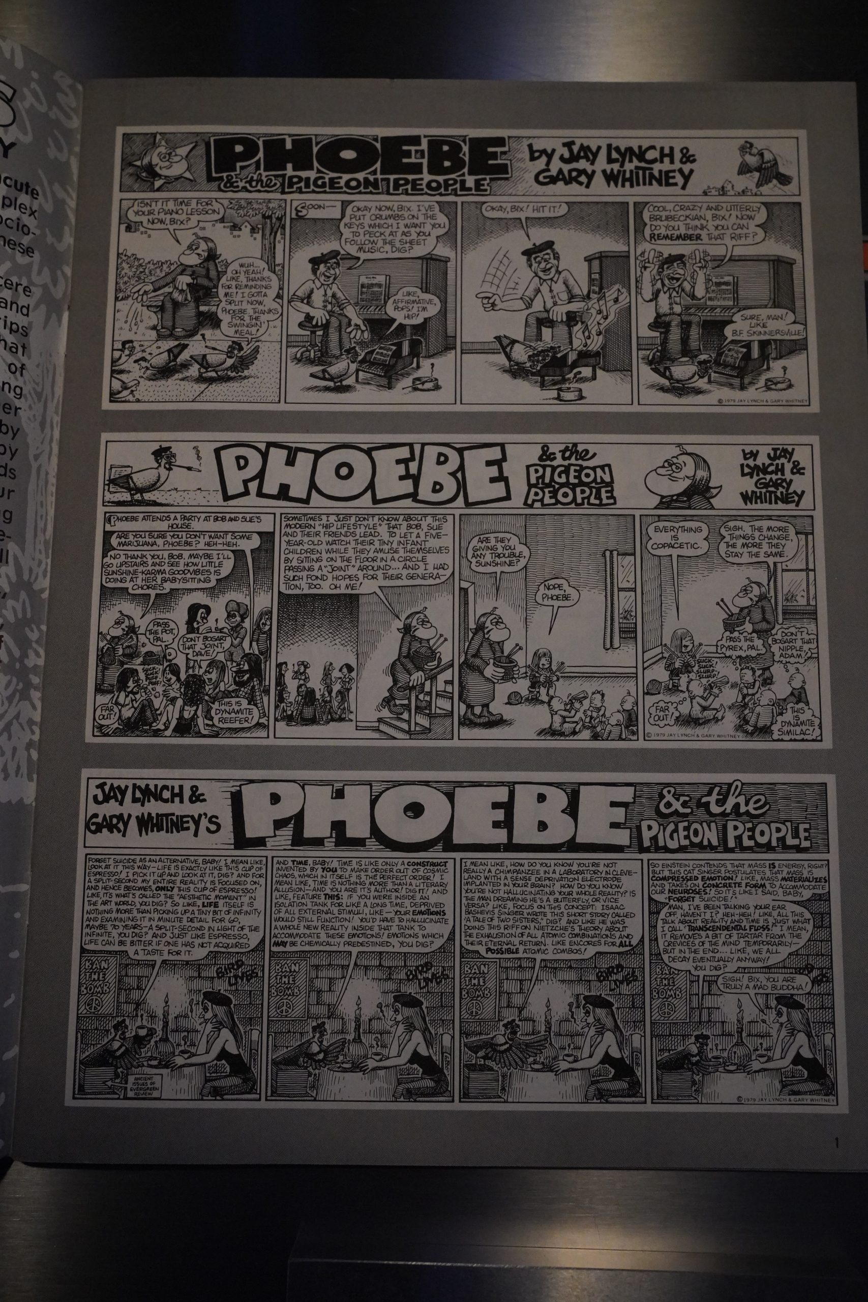
The first two issues were printed in a very attractive digest-like size. Cute and displayed the strips to their advantage. The third issue is magazine sized, and the strips are arranged horizontally instead. (All the panels are the same size to allow rearranging, presumably? Just like Peanuts.)

The problem is that the strips are printed in a smaller size here, so the strips with the most verbiage just become a sort of grey haze.
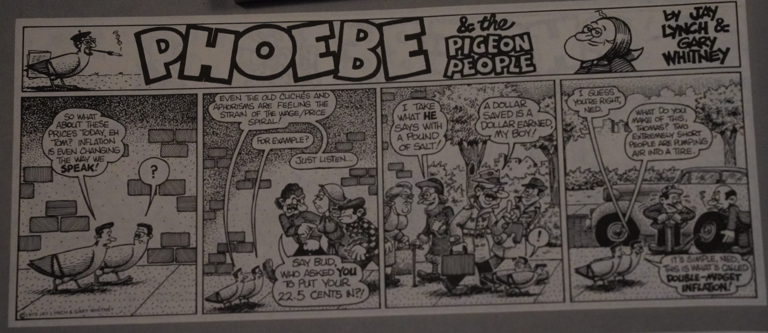
*groan*
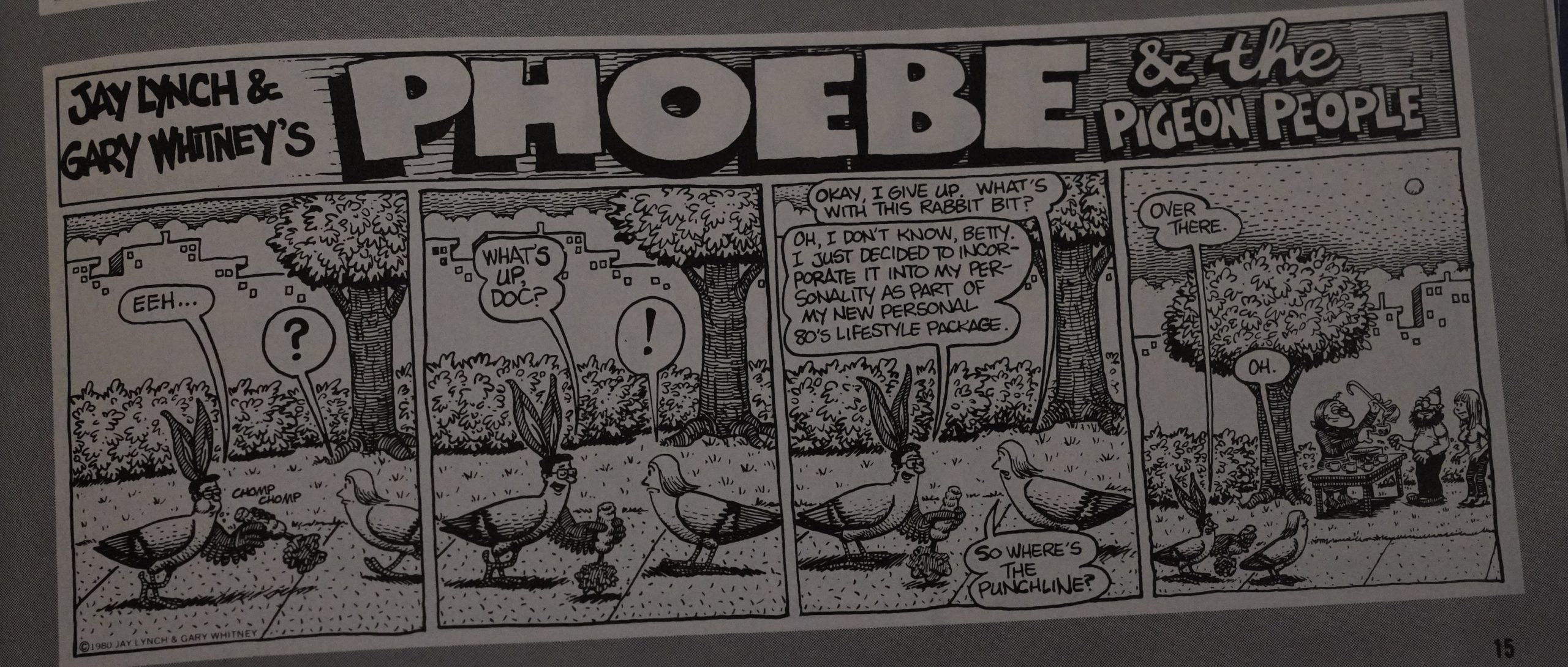
*double groan*

There’s a lot of strips like these. I think the problem is that the creators didn’t really manage to come up with character for their characters. I mean, they try to differentiate them by giving them sort of individual schticks that can pass for personality if you squint, but they aren’t personalities that naturally give rise to gags; that generate storylines and fun in themselves. So they have to come up with some random word play and try to shoe horn it into this format.
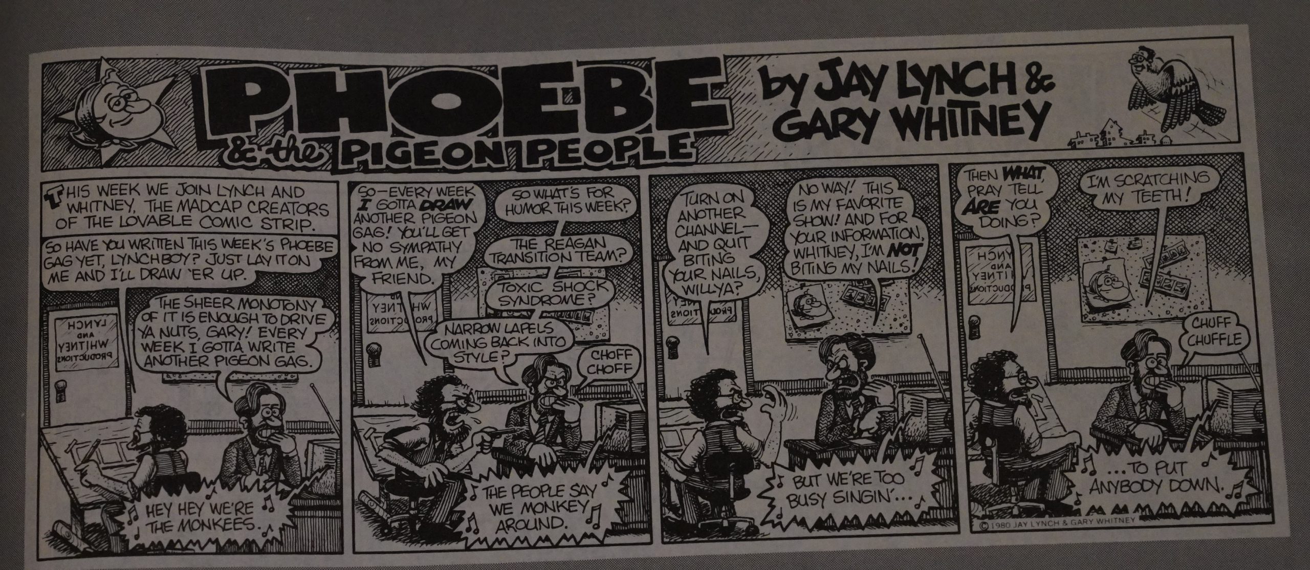
Which explains all the strips about not being able to come up with any gags.

Peanuts this ain’t.

Lynch is interviewed in The Comics Journal #114, page 87:

GREEN: In the underground comix you Wrote
and drew the adventures of the characteß
Phoebe The Pigeon people, which appeals
weekly in The Chicago Reader newspaper.
How does the writing of a weekly strip differ
from the writing of comic book stories?
LYNCH: Well, Phoebe has to be a joke a
week. It’s a different thing than Nard ‘N Pat
in that Nard ‘N Pat was long stories with
a lot of dialogue, and those stories didn’t
necessarily have to have punchlines. Phoebe
pretty much has to have a punchline every
week. Even if we get involved in a continui.
ty situation in Phoebe, there still has to be
a gag a week in addition to the continuity.
Gary Whitney draws Phoebe. I just write it.
With Nard ‘N Pat, I drew many hundreds
of panels of a man, a cat, and a chair. When
I had the idea for Phoebe about nine years
ago, I didn’t want the tedious task of draw-
ing it because originally—for the first year
or so—it was just a woman, a bench and
some pigeons. Then I met Gary, and we
combined forces. After the first year, Phoebe
got up off the bench, and now the strip has
evolved, and there are dozens of regular
characters in it. It’s a whole little universe
unto itself.
YOE: What is this ‘ ‘You get what you draw”
philosophy of
LYNCH: Well, lately I ‘ve been into this idea
that drawing a comic strip is a form of vi-
sualization, and.. .Why don’t we just reprint
this thing from the Chicago Reader’s letter
column here. One of the readers corn.
plained that Gary and I drew ourselves in.
to the strip wearing tuxedos and appearing
too wealthy-looking, and we answered him
by articulating our “You get what you draw”
theory.
YOE; So have there been any positive benefits
to this ‘ ‘You get what you draw” thing?
LYNCH: I don’t know if we can use our
Oowers for our own personal gain, but.. –
Well, in the ’60s we advocated that the war
in Viet Nam should end—and it did.

A complete collection was published in 2017 by Alternative Comics.

This is the fifty-fourth post in the Entire Kitchen Sink blog series.
1979: Hyper Comix

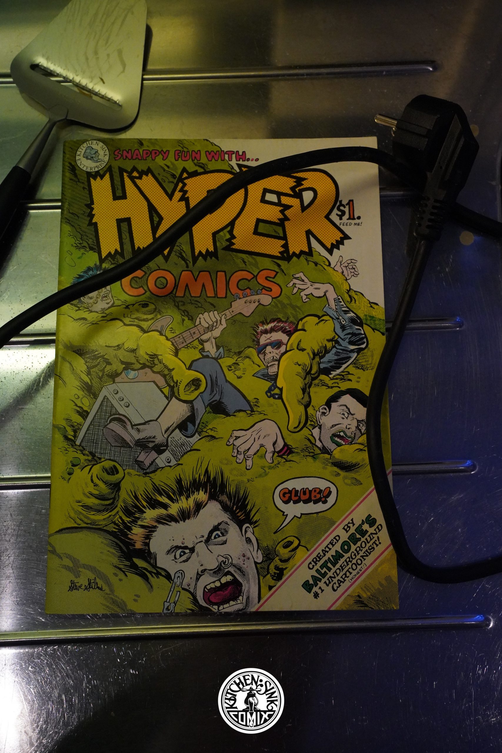
Hyper Comix (1979) #1 by Steve Stiles

This is yet another one of the single author anthologies featuring an artist that had been featured heavily in the various Kitchen Sink anthologies… but this time around, it’s all new comics instead of reprints.

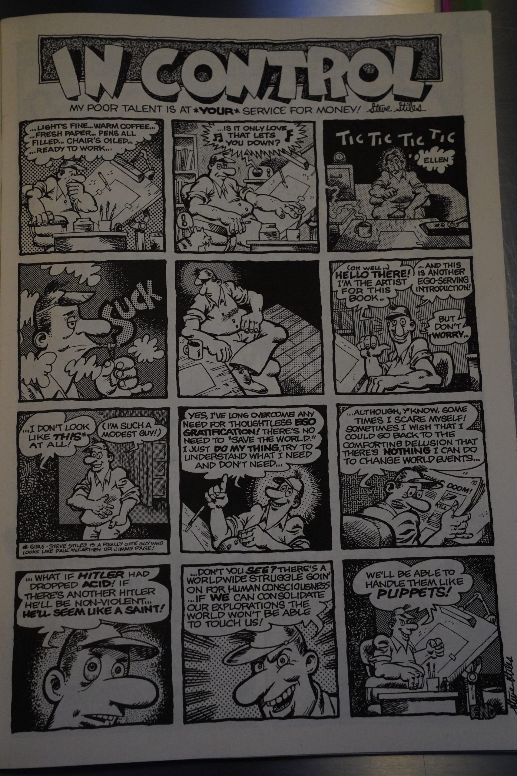
The name of this book is Hyper Comix, but it starts off kinda staid?

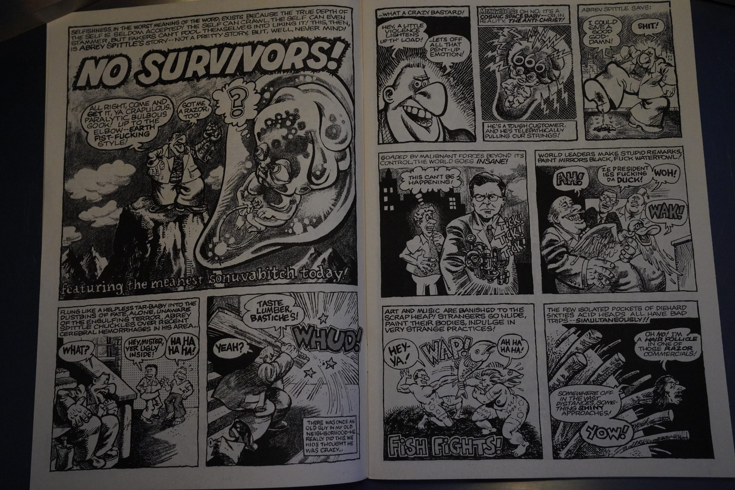
And then! It starts! And never really lets up. The pacing owes quite a lot to Mad Magazine, but it’s way, way more hyper, and very underground.

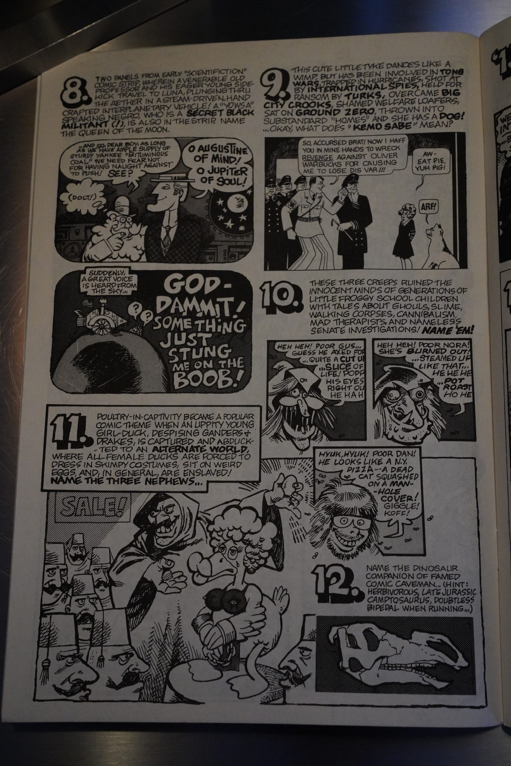
The book is a mixture of longer stories (that mostly don’t really go anywhere, except into lunacy), and stuff like this quiz (no answers are printed in the book, of course).

And also very random, but inspired, nonsense.

Stiles’ artwork is really stylish — it seems to derive something from just about all the EC artists? But a different mixture for each strip.

Anyway, it’s fun.

As usual, I don’t agree with the ComixJoint guy:

The story has pretty good pace and is funny in places, though it confused me a couple times with seemingly incongruous transitions or writing that just missed the mark.

There’s a few other one-pagers and short features in the book that don’t stand out, but overall Hyper Comics is a fairly solid book from a veteran creator. It has the look and feel of alternative comics that would come in waves some years later, so to some degree it heralds a future style.

The Comics Journal #83, page 44:

Denis Kitchen, for
example, survives as a publisher largely due
to the success Of The Spirit in specialty
shops that won’t accept Dope Cornil Or
Bizarre Sex. (l hope his new Steve Canyon
proves eoually successful.) But his days Of
indulging his regular artists with solo titles
like Steve Stiles’s Hyper Comix (a really fine
and very funny comic, by the way) are Over
and gone.

Stiles died in 2020:

I had the pleasure of being friends with Steve for 44 years. When he, sadly, left us, much too soon, I at least had the pleasure of helping pull together the print version of Steve’s epic anthology of his life’s work, The Return of Hyper Comics, 164 pages of his fabulous art and uniquely droll brand of writing. Steve had been working on this book, the second Hyper Comics volume, for many years.

This is the fifty-third post in the Entire Kitchen Sink blog series.
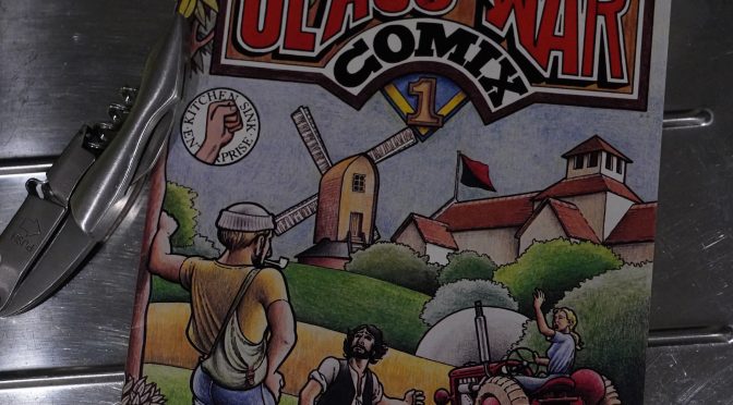
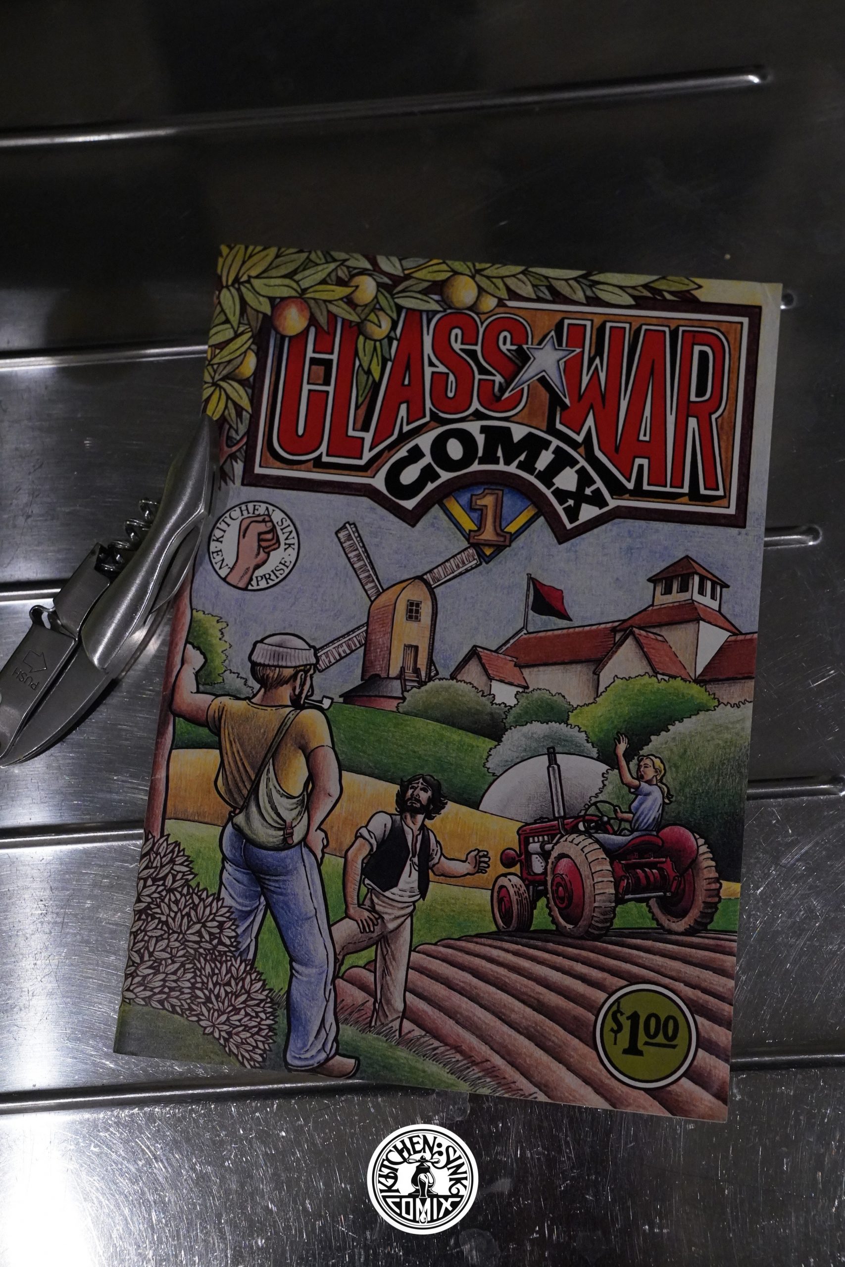
1979: Class War Comix

Class War Comix (1979) #1 by Clifford Harper

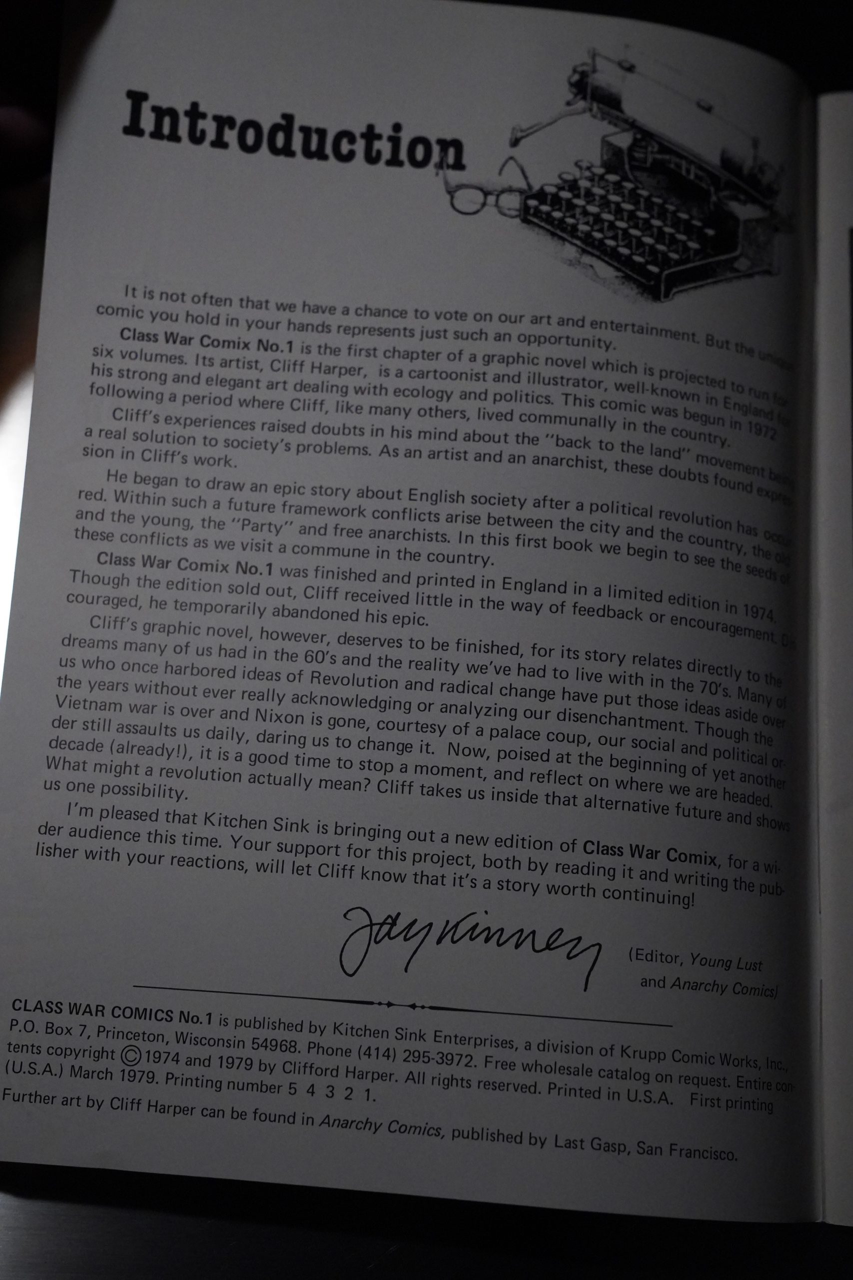
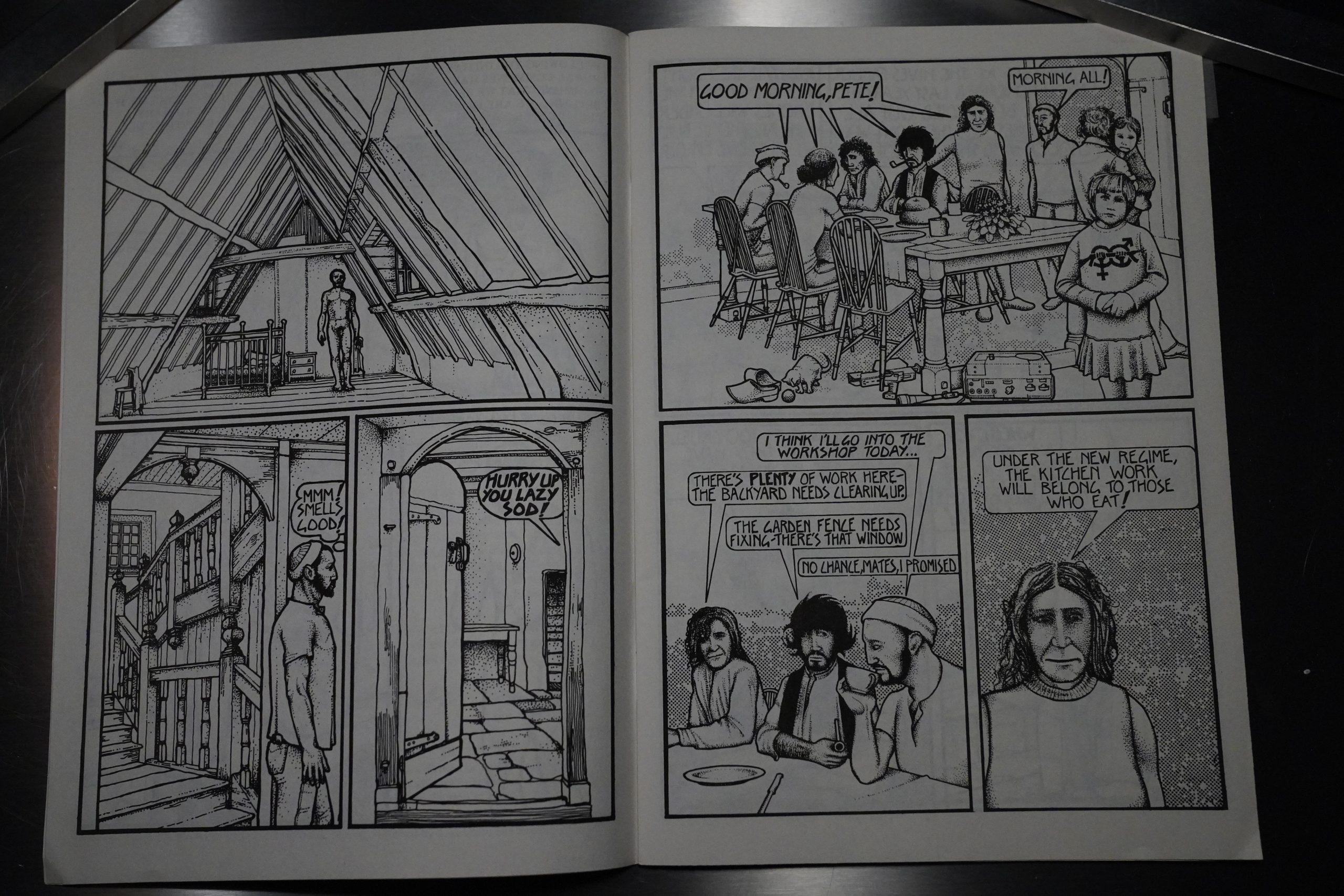
As with many of the books Kitchen was publishing at the time, this is a reprint of book published earlier by somebody else — but this time around, it’s a British underground comic (that was abandoned, Jay Kinney explains, because of the lack of reaction).

The artist explain in the afterword that the artwork was done before having a story (or script) in mind, but it seems clearly narrative, so I suspect that he meant that he hadn’t written the words.

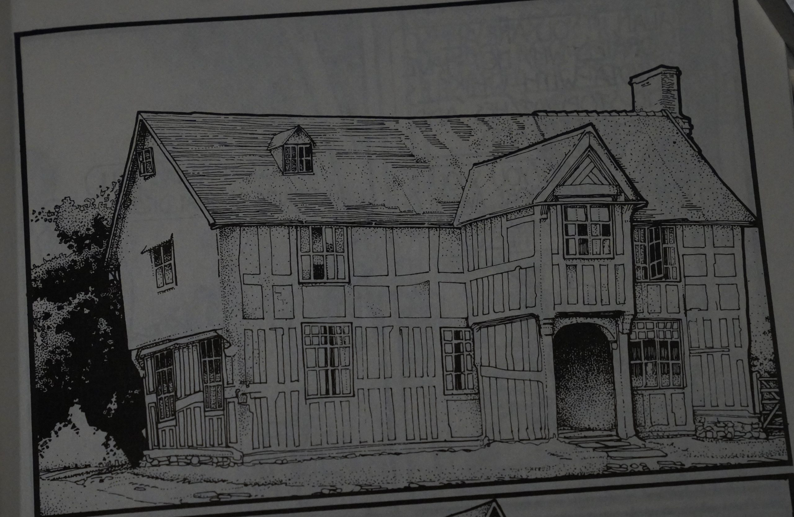
The artwork looks like it’s referencing photos a lot. Or rather — that he’s tracing photos. But that’s a very nice house.

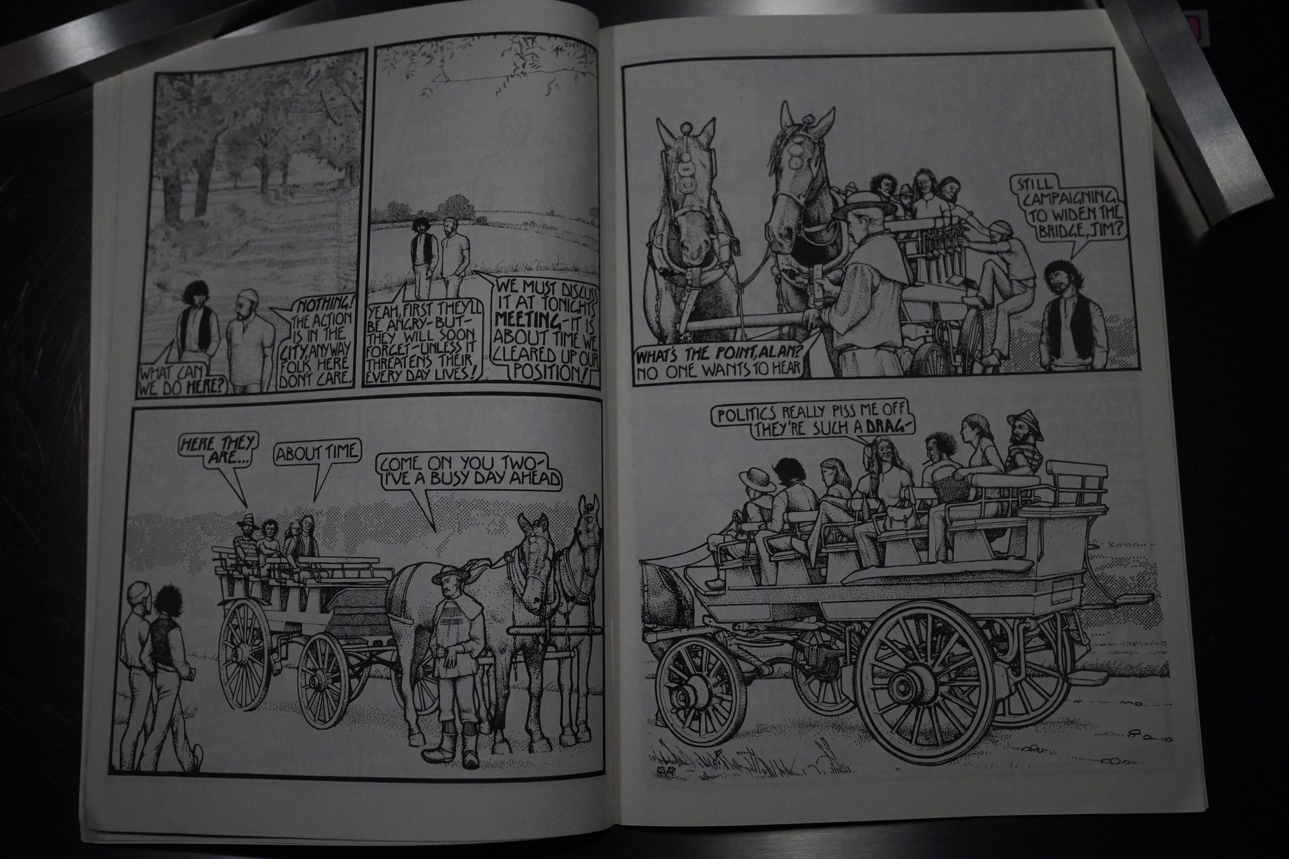
Whenever he’s not drawing people, it looks pretty good?

The storyline is about living on a commune in the near future (there’s been some kind of societal breakdown), and it’s pretty interesting.

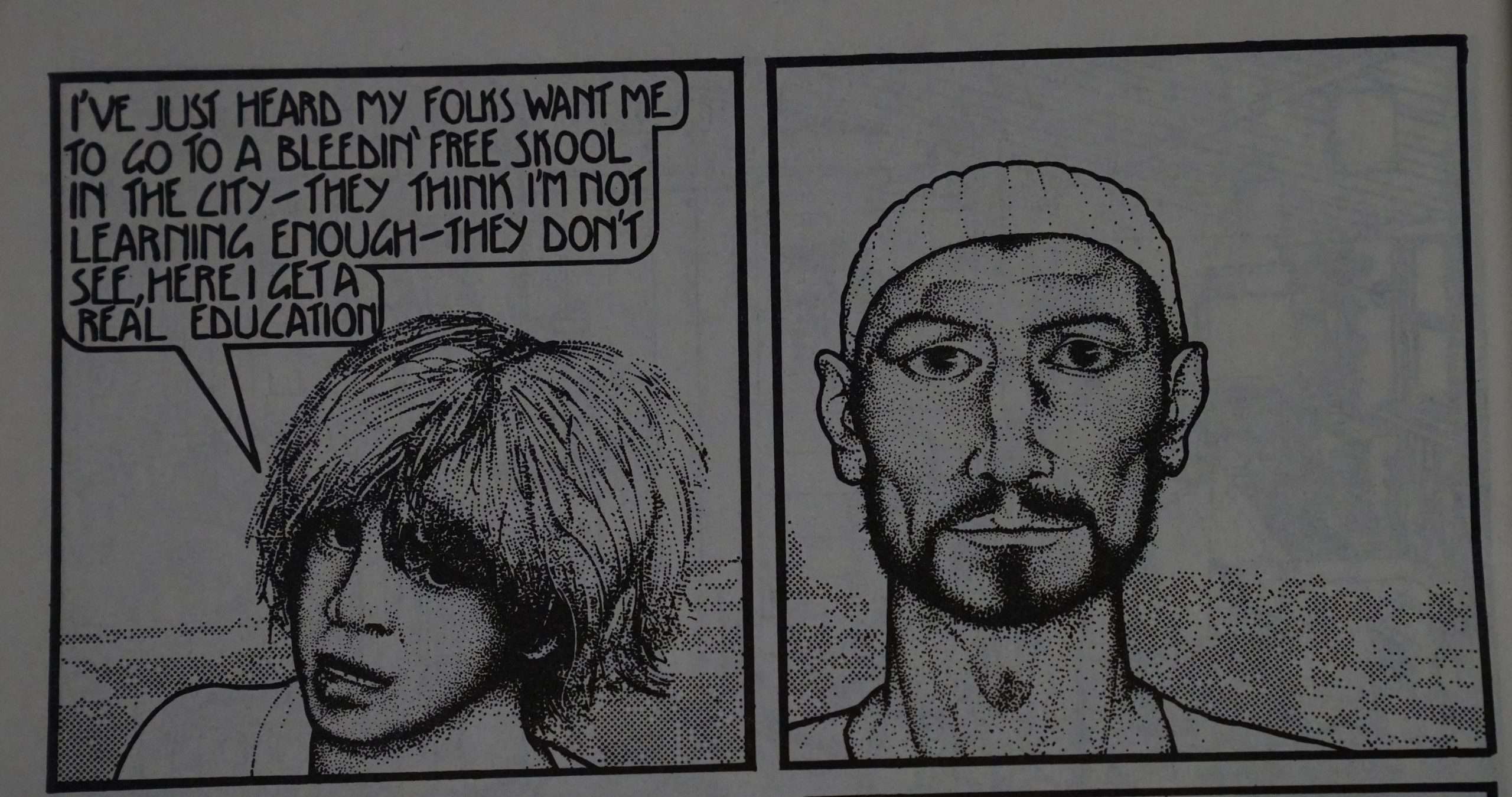
The faces go from very odd indeed to quite nice.

But… how on earth was this done? I guess that’s mechanical tone in the background, and then the linework looks inked as normal, but all that stippling… if this had been made ten years later, I would have thought that this had been (partially) printed out on a dot matrix printer, but surely that’s impossible in 1974. So it’s just obsessively dotted?

He’s spent a lot of time on the rendering, and not that much time in getting the faces quite right to begin with.

David Stallman writes in The Comics Journal #56, page 79:

“A revolution does not march in a
straight line.
‘—Mao Tse—Tung
Class War Comics is the first of
six possible eomix about the
organizing of an embryonic anarchic
society after a successful class
revolution in Britain, and the
personal and political problems that
Would confront the participants and
beneficiaries Of the revolution.
The story takes place in a rural
commune, composed of several
autonomous collectives (carpentry
farming, etc.) , and the characters
are shown going about their activi—
ties, while expressing and debating
the Various organizational, political,
and personal difficulties they face.
The major developing conflict is
that the socialist bureaucracy ,
which replaced the former capitalist
system, is beginning to adopt a
repressive policy against the urban
workers and against the anarchist
elements determined to dismantle
the bureaucracy’s power. The
commune members are reluctant to
become involved in this distant
growing political battle, but they
are aware that they will eventually
have to, as it may threaten their
own autonomy.
Harper’s main statement is that
after a class revolution, the great
expansion Of freedom does not
entail a unanimity of political and
social views, but rather a diversi—
fieation. Unity exists in the desire
to create a better existence, not in
how to accomplish it. It is this
diversity of views that is at once
the wealth and retardant of an
ongoing revolution.
The main political conflict between
the party and the free anarchists
in the book is not new and has been
around since the battles between
Marx and Bakunin in the First
International. The question of
centralized power (the state) vs.
decentraUzed power (the rights Of
local organization and individuals)
has erupted in the past into shooting
Wars between communist and anar—
chist (for example the Russian and
Spanish Revolutions) . It will be
iriteresting to see how the conflict
progresses in the series’ possible
Harper’s beautifully detailed
artwork includes exquisite drawings
of English manors, farmhouses, and
countryside that superbly create
a believable rural atmosphere. His
stippled shadows and interiors Of
forms pr•oduce a light, open air that
is easy and pleasurable to view.
Simply, the book is a visual delight.
In his afterword/ Harper apolo-
gizes for the rhetoric in the book I
feel that the use Of rhetoric is
appropriate considering that it
would be bandied about in such
political situations, but if he wishes
to make it more elegant and eloquent ,
I certainly have no objections as long
as he continues to directly address
the political issues.

Right on, Comrade.

Harper didn’t continue the book, but he’s a successful illustrator.

ComixJoint:

This is a well-drawn, fascinating tale about real people, communal living and the potential complications of living outside normal society.

This is the fifty-second post in the Entire Kitchen Sink blog series.