Category Archives: Uncategorized

1993: Tantalizing Stories

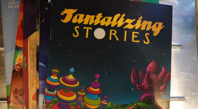
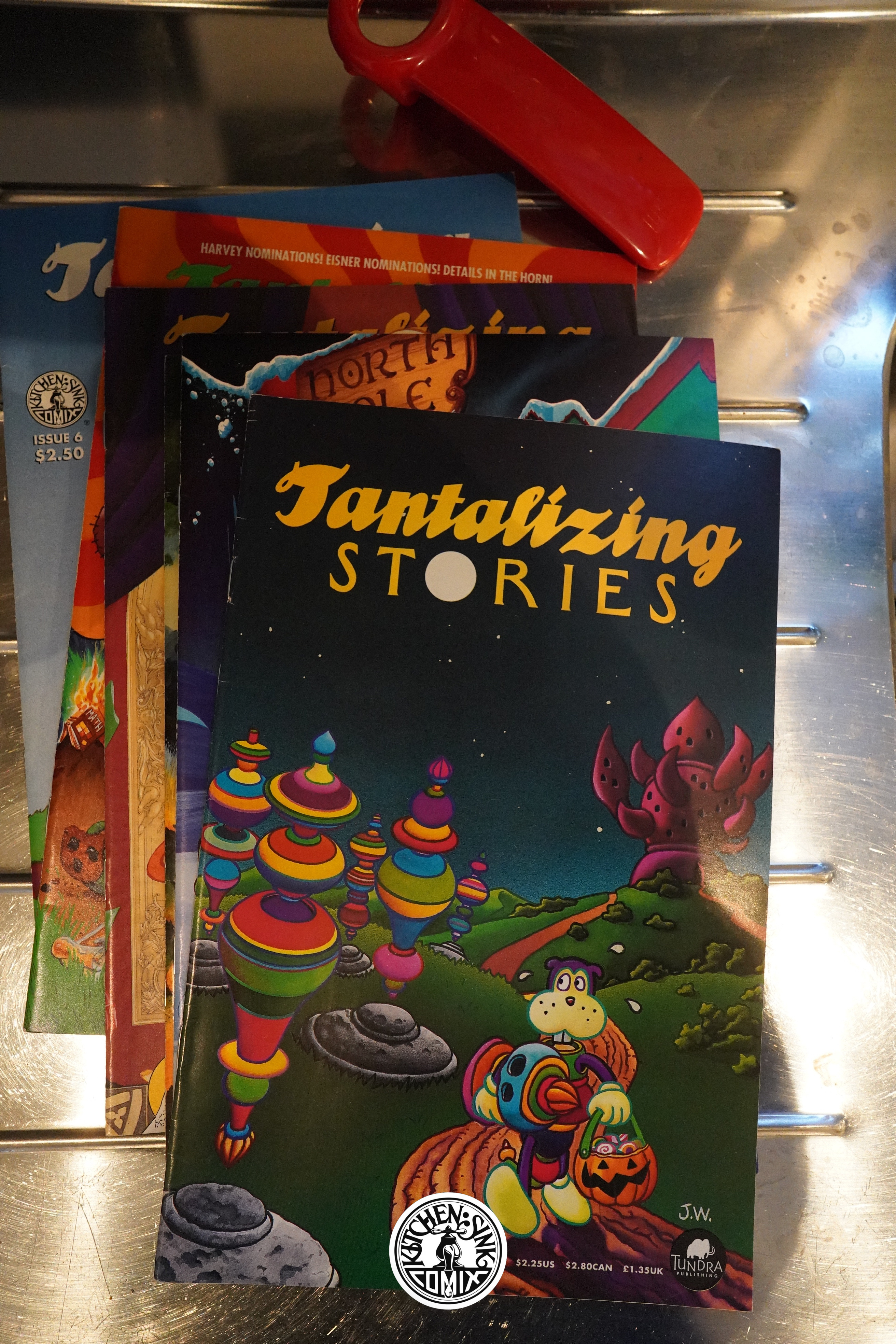
Tantalizing Stories (1993) #1-6 by Jim Woodring and Mark Martin

I’ve had these comics for quite a while, but I bought them at random as I found them as back issues, so while I’ve read these issues before, I’ve never read them in sequence before. Thrilling, eh?

Tantalizing Stories is one of those rare two-person anthologies. Not rare because they aren’t frequently attempted — it makes sense for a couple of friends to get together and put out a book like this, because you can get it out more regularly than if you do it on your own (and it’s probably more fun to do, too) — but because they all fail pretty quickly. For various reasons: People don’t like anthologies in general, and one of the two may be more popular/more productive than the other, and so on. (There’s Love and Rockets, of course, which proves that it can be done, but…)

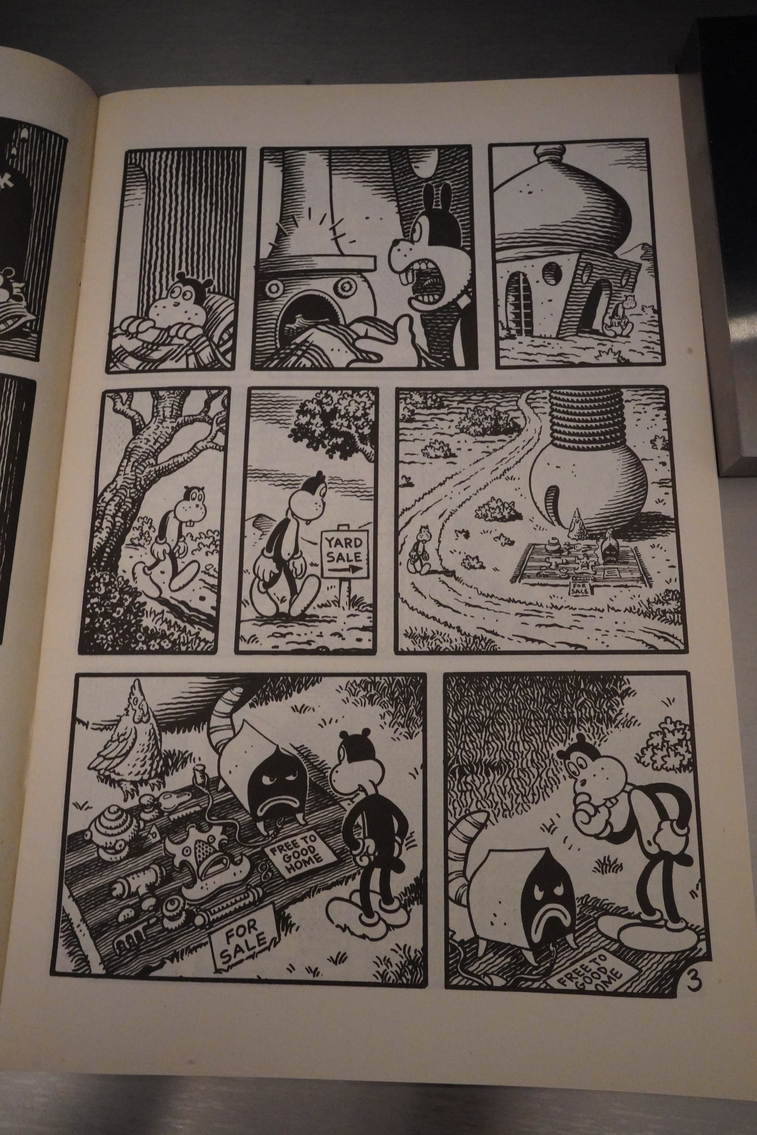
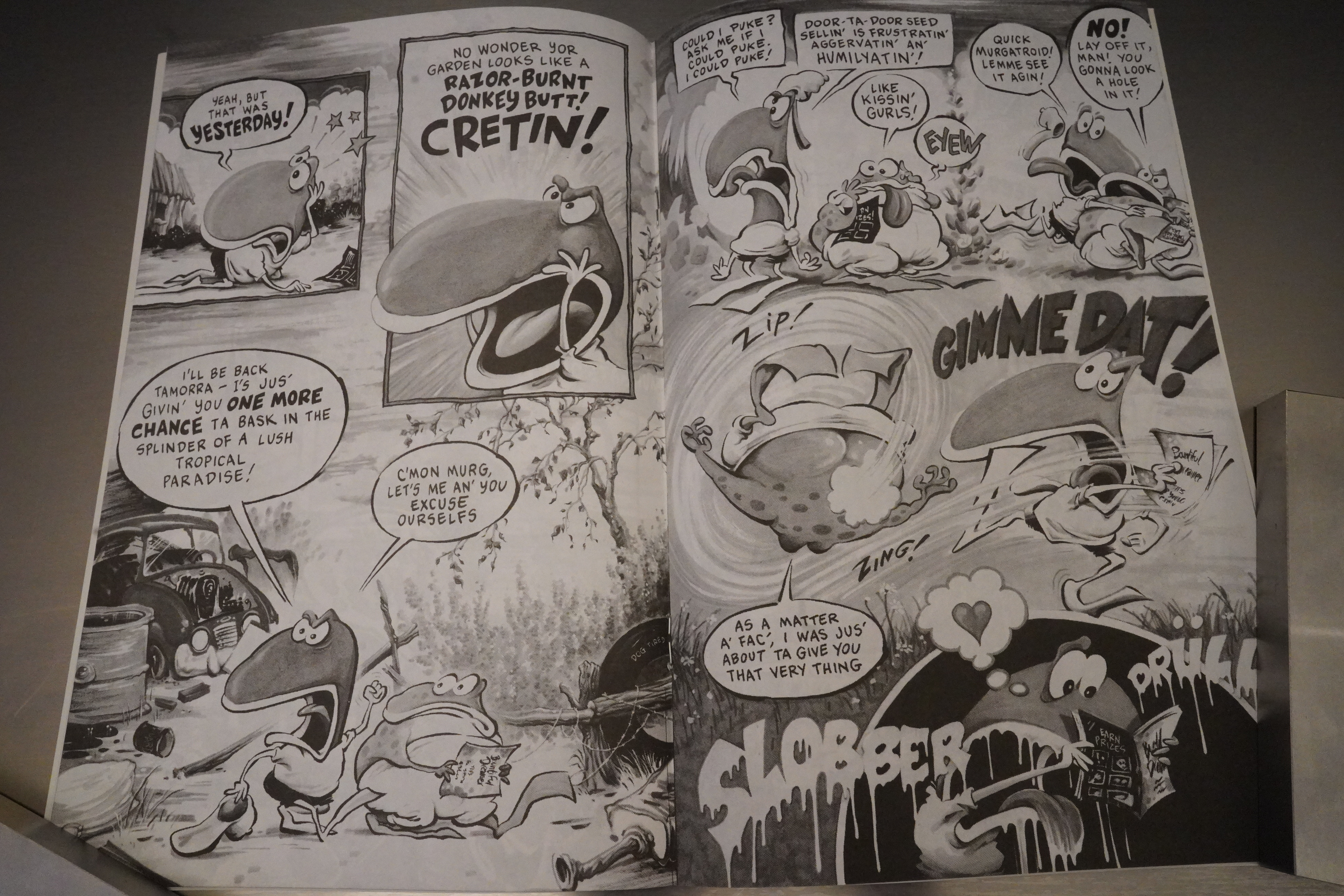
This two man anthology is pretty odd, though: I don’t think there’s much of a connect between Mark Martin’s zany and good-natured stories about these anthropomorphic children, and Jim Woodring’s unnerving and precise stories about Frank.

(And the cover doesn’t mention Martin nor Woodring, so I guess people just have to guess at who’s inside.)

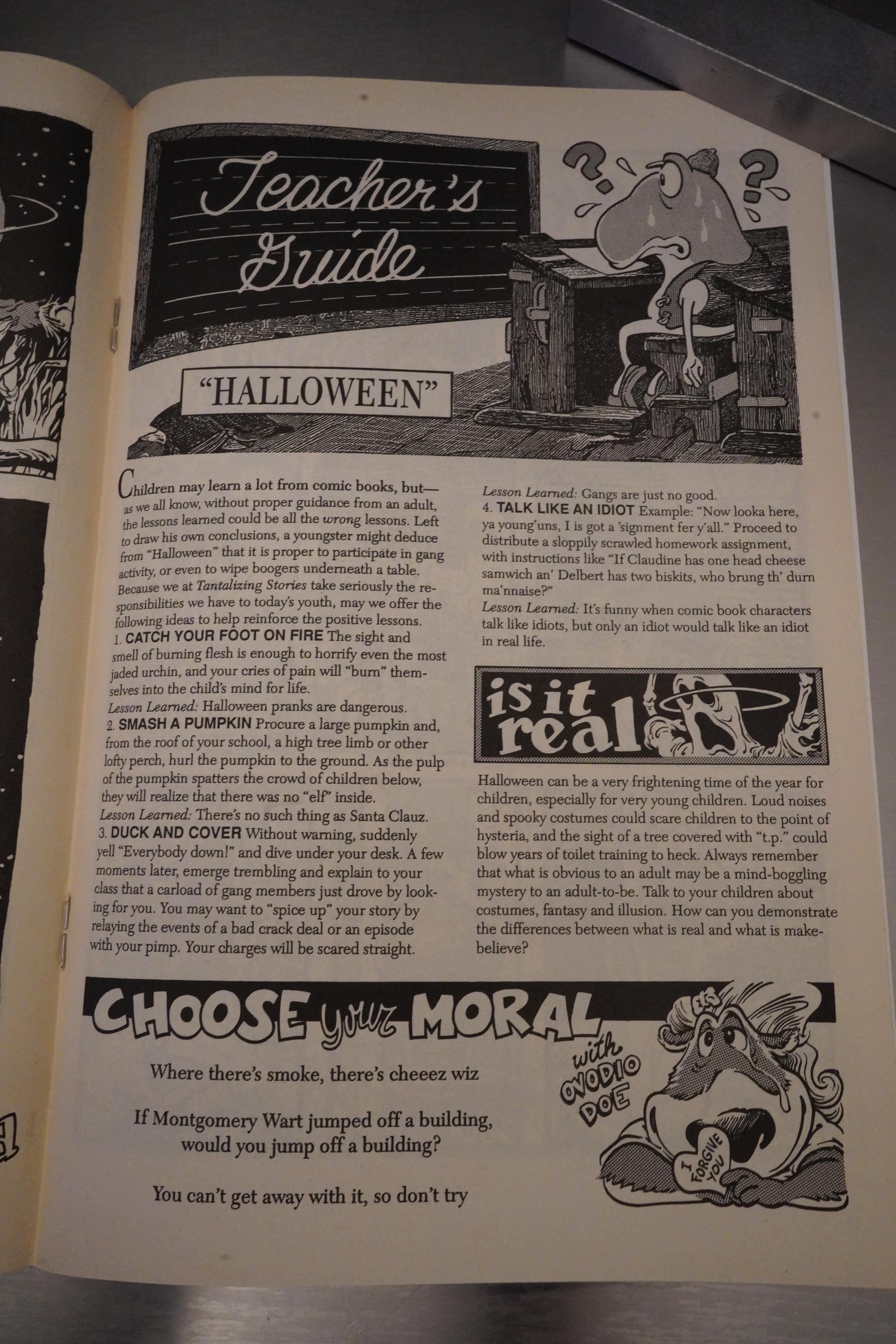
In addition to the stories, we also get a couple text pages.

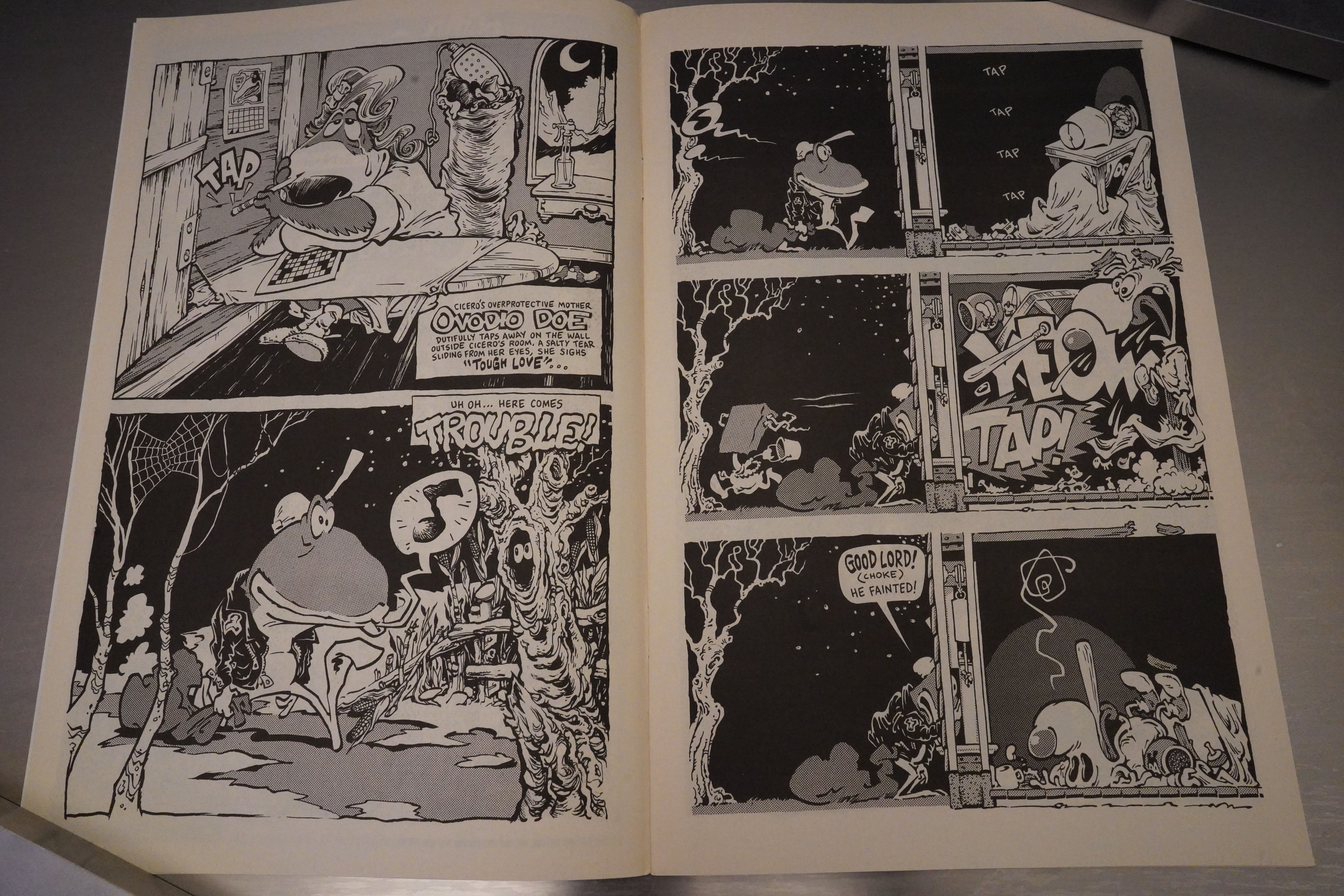
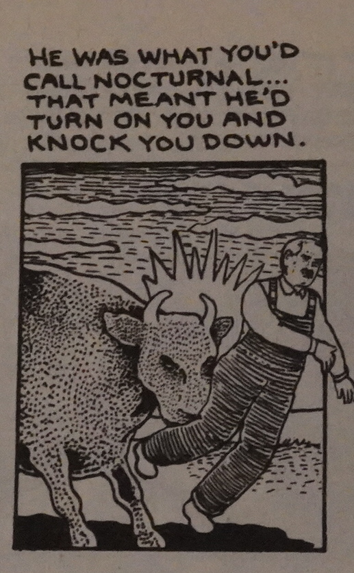
Is this where Jim Woodring started doing the Frank stuff? Hm… or did he start those in the Jim magazine? I forget. Anyway, it’s great, as usual.

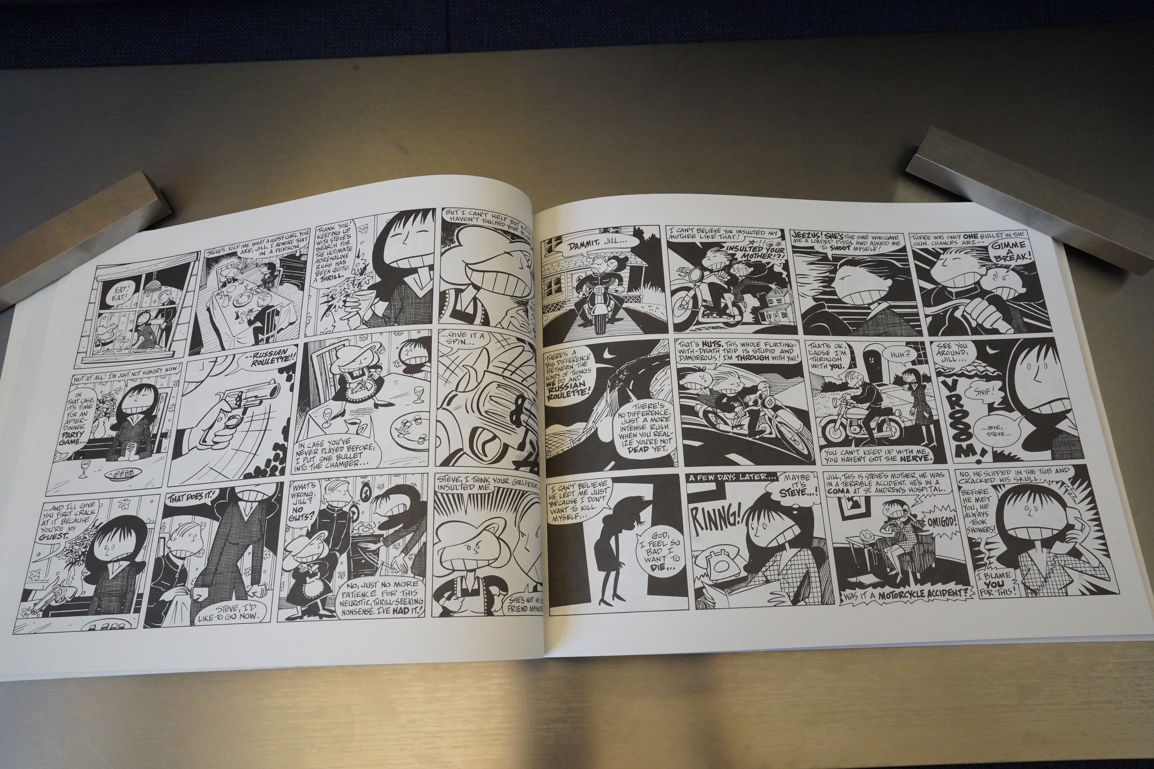
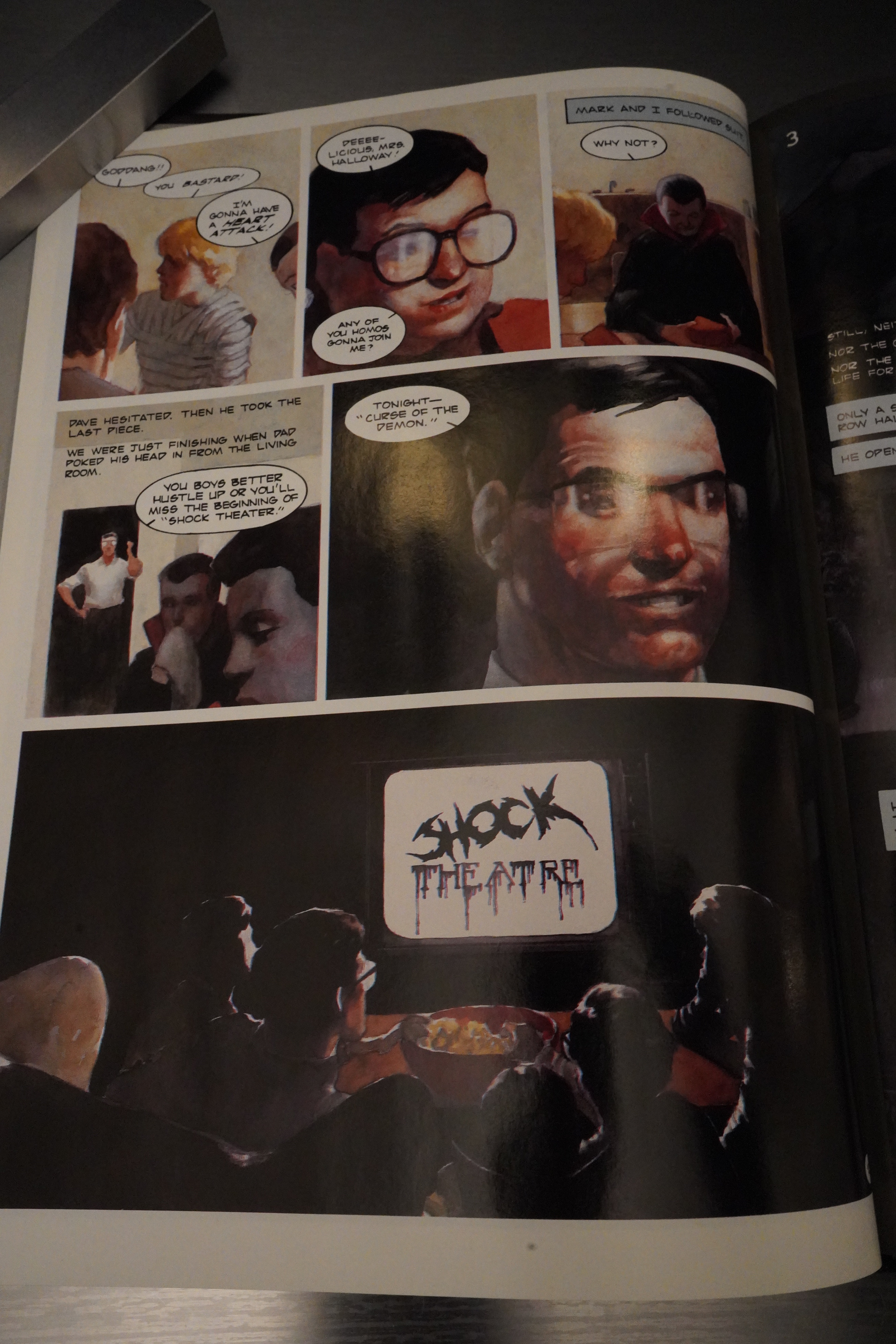
But that’s not all — Woodring starts this serial about these two kids (perhaps as a response to Martin’s stories?), and it runs (as a somewhat continuous story over the six issues — sometimes just a couple pages per issue).

Ooh! Is that the first appearance of that cat/valise character in Frank?

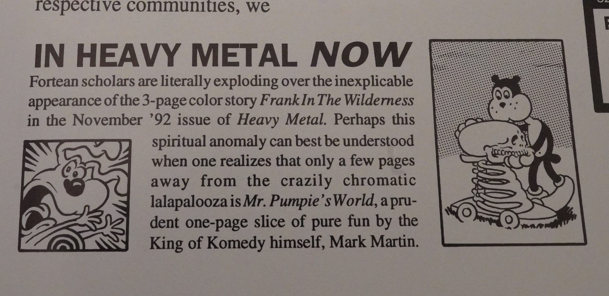
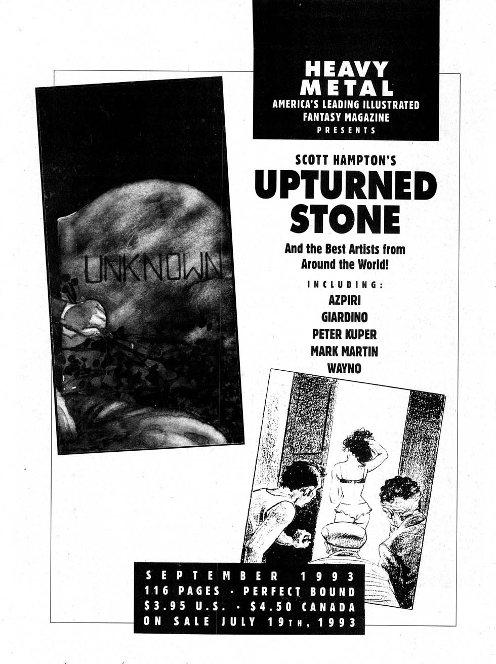
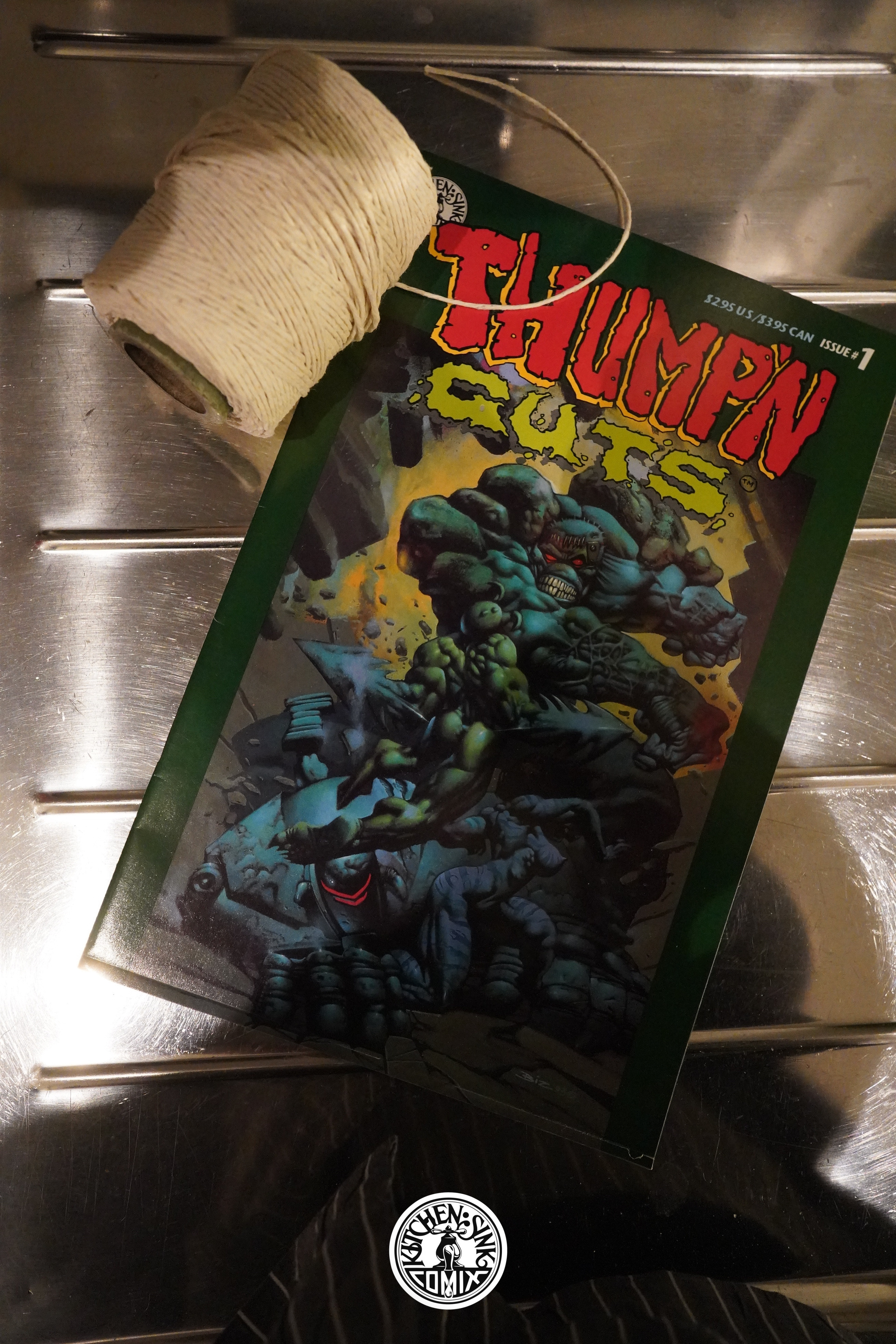
The first five issues of this were published by Tundra, and Tundra was owned by Kevin Eastman, who also owned Heavy Metal at the time. So there’s some cross-pollination going on: Woodring is also featured in Heavy Metal.

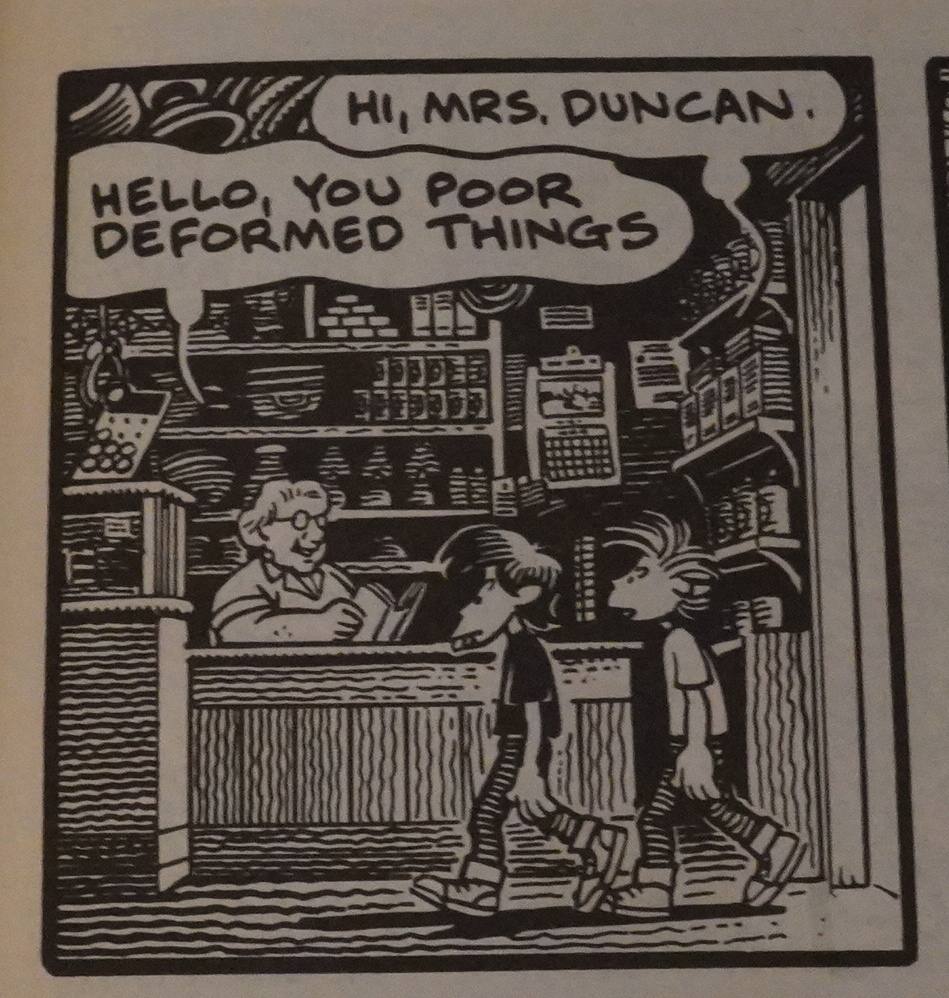
Woodring’s story about the kids is a bit hard to get a grip on — it sometimes seems like it’s referencing what could be stuff that somebody could actually have done, but then it slips into uncharted waters. It’s fascinating and a bit unnerving.

The first two issues had good stuff, but reading these 24 page issues, they don’t really seem to work all that well as books? With the third issue, that changes, and suddenly it feels like I’m reading something vital and exciting. It’s both that they start rearranging things to get a better flow, and also that the pieces seem to start playing off each other a bit more.

And then next issue… six pages by Gerald Jablonski!? I love Jablonski’s insane pages, and they work well in context, but these are 24 page books, so I’m sure some people would feel like this is “cheating”.

But how can anybody not love a joke as corny as that?

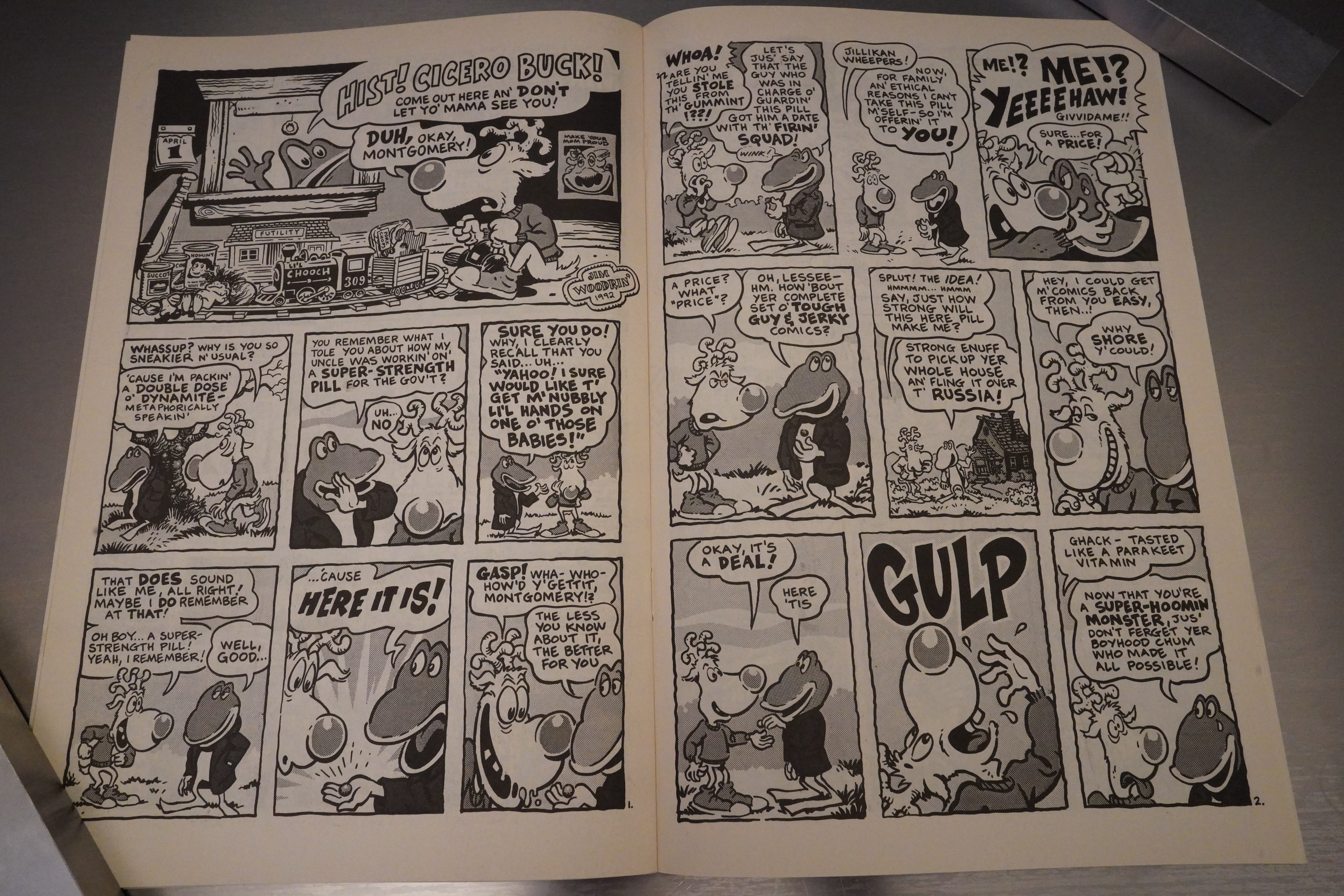
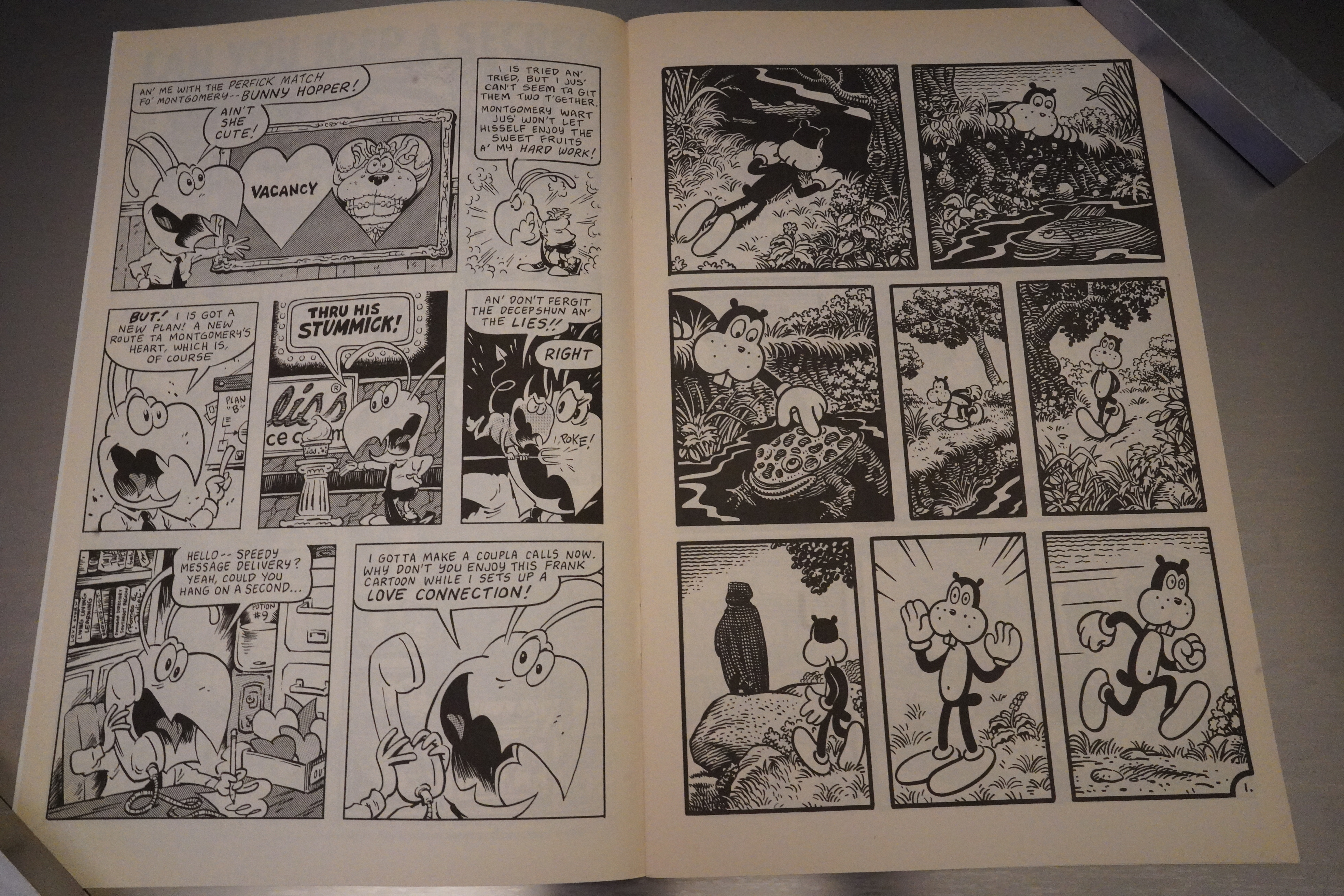
Uhm… it says there that this Montgomery Wart story is by “Jim Woodrin'” — and the artwork doesn’t seem to be by Mark Martin? It doesn’t really look like Woodring, either, and the lettering certainly doesn’t look like Woodring. I guess it could be Martin just experimenting with his art, or it could be Woodring filling in, adapting Martin’s art style? comics.org says that it’s by Woodring… Oh, and Martin drew the Frank story? Wow. Now the book is really hopping.

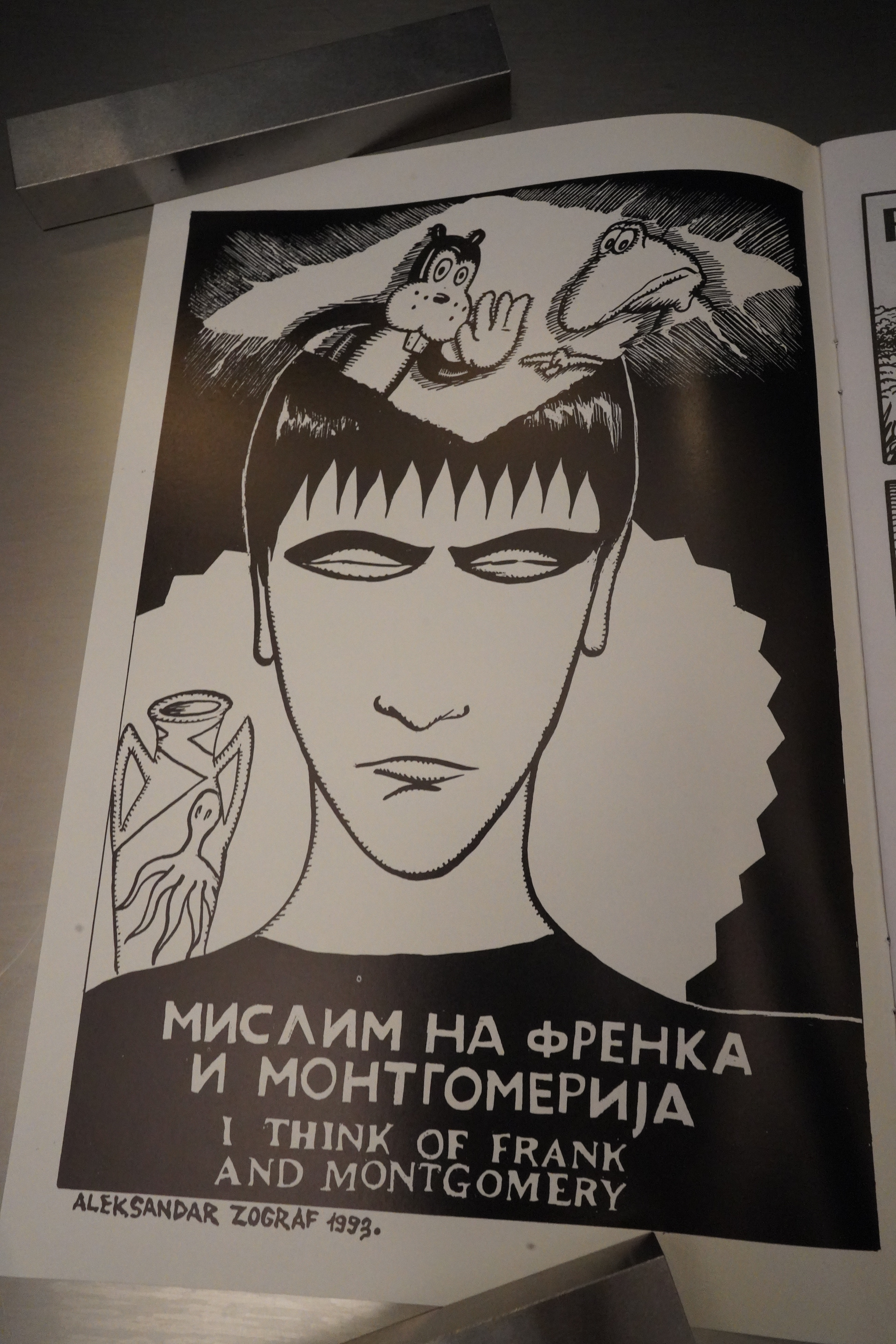
Aleksandar Zograf thinks of Frank and Montgomery.

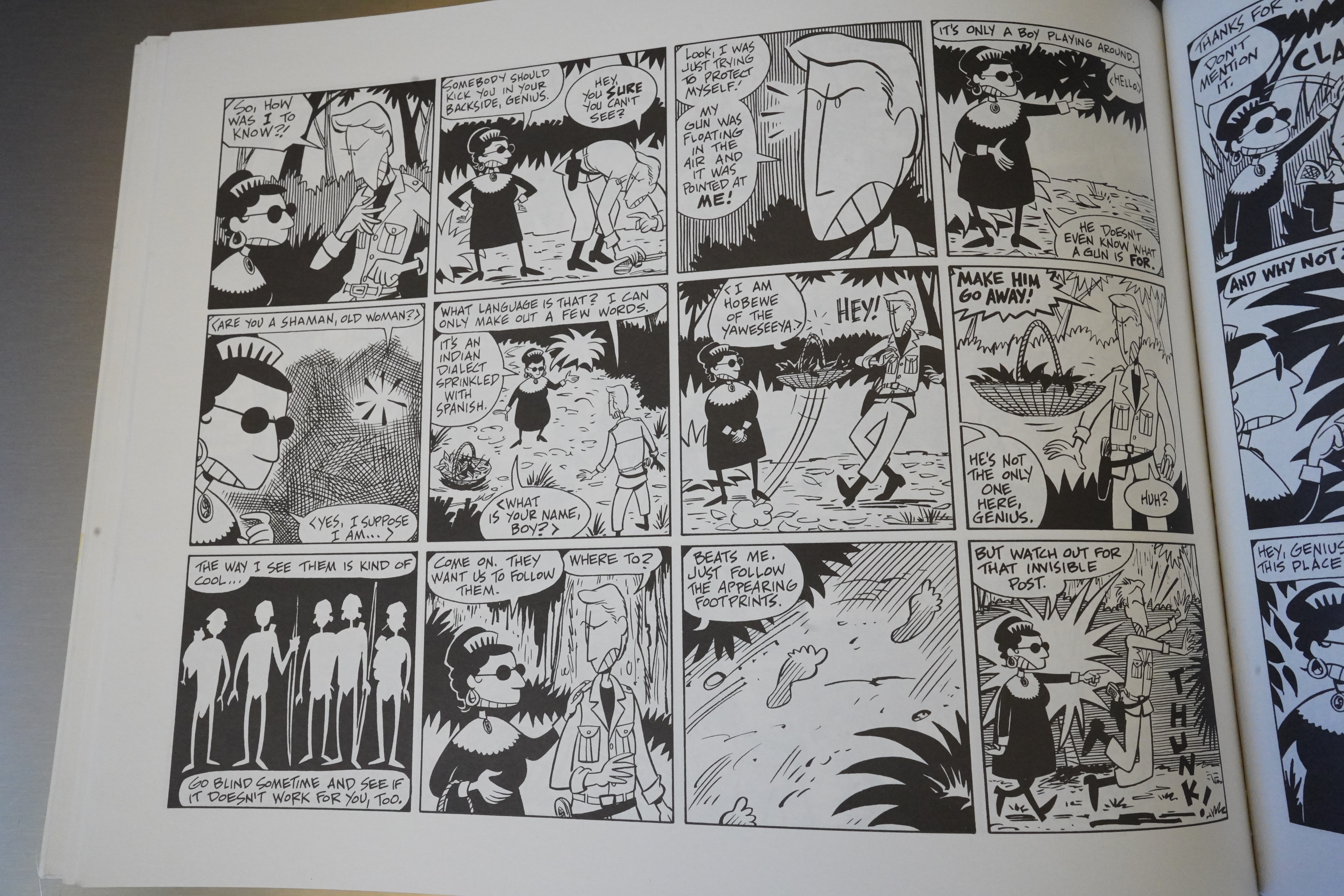
In the final two issues, Martin debuts a new art style. Looks great! It’s both more chaotic and more easy to read than the older style.

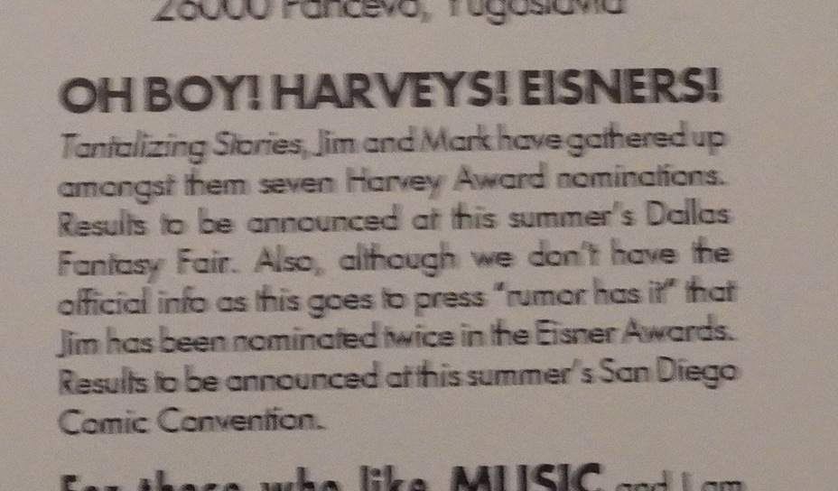
Oops, blurry. But this says that they’ve got seven Eisner/Harvey nominations for Tantalizing Stories, so it was a critical hit, at least.

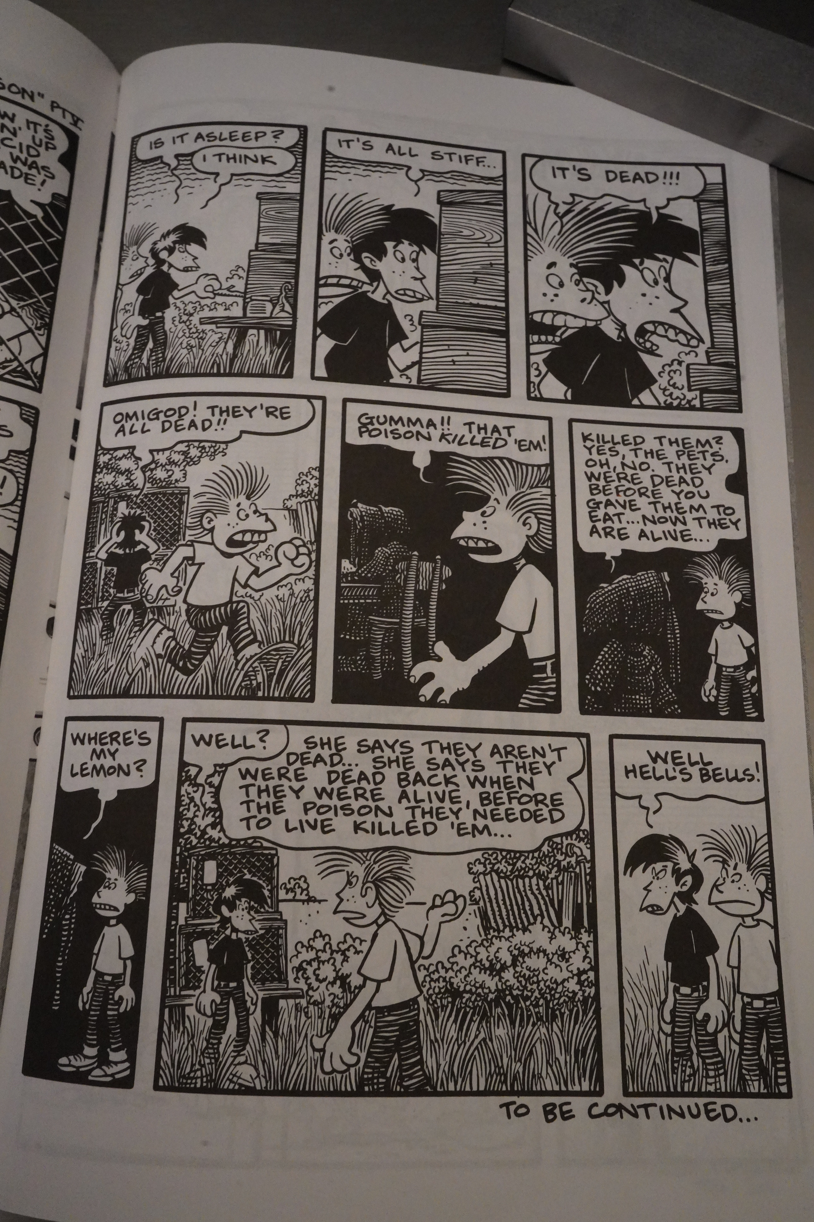
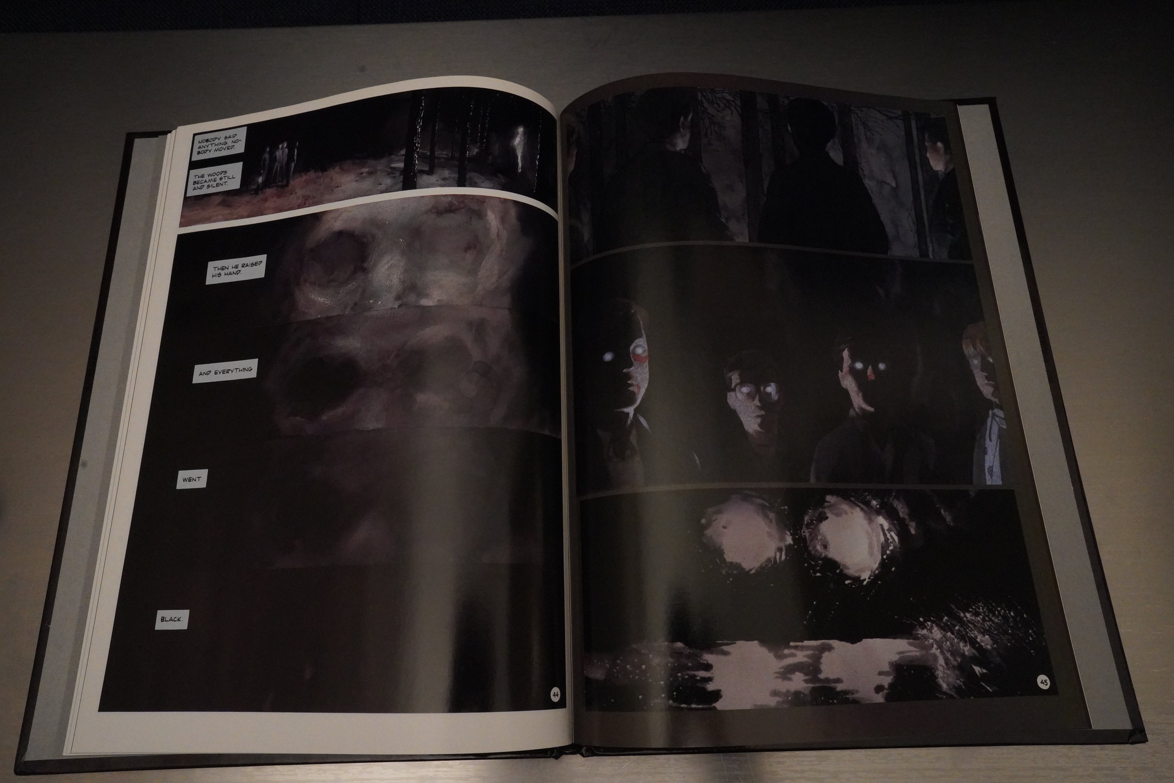
Kevin Eastman “aqui-hired” Denis Kitchen for Tundra, and changed name to Kitchen Sink. Only one issue of Tantalizing Stories survived the transfer, and Woodring’s serial about the two kids ends like this. I don’t think it’s ever been completed? Which is a shame — it’s got something special going.

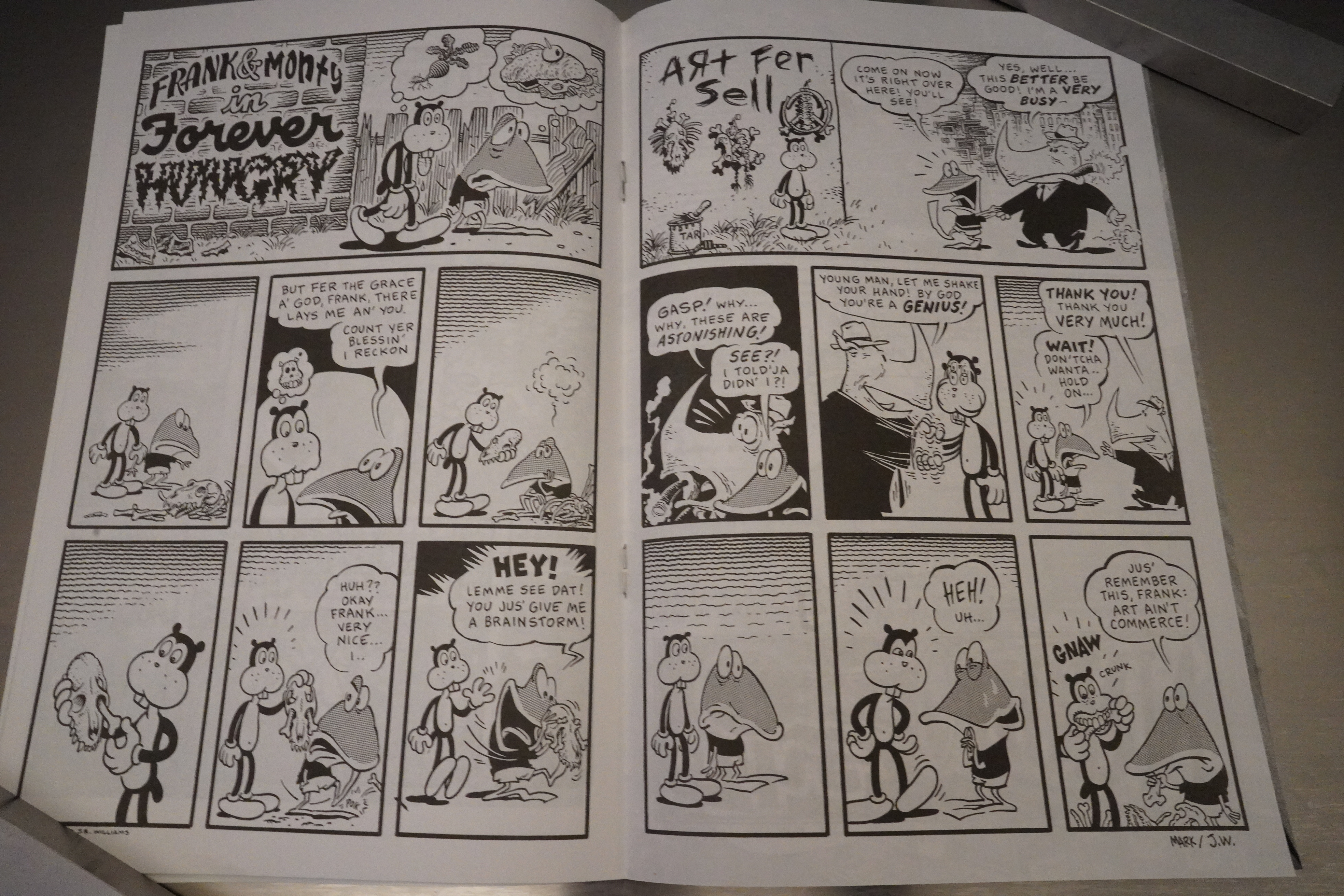
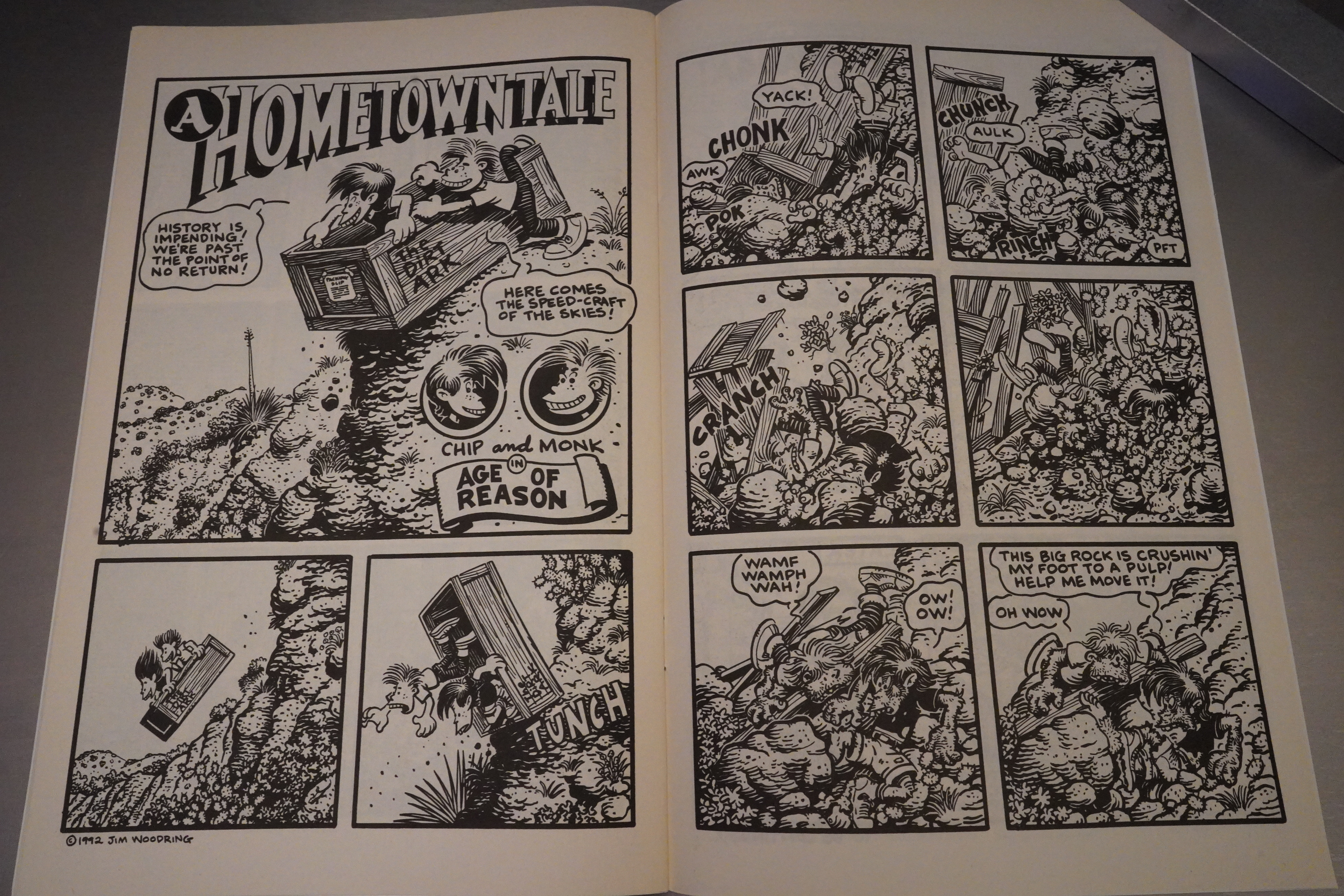
Heh. Martin and Woodring collaborate on a two-pager.

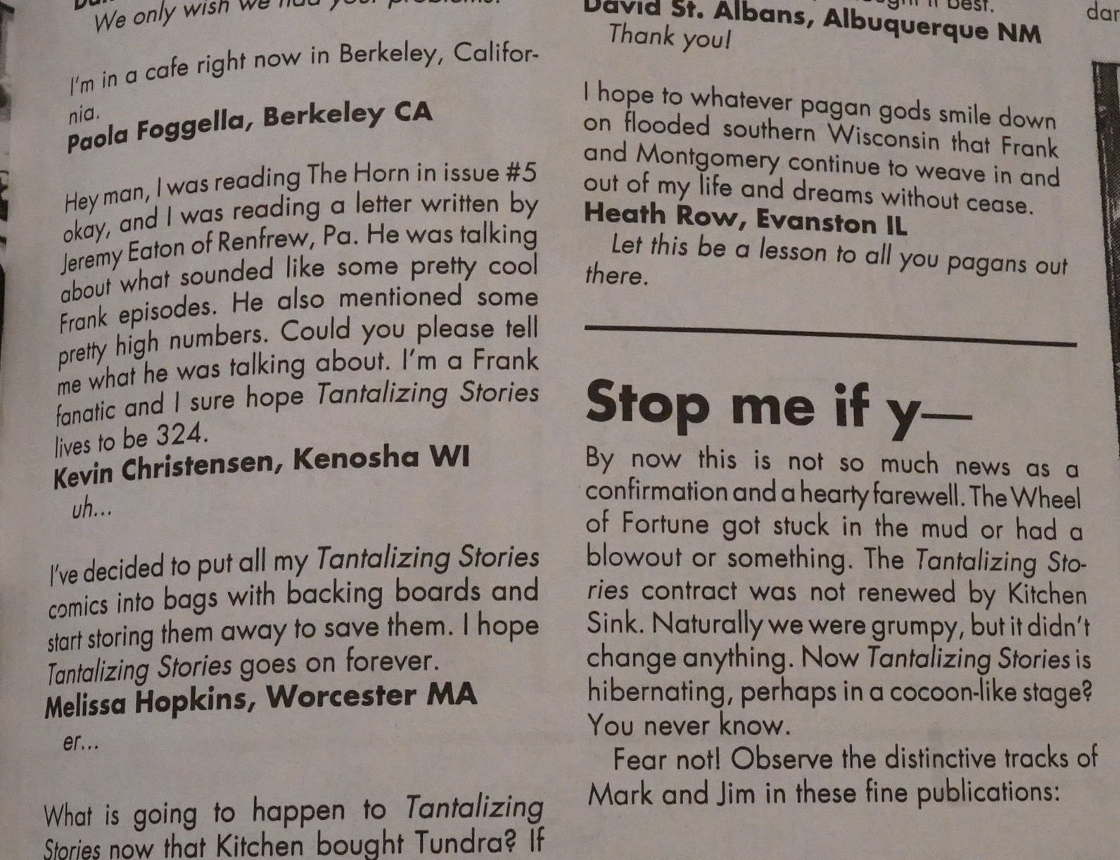
And on the letters page they confirm that they have indeed been cancelled.

It’s a shame, but not surprising. Once they really got going (from the third issue on), it’s an excellent, thrilling book to read, but it’s hard to see how this could ever survive in the US direct sales market.

Hugh Bonar writes in The Comics Journal #164, page 47:

The innate i mplication of the forgotten state
Of consciousness that Woodring describes is
one in which reality is seen as a series Ofvarying
expressions of a single,
unifying conscious-
ness. All thatone needs
is unimpeded sight to
intuit this, but how is
this expressed artisti-
cally? Woodring used
narrative in Jim as a
means Of subverting
narrative, but despite
their unpredictability
there was a linear pro-
gression of events.
Likewise, his recent
work in Tantalizing
Stories are straightfor-
ward narratives, inter-
nally consistent with
themselves, but more
authoritatively using
images in a way that
transcend linear con-
sciousness. Woodring
achieves great success
through his use of si-
lence. The consistent
silence ‘Of his “Frank
and Manhog” stories,
regularly appearing in
Tantalizing Stories,
makes us look carefully
into the detailed, fully-realized world of each
panel. The intention of the work as a whole is to
announce to us the importance of sight, but,
paradoxically, we can fulfill this intention by
merely looking into a single panel. The stories
are almost neurological in their intentions.
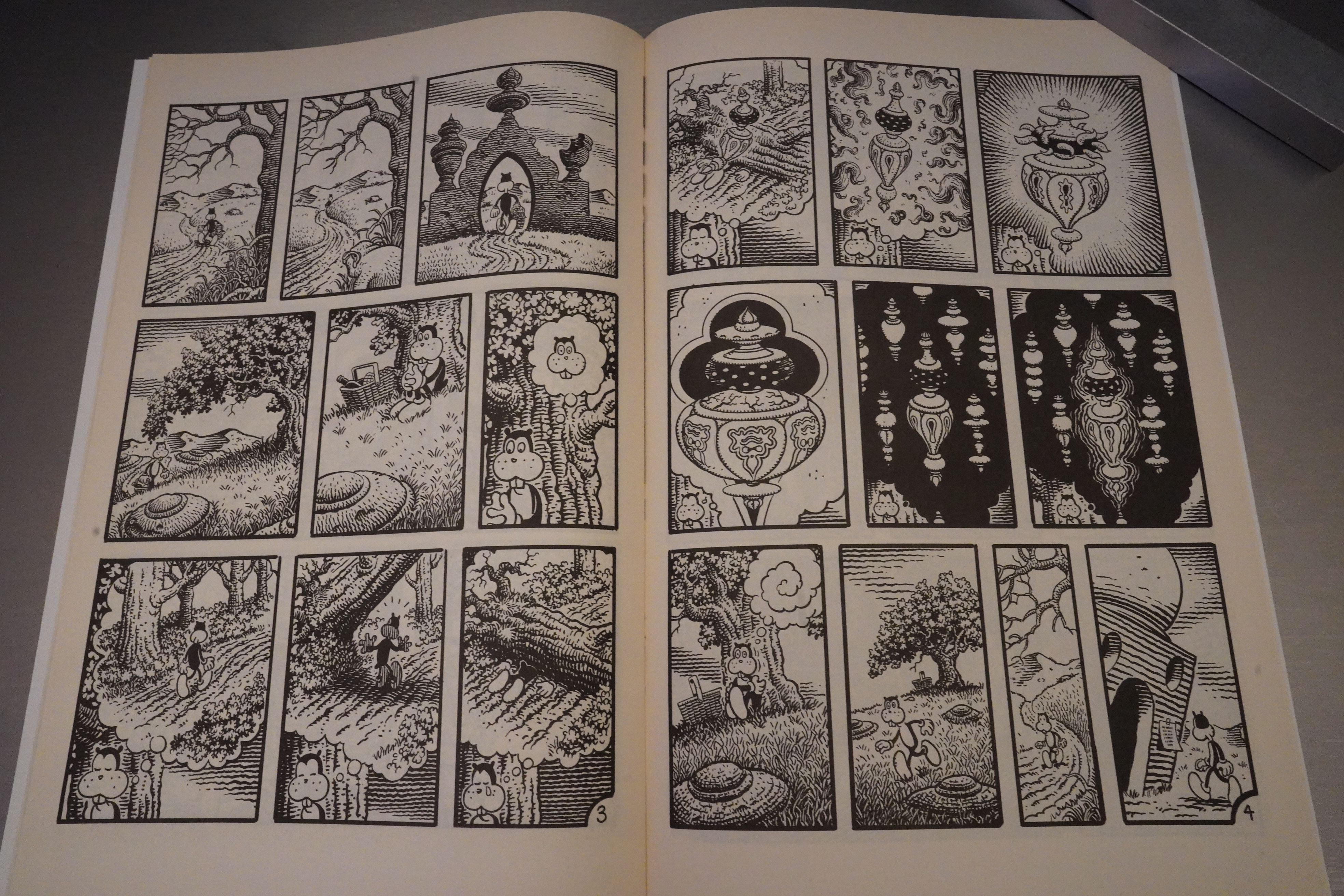
Tantalizing Stories are beautifully dark
fables of transformation, ostensibly children’s
stories but with a sense of terror and mystery
lurking within the fantastic imagery. There are
Arabian cities, bizarre creatures and inexpli-
cable, sensual machines. In the occasional color
work, as in the award-winning Tantalizing Sto-
ries Presents Frank in the River, every color is
taken to its extreme, an image of color, the
conception of color itself; everything seems
virtually present, always on the verge of incan-
descing. The stories involve arepetitive com-
petition between Frank, the innocent embodi-
ment Of contemplation, looking something like
a gentle, anthropomorphic cat, and Manhog, an
unnerving creature drawn straight from the
unconscious, the embodiment of all negative
human attributes — shame, fear, greed, stupid-
ity, etc. Frank watches the world as though he
were encountering it forthefirsttime—in “The
Mood,” from issue #2, Frank silently observes
first a shelf, then a wall, a slug, a candle, a
staircase, concluding, after nine panels, with
Frank staring out in mute shock, his eyes wide.
Manhog, meanwhile, generally runs around
stealing things, spying on people, trying to hurt
Frank anyway he can. Sometimes Frank wins is
these combative rituals; at other times his en-
emy triumphs, although Manhog’s “triumphs”
are invariably limited to successfully humiliat-
ing Frank.

The Comics Journal #160, page 9:

Jim Woodring and Mark Martin’s Tantaliz-
ing Stories and Roy Tompkins’ Trailer Trash
will to the end of their Tundra contracts under
KSP, but will not be renewed. Both will end with
their sixth issues. According to Jaime Riehle,
KSPMarketing and Promotions Manager, KSP,
influenced by Tantalizing Stories’ two Harvey
wins, is discussing the possible redesign and
renewal Of publishing Of that title with the two
creators.

Well, that didn’t happen.

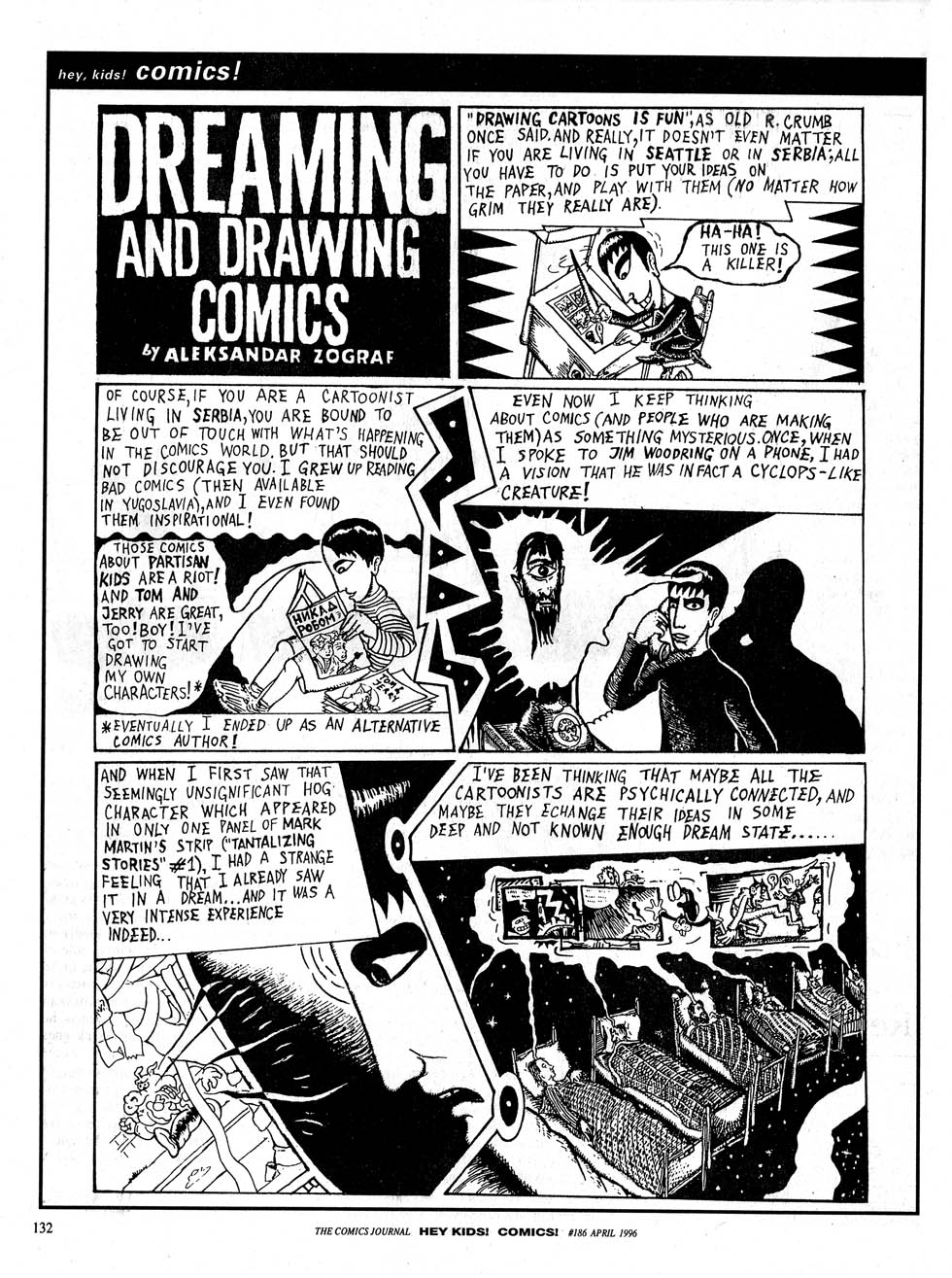
Zograf did a page in Comics Journal…

Woodring is interviewed writes in The Comics Journal #164, page 65:

I’m also crazy about
Mark Martin’s work, and he keeps getting better and
better. He’s a great natural cartoonist. Working with him
on Tantalizing Stories was great because… well, because
he’ s real easy to deal with, but also because his constantly
accelerating rate Of improvement spurred me on to im-
prove my own work.

I think all the Frank material has been reprinted in various collections, but the rest hasn’t.

This is the one hundred and fifty-fifth post in the Entire Kitchen Sink blog series.

1993: Now, Endsville and Other Stories

Now, Endsville and Other Stories (1993) by Carol Lay

This looks like something that might have originated at the old Kitchen Sink Press? Virtually all of the books published under the “Kitchen Sink” name this year were obviously ex-Tundra books, I think, but perhaps not this one?

I was a fan of Carol Lay back in the Good Girls days — her plots were funny and her cartooning was sharp. But I never kept up with her after she started doing the Story Minute stuff…

… and I think one of the reasons is simply to do with her art style, as reductive as that may be. That is, I think her decision to invent this bizarre way of drawing faces — with teeth covering the lower portions of all faces — is just really offputting. (This is an early strip, I guess — she hasn’t perfected it yet. Look at the third panel: It looks like a downturned mouth with vertical stripes on her chin.)

It’s just… I know there are many really stylised way to draw faces in comic strips, and some are weirder than this, but I just take a look at this and go “uhm, perhaps I could be reading something else”. Yes, I’m that shallow.

So while I bought this book at the time in the 90s, I may not actually have read it until now, and I wish that I could say that I now see the error of my ways and this is really hilarious stuff, but… it isn’t. The single page strips seem to go with really forced “irony” as the main device, and to me, it doesn’t work.

This is my favourite strip in the book.

The book starts with a number of one-page strips and shorter narratives, but the bulk of the book is taken up by longer stories, like this 20+ page epic, and it’s weird how impatient that made me: Having first set up a one-page-per-thing rhythm, adjusting to these longer narratives made me constantly check how many pages I had to go.

The final thing is 40 pages, and is a really inventive story, but not really that entertaining, either?

The Comics Journal #165, page 110:

Without a doubt, Carol Lay is
one of the finest cartoonists working today. After
she finished the six-issue series Good Girls, though,
she seemed to disappear from view. her activities
unknown. Now it can be told that she been hard
at work on a weekly news,
paper strip entitled Story
Strip. Now, Endsville is
a collection of single
Story Strips as well
as several longer
stories: “Now, Ends-
Ville,” “Sweet Sue,”
and “Invisible city.”
“Now, Endsville” tells
the heart-stopping story
of love and thrill-seeking,
improbably leading to the shad-
Owy realm between life and death. “Sweet Sue,” se-
rialized in Story Strip, is a semi-cautionary tale of
the dangers of magic featuring the potion-maker
Madame Asgar, who returns in the 38-page “Invis-
ible City,” a futuristic tale of greed and forest pres-
enation. Lay has evolved a new style for her strips,
simplified, streamlined, and beautifully fluid and
coherent. It works equally as well in her short,
punchline-oriented gag strips as in the longer pieces.
Her new style also involves mouths being repre-
sented by a row Of teeth covering the bottom of the
face, a devicæ that, in Lay’s talented hands, becomes
not only effective but essential. At S9.95 for 112
soft-bound pages. Now, Endsville is a must-have
item from a must-read artist.

Lay is interviewed in The Comics Journal #213, page 75:

LAY: It started when the excellent Robert Newman, art
director, was working at theVi//age Voice. He knows
Peter Bagge from Northwest connections and for
Some reason he got the gig ofwrangling cartoon strips
for the A. Weekly. He was looking for new cartoon-
ists, got my name from Peter, and gave me a call. I
think I’d already done work for the Village Voice. He
asked me ifl wanted to do a one-to-five-page sequen-
tial strip that would fill a half of page in the LA.
Weekly. I jumped at it. At the time, I was living just
doing animation storyboards. This Was around 1990.
so I Came up with a five-page story called “The Thing
Under the Futon.”
WORCESTER: Which is a pretty bizarre story. It’s got this
sort ofnormalsurface — this suburban setting and this all-
American family.
LAY: Yeah. I like using suburban settings and putting
weird stuff in them. That, to me, is finny because I
grew up in suburbia, and it was just mind-numbing.
And in a way, a vacuum like that helps your imagina-
tion because you need something to keep you from
going crazy. Thads the first flat-out big-toothed style
storyl did. les a lot more vibrant than the way I draw
now. I wish I could get back to that really charged kind
of look — it’s goof)’ as hell. Way fewer brush lines get
a character across.
So anyway, I did those first five, and got my foot
in the door over at the IM. Weekly. When Charles
Burns quit doing his strip, I forget what year, I made
a pitch to do a weekly strip. Now Matt Groening
suggested that I do a strip years earlier, when he was
taking offwith Life in Hell. Thatwas probably the best
time to Start up a strip, because all these little papers
were being born and there weren’t so many cartoonists
to fill the spaces. But I was not ready at the time. I
didn’t have any kind of focus or really a good cartoon
style for doing that at the time. So I just took one tiny
shot at it and gave up. But by 1990, I was ready to tackle
this. So they let me do a 24-page sequence called
“Now, Endsville.” a bit Ofa science fiction fantasy
kind Of near-death experience floating around in the
after-life kind of story. There were a lot of autobio-
graphical elements in it, in that the lead character is
based on me. She’s kind of angry and desperate for
love, but basically good.
So that was running in the Ld. Weekly, and the
next paper that picked me up was the New York Press.
When I left IA, I was in those two papers. The next
paper was the San Francisco Examiner. Their Style
section was running people like Matt Groening, Nina
Paley, and I think Zippy and some others. They were
putting more alternative strips into a daily paper,
which was great for us.
I did a few self-contained strips—eight or ten Of
them. The shorter-formed strips were more gag-
oriented. After I did those short pieces, I launched into
“Invisible City,” which was 36 pages. Ifs interesting
telling a story in serialiftd form. You have to do the
recaps, but you can’t bore them by repeating your plot
thread every two minutes. That One allowed me to get
ahead on the strip so that I could pack up and move to
New York. But when I got to New York, I got a call
from Talbot at the Examiner saying, ‘The serialized
stripjust I’d gotten hate
mail to the Neu York Press to that
effect. People don’t have the attention
Span to hang onto a story week by
week If they miss a week, a big chunk
is gone, where comics used to do this
all the time — like in the old color
Sunday strips. But I think that our
culture is so speeded up that a long
story like that doesn’t have a chance in
a weekly format. But I didn’t Want to
lose the Examiner so I switched gears
and started doing one-page stories. I
called it Story Minute just because I
couldn’t think ofa better title. It pretty
much says it all — it’s a story and you
can read it in a minute even though it
takes me ten or twelve hours to draw
one.

The Comics Journal #234, page 8:

Lay is one Of the artists
whose strip was dropped from
the press when Gentile was fired.
But ironically, Gentile had
rejected her strip when she first
approached the Press approxi-
mately 10 years ago. It was
Smith, Who had seen her strip in
the L4 Weekly, who championed
her and insisted that Gentile get
her for the Press. In Lay’s early
years at the Press, Smith was so
enamored of her that he took
out an ad that repeated the
phrase “Carol Lay rules!” over
and over. But when Lay had first
approached Gentile with her 24-
part serial “Now Endsville,” she
told the Journal, “he didn’t even
look at it. He took it and tossed
it on a pile and said he didn’t
have time to read it. Then he
said, ‘You know who I’d really
like to have in here is Julie
Doucet.’ I couldn’t believe he
could be that rude. That’s like
getting Out Of bed with someone
and saying, ‘You know Who
really like to fuck?'”
Indeed the narrow market
for alternative weekly strips
encourages a competitiveness
that is not unlike sexual rivalry.
The nature Of that courtship is
made all the more personal by
the way that each alternative
weekly tends to take on a per-
sonality of its own, often the
extension Of key individuals like
Smith, Gentile or Strausbaugh.
“Every paper has its own wacky
editor at the helm,” Lay said.
“And as soon as they leave, a new
person comes in and has to
change everything. It doesn’t
matter how many readers 100k
forward to seeing your strip
every week.

Here’s a review:

Much of Now, Endsville is entertaining fun, yet it’s not Lay at her peak, and most material collected in her later books is.

And it’s on Paul Gravett’s 1001 comics you must read before you die or something.

This is the one hundred and fifty-fourth post in the Entire Kitchen Sink blog series.

1993: The Upturned Stone

The Upturned Stone (1993) by Scott Hampton

I’ve always liked the Hampton brothers’ artwork — happening upon something by them in some horror anthology or other was always a delight. (Usually from Pacific or Eclipse comics.) They mostly did fully painted artwork at a time when that wasn’t usual yet, and they always seemed to develop and try new things, so they kept things fresh and were not as staid as some other artists doing similar work.

But I have to admit that I’ve lost track of them, and I had no idea that this book existed, for instance. (And neither does Scott Hampton’s wikipedia page.)

Hampton’s artwork has gotten even more distinctive than what I remember from the 80s. It’s photo referenced, I guess? But he’s good at getting appropriate poses from people, and people don’t look awkward. But sometimes people look oddly similar — the boy in the second panel has the exact same expression as the man in the fifth panel, right? (Which may or may not be on purpose, because er are they father and son? I forget; it’s been several minutes since I read this.)

And… those speech balloons? I can’t recall anybody using exactly that technique — a little short line extending into the balloon to indicate who’s talking. I like it! None of those messy er tails? handles? hanging off of them.

(The letters themselves look slightly odd — I wondered whether they were early machine lettering, but they don’t seem to be. They look like they’ve been scanned in low resolution, though? Looks like 150dpi or something.)

As for the story… it’s quite spooky at first, before we know what’s going on. Properly creepy.

Wow, that’s cool… The book is very dark. I mean, lots of dark paints and blacks. But there’s still room for a lot of stuff like this.

See? Really good.

As the plot went along, things grew less scary, and it became more of a revenge fantasy. Which is a genre staple, too, and it worked well here.

It was nominated for best graphic album at the Eisners.

Ah, it was serialised in Heavy Metal.

You can still pick up copies of this for not much more than cover price.

There’s some reviews out there:

Dark, painted watercolour art is ideal for the story, although it’s still relatively early in Hampton’s career, so some stiff poses and over-exaggerated expressions are found. He’s also overly fond of giving people red noses, something of a career trademark, and in some places that draws too much attention. Otherwise the pages strike the right note. The boys aren’t just scaled down adults, Hampton makes good use of the woods, and the bit players are completely realised, except for one who has to remain vague. It’s a cinematic production, and a neat touch concerns Hampton substituting for musical effects and the pacing available to films with more impressionistic images, slowing the reading and raising the tension.

I guess the adaptation didn’t happen?

These people are a very big production company. They wanna make it as a studio film not as an independent film. It’s moving forward and it’s in pre-production already. Once they make the announcement, hopefully everything will be nice and set up, they’ll have a director and will be able to move forward after that. My hope is that not this coming Halloween, but the one after it, the movie might come out.

This is the one hundred and fifty-third post in the Entire Kitchen Sink blog series.

1993: Thump’n Guts

Thump’n Guts (1993) #1 by Kevin Eastman, Simon Bisley and others

When Kitchen Sink “bought” Tundra, they inherited a whole bunch of work that they’d already paid for, and were apparently contracted to publish, too. Some of these books feel like “well, just shovel it out the door already”? (And whether even that was economically sound seems to be answered a year and a half later, when Kitchen Sink was forced to seek more funding by selling off more of the company.)

And you could expect this book to be one of them, because starting with a blank page page is pretty unusual.

On the other hand, this book is written and laid out by Kevin Eastman himself, who owned Tundra, so perhaps he just felt that the book should start on page two, anyway.

And for all I know, perhaps that’s a reference to something, because I think that this book is a parody. And I’m guessing it’s a parody of Image comics in general, or possibly some specific Image book, but I’ve read so few that I can’t really say.

The book is mostly fight scenes, which is appropriate. There’s also some daddy issues on display, which is, too.

“Stab! Detonate! Veto! Megadead!” Those are some names.

The artwork by Bisley is insane and a lot of fun to look at, but the book isn’t funny enough to really be worth reading. Perhaps if you know what it’s parodying?

You can allegedly get this issue along with a poster and trading cards and possibly $100 for just $5. But!

The current owners of the Heavy Metal web site have problems:

I ordered over $200 in current and backorder issues. Got the backorder shipped from Dallas the current ones from California till this day have yet to be shipped. Don’t waste your time with the BBB

This book has apparently never been reprinted.

This is the one hundred and fifty-second post in the Entire Kitchen Sink blog series.