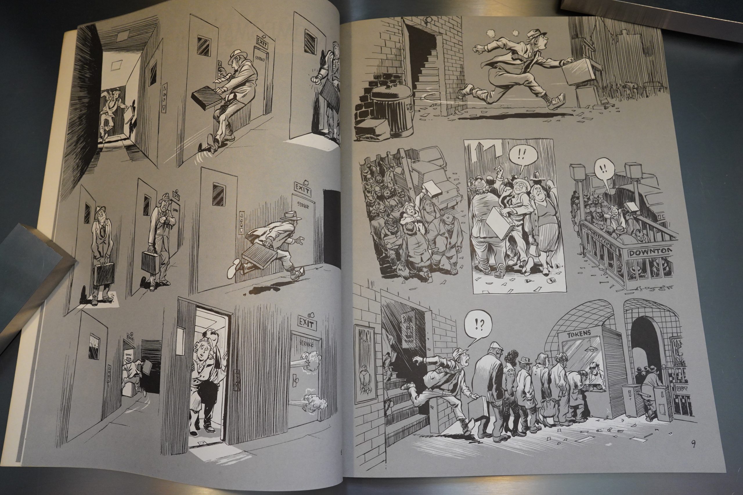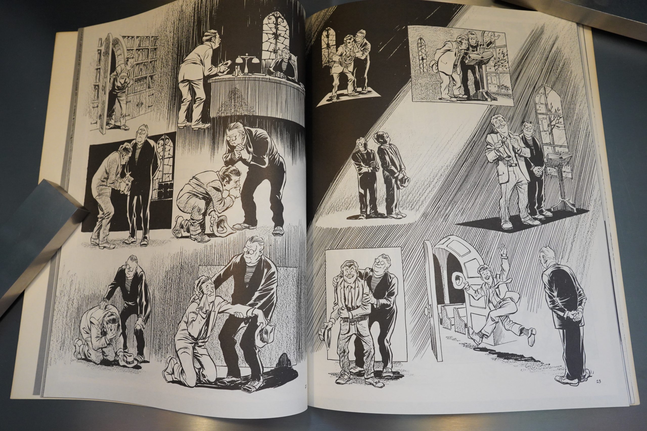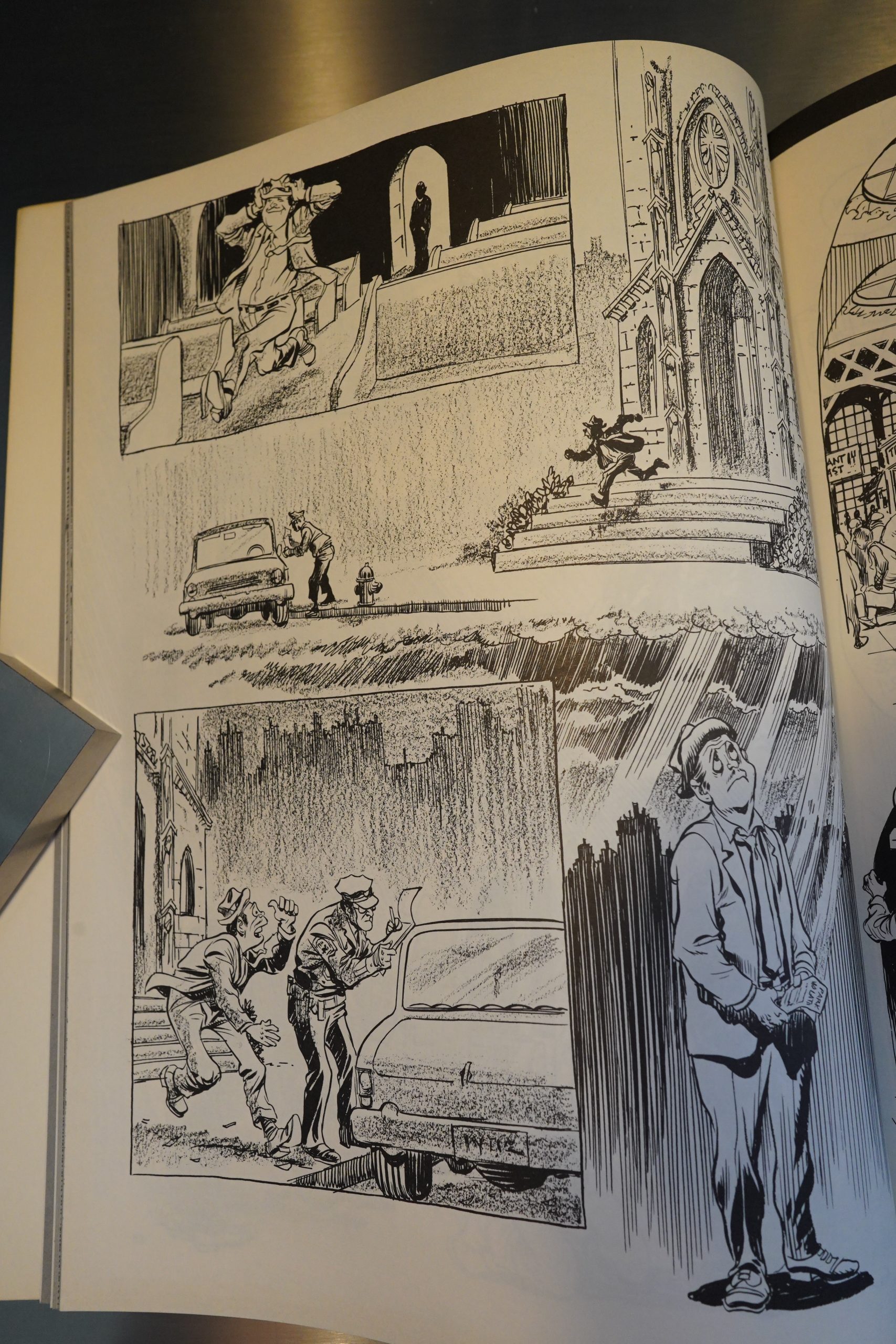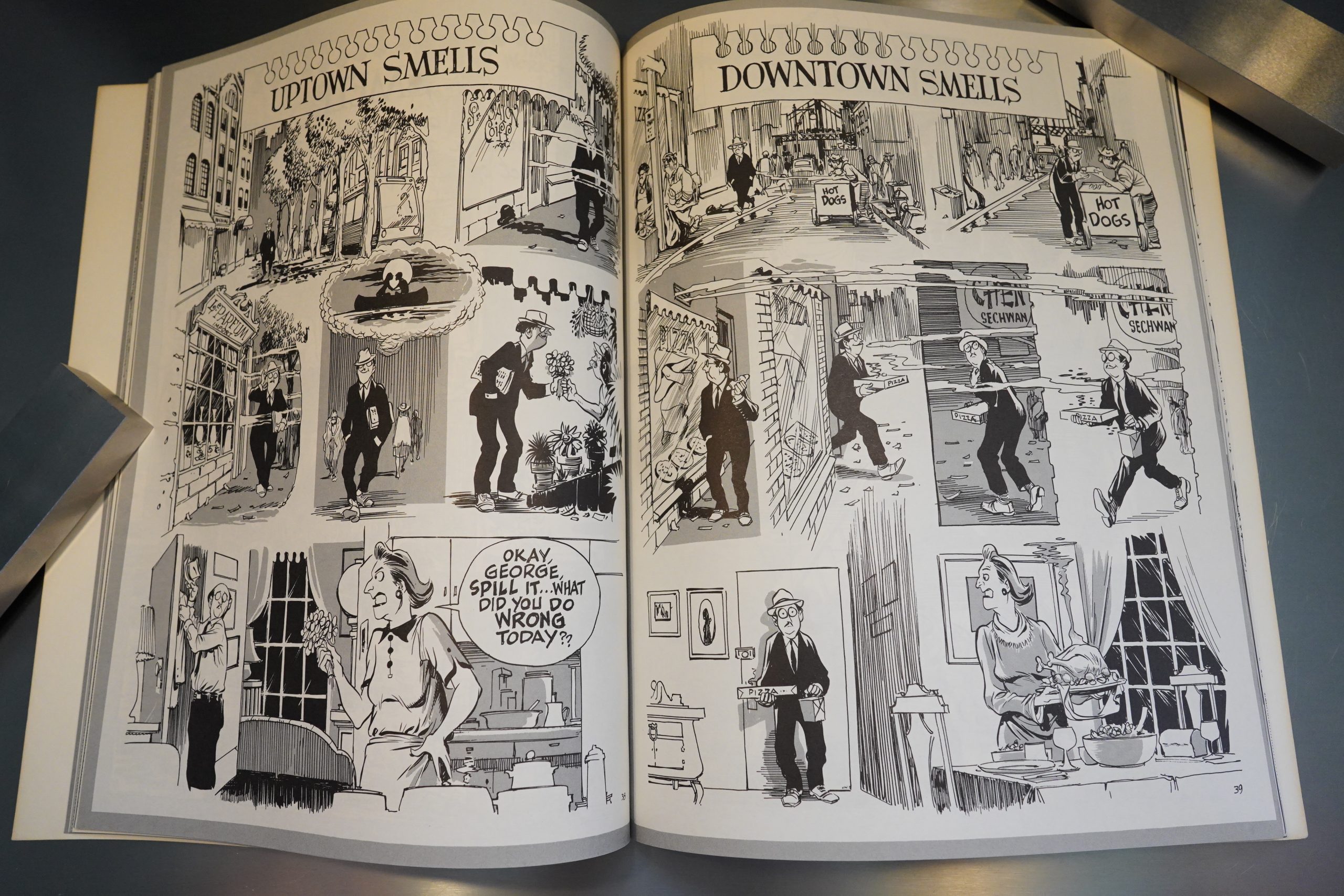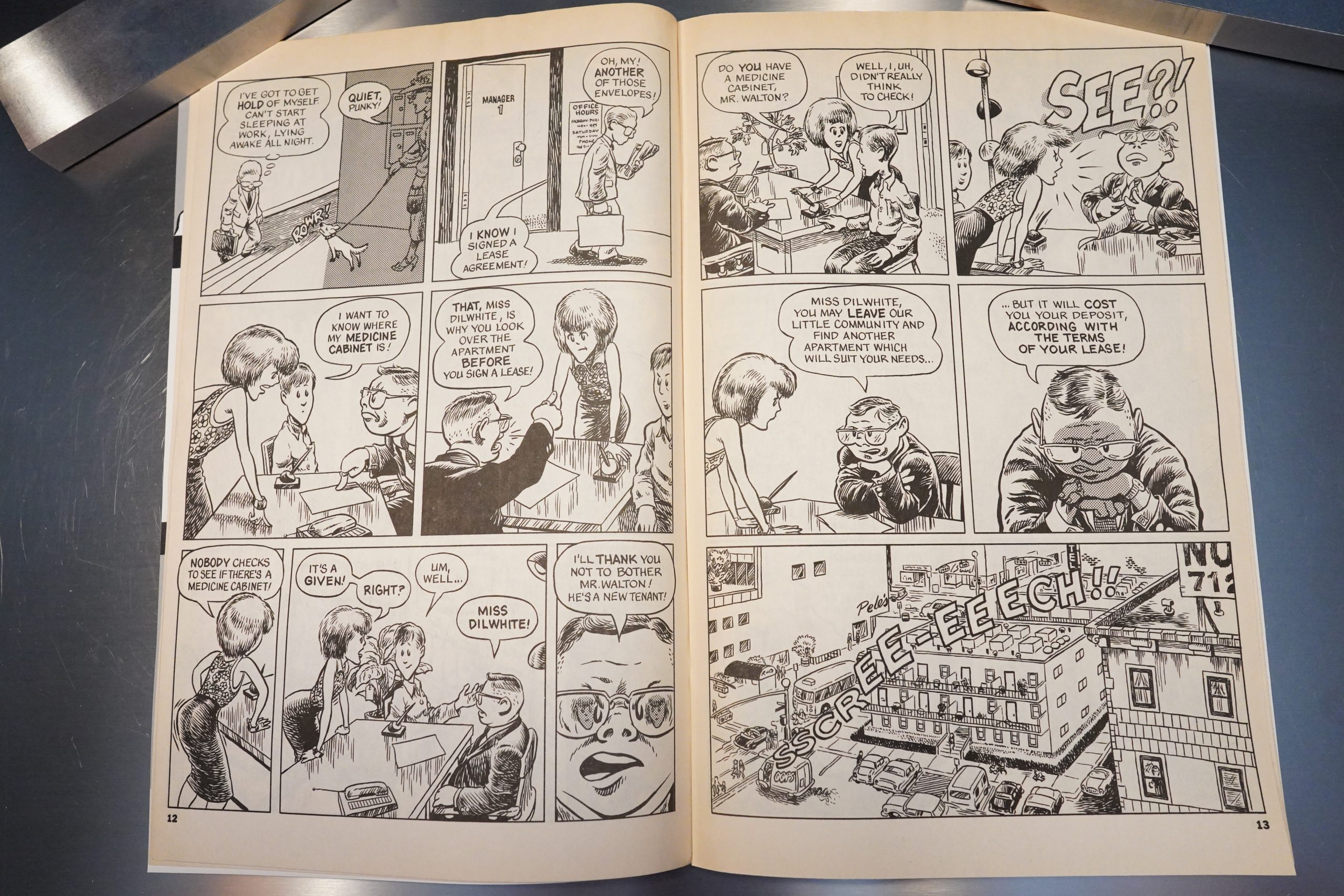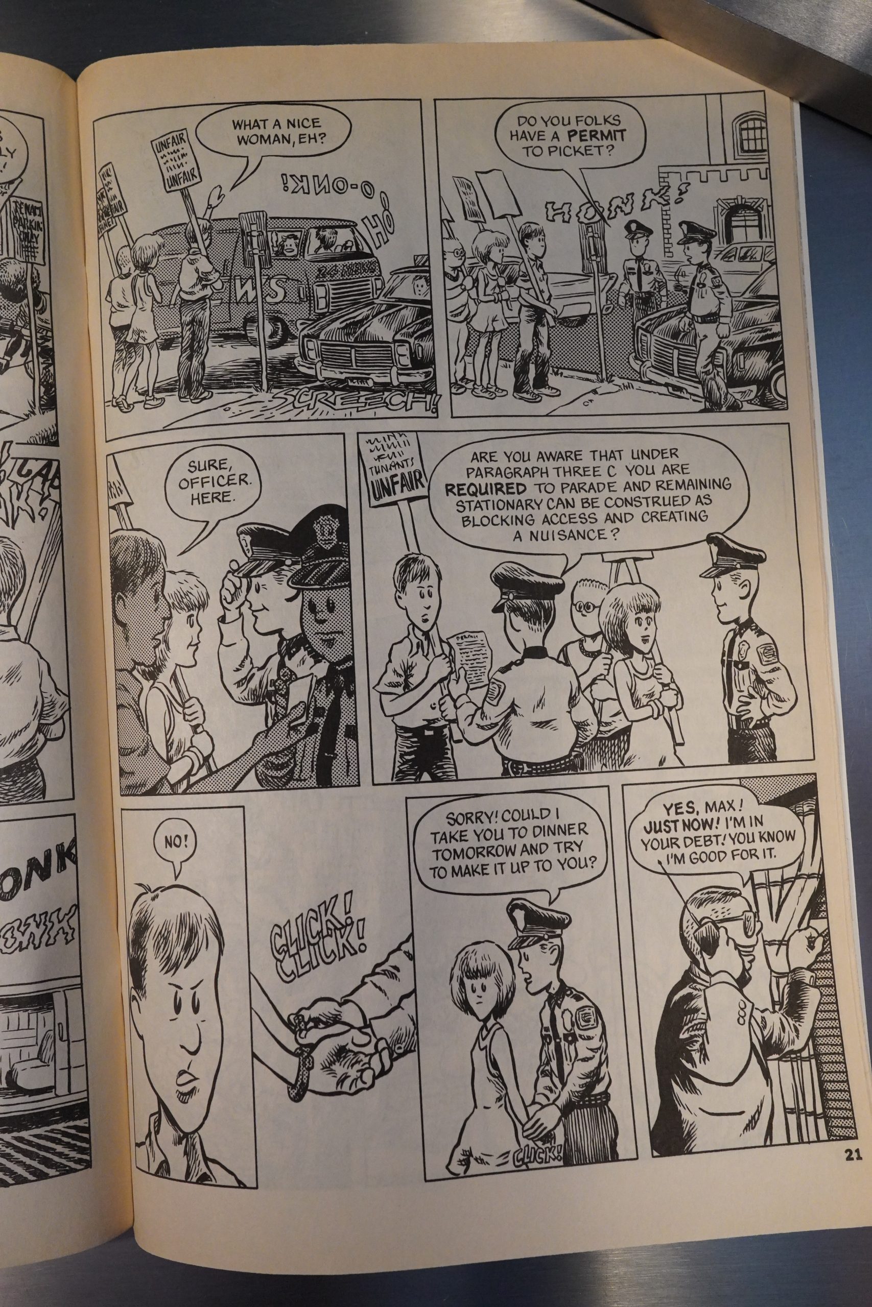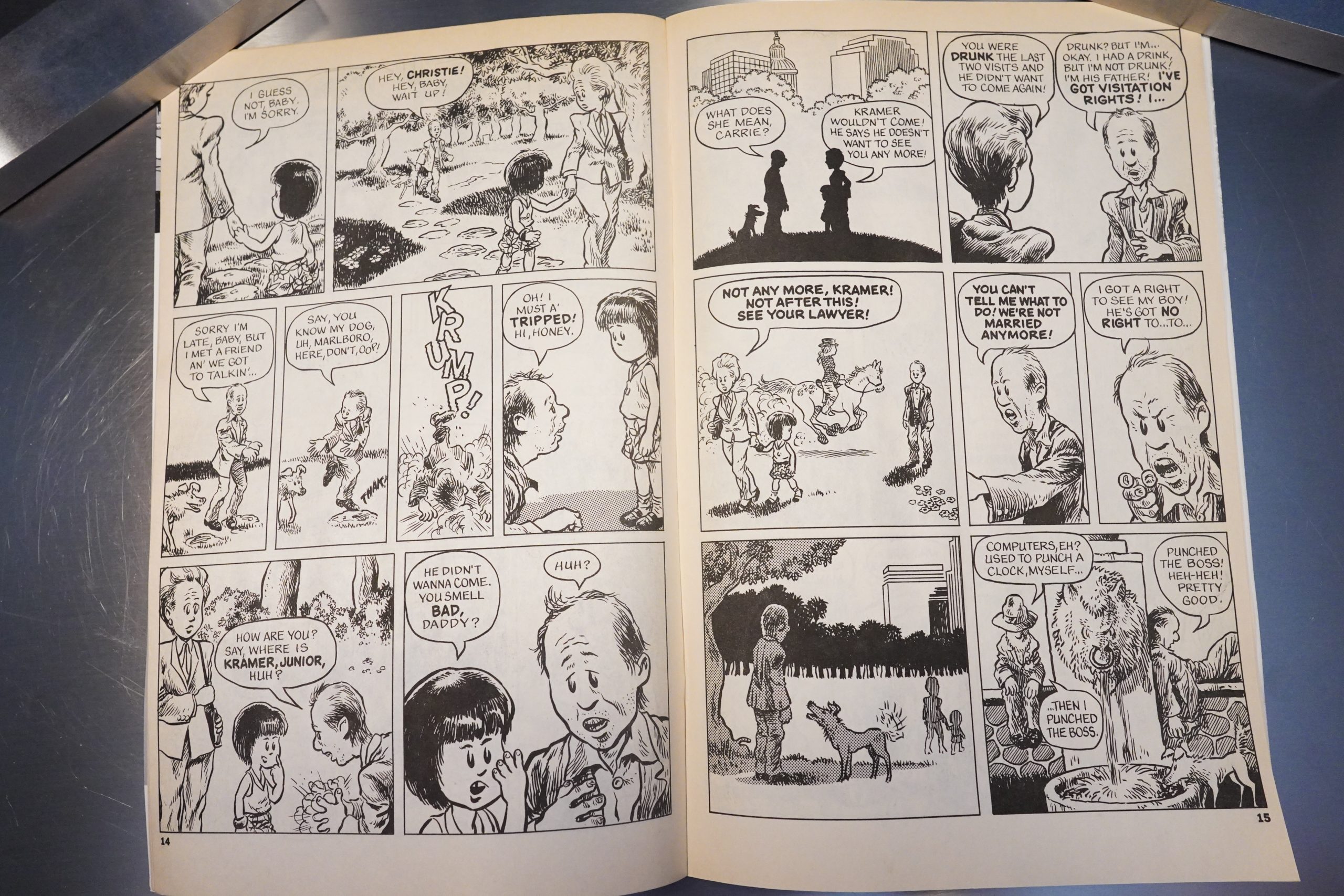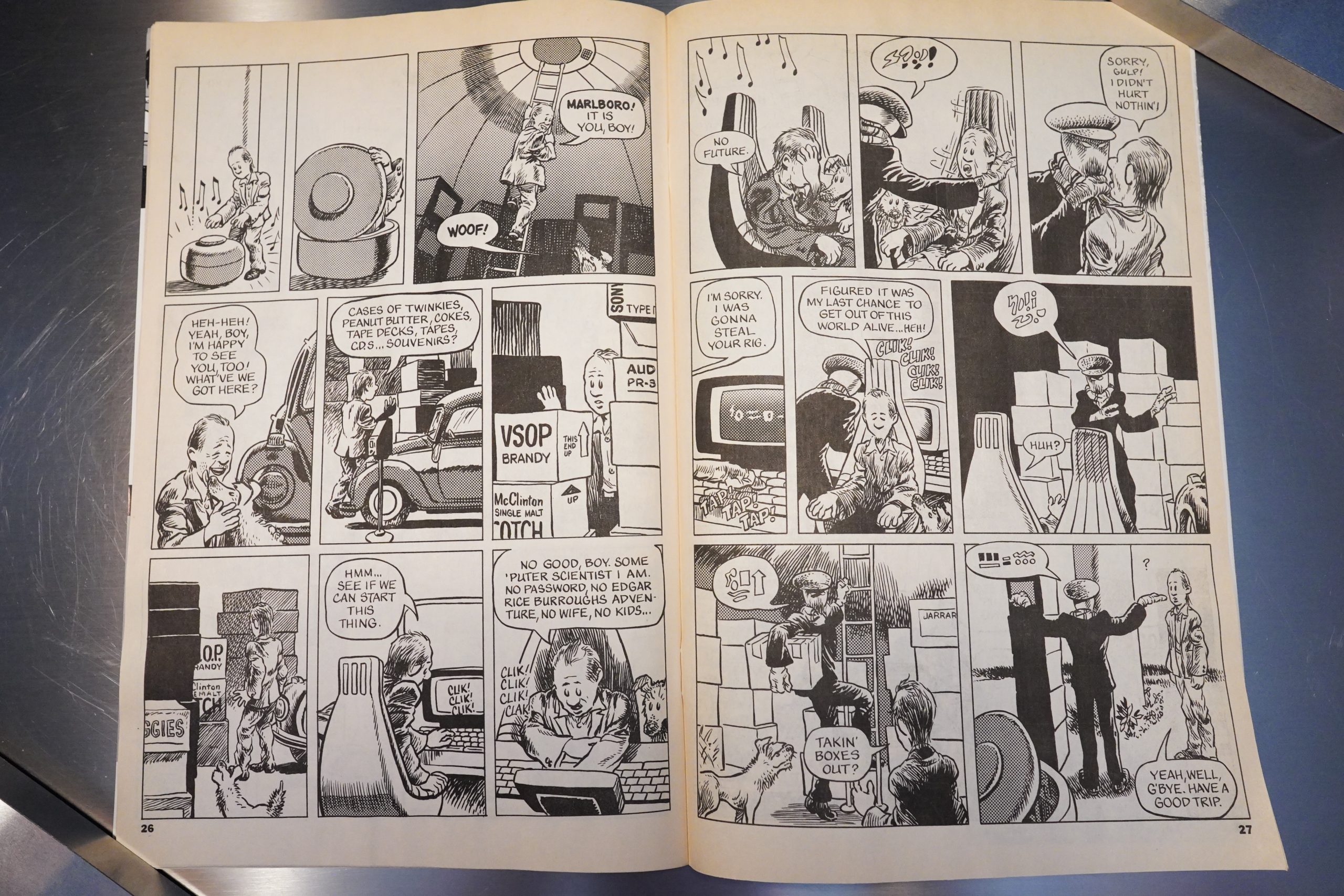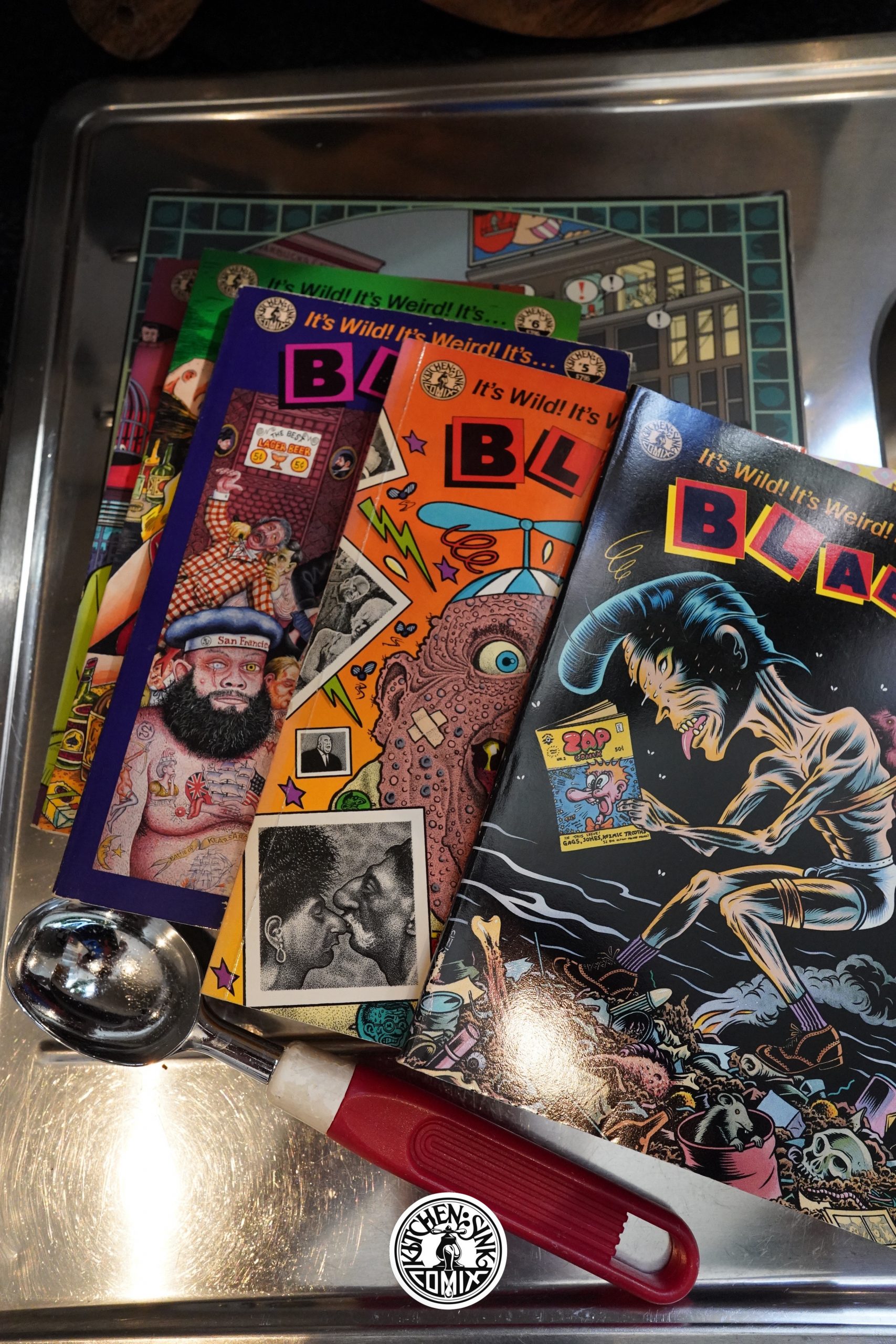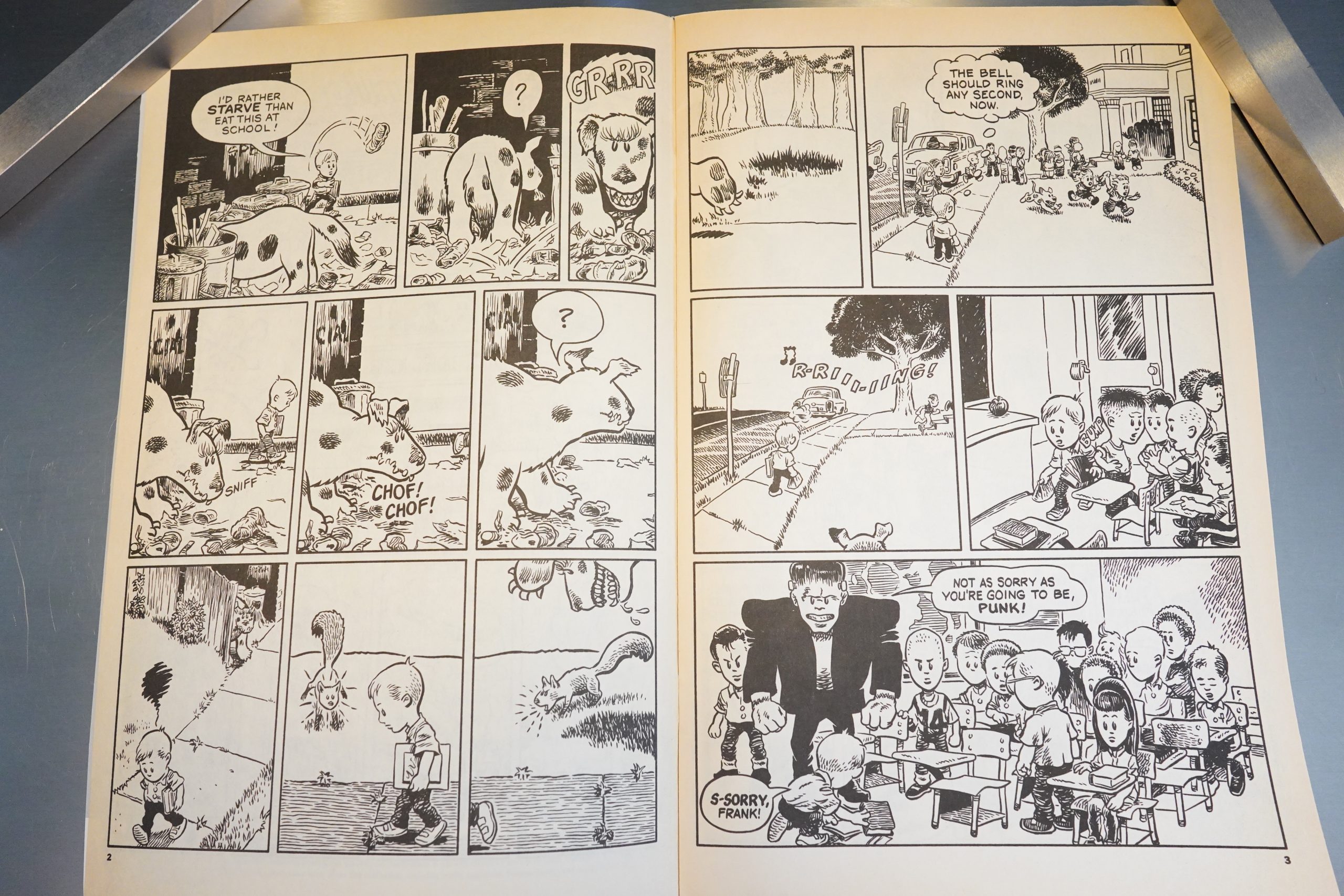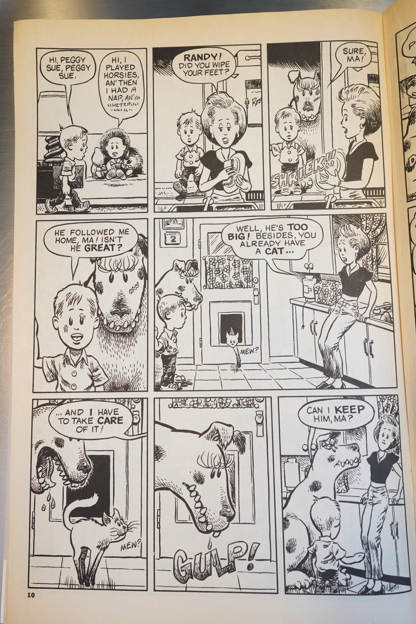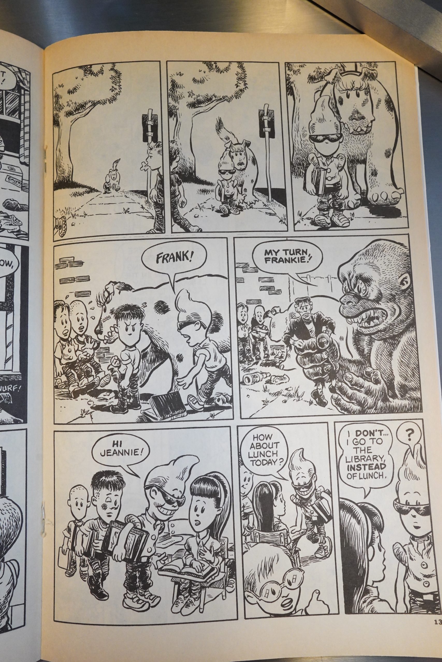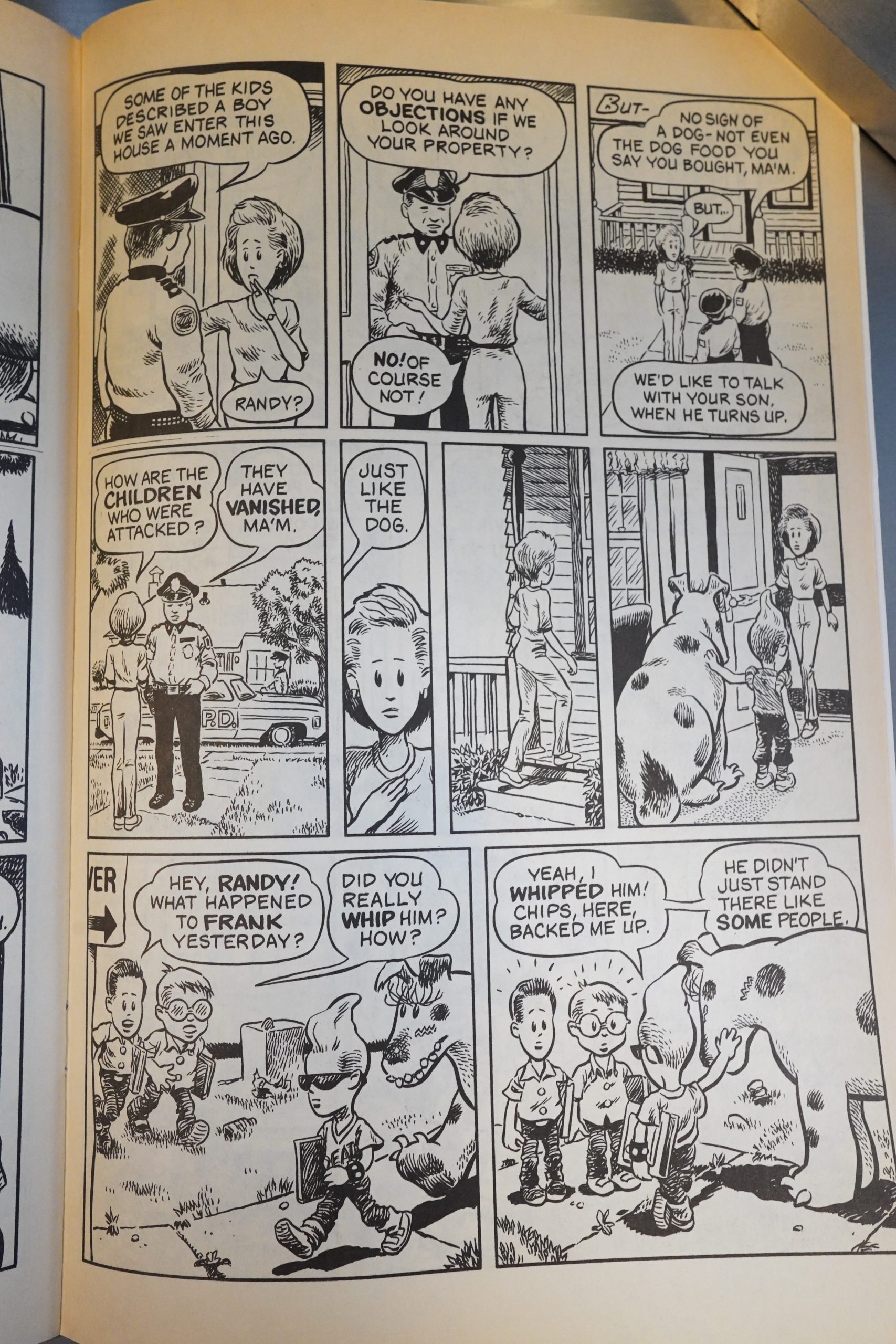
Blab! (1988) #1-8 edited by Monte Beauchamp
In the 80s, there were two major anthologies, and you were either a Raw artist or you were a Weirdo artist. So the story goes. Some people have attempted to expand the narrative slightly by positing Blab! as The Third Anthology, but that doesn’t really work — Blab! arrived too late, and while it featured many artists that appeared in the other two anthologies, it didn’t feel as well-thought-out as the other two, either.
That is, when I remember Blab!, I’m thinking it was a typical fanzine, obsessed with 50s pop culture things (and Ed “Big Daddy” Roth), that eventually got some underground artists to submit comics.
Then, later, it turned into a showcase for low rent “art”, and I lost interest completely.
But I haven’t read these books since they were new — perhaps I totally misremember? Let’s find out.

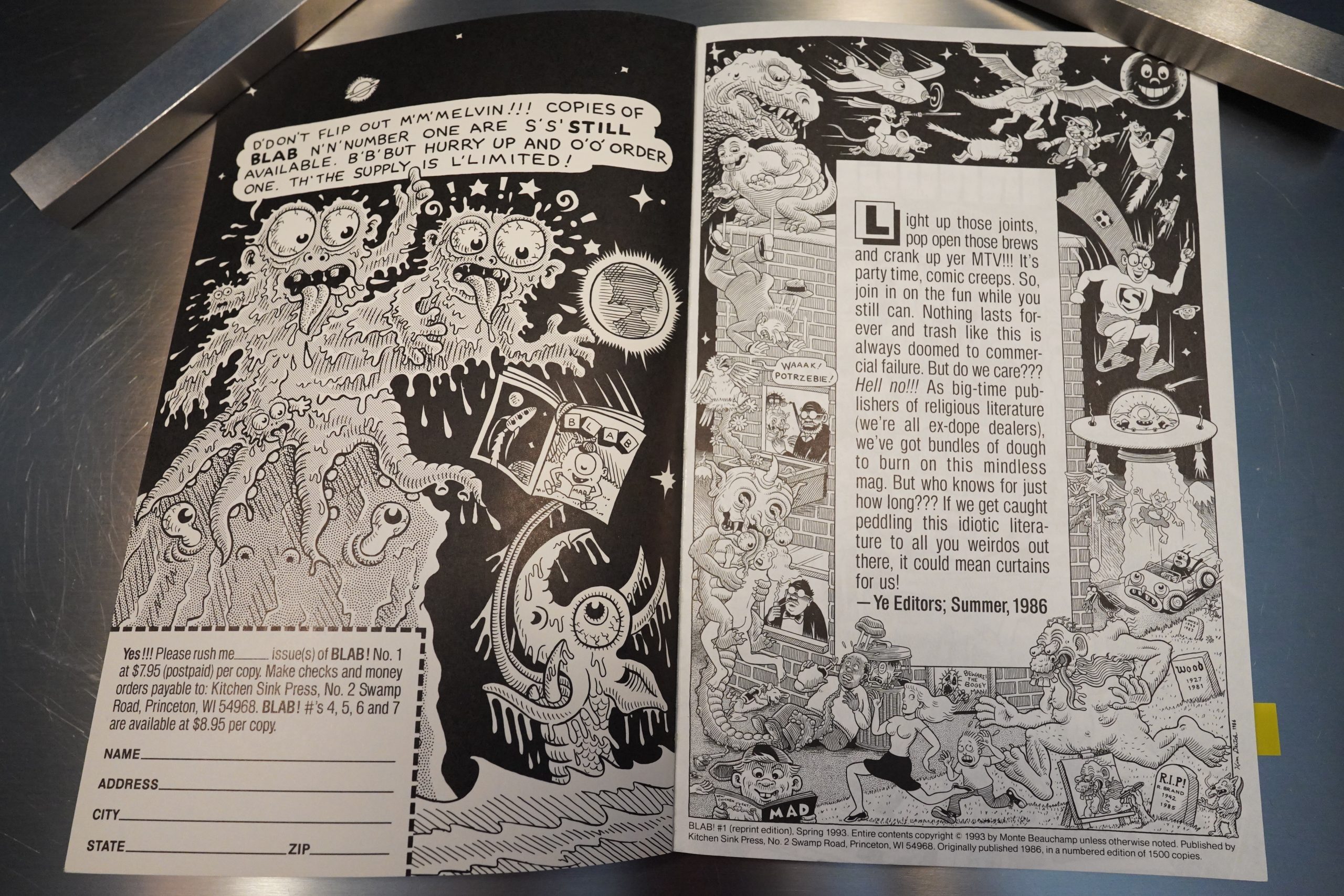
I’ve got the Kitchen Sink edition of the first issue here, but it was originally published by somebody else — self published, perhaps?

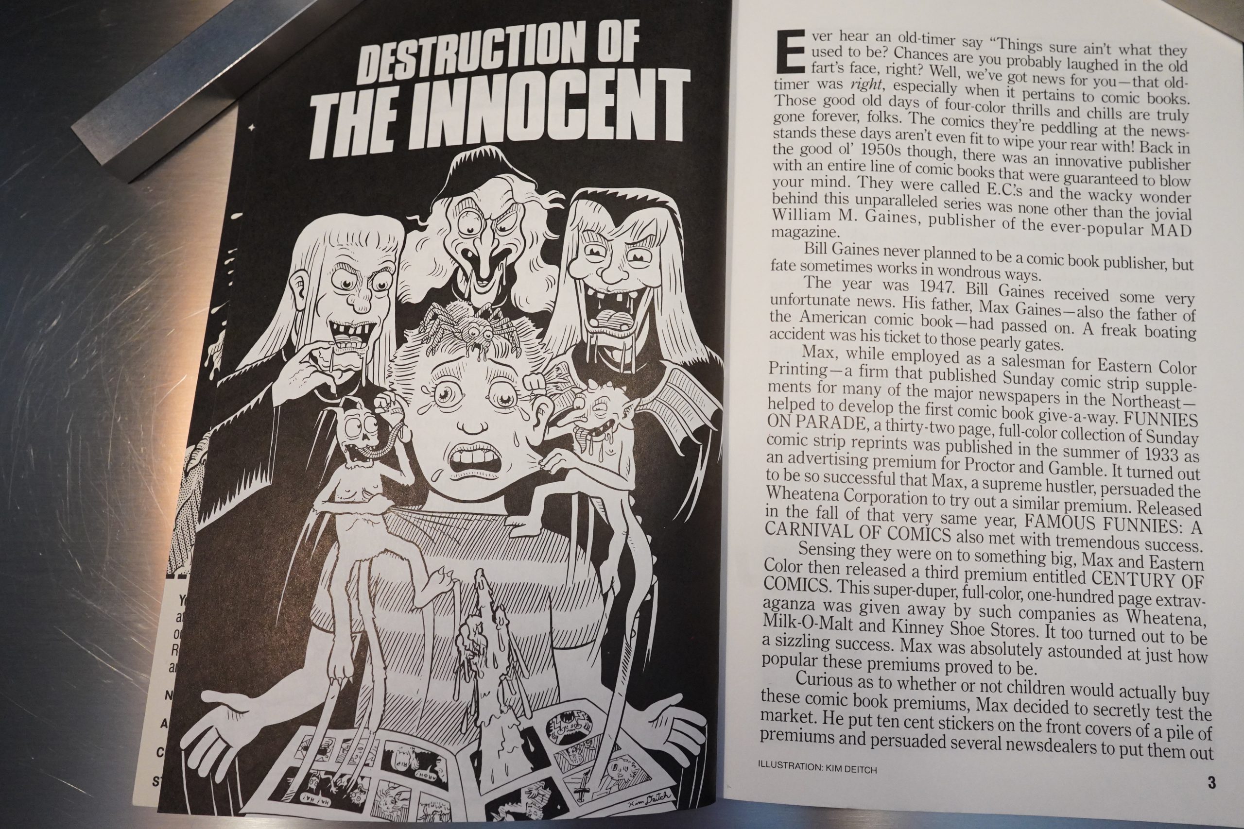
As most fanzines did those days, we start off with a lengthy exhortation on how evil Fredrick Wertham was — it seems like thousands of budding comics nerds in the 50s were really traumatised by EC Comics shutting down.

I think opinion has shifted on this a bit — I think most comics historians these days are coming more from a “well, perhaps he had a point” angle these days. But perhaps that’s the result of reading all these 80s essays and then having to take an opposite position just to avoid being boring. (I haven’t read Seduction of the Innocent myself, but I feel that I must have, over my lifetime, read more pages about the book than the book’s length.)

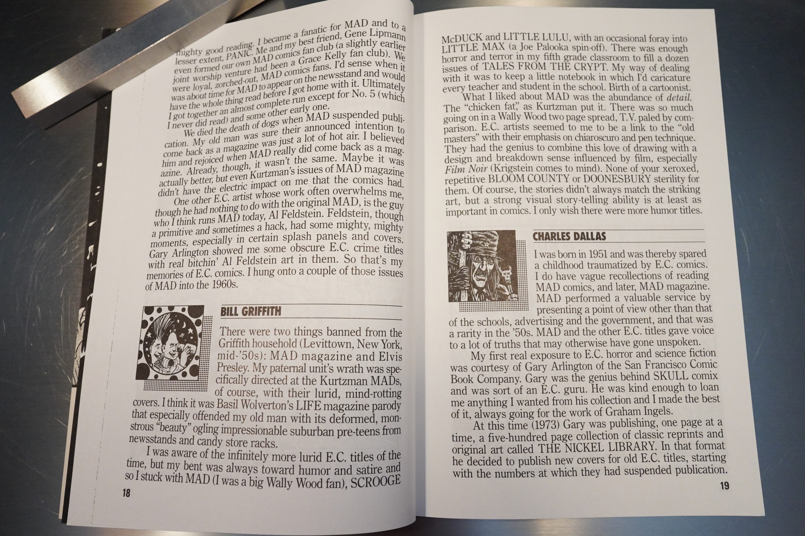
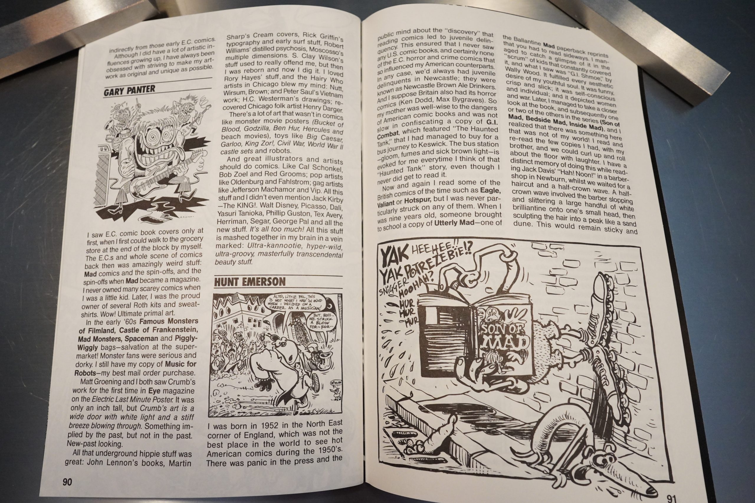
But then the rest of the issue is just short text pieces from (mostly underground) artists about how great EC Comics was. I’d forgotten that Blab! basically started out as an EC fanzine…
And Blab! definitely started off the way it was to continue, as a boys’ club — the only woman featured here is Trina Robbins.

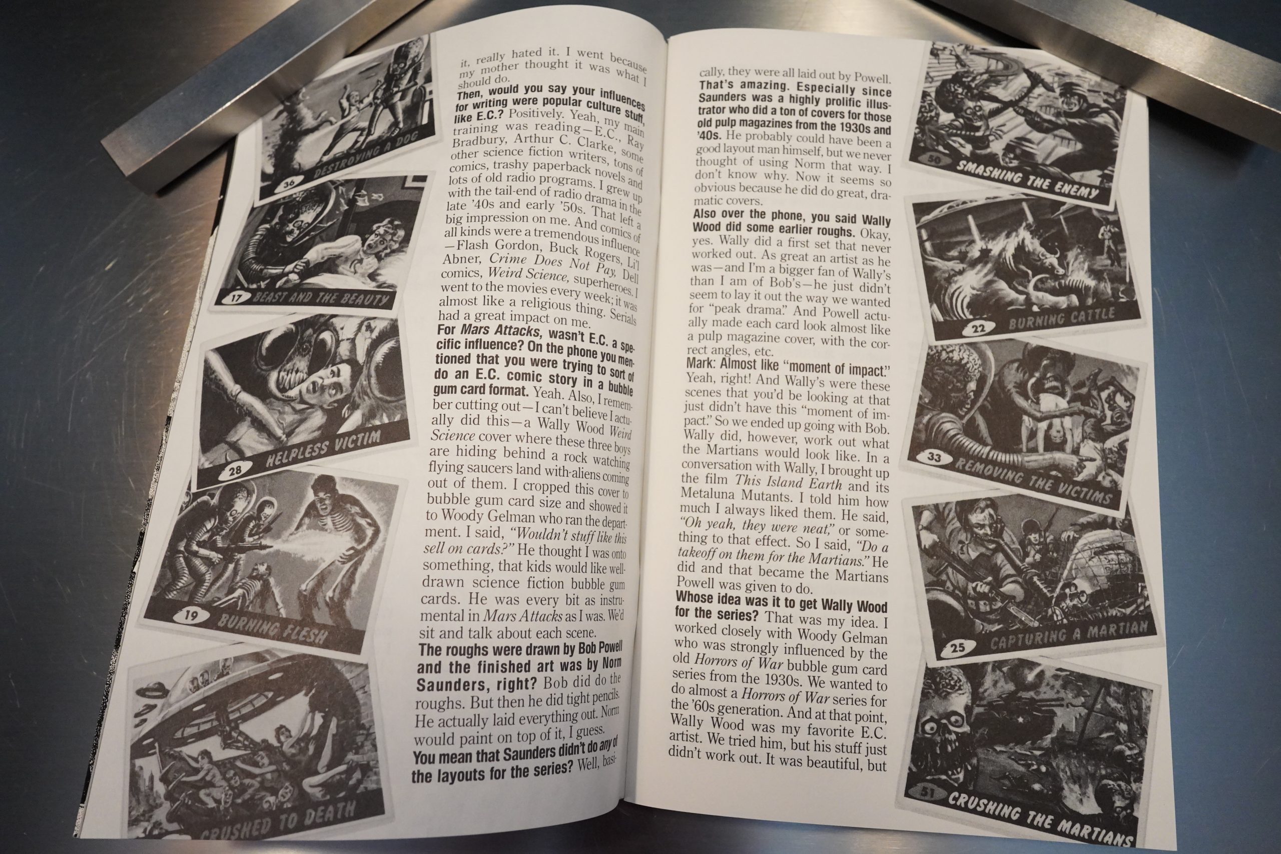
The second issue branches out into talking about other oldee tymey stuff for children, like Mars Attacks, but it’s mostly about EC.

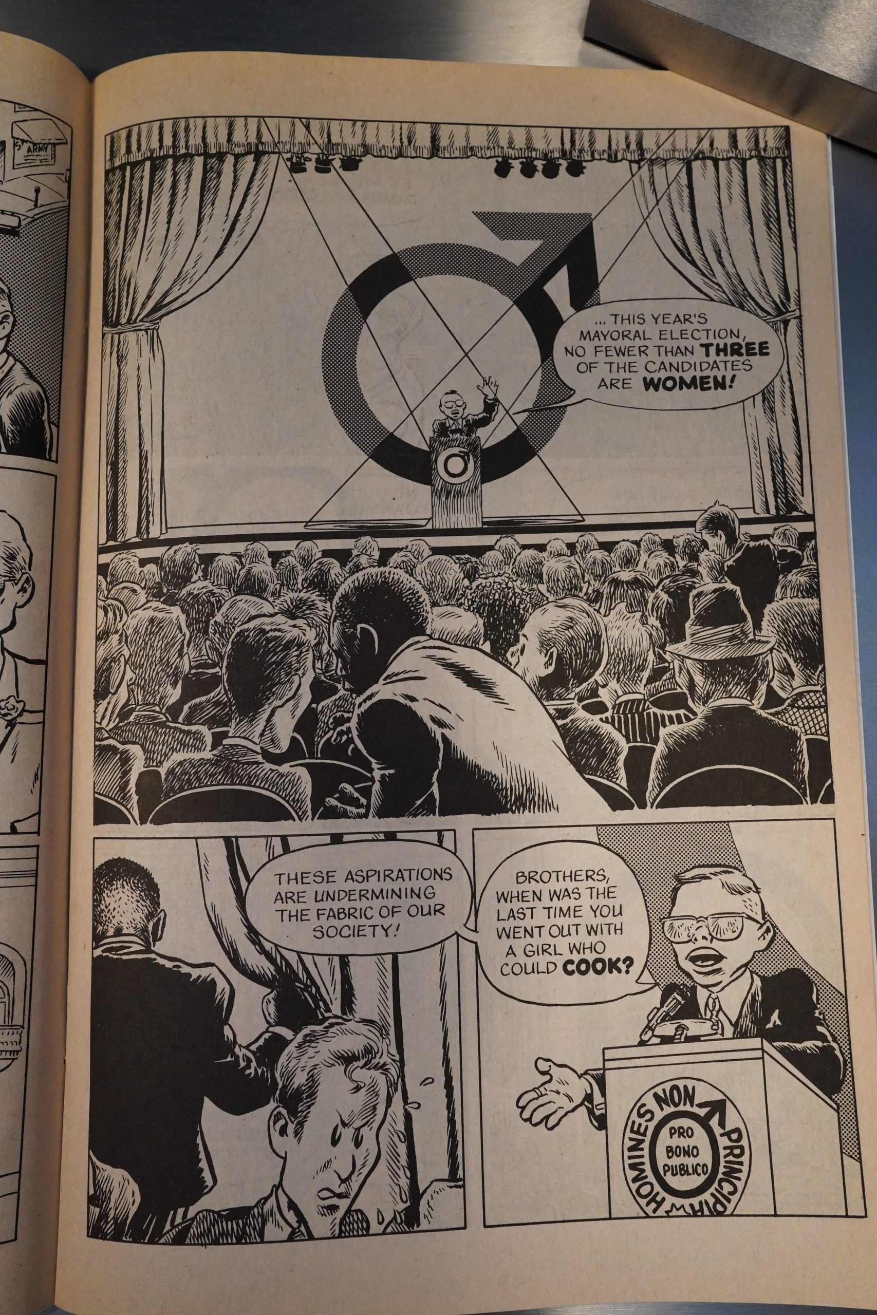
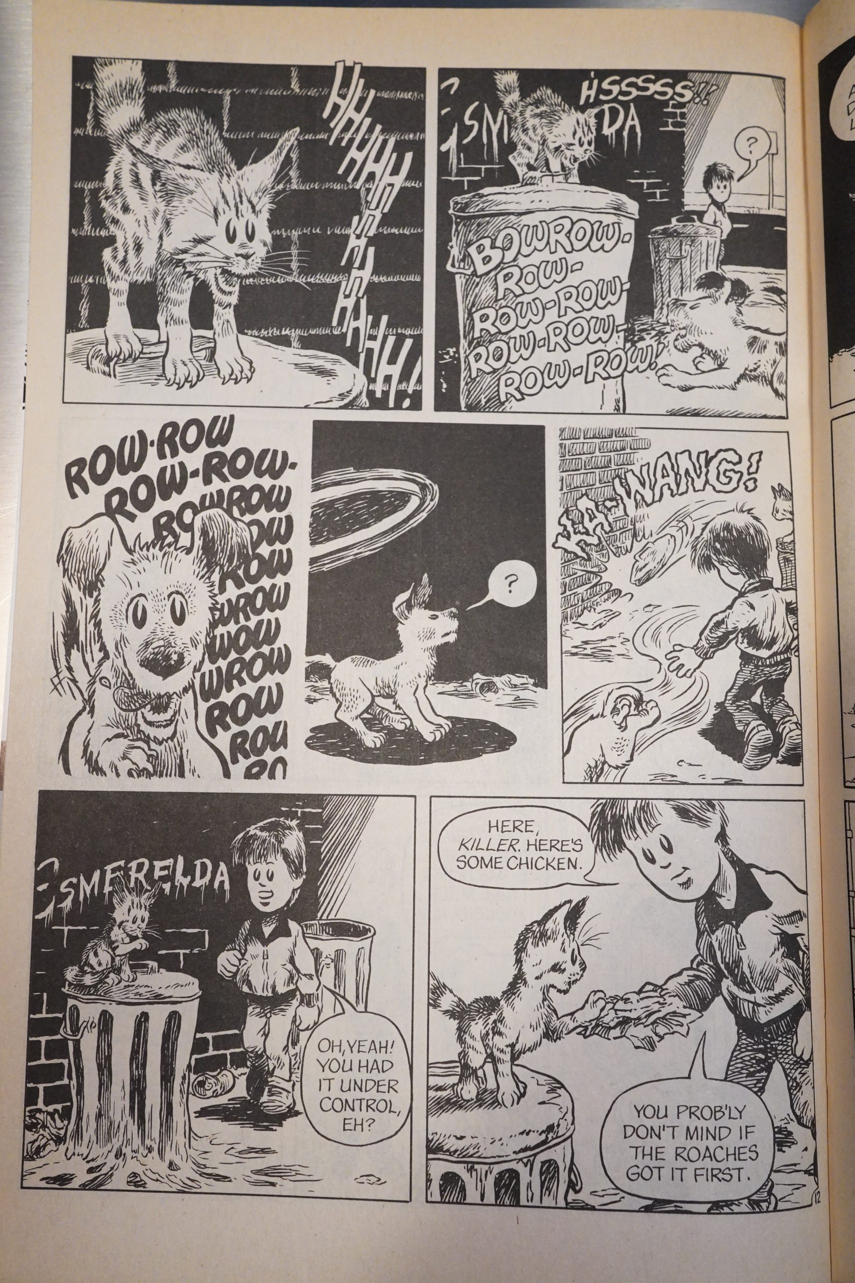
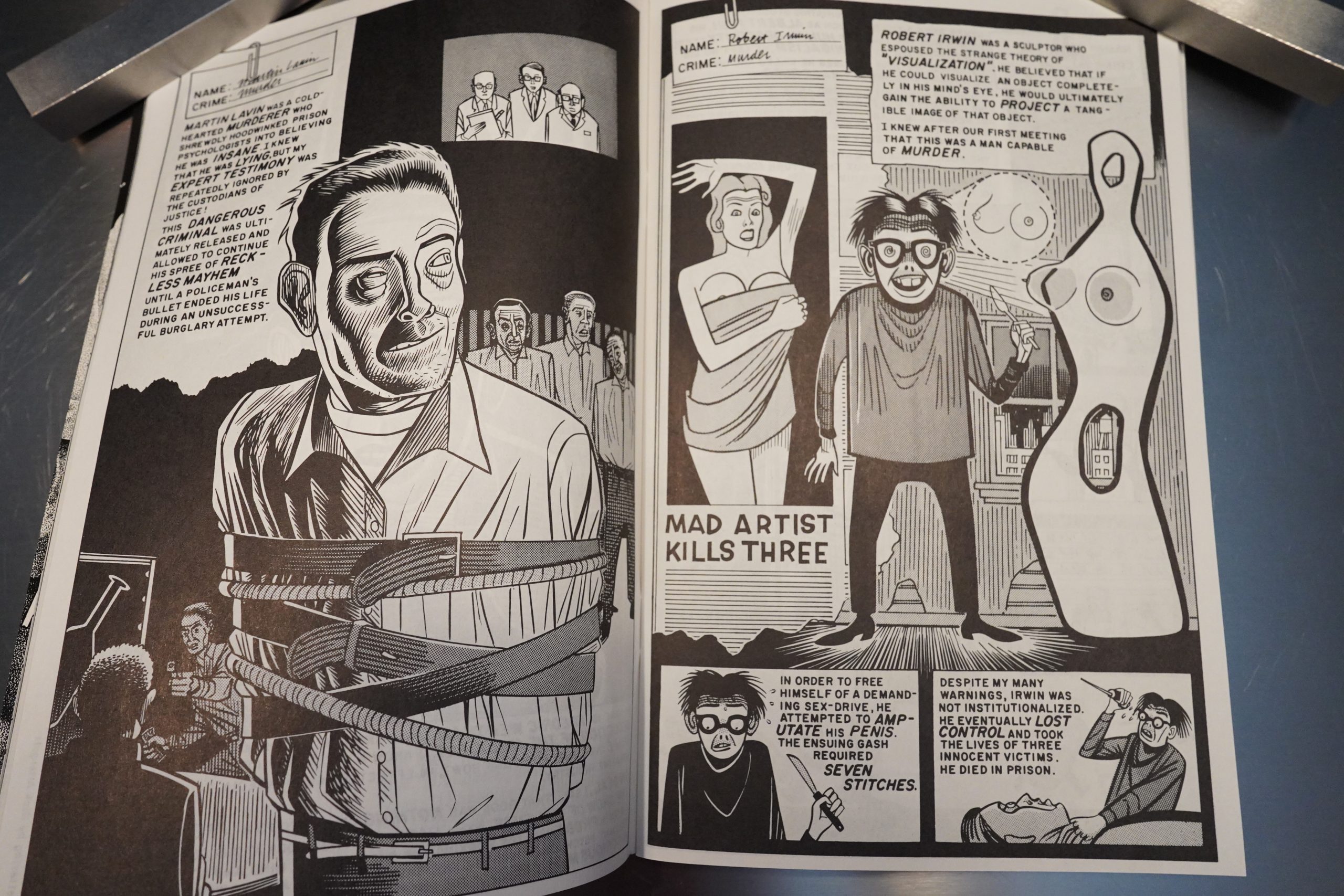
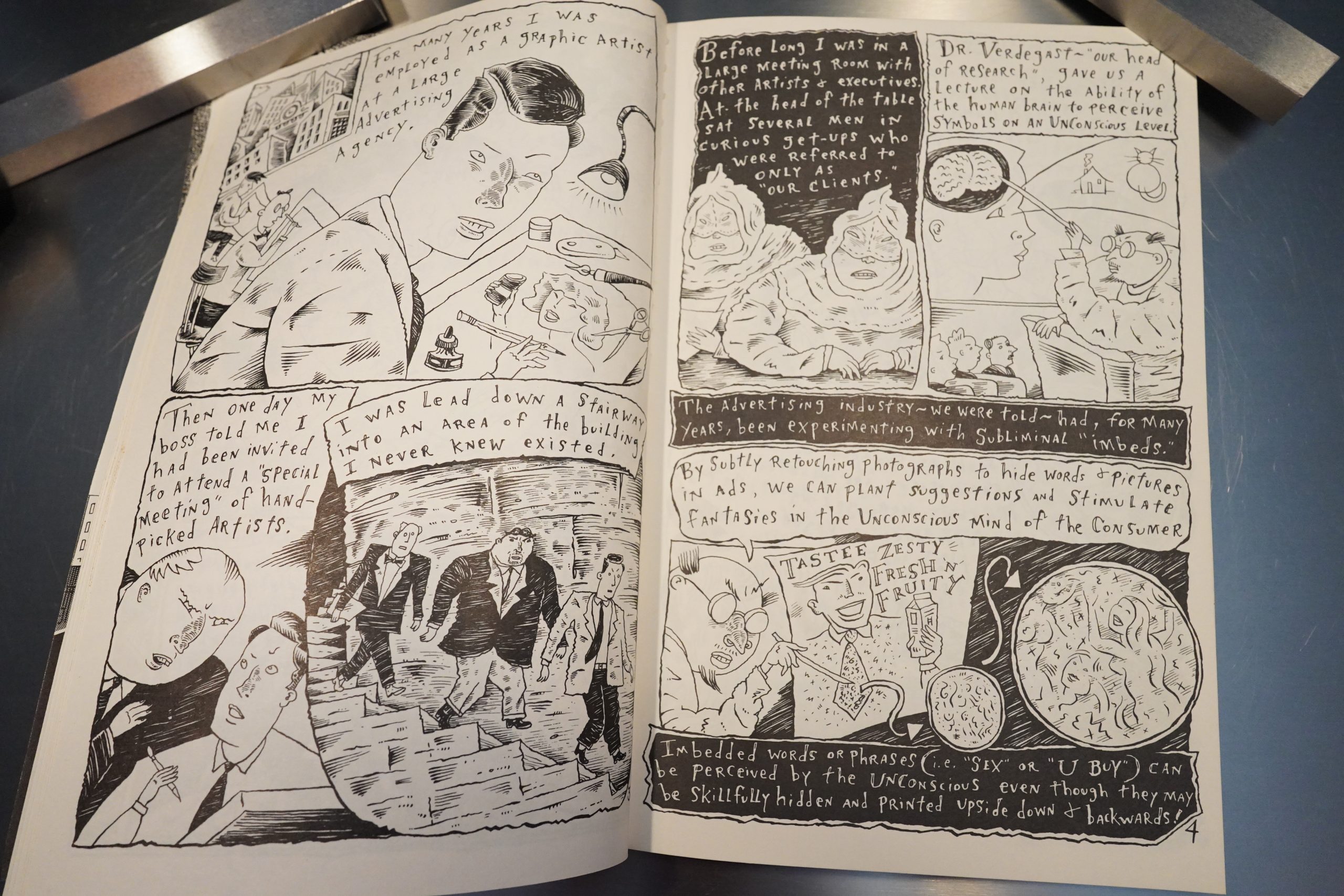
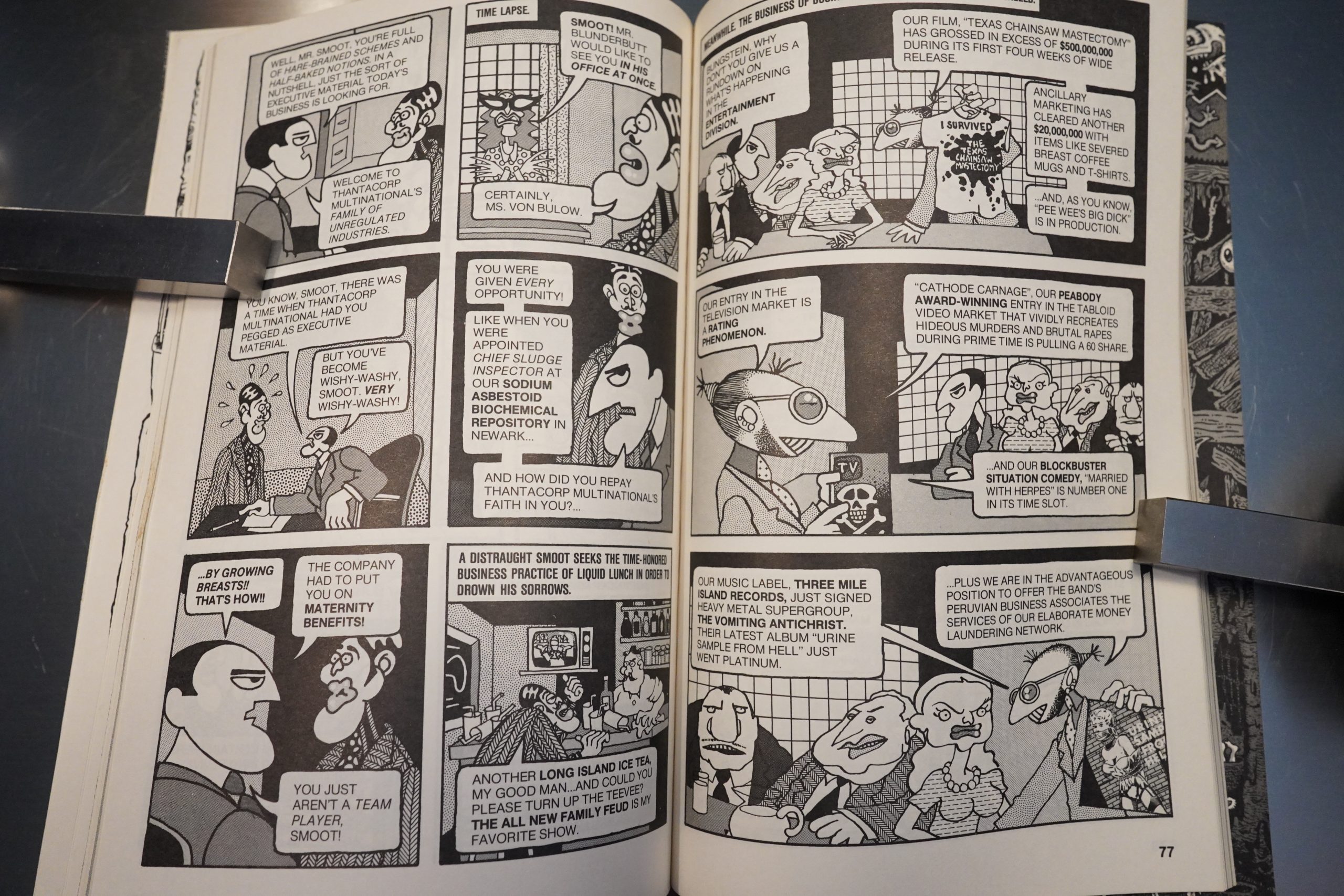
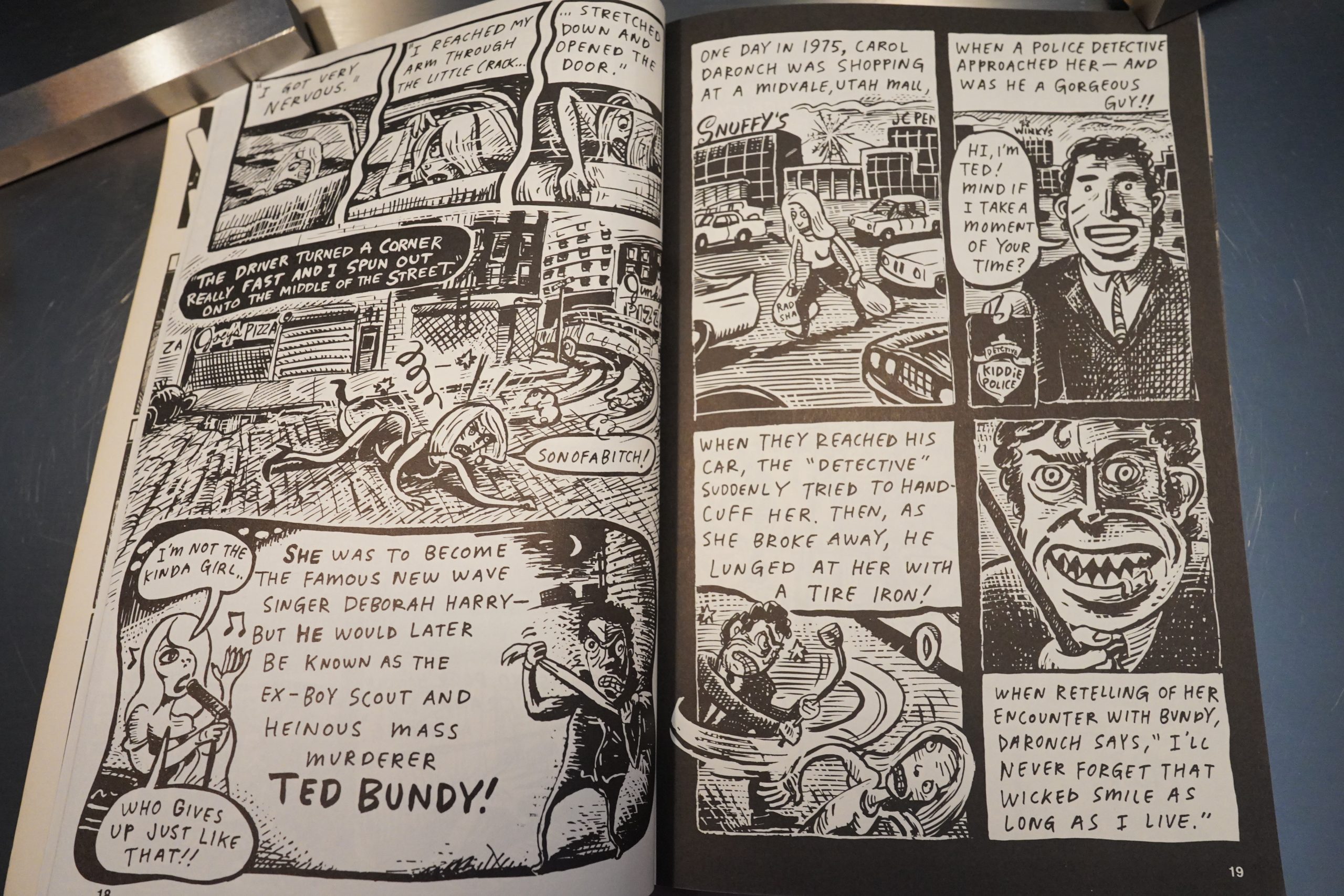
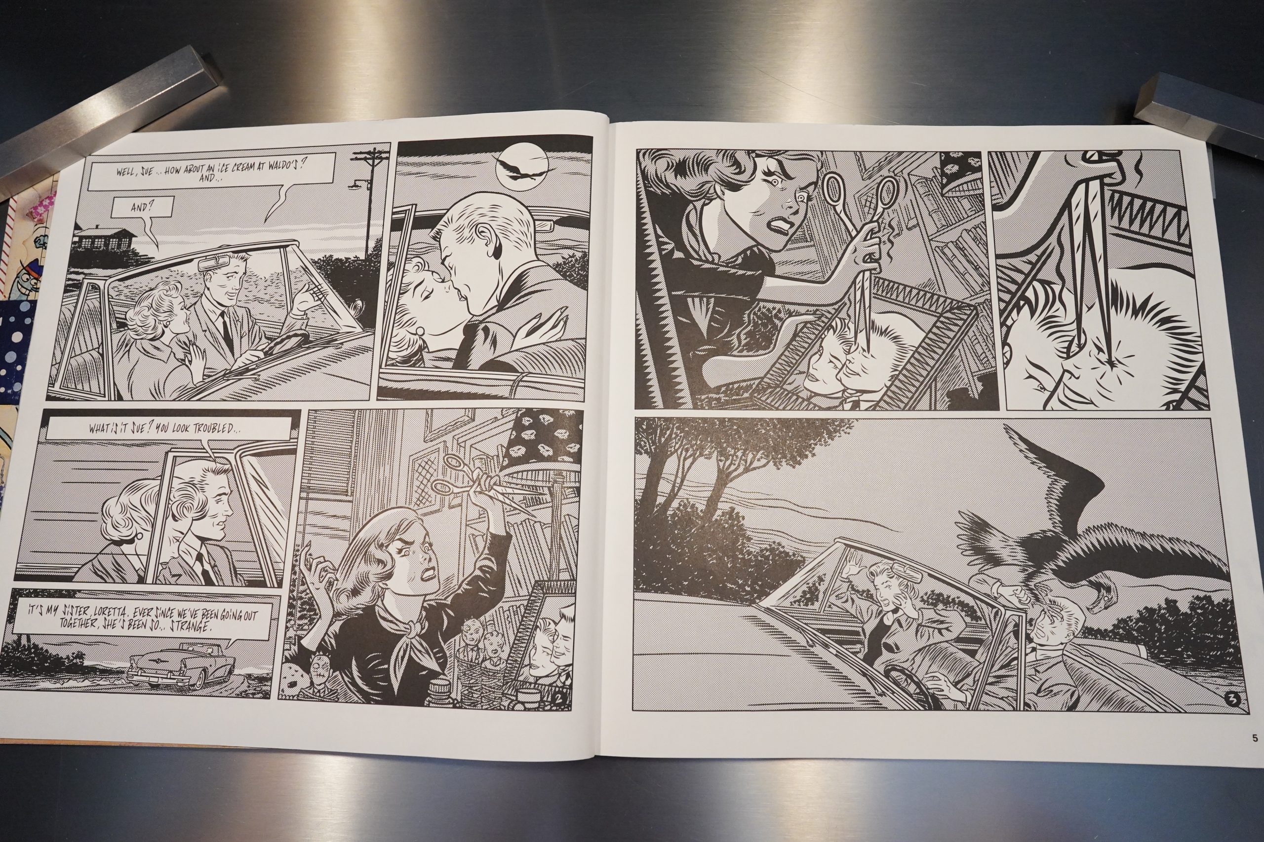
We do start getting some comics in the second issue, and we get a mash up of two Blab! themes in this Daniel Clowes piece — Fredrick Wertham and serial killers. (I think there’s about half a dozen things about serial killers in these eight issues.)

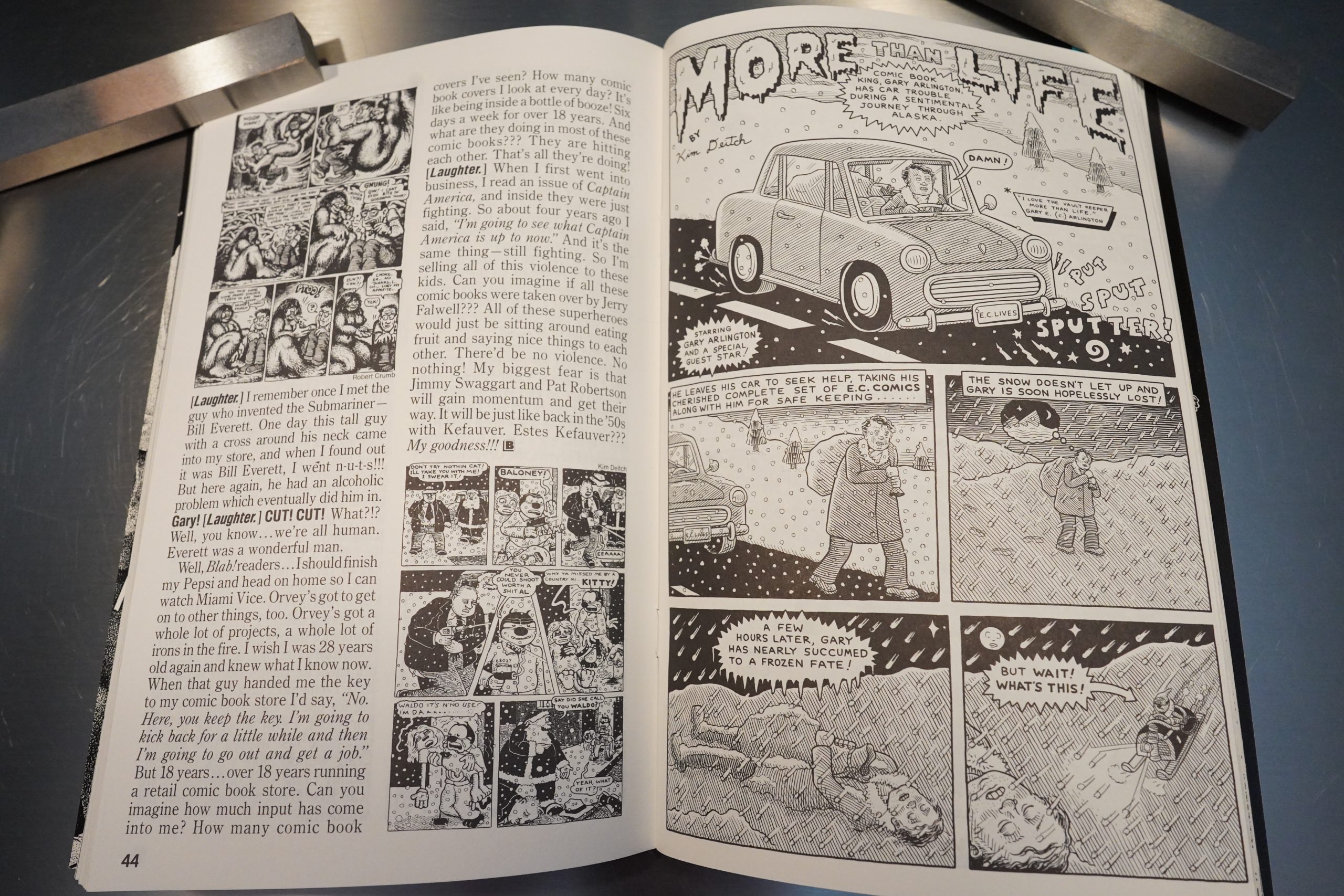
The second issue is mostly text, but Kim Deitch drops by to draw a story featuring the interview subject here, Gary Arlington.

The rest of the issue is… a bunch of texts about how great EC Comics was, but this time from younger artists.

So we’re still solidly in fanzine territory.

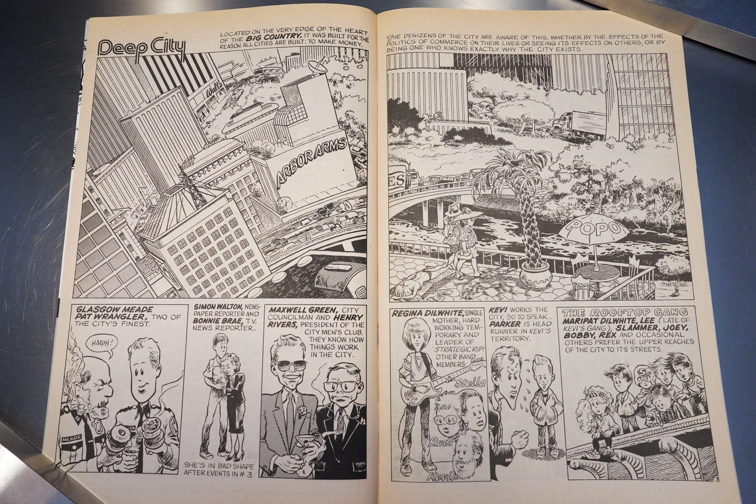
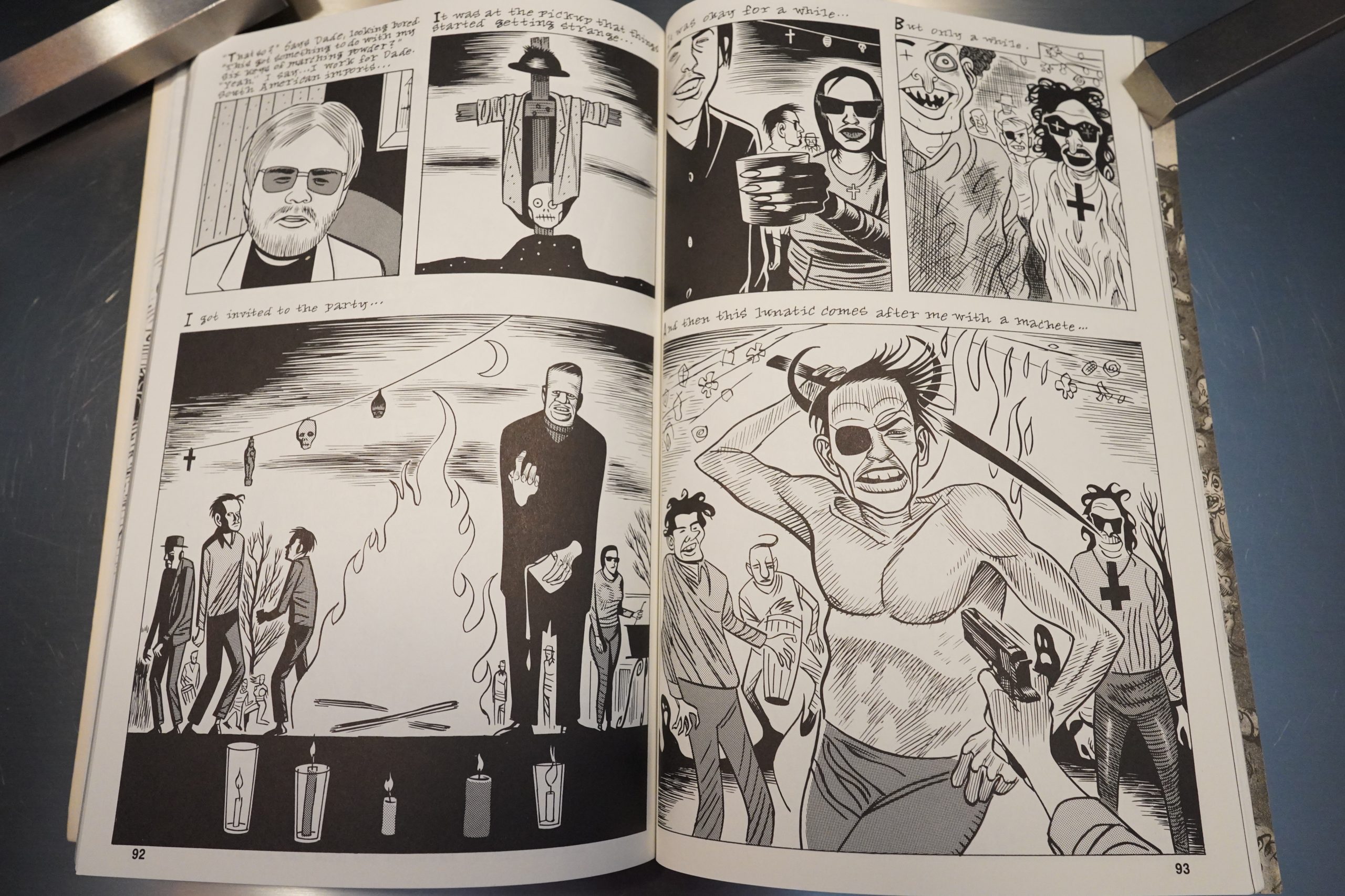
Blab! does have a very distinctive feel, and a lot of that comes down to the same people appearing in issue after issue. I think Spain is in most of them (and he starts off with an EC relevant story), but also people like Kim Deitch…

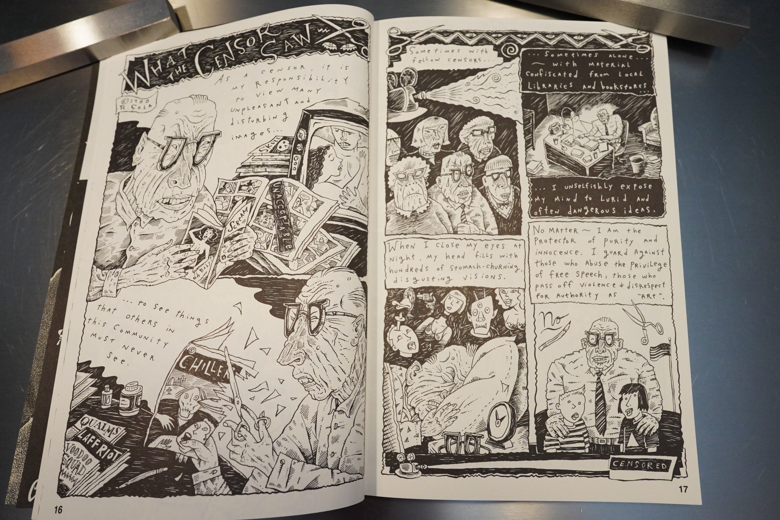
… and younger people like Richard Sala, which is fun.

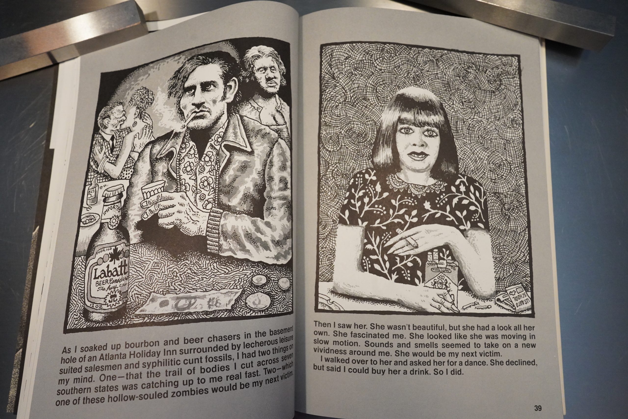
Did I mention the serial killer thing? About half of those are from Joe Coleman, and they’re all like this.

Hey… these Kim Deitch drawings are announced as being from a forthcoming book, but I can’t remember this one? I mean, I might just be misremembering, but perhaps Deitch was just joshing — he mythologises a lot, which is fun.

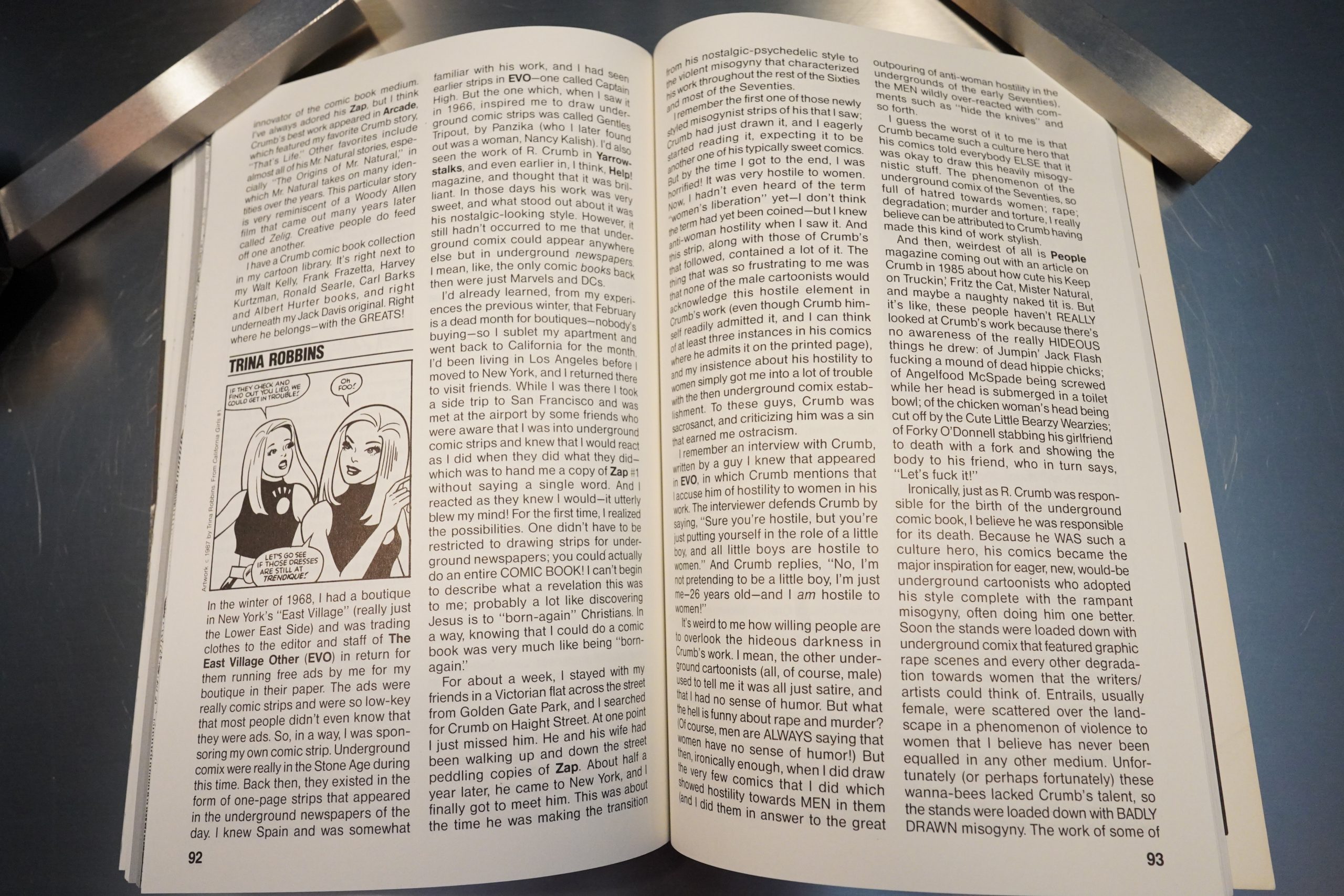
So, after two issues of people reminiscing about how great EC Comics were, what do you do next? Why, you get people to write about how great Robert Crumb is. It’s a natural progression. It’s mostly the same people, and they mostly gush a lot — but Trina Robbins provides a more tempered take.

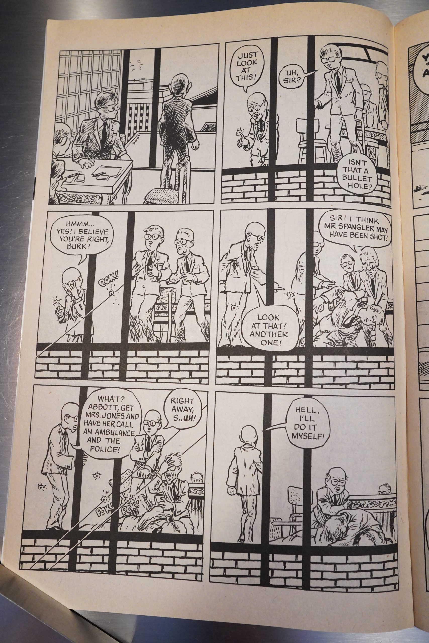
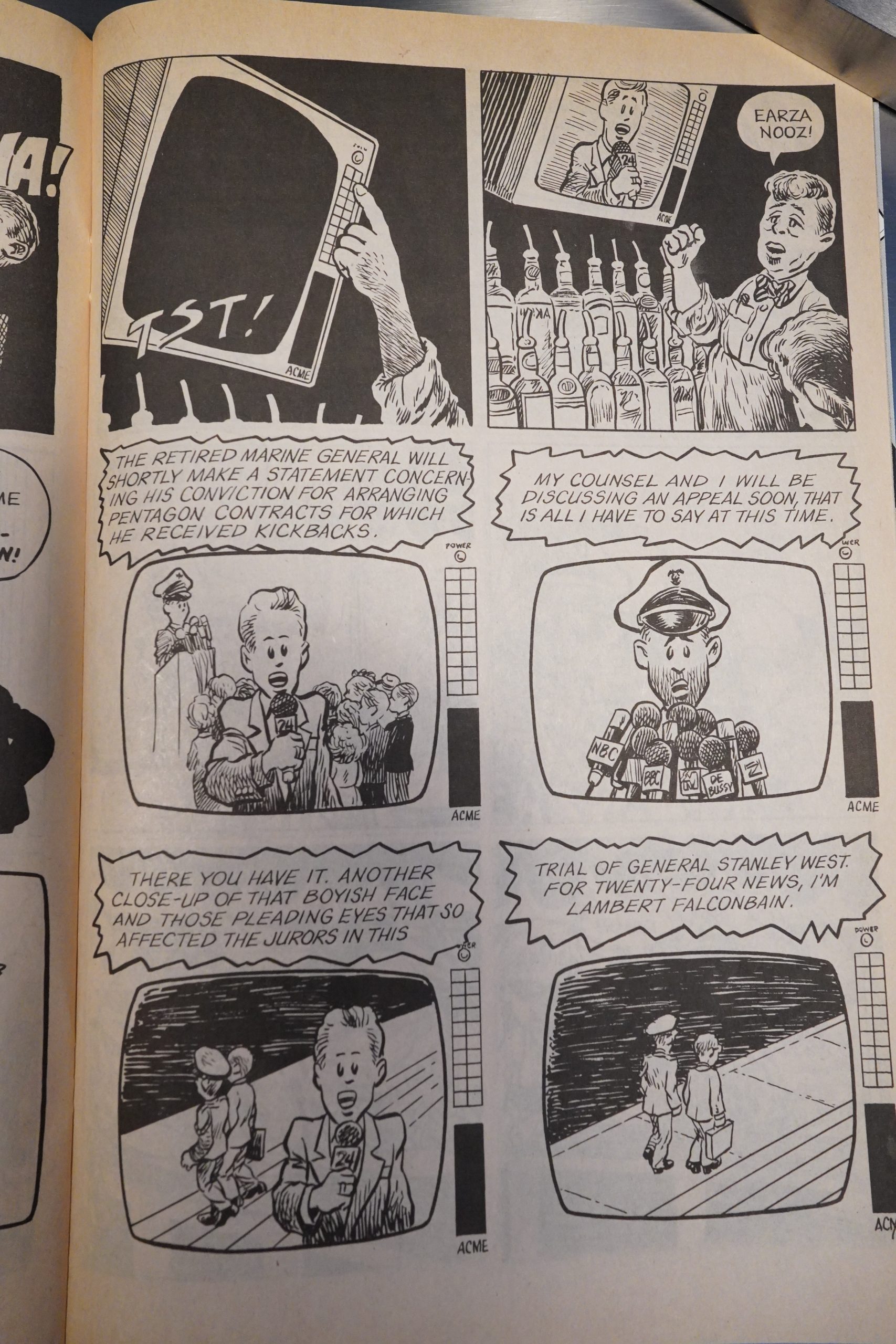
By the fourth issue, there’s more comics than text pages. There’s still something oddly slight about many of the comics pieces — I love Richard Sala, but few of the strips he does here are among his most thrilling. Perhaps it’s just a format/space restriction? He can’t really let loose in the few small pages he’s allotted, so the stories mostly don’t have time to develop anything interesting.

The range of artists is expanded somewhat, and I wondered whether Beauchamp was going to bring in many Kitchen Sink-affiliated artists from the 70s, but he doesn’t. Skip Williamson is the main exception.

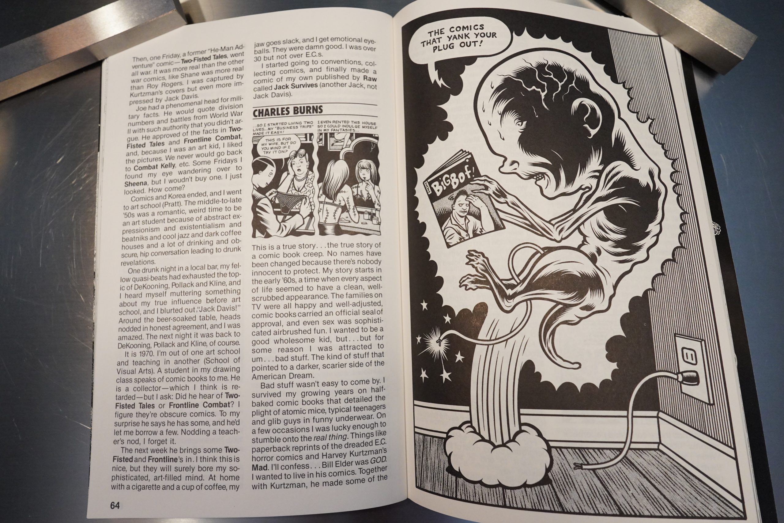
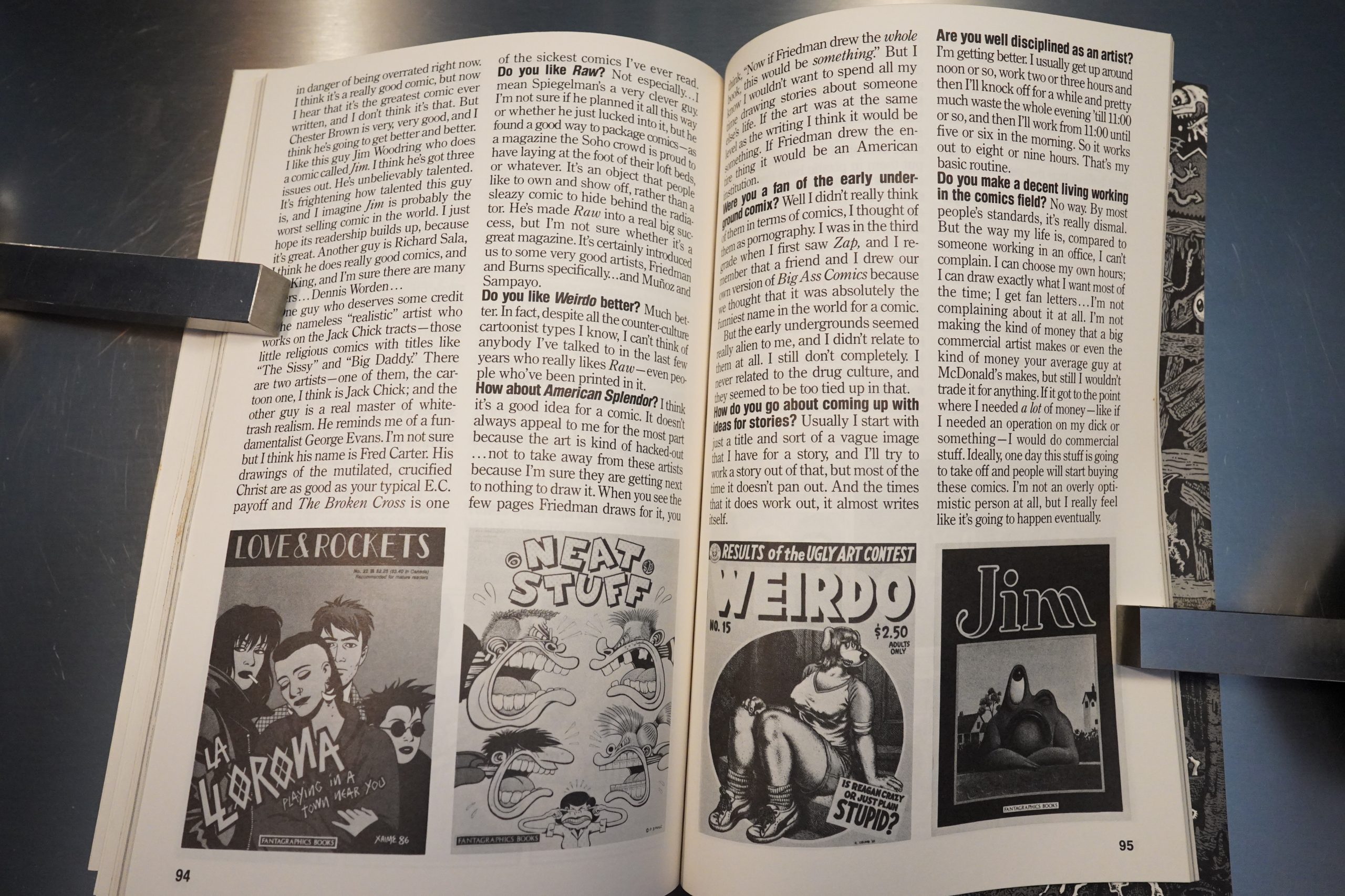
Most of the interviews are with people that also do artwork for the book. Here’s Daniel Clowes about how much Raw sucks. “a magazine the Soho crowd is proud to have laying at the foot of their loft beds”. “I can’t think of anybody I’ve talked to in the last few years who really likes Raw — even people who’ve been printed in it.” The resentment towards the art crowd and the jealousy of Raw’s success is so transparent that it’s almost endearing.

Even Lloyd Dangle gets in on the serial killer biography business. This interest in EC Comics and serial killers… WAS WERTHAM RIGHT!!!!

That’s some cool Clowes artwork.

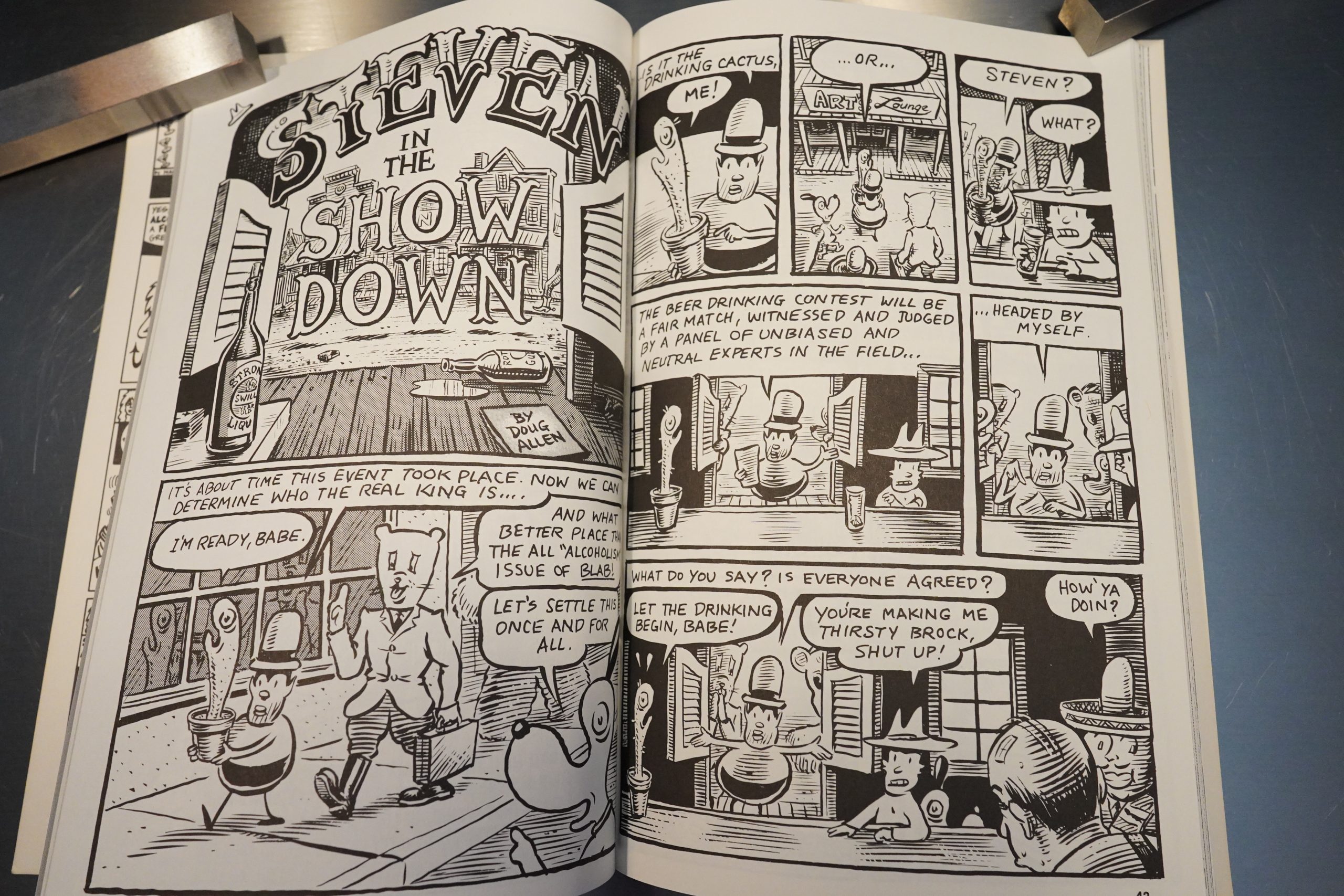
Oh, yeah, I didn’t mention Steven by Doug Allen… he’s also in most of the issues, and I’m mostly not that interested.

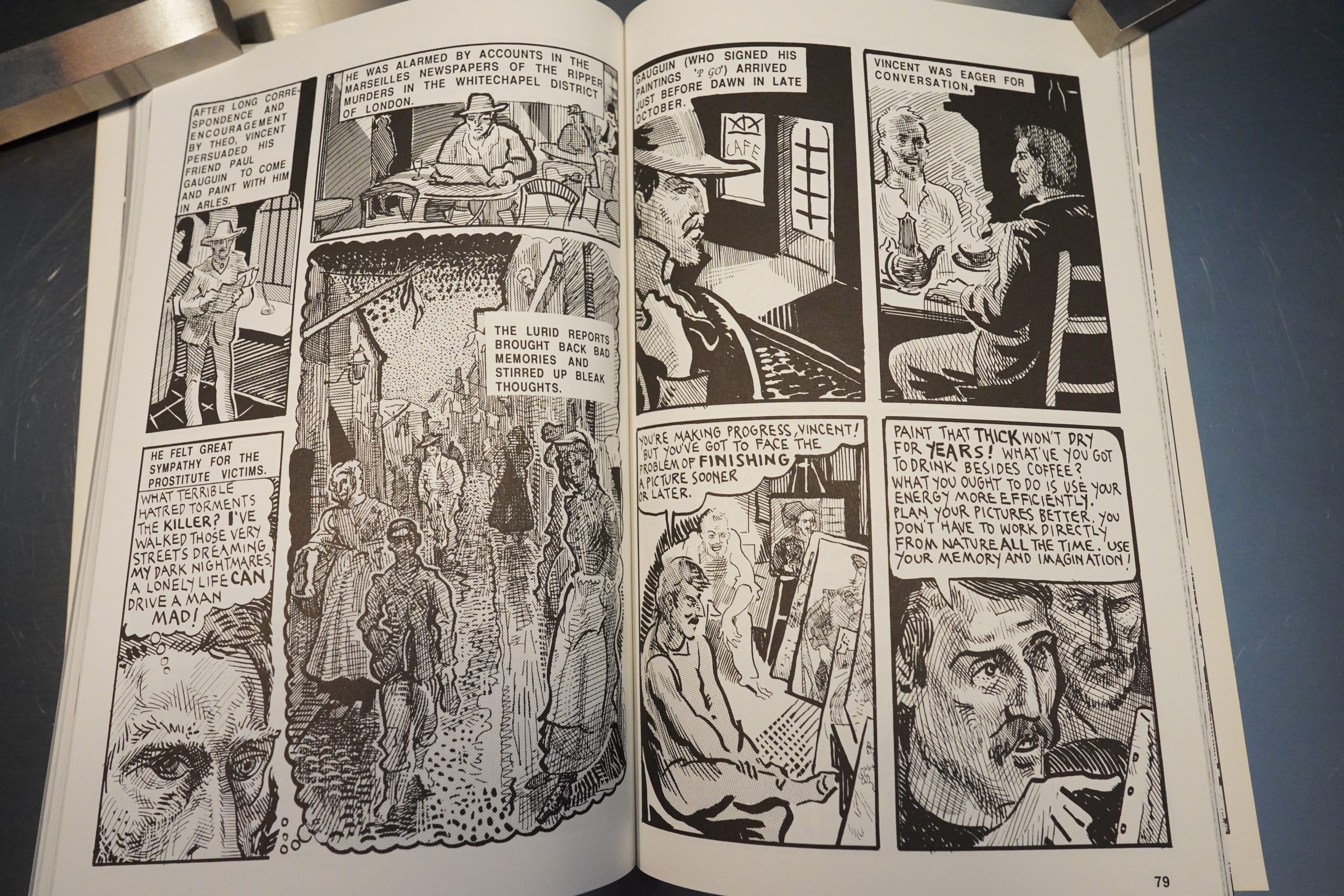
Finally! In the sixth issue, we get a comic that’s actually good good, and not just “OK, that’s amusing”. It’s by Frank Stack, and it’s about Van Gogh and Gauguin. It’s not that the other pieces are bad, but they have a fanzine feeling going: It’s not very ambitious work. The Frank Stack thing, though, is really interesting and beautiful.

And perhaps Beauchamp had had a wake up call of some sort, because with the seventh issue, the tenor of the book changes substantially. All the regulars are still here, but do stronger work, and Beauchamp also brings in up and coming super stars.

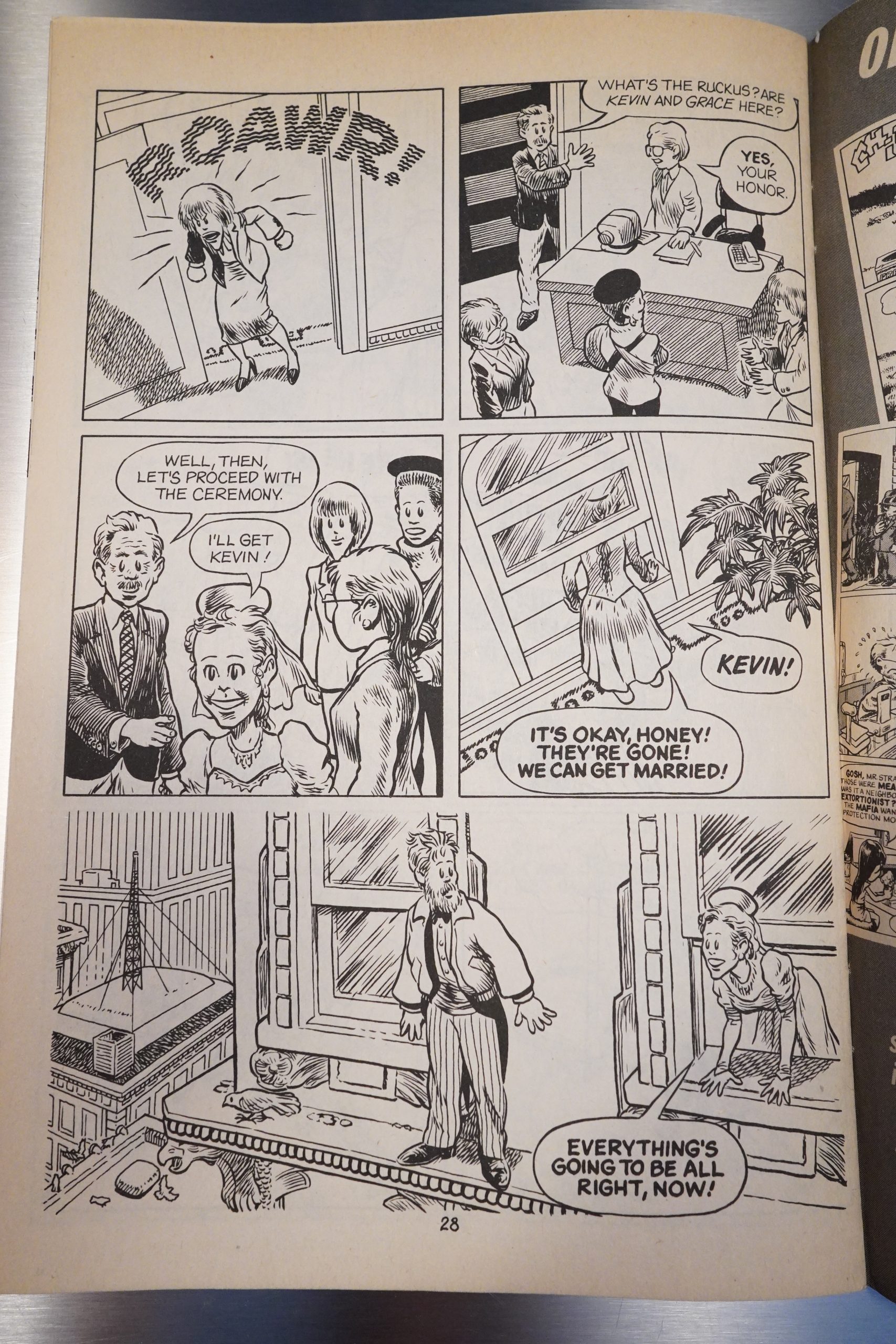
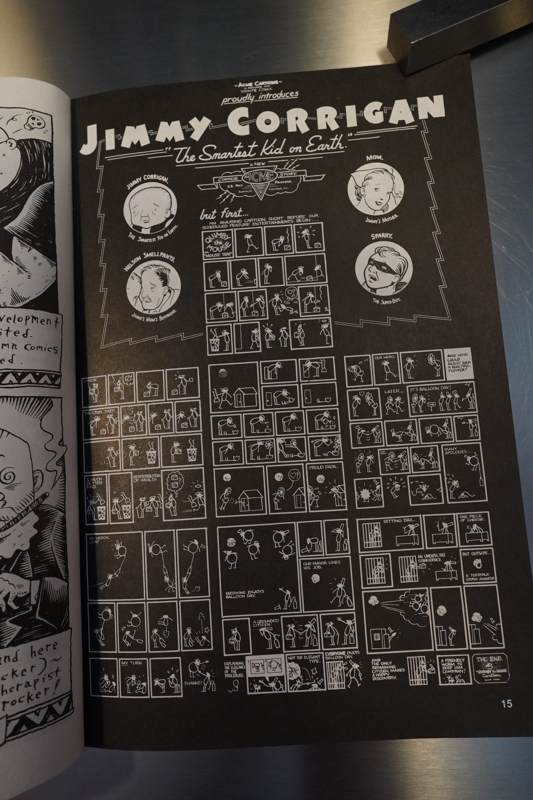
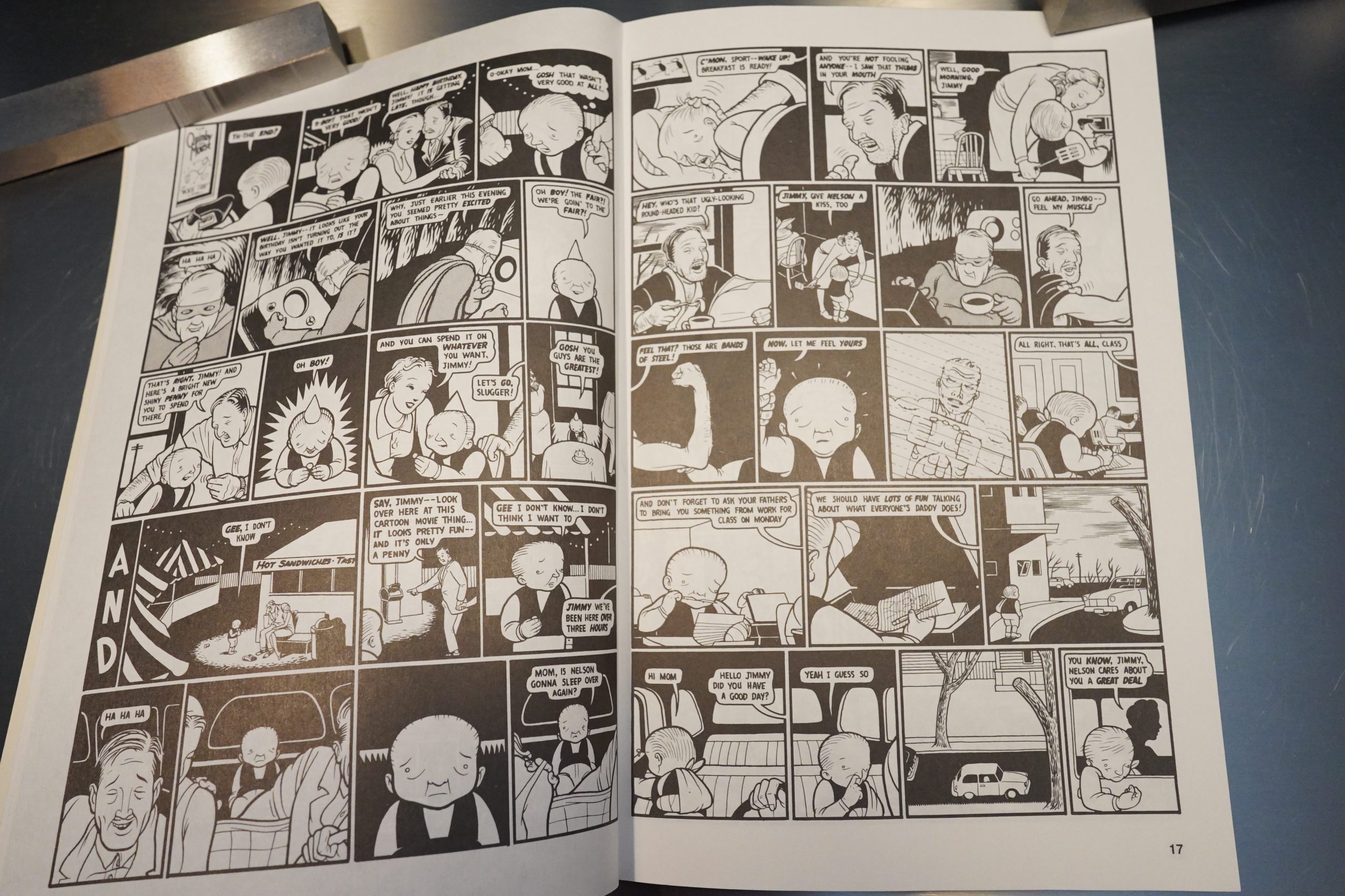
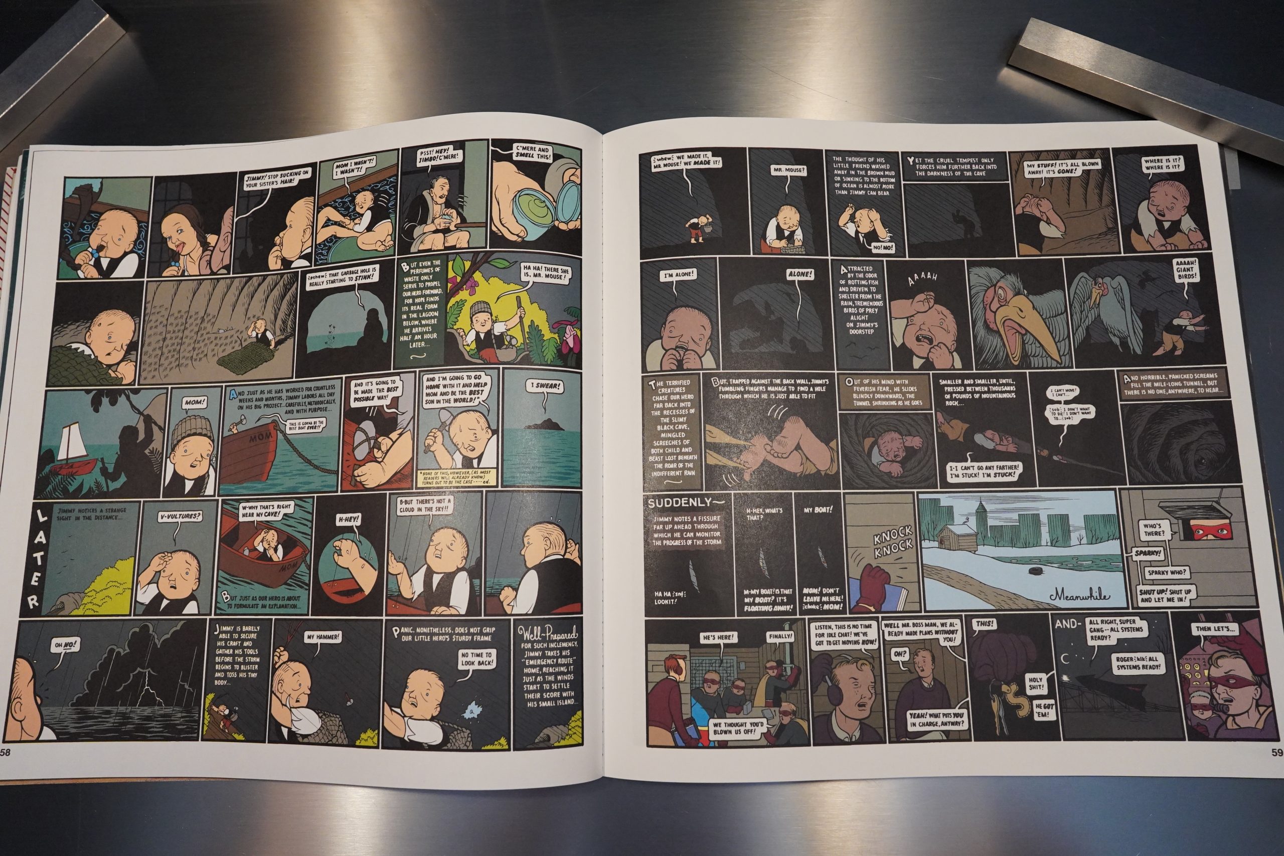
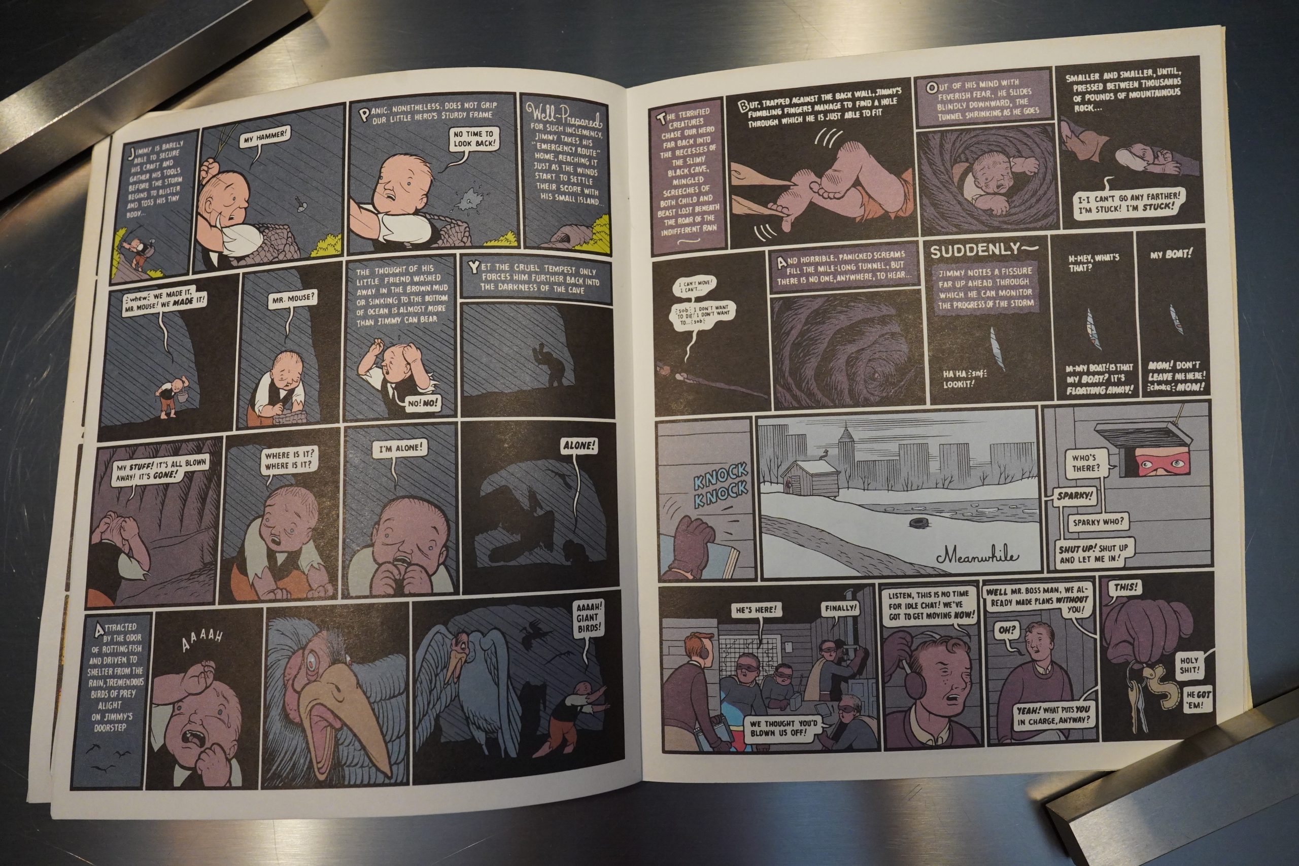
Chris Ware does one of his Chris Corrigan stories, and it’s one of Ware’s most powerful early stories. It’s printed so small, though… On the other hand, perhaps that makes the claustrophobic atmosphere even stronger.

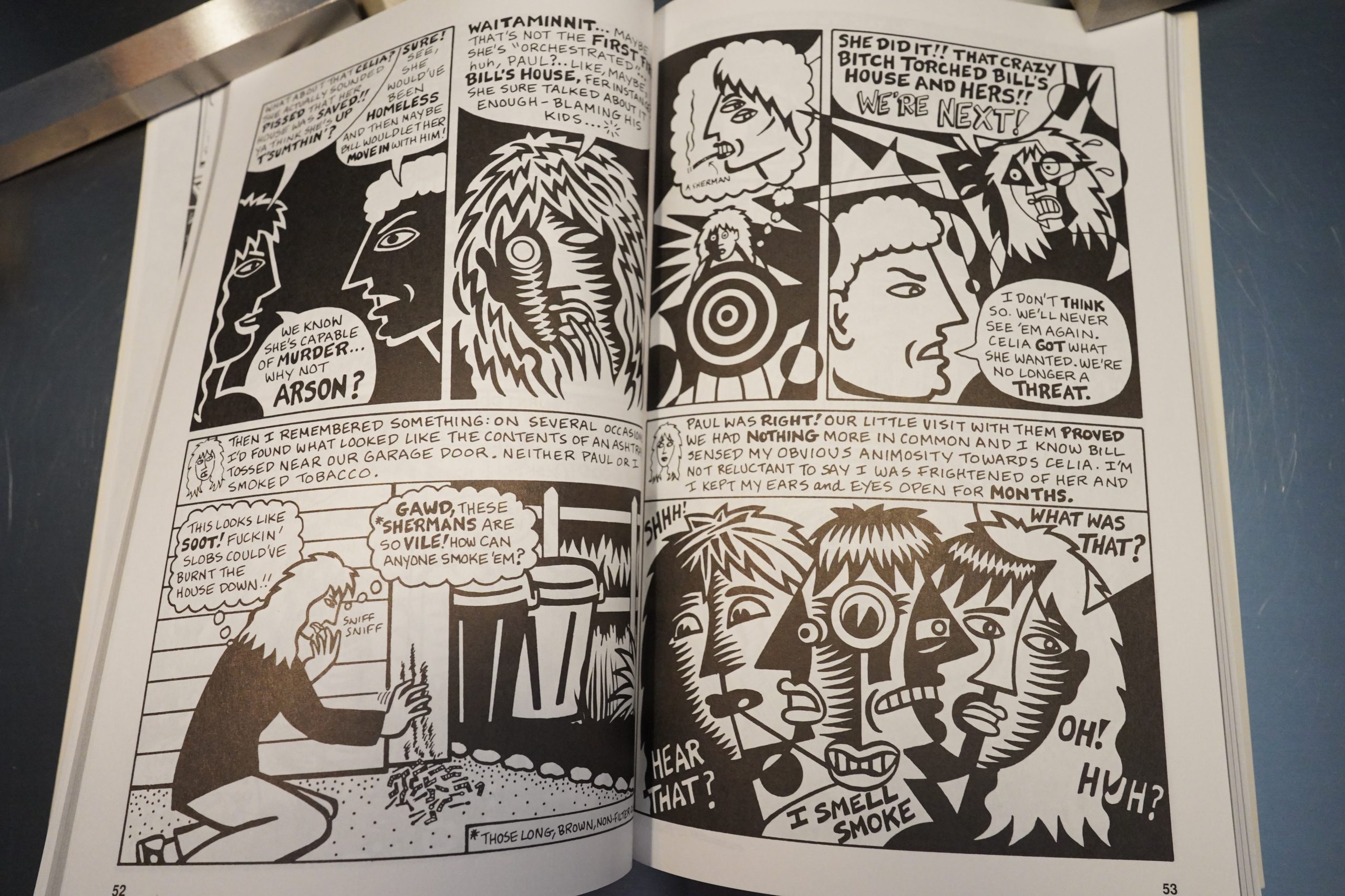
And by golly, we get a woman contributing. Mary Fleener is in amazing form with her ultra cubizmo style (and a very amusing autobio story).

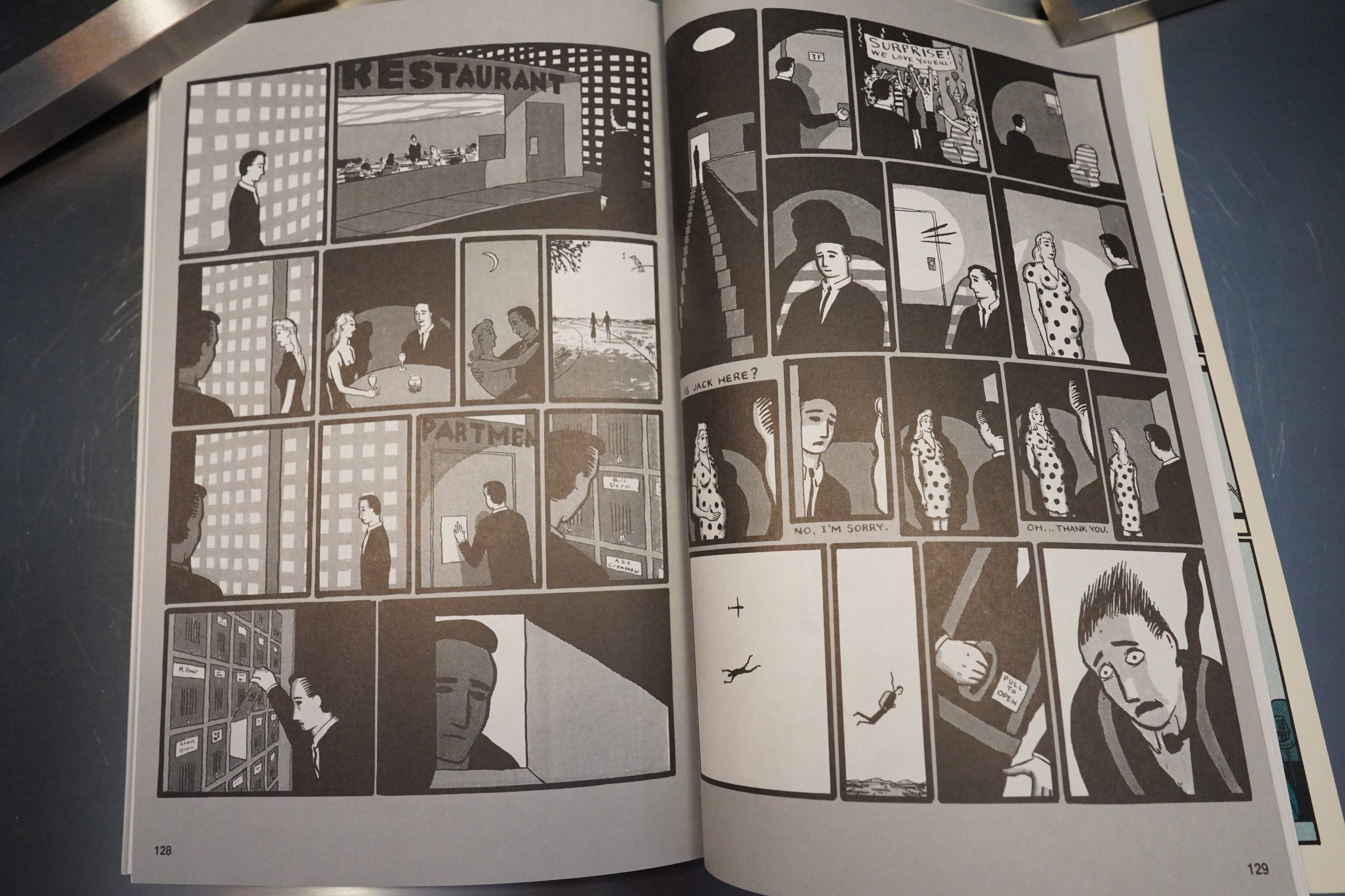
And is this the first post-Ware comic? Marc Trujillo looks like he’s been reading Ware. Or perhaps it’s Chris Reynolds? Anyway, it’s very stylish, and a lot artier than Blab! had been up to this point.
So where to take this next?

Format change! With issue eight, the book moves to a much larger, almost square format. And… with a variant inner cover!? That has to be a first. (I’ve got the David Goldin version, and the cover has separated from the innards, so perhaps they hand-glued the variants or something…)

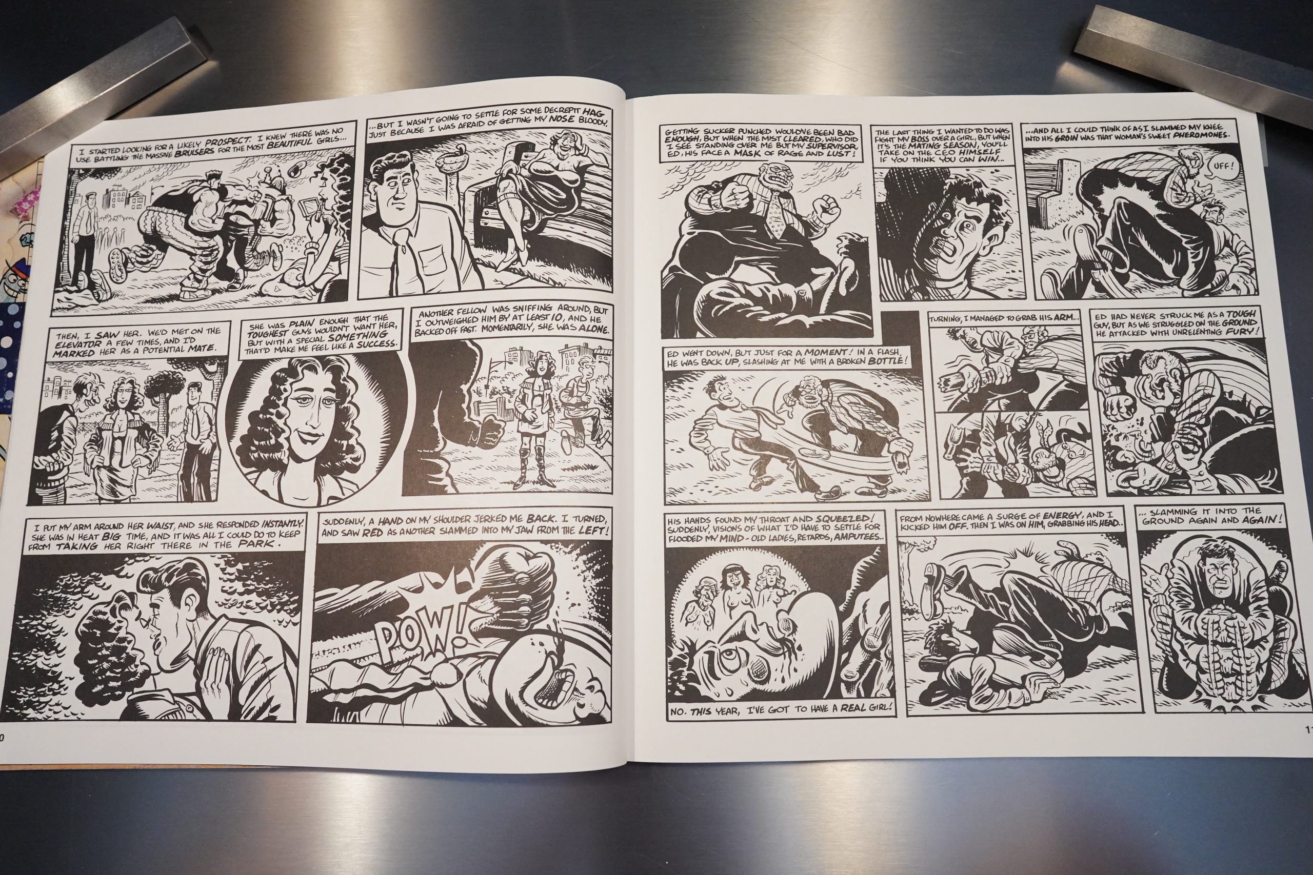
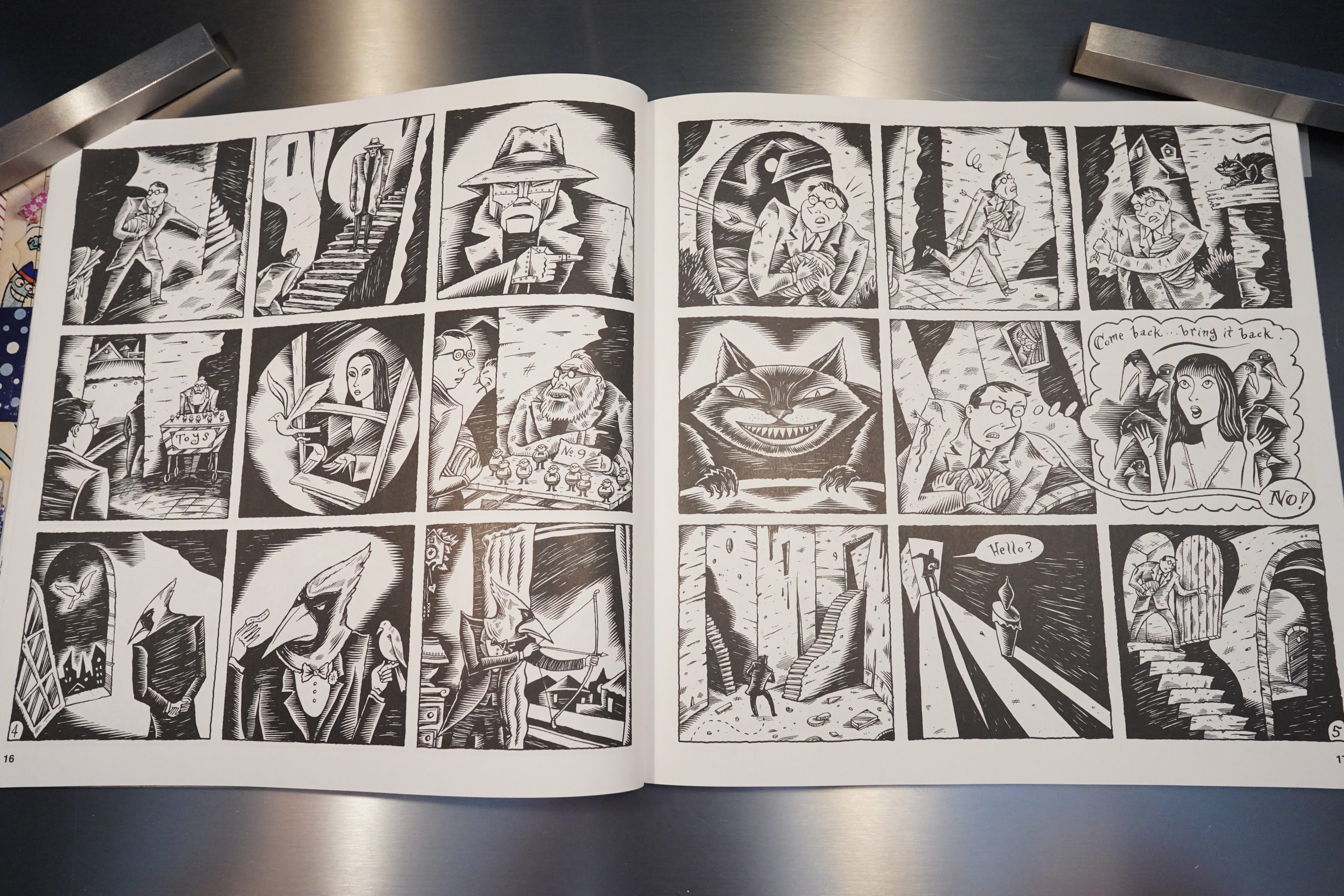
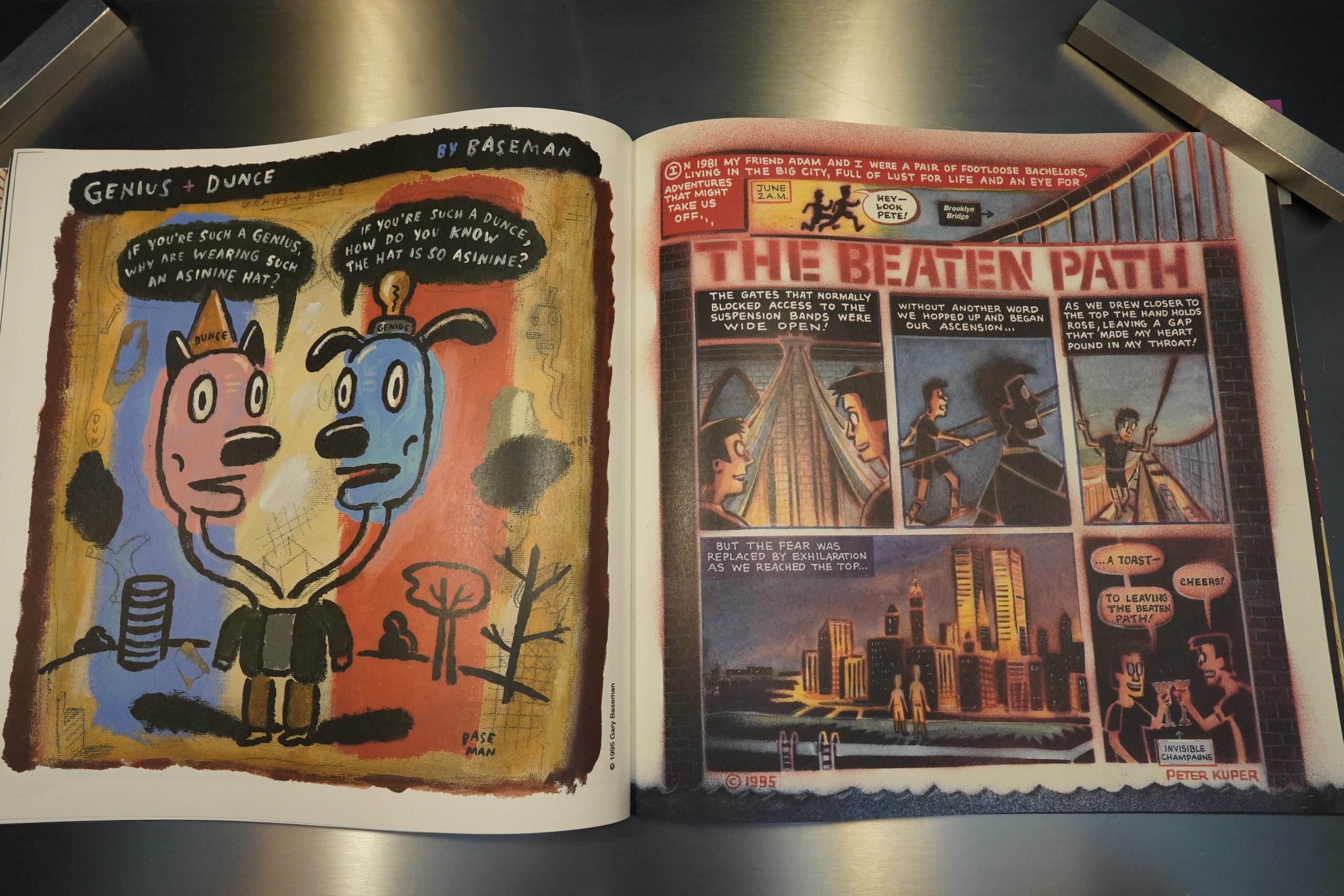
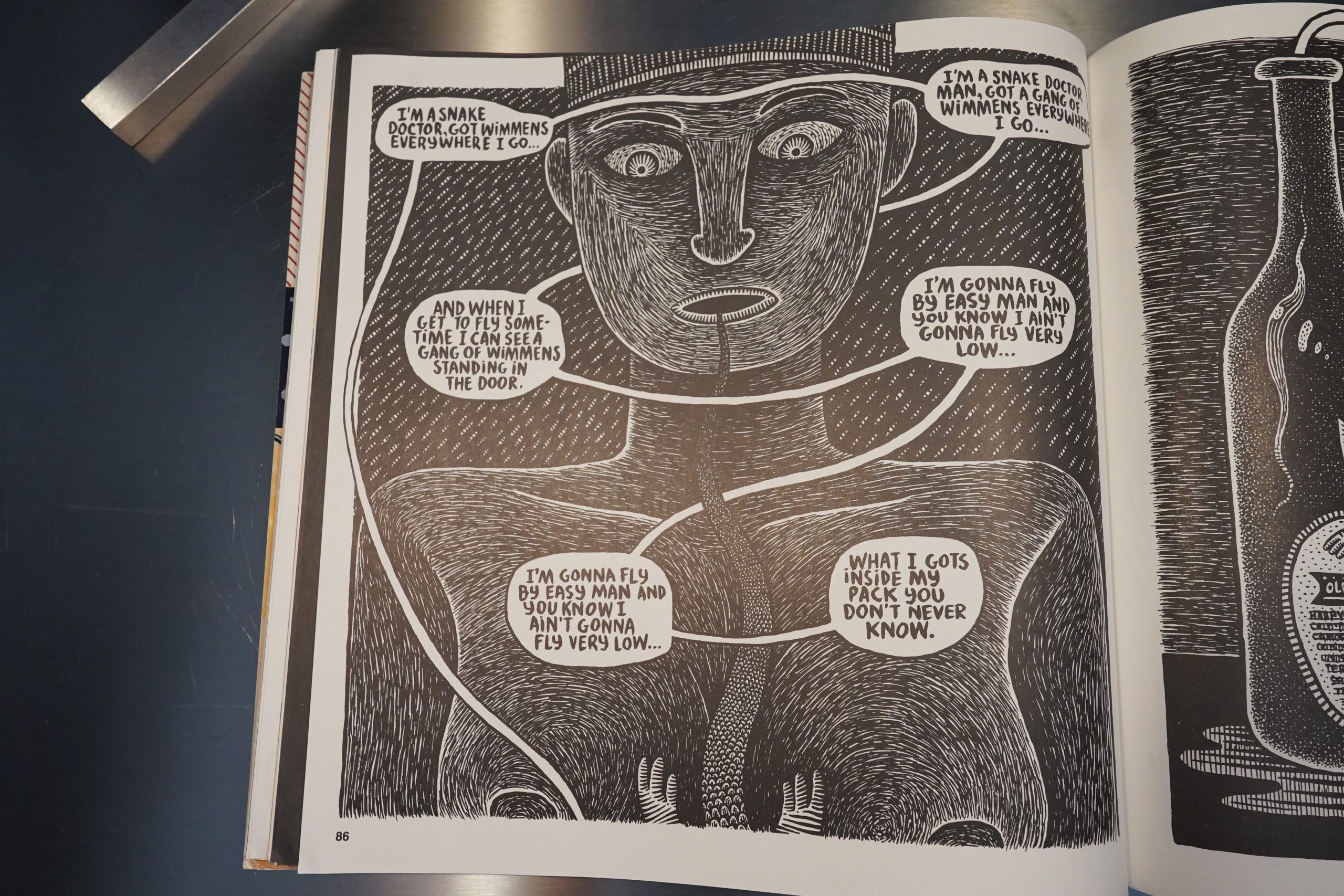
The differences are striking. With the larger pages, people suddenly seem to get a whole lot more interested in doing ambitious artwork. Walter Mingus and Charles Berberian here — and they’re new to the book, too.

The stories also somehow get wilder. Here’s Terry LaBan imagining how it’d be if humans had a mating season.

Finally Richard Sala gets space to let his wonderful artwork breathe.

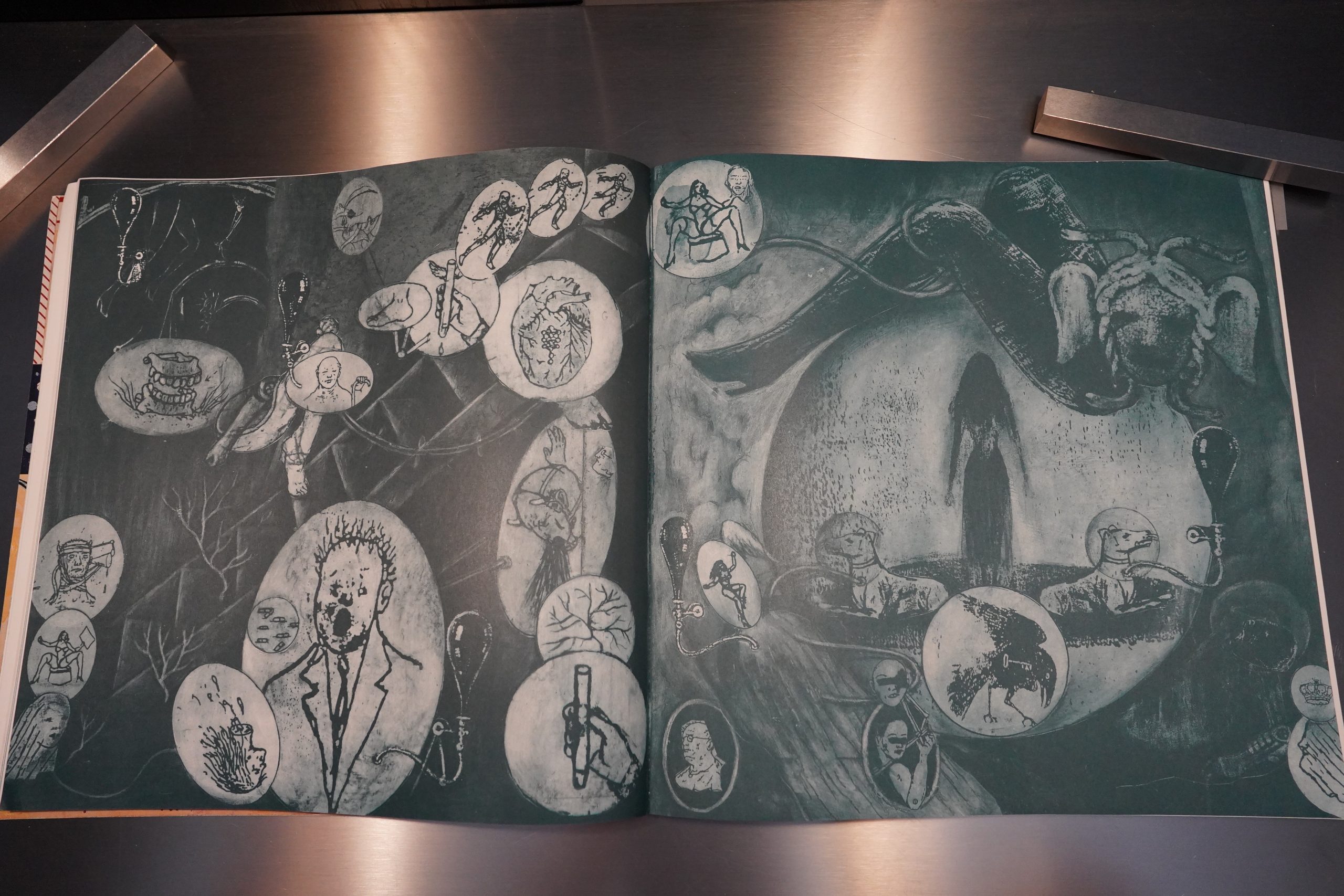
And we get the some pages by people who aren’t comic book artists, like Jonathan Rosen. (In subsequent issues of Blab!, these kinds of things would come to dominate, if I remember correctly.)

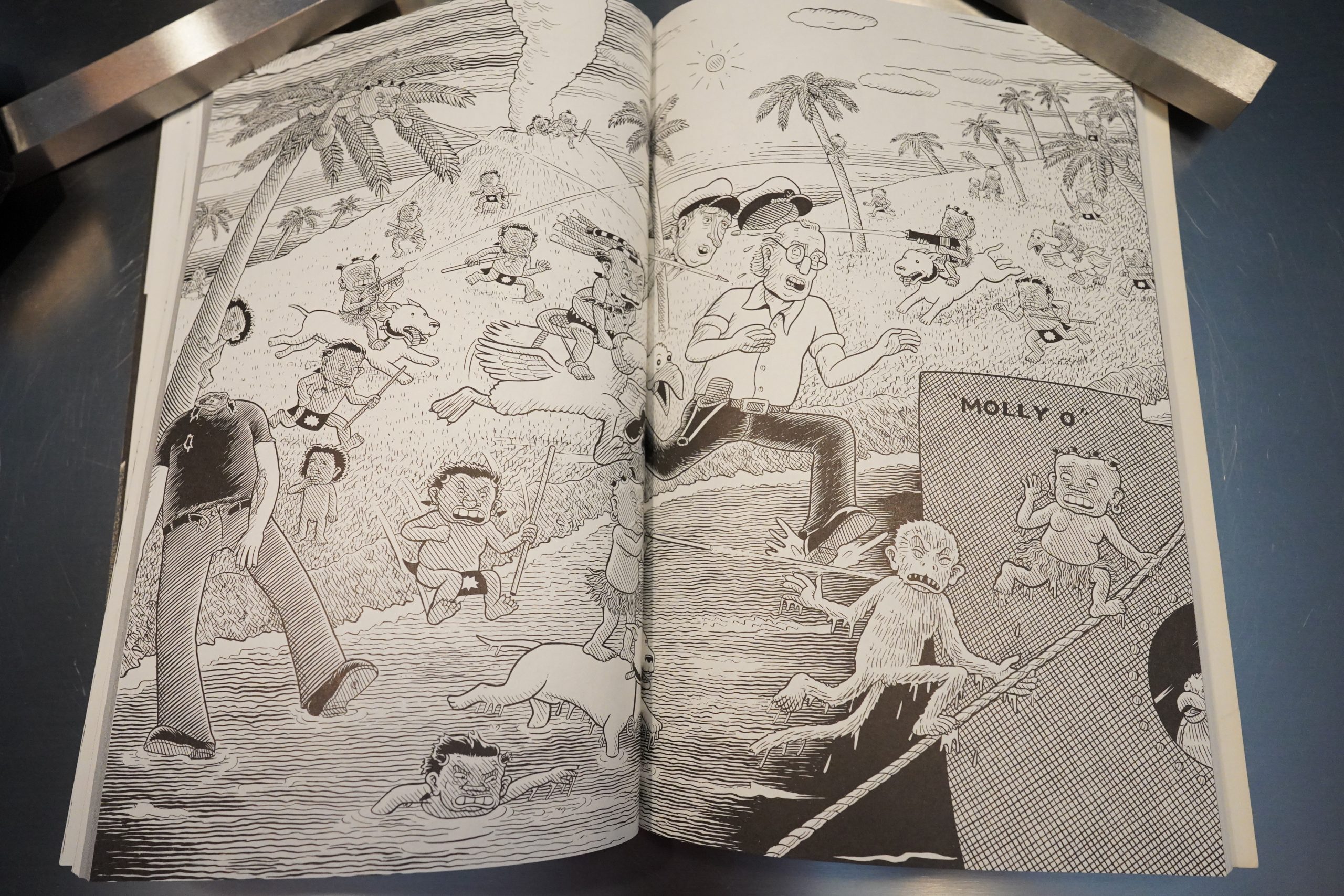
Ware doesn’t let the larger pages affect him, but just piles more panels on each page.

The story serialised here was later reprinted in Acme Novelty Library #10, but significantly rearranged.

Anyway, with the eight issue, I’d say that Blab! really came into its own — it’s lost all the traces of its fanzine beginnings, and it no longer has that musty boys’ club smell (even if it’s still virtually just male contributors).

And then there’s Jeff Johnson. That’s a stunning drawing.

But the text pages aren’t totally gone! We get an amusing interview with Drew Friedman, which is printed using a strangely large font?
Anyway, solid issue, and I’m tempted to keep reading Blab!, but this is where Kitchen Sink stopped publishing it. (It would later move to Fantagraphics, but keep the same format.)
Darcy Sullivan writes in The Comics Journal #260, page 53:
Blab! #14
Edited by Monte Beauchamp
Fantagraphics Books
Now that Monte Beauchamp has
published as many coffee-table sized
issues Of Blab! as digest-sized issues, can’t
we call the project done and just pull the
plug? Point taken, Monte — you know
how to put together an absolutely drop-
dead gorgeous compendium Of graphic
art. But the big Blab! is dull. In fact, let’s
lay it right out there: Blab! must die!
[…]
The rest of Blab! — as With most
of every issue now — is hogged by full-
page attitude-drenched artwork, some-
times masquerading as narratives, and
blown-up retro graphics, in this case
early matchbook art. Look at pages 64
and 65, full-color mosaics by Noah
Woods. Did you need to see that —
much less pay for it?
[…]
Blab! seems so bad now because it
once was so good. God, it was amazing.
Just to remind you What a treasure we’ve
lost, here are the highlights from the last
little Blab!, published in 1992: A Dan
Clowes cover; inside covers by Chris
Ware, who also contributes 11 pages of
Jimmy Corrigan; short stories by Richard
Sala, Joe Coleman, Mary Fleener, Doug
Allen, Spain Rodriguez and more, in
addition to Stacks full-length story.
Unfortunately, Blab! has stopped
being a top-drawer anthology of comics
at a time when we desperately need one.
The clear frontrunner, Drawn &
Quarterlh only comes out once a year,
and most Of the best peer books are dead.
(Strangely enough, D&Q also moved to
the coffee-table book format in 2000,
but Without ill effect.)
And While today the Concept seems
to have been marginalized, anthologies
have virtually defined the progress of
alternative comics. ZAP, Weird”, RAW
and Drawn Quarterly announced
styles and artists in the manner of the
(much more popular) European antholo-
gies such as mote, Metal Hurlant, Fluide
Glacial and (A Suivre).
Blab! wasn’t as groundbreaking, but
it was frequently more fun. Where else
would you find articles on Mars
Attacks cards or the Garbage Pail Kids,
or Clowes’ interpretations of Fredric
Wertham’s Seduction Of the Innocent and
The Show ofViolence, or Drew Friedman’s
“Wacky World,” matching comedy
greats with serial killers? And Blab! was a
showcase for work by such artists as
Clowes, Sala, Spain and Ware back when
most of them didn’t yet have their own
books.
When Blab! super-sized with #8 in
1995, things looked good. Chris Ware
contributed one of the best comics covers
Of the 1990s. There was an article on
Drew Friedman’s work, and the issues
contributors included Sala, Ware, Spain,
Peter Kuper, Gary Baseman, Archer
Prewitt, Doug Allen, Frank Stack and
Walter Minus/Charles Berberian. It felt
like the old Blab! on bigger pages.
With #9, the series moved to
Fantagraphics, under a Gary Baseman
cover (Which made Blab! resemble an
issue Of the now-defunct anthology NO-
Zone). The publisher change itself unas
not an auspicious sign. It’s an anomaly of
comics history that, despite the critical
importance of alternative comics
anthologies, the most important compa-
ny in alternative comics didn’t publish
any of the big ones. None of
Fantagraphics’ entries — and there have
been many, including Graphic Story
Monthly, Prime Cuts, Pictopia, Snake Eyes
and Zero Zero — were as good or as well-
produced as the top-tier anthologies.
So did Fantagraphics somehow screw
it up? Or did the new format, new pub-
lisher and bigger budget allow
Beauchamp to pursue a different mis-
sion? Hard to know, but Blab! #9 showed
Beauchamp moving toward a new class
Of artists with a less narrative bent and
with more painterly tendencies, such as
Tony Fitzpatrick, Christian Northeast
and Blanquet. This issue ‘,vas still mostly
comics, and included one of Richard
Sal” finest black-and-white stories, but
the change was afoot. Issue after issue
would see fewer standout comics stories,
more full-page “outsider artsy” graphix,
and the mood just kept get-
ting colder.
One could argue that Beauchamp
has broadened our narrow definitions of
comics art and brought a new generation
Of talented artists to the fore, much as
Art Spiegelman did with Raw. But even
laying aside subjective preferences for
one school of artists over another, the
fact remains that the newer artists so gen-
erously exposed in the latter issues of
Blab! have not made significant contribu-
tions to the comics genre. They’re
painters, designers, provocateurs — but
not cartoonists.
Blab! remains one of the best-pack-
aged books around, but it’s profoundly
unlikable. The title now serves as a
mocking reminder of a time when Blab!,
well, spoke to us. Since those days are
gone, at least stop rubbing our noses in it
by calling this Blab! HOW about Flab?
That’s a fun review, and I find it interesting how he lauds “the old” Blab! — but holds out #7 and #8 as the paragons, while glossing over the earlier issues. But what he says tallies with what I remember from the later issues — it’s mostly not very interesting illustration work.
So perhaps Blab! only had two fully successful issues?
Eric Reynolds writes in The Comics Journal #186, page 144:
BLAB #8
I was going to Hit List
this anthology when it
came out late last year,
but I didn’t because of an apparently misguided
confidence in the comic bcnk community. Upon its
triumphant return from a several-year hiatus, I was
convinced that Blab #8 would be heralded as a
masterpiece of aesthetic choice on editor Monte
Beauchamp’s part, and the best single-issue anthol-
ogy since the last RA W some four or five years ago.
As I turned the pages Of the Comics Buyer S
Guide every Monday and The Comics Jour-
nal every month, however, my resolve wore
down considerably, and I felt a social and
professional responsibility O — ahem —
blab effusively about my favorite comic of
1995.
Simply put, Blab looks like a fuckin’
million bucks. Chris Ware’s cover is predict-
ably brilliant, a contemporary homage to
classic newspaper strips like Nancy and
Little Orphan Annie. Inside, there’s lots Of
familiar, dependable favorites: Richard Sala,
Doug Allen, Spain, Jeff Johnson, Frank
Stack, and even Denis Kitchen, who still
makes me wish he would draw more often.
[…]
More often than not, anthologies are
are comparably well done, but Blab
wins hands-down: it’s got quantity, quality, and its
finger to the pulse of today’s comics scene.
Beauchamp’s a great editor because he ap-
proaches Blab from a cartooning perspective (a
more radical agenda than it sounds), clearly empha-
sizing aesthetics over intellectuality. The book is
pure eye candy, perhaps best exemplified by the
stunning, yet completely devoid Of content, section
devoted to cosmetic product labels from the ’20s
and ’30s.
Gregory Cwiklik writes in The Comics Journal #163, page 37:
BLAB! , the black-and-white, digest-size
annual, produced and edited out Of Chicago by
Monte Beauchamp and published by Kitchen
Sink Press, has undergone a curious evolution
since its creation in 1986 — it started out as a
fanzine extolling the lost pleasures of old EC.
comic books and other targets of parental and
societal ire, like offensive bubble gum cards,
and radically transformed, itself with its third
issue into a showcase for alternative comics
artists like Dan Clowes, Joe Coleman, Richard
Sala, Spain Rodriguez, and a number of others.
The focus of the first two issues is the
listings of “Notes from the Underground,” which
reveal the profound and lasting effect that the
EC. comics have had on many underground
and alternative cartoonists. Individually, these
reminiscences are quite interesting, but en masse
they are almost numbing in their sameness and
in their repeated genuflection before Sts.
Kurtzman and Elder et al. ne children Of the
’50s all report experiencing a similar sort of
epiphany upon first seeing a copy of Weird
Science or MAD on the newsstand. These com-
ics evoked hostile reactions from parents, and
many comic collections were consigned to the
flames, They still seethe with resentment to-
ward their middle class parents for trying to
inflict some dull, sterile code of “good taste” on
them when all they wanted was to wallow in the
vulgarity and gross bad taste of a Basil
Wolverton cartoon or the low-rent “chicken
fat” of Will Elder’ s “Starchie” Or gloat over one
of Ghastly Ingles’ lovingly-rendered rotting
corpses. The particular aesthetic vision and
remarkable technical virtuosity of Wood and
Williamson and so many other EC. artists is
beyond question, but there is an unfortunate
tendency in “Notes’ ‘ toward an uncritical adula-
tion that stands in •the way Of any rational
assessment of their work. The interview with
dealer and former underground publi sher Gary
Arlington is a good case in point —even in cold
type he seems to swoon in some sort of narco-
sexual ecstasy at the mere mention of Wally
Wood or Frank Frozetta. It’ s embarrassing.
[…]
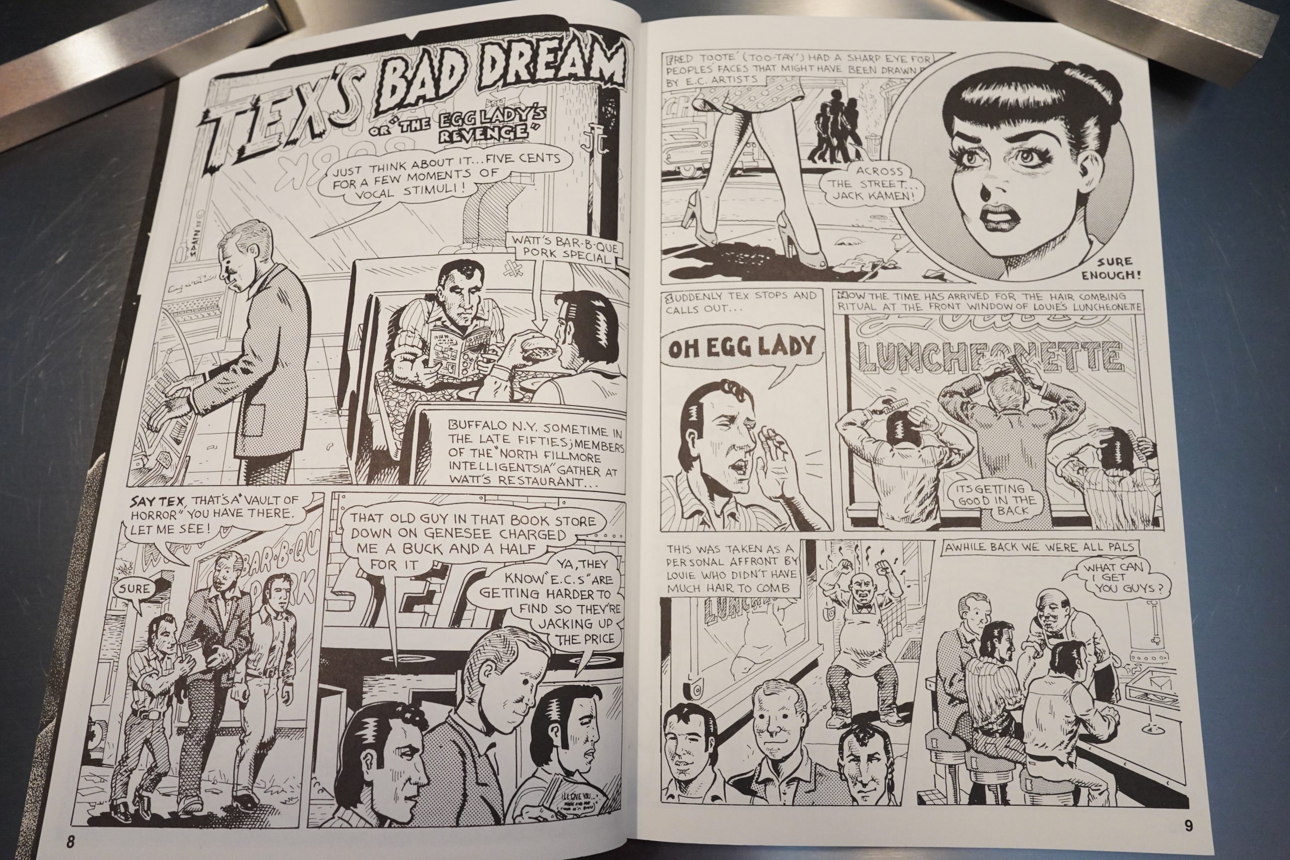
The third issue of Blab! is one of transition
and the spirit of EC. still hovers over it. Spain
and his pals are all shown to be EC. comics
fans, and there is a running subplot about Fred’ s
penchant for pointing out individuals on the
street whose distinctive physiognomies make
them look as though they had been drawn by
particular E.C. artists. “Jack Kamen!”Fred will
exclaim and there, across the street, will be
strolling some bright-eyed, long-lashed cutie
looking like she just stepped out from one of
Jack’s panels. Also in keeping with the E.C
theme, the first story revolves around a hor-
rible/hu morous Talesfrom the Crypt type night-
mare that Tex experiences.
Story development is gradual. The first two
episodes seem just a bit contrived, disjointed,
played mostly for their humorous aspects —
but they do establish a certain atmosphere and
set the stage for what will follow. Spain turns
the corner with the third episode, in Blab! #5,
the “All Crime Issue.” Here the everyday ac-
tivities of the North Fillmore gang are played
out against a background Of violent crime pro-
vided by two bank robbers, Wilcoxson and
Nussbaum, whose exploits electrify the neigh-
borhood.
[…]
Blab! has come a long way from its clubby,
fannish origins. Since its inception, editor
Monte Beauchamp has maintained excellent
production values — even postage stamp-
sized art is reproduced sharply and clearly,
and layout and design are first rate. There is
a nice mix of styles and subject matter. Since
its transformation in 1988, it has gradually
shifted away from articles and interviews, but
the fiction that seems to have replaced them is
nothing to complain about.
I think Blab! could stand to lose some of its
more lightweight material. It would be nice to
see new artists like Kaz or Roy Tompkins and
the return of Deitch and Burns to its pages —
Justin Green’s “Great Moments in Alcohol-
ism” page has potential, too. Although I believe
Coleman and Spain are its strongest artists, and
would like to see more work in that vein, I think
that Dan Clowes’ brand of sardonic humor best
captures the overall feel and spirit of Blab! , and
it’s a shame to see his role diminish. But for the
most part it has kept its original core of artists,
sustaining it as one of the best comix antholo-
gies around.
Mark Barnette writes in The Comics Journal #149, page 34:
Everybody has something to say about al-
cohol these days. Blab! enters the fray with
a probably unintentional editorial slant that pla-
ces it squarely in the mainstream of American
thought on booze. This obsession with alcohol
is one of the few things Americans who labor
on the fringes (presumably alone in their dank,
silent sanctuaries) share in common with those
who laugh out loud at Garfield. If you read the
papers, however, you know that we’re allegedly
in the midst of what has been dubbed a “New
Prohibition.” Alcohol, among other things, has
once again become a dubious commodity.
Drinking and driving is out of fashion.
Drinking while prggnant is again an affront to
polite society. Rehabilitation centers open their
doors and — by God — people walk right in.
Then they walk back out to tell us more than
we perhaps care to know on the talk show cur-
cuit. And 10, thus is the wrath of the righteous
called down upon the poor guy tipping back a
few brewskis.
Now comes the backlash. Eminent doctors
decry the labeling of alcoholism as a disease and
yearn for the days when the death Of a drunk
could be attributed to lack of spine — and the
medical profession was still believed to possess
cures for those with sufficient moral fiber to av-
ail themselves Of it. Writers more rational than
you or I will ever be get bent Out of shape in
the pages of national magazines about a pleth-
ora of 12-Step programs that seem to alleviate
the problems of those who subscribe to them,
and from this predict the downfall of Western
Civilization.
And meanwhile, much of the rest of America
gets antsy about defending its right to drink. This
is where Blab! has aligned itself, whether it in-
tended to or not. This alleged prohibition ex-
tends, as noted, to more than alcohol, and Blab!
#6 takes some of the rest of it into account as
well.
[…]
There are two Skip Williamson stories here,
as funny or unfunny as he ever was, depending
on your point of view. Personally, William-
son has always reminded me of the comedian
Norm Crosby, only with a better grasp of his
vocabulary.
Justin Green’s offering is a one-page “Great
Moments in Alcoholism,” in which Green’s
father tells Frank Sinatra and his entourage to
shut up in a Las Vegas nightclub. He coulda got-
ten killed — but what a great story.
The other stories in Blab! #6, however, are
hit or miss affairs.
The best “Steven” comic Doug Allen ever
drew was a four-panel I saw in the Boston Rock-
er in the late ’70s in which Steven, in need of
revigoration, steps into a health food store, tells
the customers, ‘VI hate you,” and then leaves.
“I feel better now,” he says. But what worked
well for Allen in four panels is stupid and in-
dulgent sprawled over 16 pages.
Chris Ware is interviewed in The Comics Journal #200, page 137:
Anyway, when I originally ran the story as the daily
strip, there were two different endings to the strip. On
the particular day that the last episode ran it was to
appearin a 14-page newspaper section which required
that the pressmen make two sets of plates and run the
paper as a 28-page plate setup. So I drew two different
strips and had them shoot two different negatives for
the page on which the strip ran. One ending left Jimmy
behind on the island, and the other found him picked
up and taken home. So depending on which paper you
picked up out Of the box that morning, the strip would
end differently. And, of course, this was a problem
when it was reprinted in Blab! since Blab! doesn’t
usually provide alternative printings for its strips. The
solution was suggested by the editor, Monte
Beauchamp, who posited, “Well, why don’t you have
them leave him there for just a little while.” Which
sounded fine to me.
GROTH:A middle course.
WARE: Yeah, right. So actually it soundedprettygood,
and rare that people will suggest things that I think
will work, or narratively make sense. I mean, it felt
right. It felt right-on. I credit that to Mr. Monte
Beauchamp.
G ROTH: I’ll call” im up a n d interrogate him about the strip.
did you say this was originally a daily?
WARE: Yes. It ran in a square format. In fact, ifyou look
at the pages now, pretty much every page has a line
going down the middle of it, which is where the strip
was divided and stacked on top of itself.
GROTH: Did you do much redrawing Of this?
WARE: I redrew almost every panel where he appeared,
and the whole first part of the Story. Three pages, I
think Yes. And I’m going to redraw some ofit for the
10th issue because, the way I decided to do this story
in this very improvisational way, there are things that
don’t work. And it’s not like I want to clean it up to the
point where I ruin it, like the RAW strip. But I think
I made some mistakes when I even redrew it the first
time for Blab! by putting the superhero at the very
beginning of the story. Because originally he appeared
right when “Jimmy” was to be rescued. Putting him at
the beginning, which in my foolish state of mind
thought would add more unity to the story, instead
makes it dumber and tones down whatever punch
there might be of him appearing unannounced later
on.John Keen pointed this out to me. I agree with him,
so I’m going to take that part out.
Blab! got plenty of reviews in the Comics Journal, apparently.
This is the one hundred and fifth post in the Entire Kitchen Sink blog series.
