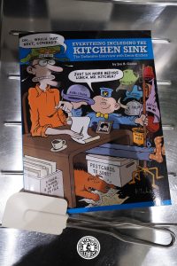
Hi! Welcome to a kinda-sorta complete overview of everything Kitchen Sink published. I started this project in late 2021, and it took me a year and a half to complete.
Compared with some of my other comics reading projects (see sidebar to the right) I kinda-sorta failed: The schtick with these projects is to read everything a publisher has er published, and then natter on about each series a bit. However, Kitchen Sink has published a large number of strip (and comic) reprints, and when it came time to read those, I found that my motivation evaporated completely. So I skipped reading those. Oops!
But I did read all the other comics Kitchen Sink has published, and a fair portion of the non-comics stuff they published, too.
Enough with these caveats — let’s get down to the Kitchen Sink publishing overview.
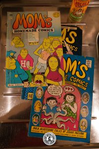
Kitchen Sink started in 1969 as a vehicle to publish Denis Kitchen’s first book, Mom’s Homemade Comis. Then… things happened, and 30 years later Kitchen Sink shut down.
Kitchen Sink has some quite distinct publishing periods, so in the listing below, I’ll be dividing the series (roughly) into these periods, as I see them. And I’m leaving out the reprinted comics, because they overwhelm the listing otherwise. (I’m including them in a separate section towards the end.)
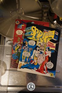
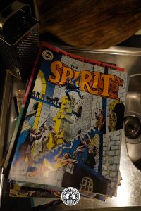
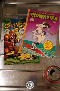
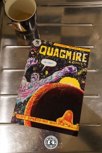
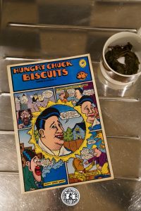
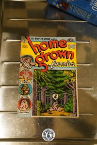
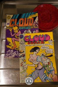
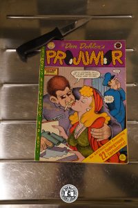
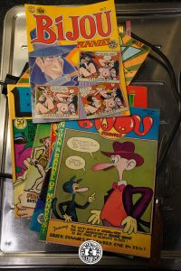
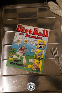
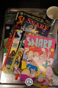
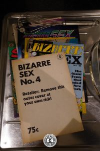
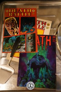
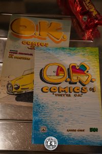
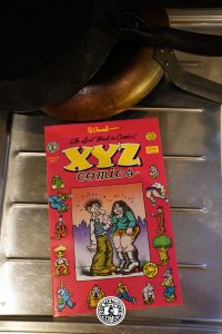
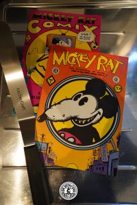
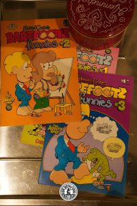
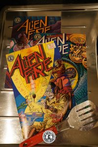
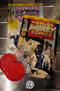
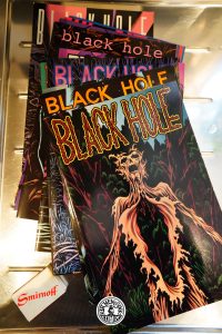
Underground Comics
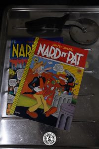
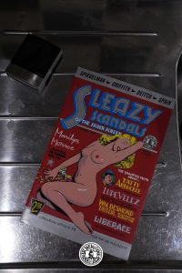
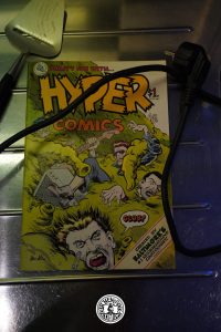
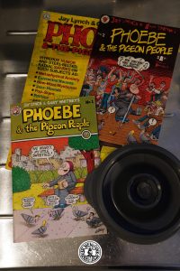
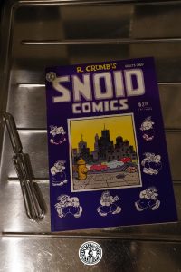
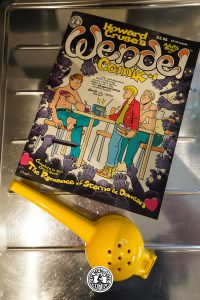
Kitchen Sink was one of the original “major” Underground publishers, along with Print Mint, Last Gasp and Rip Off Press. However, being located in the Mid-West instead of in more liberal California meant that Kitchen Sink had to eschew publishing books that contained a lot of sex (at least for the first few years). This led to odd things like having an anthology that was called Bizarre Sex that didn’t really have that much sex.
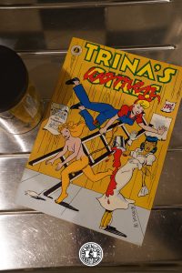
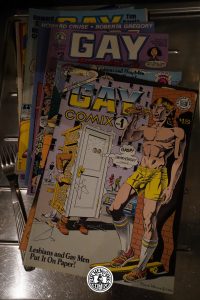
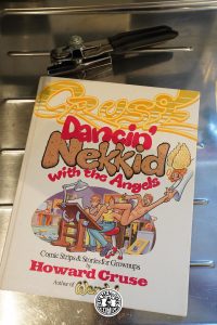
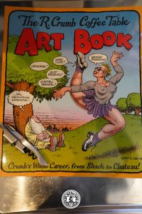
However, Kitchen Sink was the most progressive of the major Underground publishers. The other ones often came off as club-houses for straight white male cartoonists, and Denis Kitchen bucked that trend to some degree. For instance, he reached out to Trina Robbins with a suggestion for her to create an anthology that turned into Wet Satin, and she later said that he was the first publisher that reached out in that way. Historically significantly, he reached out to Howard Cruse and asked him to edit an LGBTQ+ anthology, and that became Gay Comix. Both of these initiatives got significant push-back, with printers refusing to print the anthologies, customs seizing the books, and comics shops being raided for obscenity for carrying them. And Kitchen didn’t reach out to create these anthologies because he saw a market opportunity, but because he felt that these books should exist.

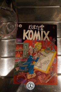
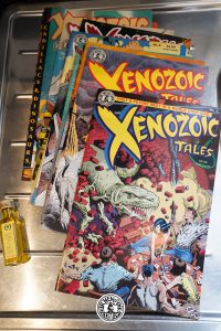
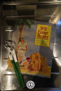
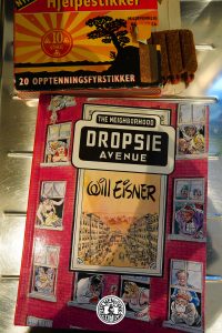
Alternative & Eisner Comics
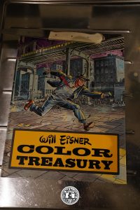
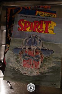
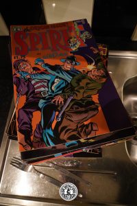
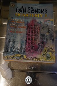
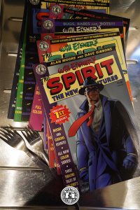
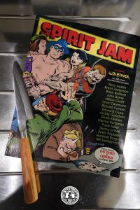
By the 1980s, head shops were history, and Kitchen Sink was selling mostly through mail order and through the new “direct sales” market. The latter wasn’t receptive to underground comics, so Kitchen Sink pivoted away from classic underground comics and went into (mostly) colour alternative comics… as well as really getting into publishing new work by Will Eisner.


Tundra
Kevin Eastman had lost a lot of money on Tundra, so he wanted to wind down his involvement in that business… by acquihiring Denis Kitchen, basically. Eastman bought 51% of Kitchen Sink (some say 49% with 2% being held by some wise guy), and Denis Kitchen moved into Tundra’s offices and started running the business.
So quite a lot of the books from this period are books that had already been started during the Tundra days, and Kitchen Press pushed them out the door (and over a cliff). However, not much of the Tundra lineup remained after a year or so.


Ocean Group
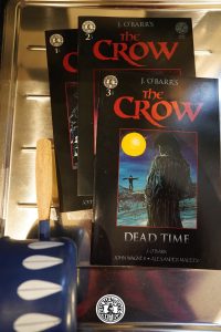
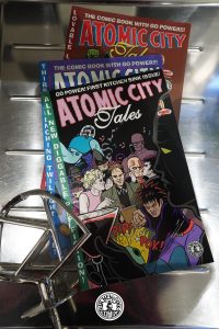
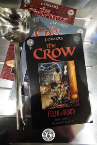
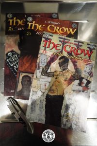
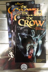
The new Kitchen Sink-branded Tundra continued to lose money (but the participants disagree in how much was lost). New investors were needed, and were found in Hollywood. The new owners, Ocean Group, wanted to use Kitchen Sink as a comics-to-movie farm, with The Crow being the prime example of what they wanted to achieve.


Don Todrin Days
The second Crow movie failed, and Kitchen Sink was left with tons of unsaleable merchandise. In addition, Kitchen Sink had backed Capital in the Distributor Wars, and when they went under, Kitchen Sink lost further money, as well as some market access. More capital was needed, and Kitchen Sink found its saviour in yet another West Coast rich guy.


The End
Denis Kitchen put an ultimatum to the final owner: Either fire Todrin or Denis Kitchen would leave… and the owner fired Kitchen. Kitchen Sink Press was wound down ignominiously, and the only thing of worth Don Todrin saw in the business — rights to R. Crumb candy bars — was spun off into its own business, True Confections.
That’s a pretty tragic way for Kitchen Sink to end.
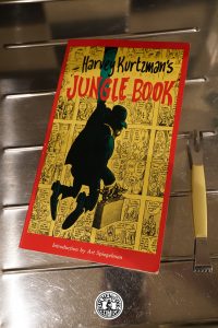
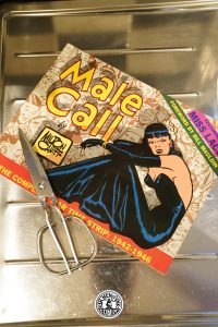
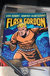
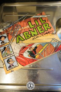
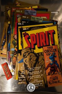
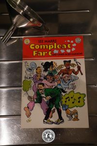
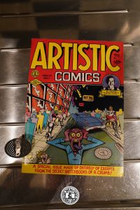
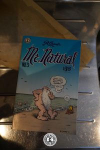
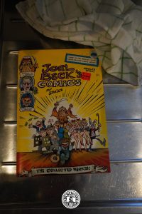
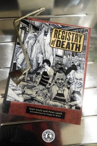
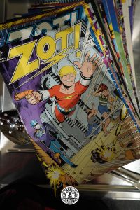
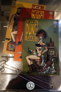
But here’s an overview of all the reprint projects Kitchen Sink did: